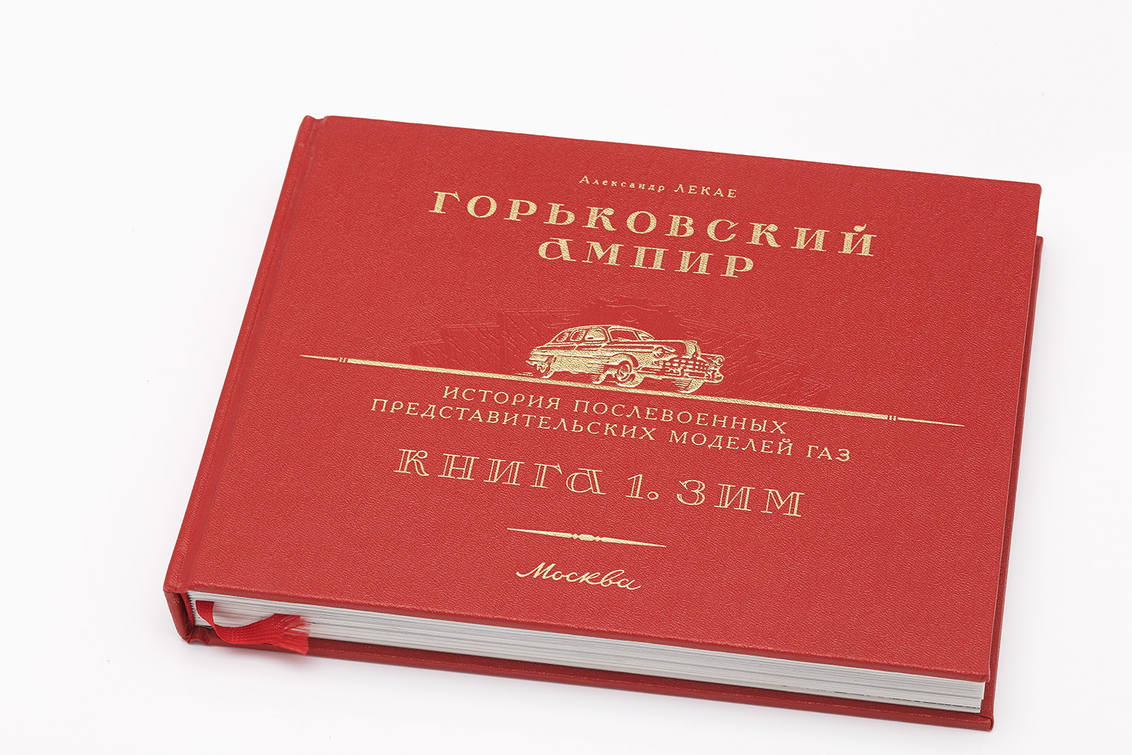
The book Gorky Empire Style: ZIM
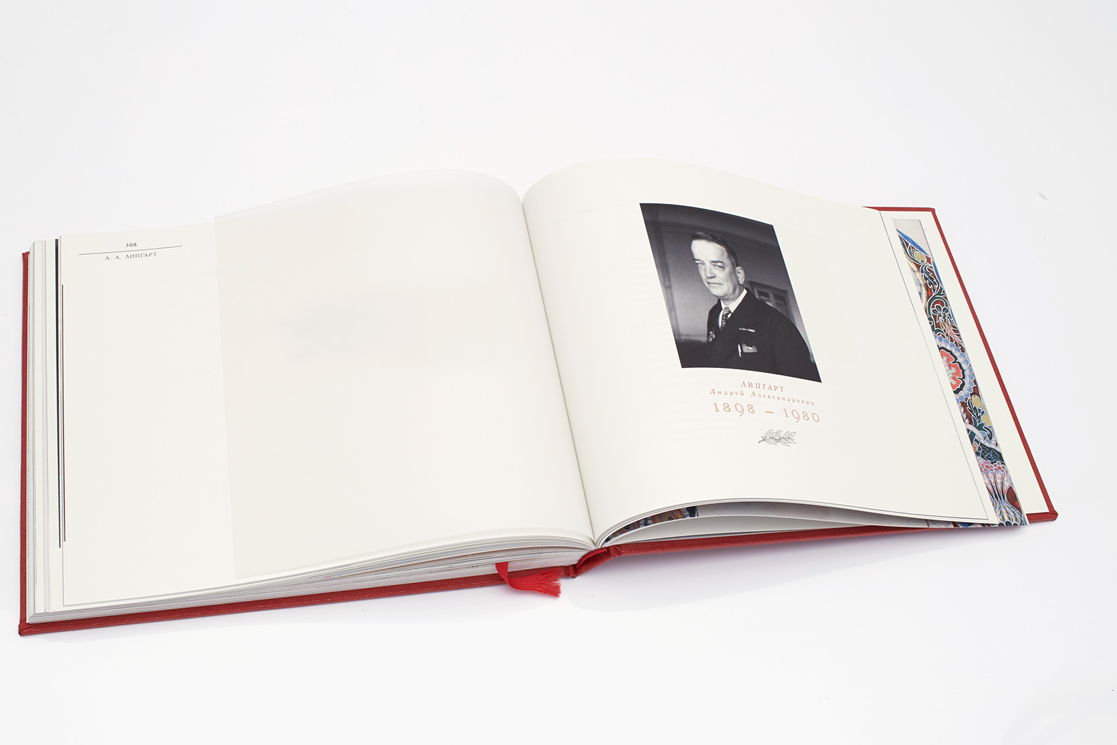
It all started with a car. In 1949, Gorky Automobile Plant (GAZ) produced one of its main models — ZIM, created by the outstanding engineer Andrey Lipgart. At the time, the car represented the peak of the design thought. This model reflected the grandeur of the 1950s, with all the passions, heroic deeds and tragedies of the time.
Aleksandr Lekaye’s book about ZIM and its creators is the first in the Gorky Empire Style trilogy dedicated to masterpieces of the Soviet post-war automotive industry and, in a broader sense, to the historical and cultural context of that unique era.
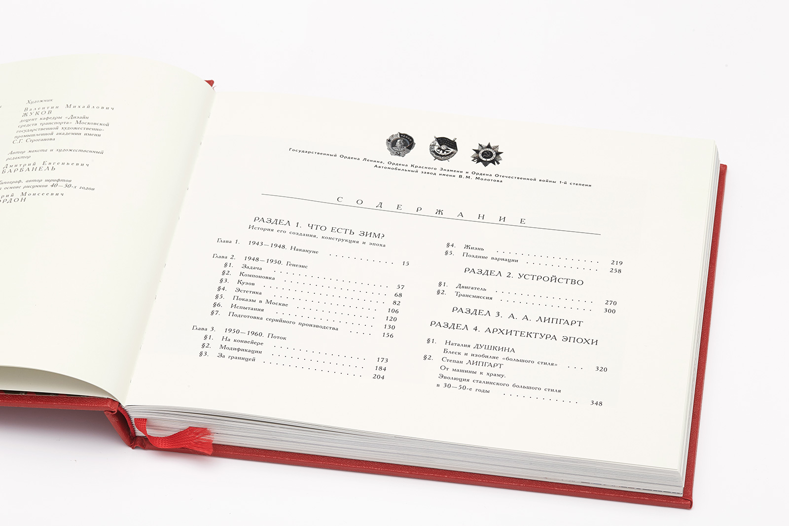
Pages: 376
Paper: Sappi coated glossy paper, 130 g/m3, bulk 1.0, whiteness 92%
Printing: four color offset printing
Finishing: thread sewing, beige thread, headband, red ribbon bookmarks
Case: Hardcover, fabric-backed leatherette, type 30, Proletarsky Trud factory, St. Petersburg.
Finishing: 3 mm guard, leatherette backing, 5 dies: foil embossing matte gold, blind embossing mylar film embossing, hot stamping
1. Team
Creative Direction
Dima Barbanel
Zhdan Filippov
Publisher
Aleksandr Lekaye
Typefaces, Logos, Lettering
Yuri Gordon
Paratype
Technical Illustrations
Marina Novikova
Automotive Illustrations
Vladimir Nosakov
Fedor Stetskevich
Color Correction and Prepress
Mikhail Shishlyannikov
Printing Manager
Elena Kaporskaya
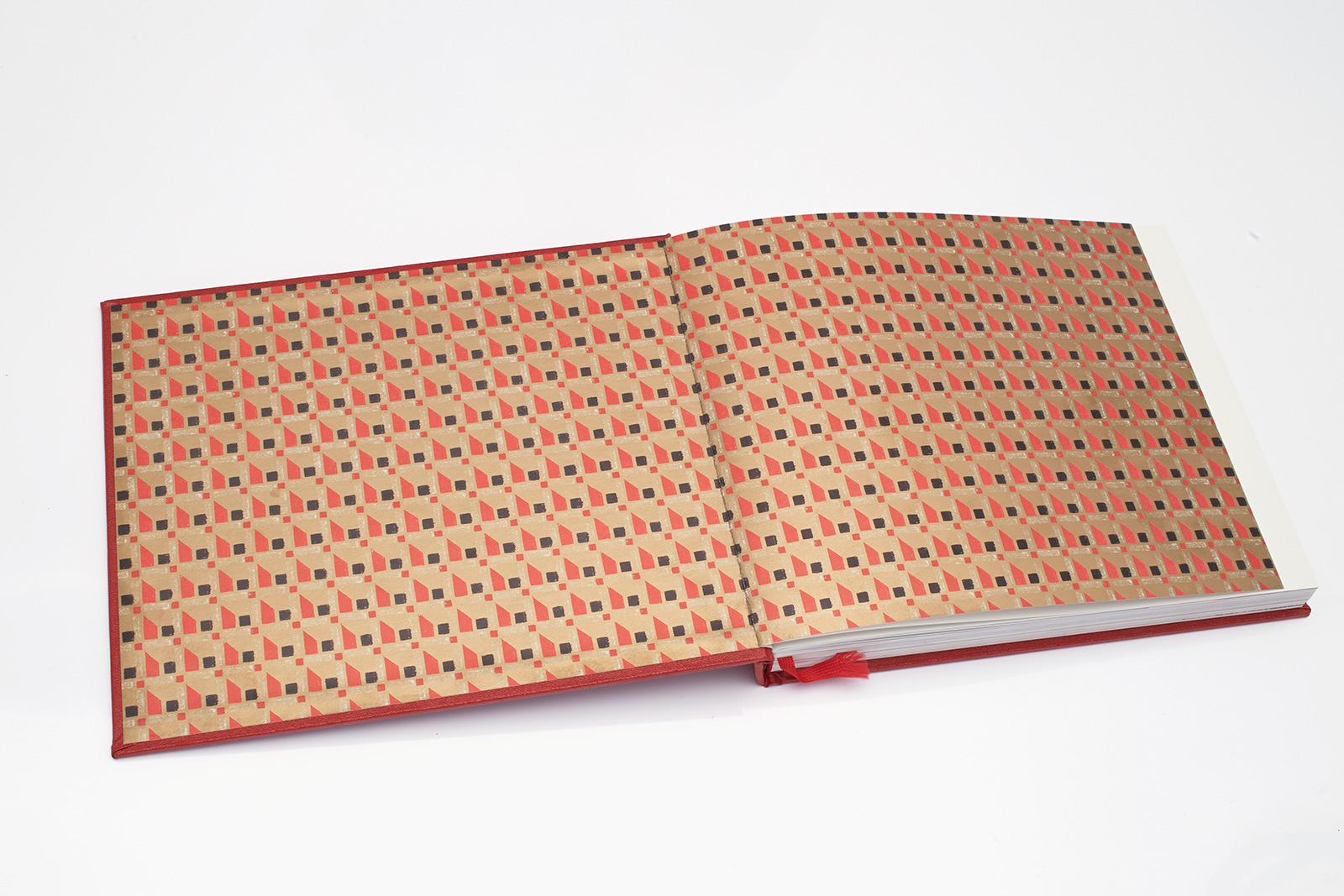
Endpapers: 1920s pattern. Paper: Garda Pat 13 Kiara, 150 g/m3. Printing: Pantone, 3 colors.
The book’s dimensions are exactly the same as those of the ZIM battery hard-rubber protective cover and... of an iPad.
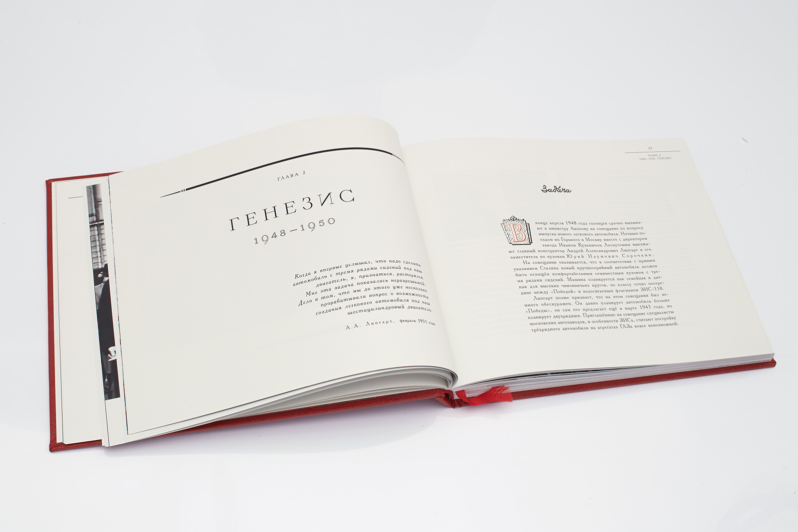
The layout is a compilation of the classical approach and the 1960s trends. The layout consists of 8 columns (21.811 mm); column gutters: 8.331 mm and 5.149 mm. The opening page of each section has one column only; the following pages may have two or three columns of unequal width, depending on the context. Vokrug Sveta display face by Yuri Gordon, based on the font design of I. F. Rerberg from 1932–1948.
2. Idea
Aleksandr Lekaye, book co-author and publisher:
“I wanted the book about the car that interests me to be produced to the best standards possible in our country. And I wanted the design and typography to be guided by the style of the period when this car was created. I wanted to pay attention to the smallest details.
It is obvious to me that we need a new type of literature — emotional automobile literature. The book does not just contain technical information and car characteristics; it is suffused with our love for the aesthetics of these cars, respect towards their creators and admiration for the period. The readers, opening the book, should be able to feel the energy that filled people during the tough post-war 1940s and 1950s.”
In case of a three-column layout, two out of eight modules remain empty and preserve the balance of the page. The decorative element is placed along the left edge of the layout, and this guide is the center line of the two-level header. The position of the photograph is reminiscent of the 1960s.
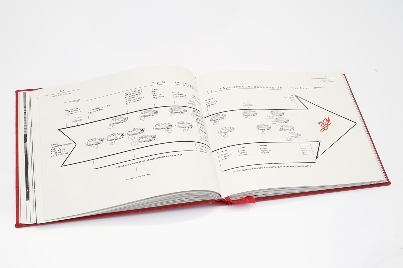
Infographics by Fedor Stetskevich. ZIM mock logo inside the arrow and on the book spine is a straightforward fake created by the designer Yuri Gordon, who is well-grounded in Soviet trademarks. Nothing like that actually existed — but it could have. The arrow shape is borrowed from a metal workplace-safety sign.
Red lowercase numeric characters based on the 1940s-1950s lettering, designed byYuri Gordon. Unlike the regular sets, only numbers 6 and 9 have descenders and ascenders. As a result, the set looks a bit strange, which is exactly what we needed in order to create a vintage look.
3. Solution
Our task was to bring back the 1950s style and spirit, through the use of appropriate design. This new aesthetic environment required a certain degree of conservatism. At the same time, we enjoyed all the freedom that graphic designers of the “big style” era used to have at their disposal. Of course, we were first of all inspired by books published in the Soviet era, which became the main source of our pre-design research.
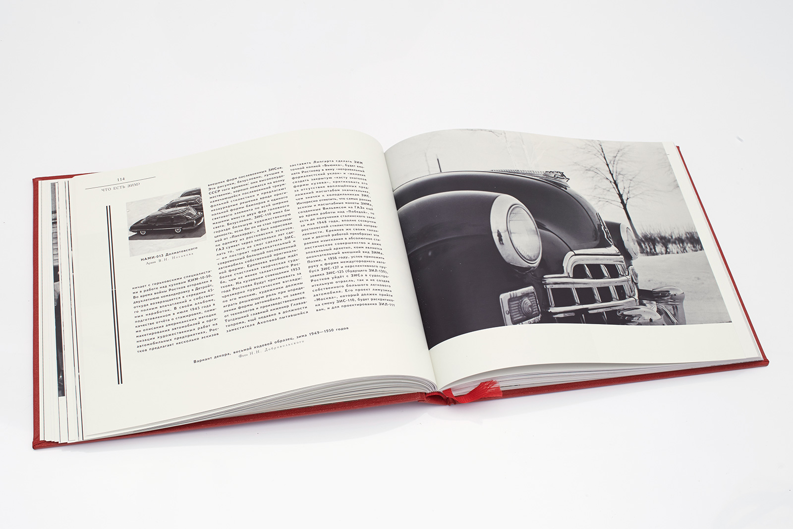
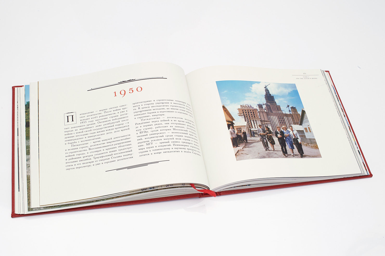
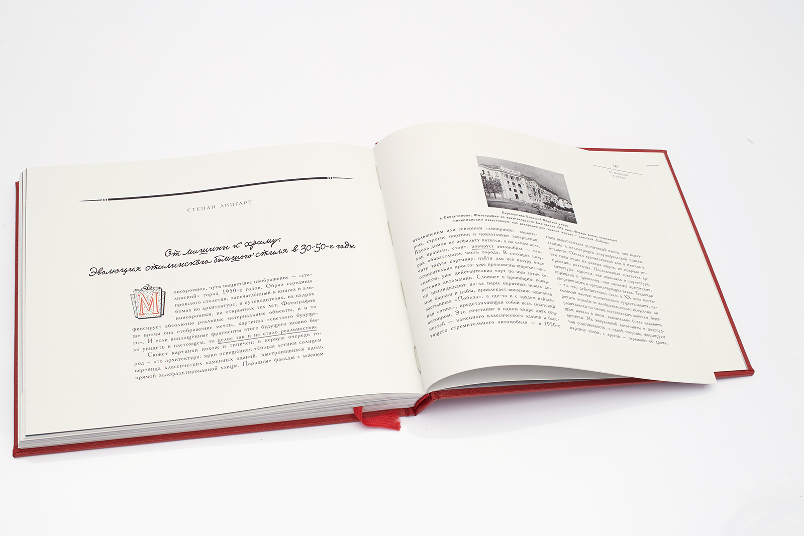
One of the most important stages in our work on the book was research in private and factory archives, including the archives of GAZ experimental design division. Lekaye also used materials from foreign archives: for example, a selection of French newspapers 1953–1954, with articles on ZIM, which was supposed to be exported to Europe at the time. Chapters on post-war urban construction with architectural illustrations from that period add depth to the historical narrative.
Dima Barbanel, co-creator of the layout:
“Even before we had a layout, the detailed book design had already existed in the author’s mind. Apart from a certain degree of mistrust towards designers, which probably existed in this case, Lekaye had a good understanding of the readership and their visual stereotypes. The two best examples of non-literal quoting of historical context — the heading script and the stone with a GK anagram on the title page — belong to the publisher, but they are in sync with our understanding of how monuments should be treated: the script was borrowed from handwritten headings of the GAZ plant wall newspaper, and the stone shape represents the control unit from Rigonda radio set, with added texture.
Good styling is almost never based on methods or techniques but on the emotional background, which is much more valuable than any technique. To give the reader a feeling of this past time period, you need to reproduce its many dimensions. We find an item created by a designer in the 1950s, ‘clean it up’ — that is, remove any excessive contour elements and the noise resulting from the reproduction method — and reassemble it, adding the emotional elements that help the modern reader to get a better insight into the era.”
Zhdan Filippov, co-creator of the layout:
“We got the idea about book design of that period pretty quickly. Everything back then was highly vivid, but vague and unconstructive. In the course of our work, we discovered the key elements that would recreate the ‘doughy’ look of the old Soviet typography: several types of lettering, two types of initial caps, three types of head- and tailpieces, rather bold rule lines (double, triple rule lines and boxes formed with them — imperfect, with visible alignment issues), different character spacing, etc.”
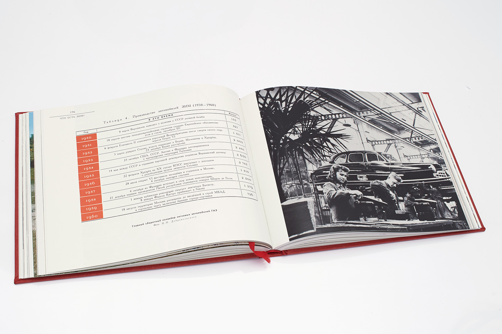
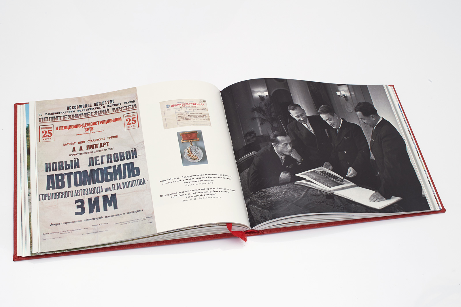
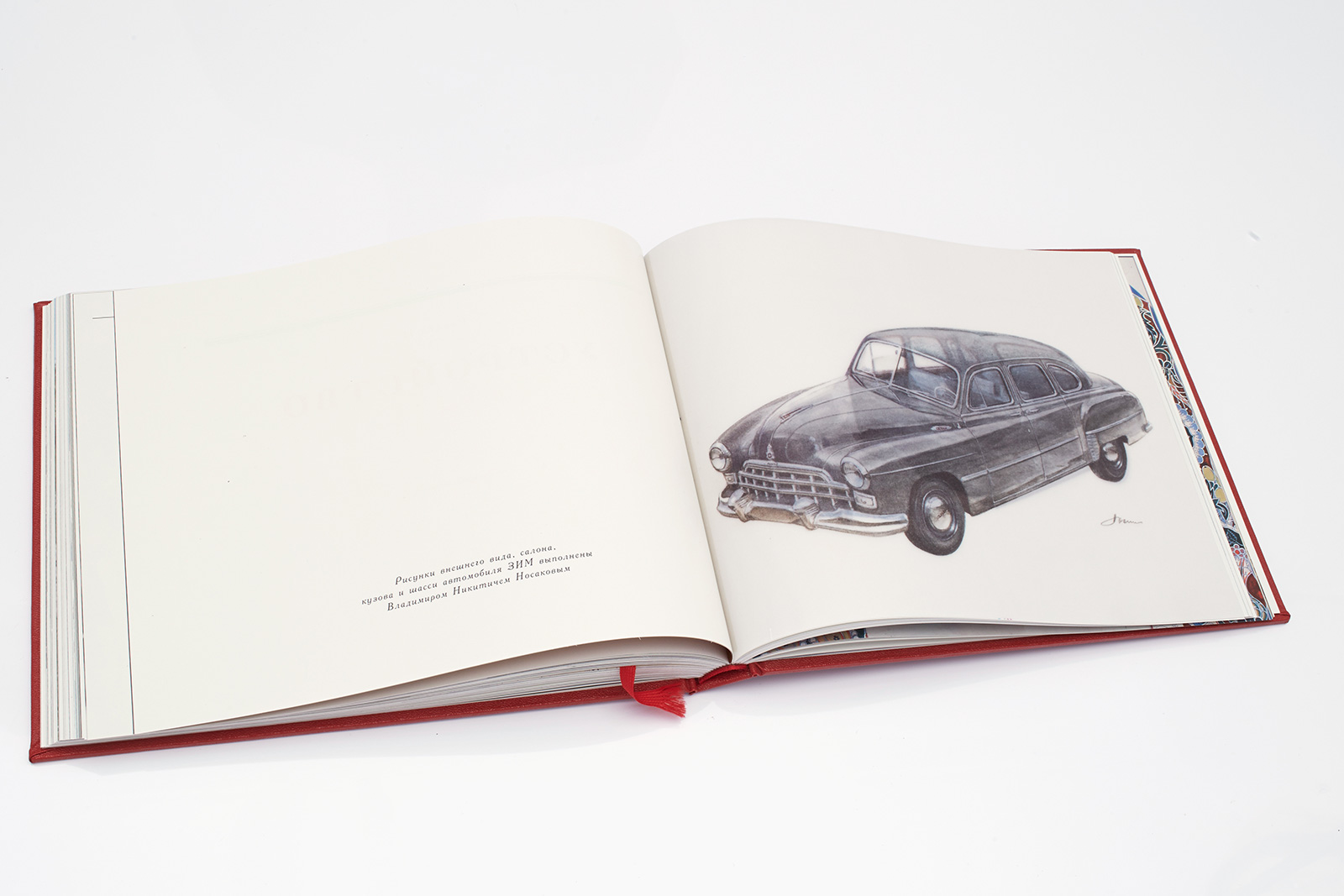
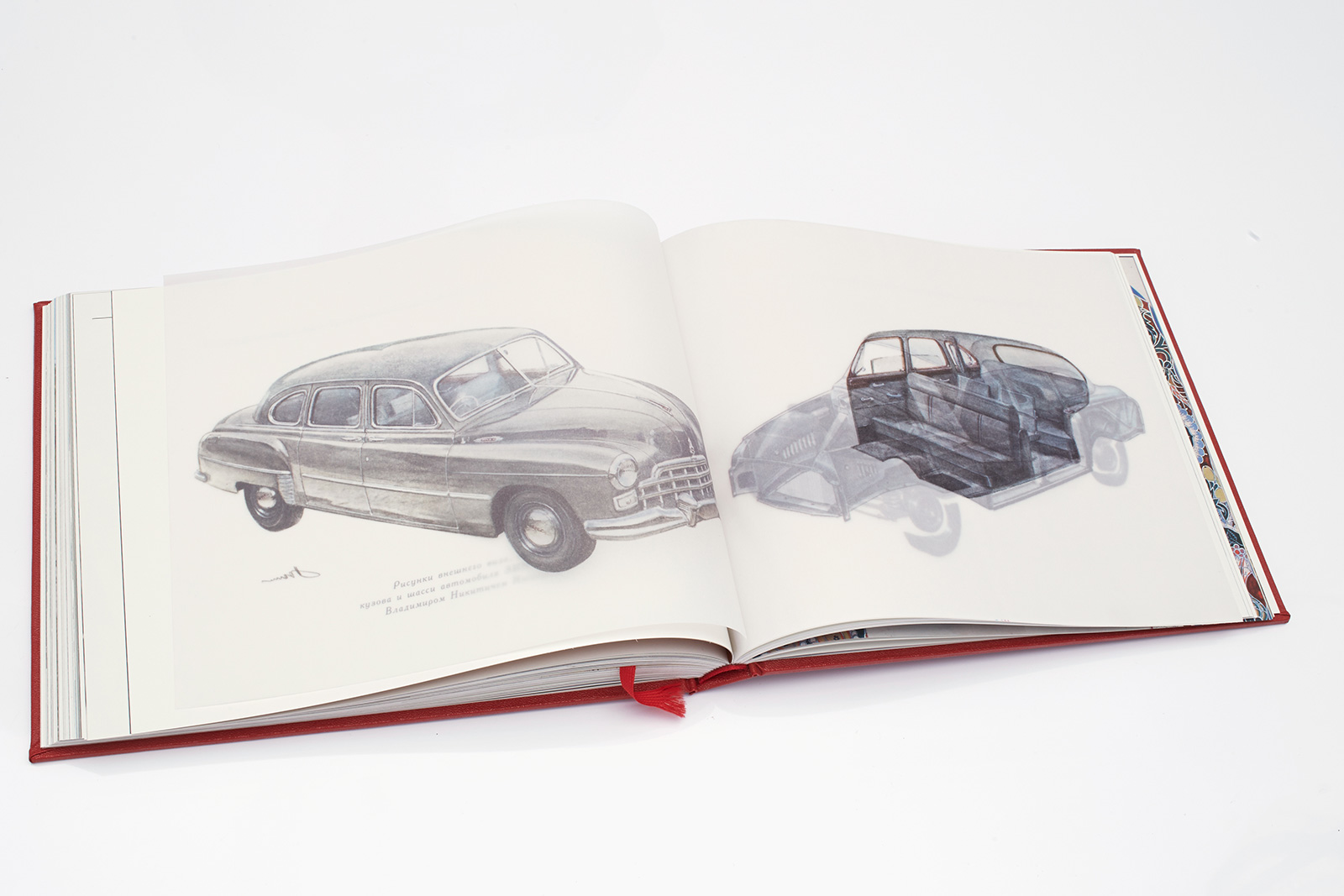
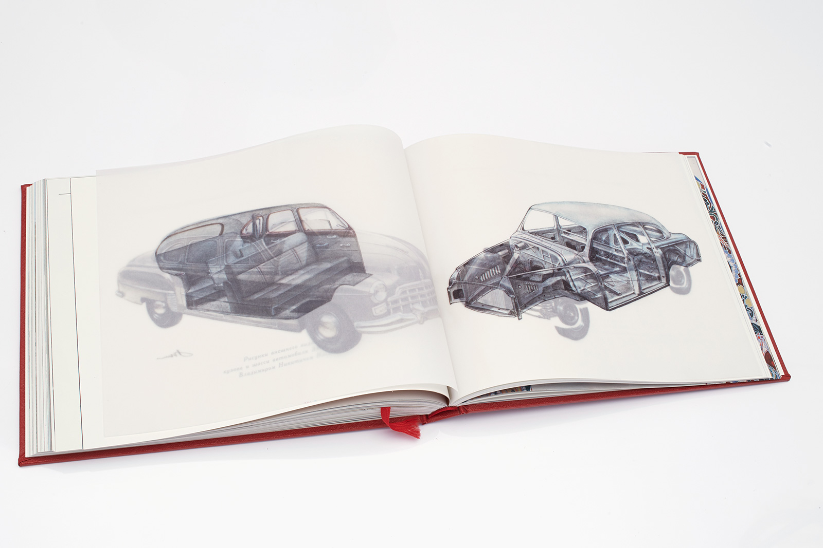
Illustration by the GAZ chief engineer Vladimir Nosakov. 4-page insert, tracing paper 92 g/m3, natural white color, printing 4+0, sheet offset printing, solvent ink.
4. Typefaces
The book uses two wonderful old type families: Academy, as the body typeface, and KudryashovSans, as the secondary typeface. Academy was developed by the Berthold type-foundry in St. Petersburg around 1910. It was based on Sorbonne typeface drawings (H. Berthold, Berlin) and Russian typefaces of the mid-18th century. It is a low contrast body face with a historical touch. The KudryashovSans gothic was created for the Great Soviet Encyclopedia in 1974 by the Soviet type designers Nikolay Kydryashov and Zinaida Maslennikova.
Yuri Gordon, font designer:
“Academy is an amazing typeface that combines classical English antiqua with mischief à la russe. It has lots of amusing things — just look at the ‘3’. This is why it leaves one with a very pleasant aftertaste.”
Zhdan Filippov, co-creator of the layout:
“The fact that we used Academy is a real success. Without it, the layout would not have been so spot-on. It brings the whole era with it. It was a tougher choice with the sidekick, which would turn the 1950s-themed book into something new. KudryashovSans works perfectly in this tandem.”
Dima Barbanel, co-creator of the layout:
“That being said, choosing Academy wasn’t all that easy. We were choosing from dozens of various typefaces, mostly those with Latin roots. No matter how great Scotch, Hoefler Text or any other Anglo-Saxon typeface might be, they would not have looked natural in this book. This is why we turned to early digital versions of Paratype, which we had never used in our typesets before. After trying them out, we offered Emil Yakupov to make a style update of Academy and Ladoga. Interestingly, the publisher insisted on using Ladoga, but it was absolutely impossible to make it work in a 1950s stylization or, in fact, to work with it altogether. And that is why we agreed on Academy.”
5. Lettering
Lettering and all decorative typographic elements were created by Yuri Gordon, our regular contributor ever since the work on the Esquire magazine. His most significant work in this project was a typeface named after the architect Shchusev, a member of the USSR Academy of Sciences. This typeface was used in all large design elements. All blueprints of that period were drawn on large-size paper, with handwritten headings and labels. Characters of the Shchusev typeface are not an exact copy of the decorative headings of architectural projects but rather represent a fusion of that style with other typographic features of the era.
Yuri Gordon, font designer:
“This project was one of the most enjoyable jobs in my experience with Masterskaya; the things they do are absolutely unique. In this project I was responsible for the artistic truth, which means that everything I created was a total fake. But the way it is done makes it more real than life itself.”
6. Prepress
Mikhail Shishlyannikov, reproductions:
“Color separation is the basis of publishing, and at the same time it is one of its pitfalls. In order to avoid losses that occur in digital color separation, we used optical color separation. The method involves imitation of the analog process on the computer — it preserves millions of color combinations and the ‘pure’ optical information contained on film. In order to create this analog effect on computer, in our printing process we used RGB plates with addition of the color black — instead of a color chart. And since black ink looks gray, we added a second black ink to create a deeper color in overlapping areas. Preserving the optical nature of the original, we were able to create a rare widow-in-window effect found in significant publications on art history.”
7. Printing
The printing process is particularly noteworthy, since our task was to create a technological likeness to original Soviet books, while using modern paper, ink and binding material. This required a lot of manual post-printing work.
After a series of experiments, we decided to print first on white paper and then apply the lacquer coating — this is how old books used to be made. Our next challenge was to choose the lacquer color that would give the paper that specific shade of yellow. Printers tried adding a small amount of yellow paint to the lacquer, and this proved to be the right solution. The most difficult part of our work was the multi-level hot stamping of the front cover and the spine of the book. Cover assembling included several stages: first, leatherette was rolled onto thin paperboard; then, in several stages, we applied hot stamping and embossing to the cover and the spine, and, finally, we rolled it onto a 3 mm guard.
Zhdan Filippov, co-creator of the layout:
“Our printers found excellent, crazy-colored binding material — just what we needed. Solid, Soviet and extremely unpopular nowadays, but perfect for our project.”
Elena Kaporskaya, printing:
“Our cover material choice was between Soviet blue, brown, burgundy and red leatherette; our customer chose the latter. The most difficult part of the process was paper toning. We could not use Finnish, Korean or Chinese coated paper because the resulting impression would have been too modern. We needed the paper that would be more light-weight and with a lower whiteness percentage.”