The Russian Language encyclopedia and mobile application
Who wrote The Tale of Igor’s Campaign and who was the first to use a smiley? What is “language expansion” and should we fight against it? In what way does the Russian letter ё resemble tears trickling down from one’s eyes, and how did this fact predetermine its fate? What language did Marina Tsvetaeva speak and would Mikhail Saltykov-Shchedrin have understood her? Why do writers misspell words — is it by mistake or intent? Why is expressiveness a good thing, while some expressions should not be used? Can we learn to write by street signs, and how did birch bark writings remain intact in the muddy soil? Answers to these and many other questions (except for the ones that have no answers whatsoever) can be found in The Russian Language school encyclopedia (available as a paper book and a free mobile application) — the latest project by St. Petersburg State University and Masterskaya.
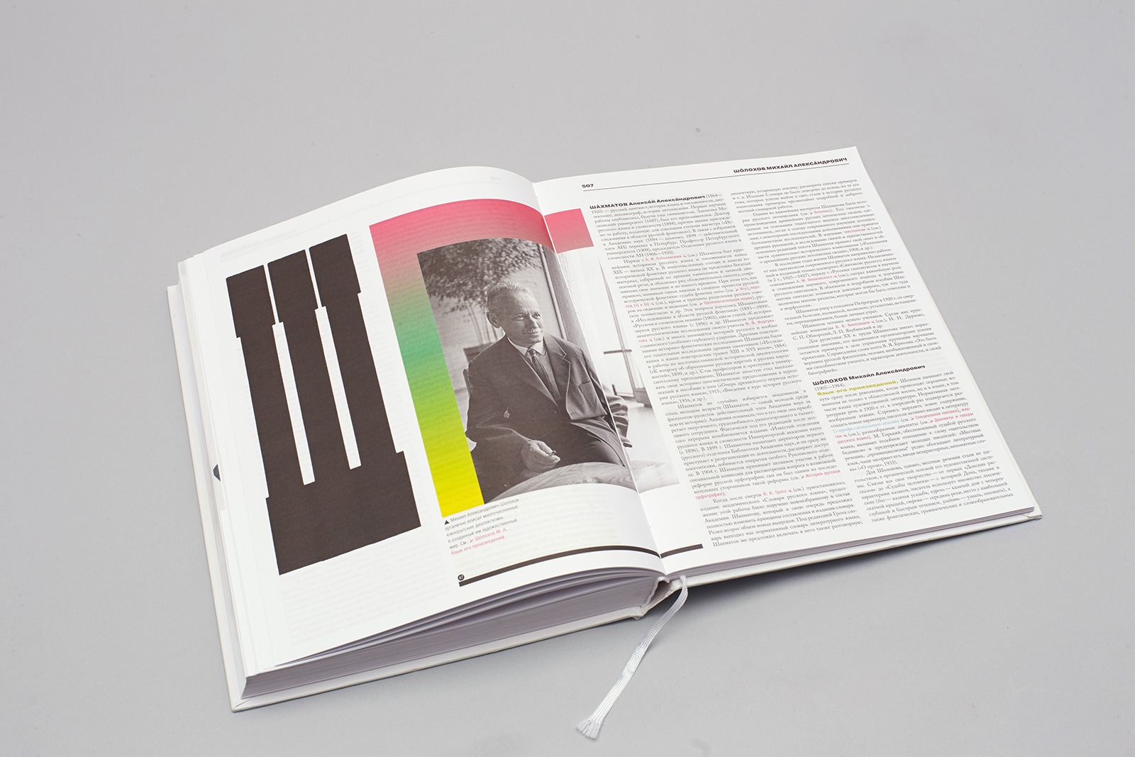
Pages: 584
Paper: offset paper 120 g/m3
Printing: four color offset printing
1. Team
Художественная концепция
Ждан Филиппов
Издатель
Санкт-Петербургский государственный университетРедакторы
С. В. Друговейко-Должанская, Д. Н. Чердаков
Верстка
Арсений Шмарцев
Шрифты
Алексей Чекулаев
Разработка мобильного приложения
Astroshoсk
Менеджмент
Дима Алексашин, Сергей Монахов
2. Idea
This could have happened earlier, but it didn’t. Generally speaking, there are not that many large non-compilation encyclopedias of the Russian language for non-linguists. The authors — experts from St. Petersburg State University, the Herzen State Pedagogical University of Russia, and the Institute for Linguistic Studies of the Russian Academy of Sciences — wanted the encyclopedic dictionary to be both useful and interesting, opening for every keen reader a vast field of knowledge — the science of language in general and of the Russian language in particular. Just like any other branch of knowledge, it is far from boring: there are lots of unresolved questions and heated debates, fascinating discoveries (Novgorod birchbark letters alone must count for something!), as well as dramatic events (for instance, the creation of Fasmer’s Etymological Dictionary of the Russian Language).
Apart from being a reference book, the encyclopedia was intended to become a kind of textbook, and even an interesting read. The idea of combining these functions was implemented on various levels — both through the design and through the text itself. Such an encyclopedia of the Russian language has probably never been seen before; on the one hand, it has a well-defined structure, and on the other, it is filled with educational information.
The encyclopedia was created with high school students in mind, but it is written in such a way that it could be interesting to anyone who — whether out of curiosity or necessity — comes to think about the structure and the use of the Russian language. Both the book and the application should make their readers see the Russian language in a new light and convince them that a fundamental encyclopedic dictionary can be something beautiful and not just useful.
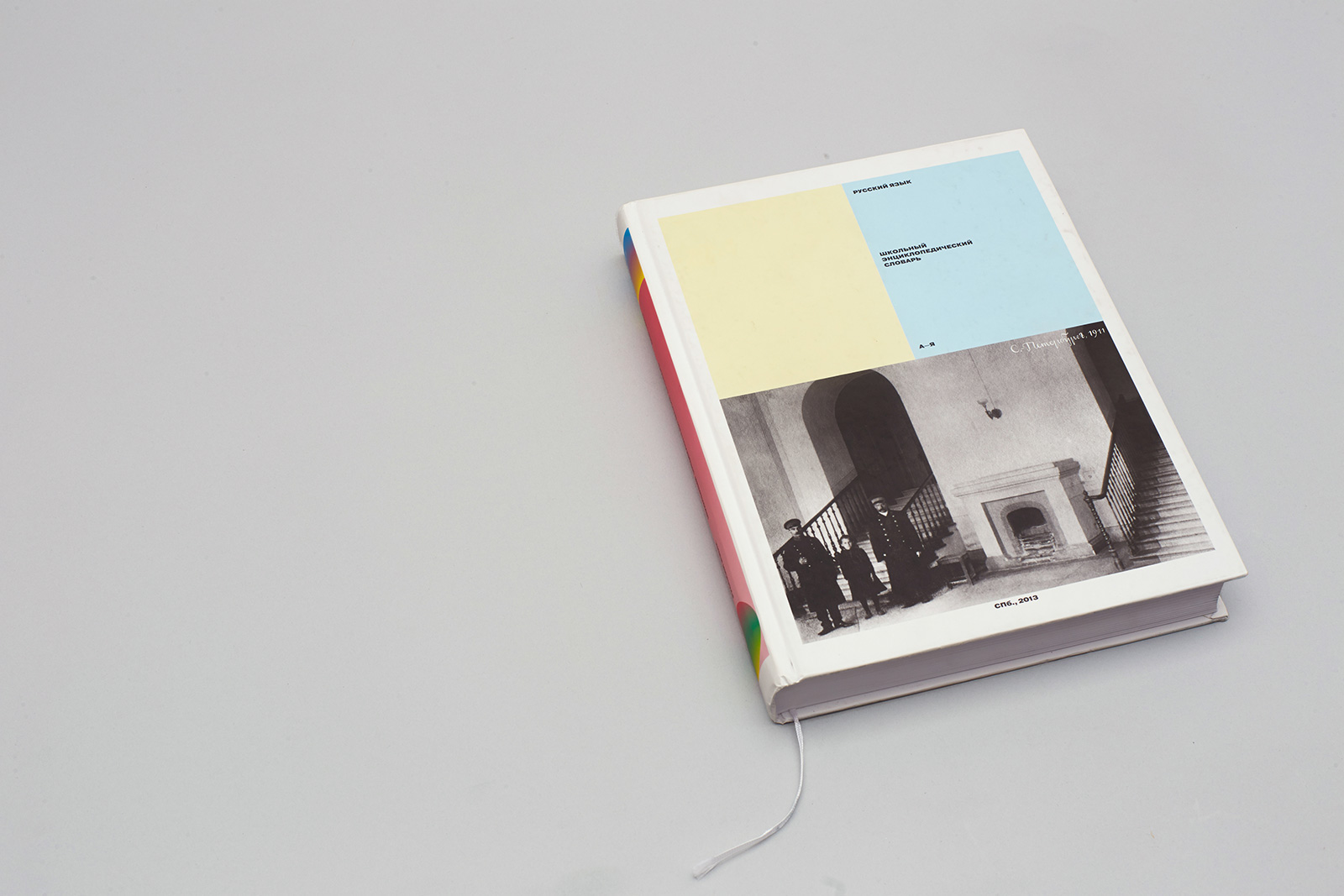
The cover page design includes a photograph taken in 1911 in the lobby of the Imperial Institute of History and Philology; it is the same building that houses the Faculty of Philology of St. Petersburg State University today. Two austere-looking doormen, looming over a girl, seem to symbolize the strict norms of the Russian language.

3. Solutions
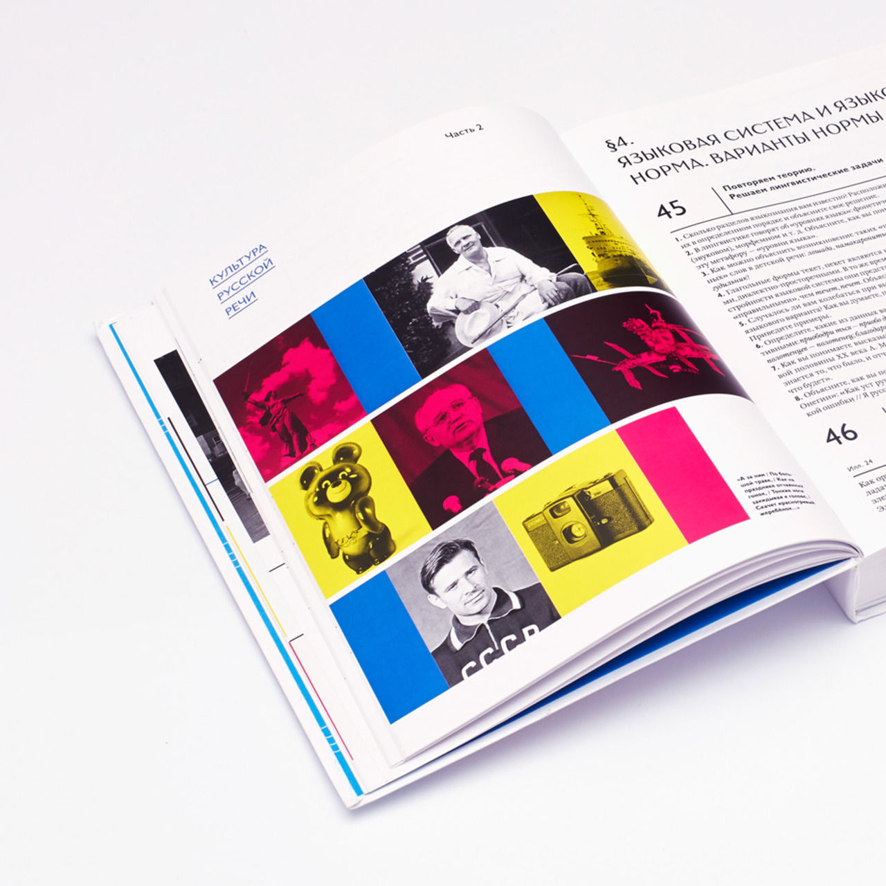
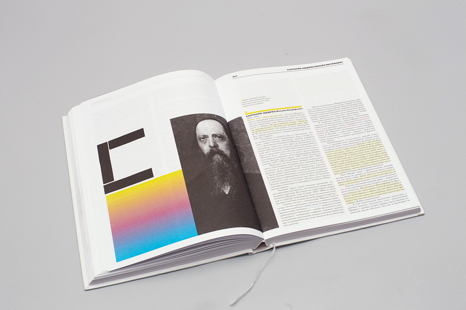
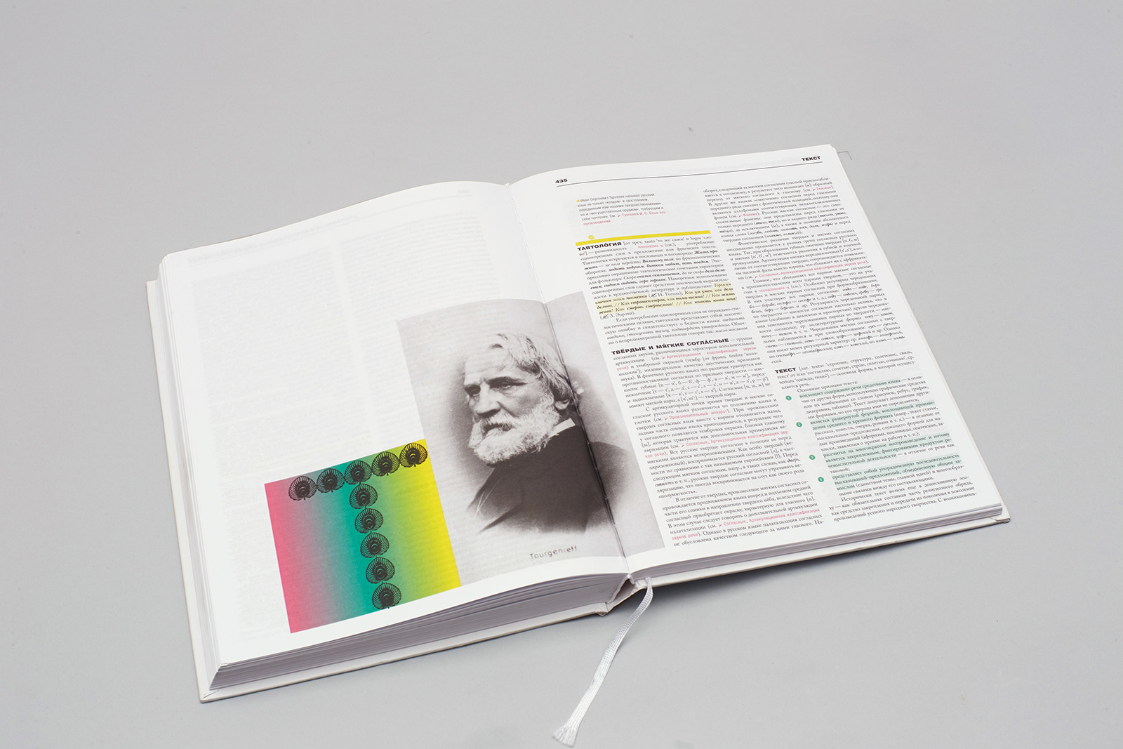
3.2. Lots of color in the text: information flows are highlighted with different colors: quotes, references, lists, terms, essays, writers’ names, and titles.
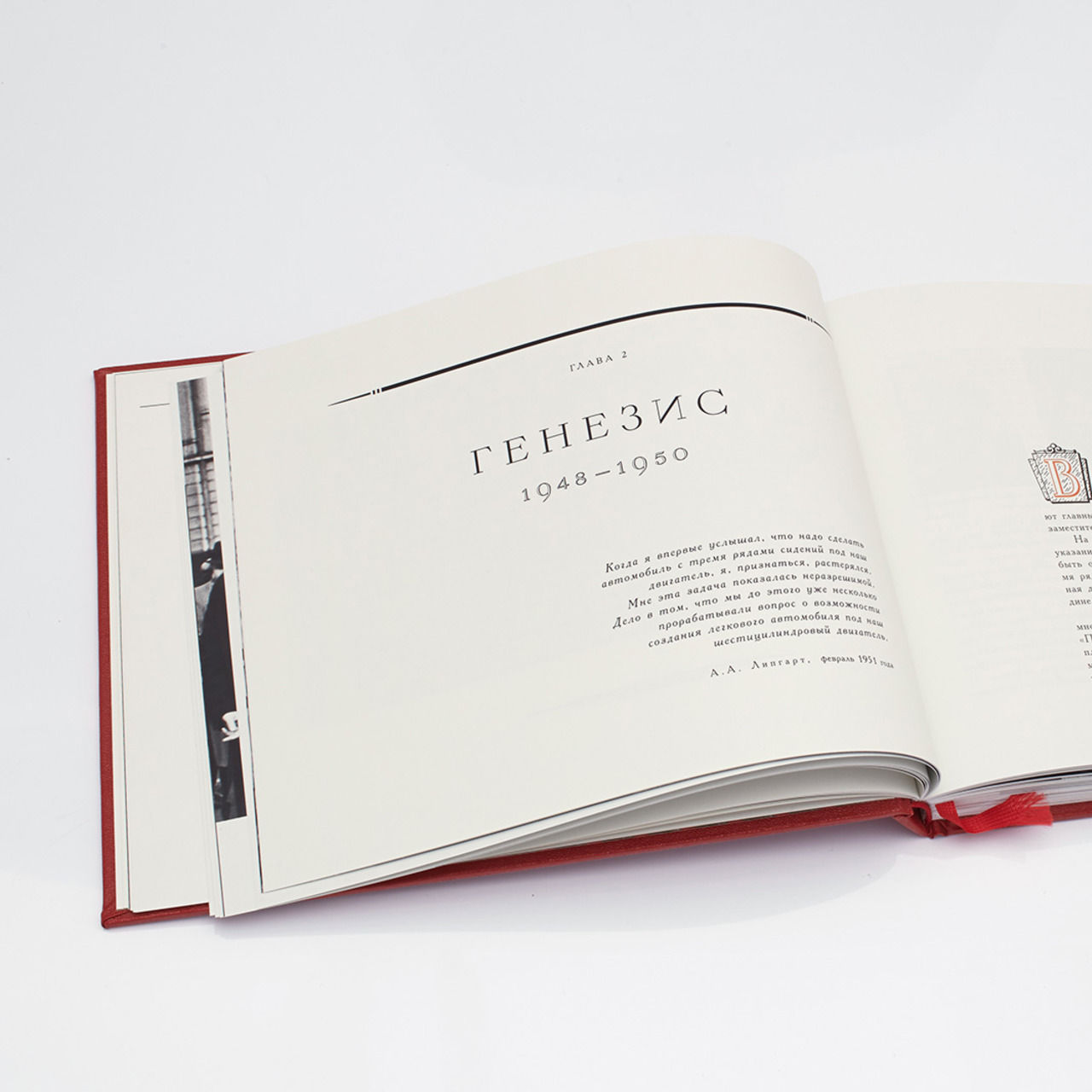
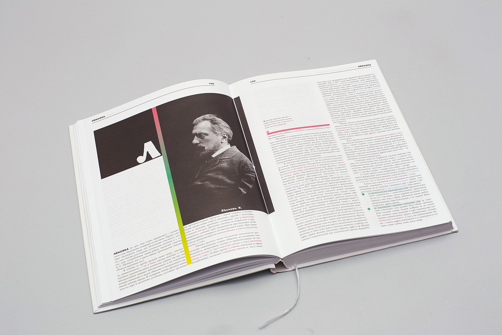
3.3. Big initial caps, inspired by Soviet ABC-books.
3.4. Small graphic elements, inspired by refined WordArt objects.
3.5. Easy-to-use alphabetical, author and subject indexes.
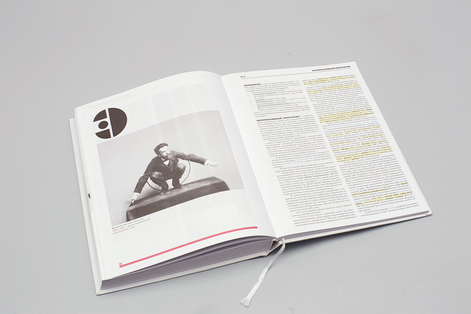
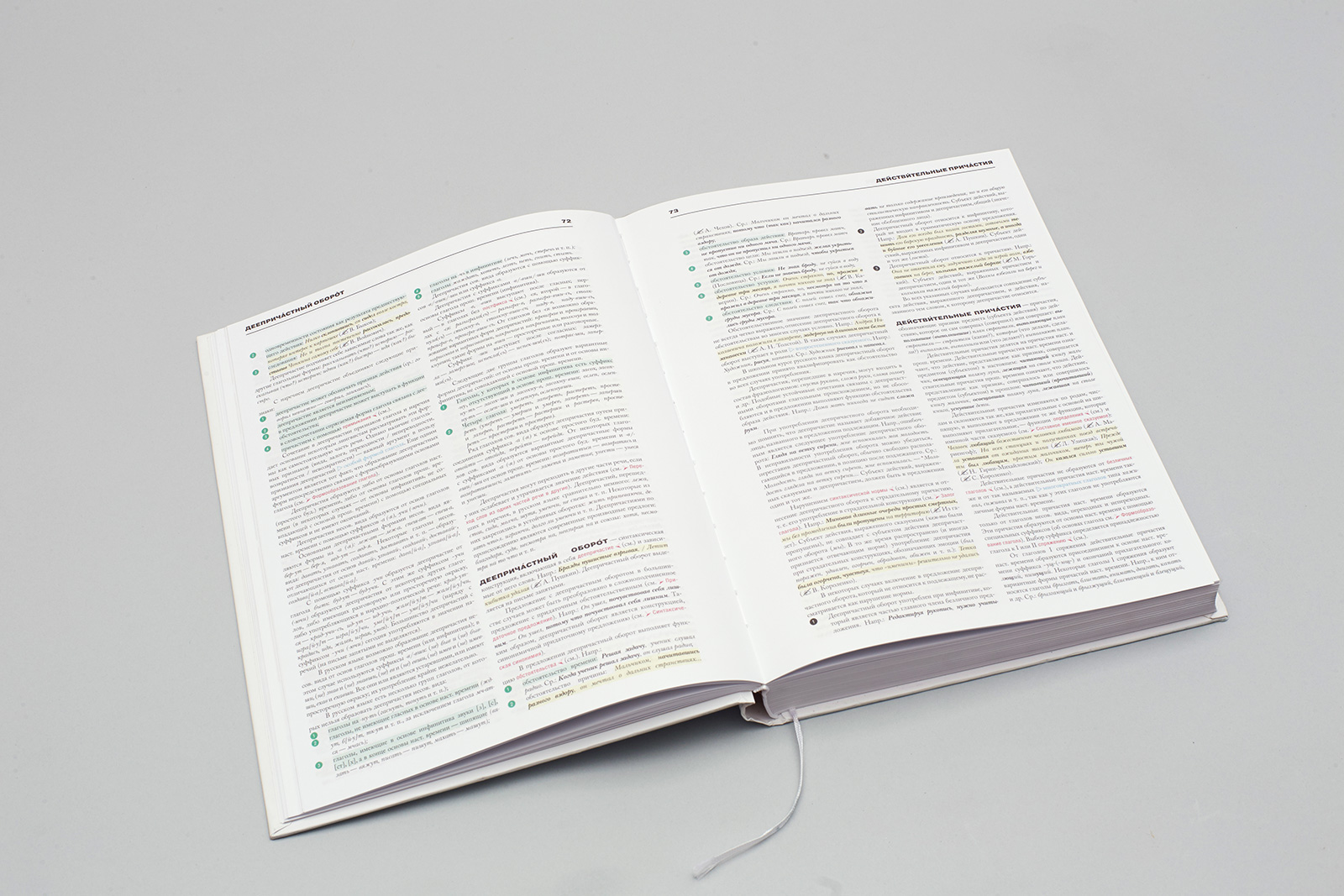
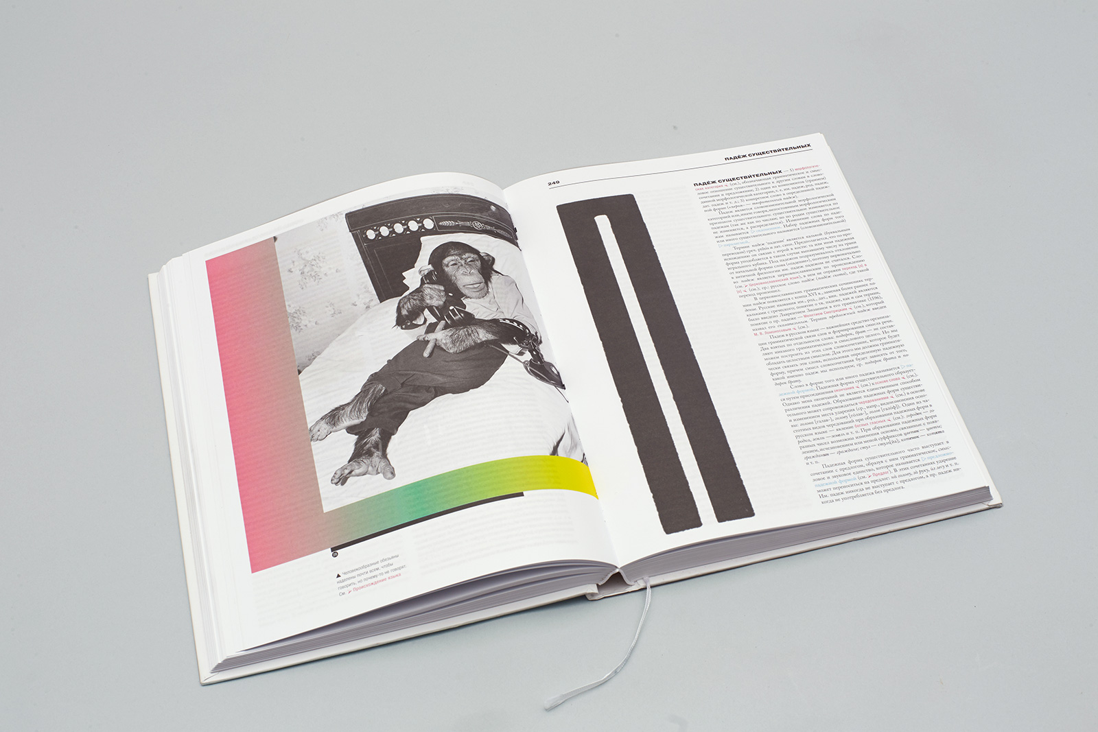
The elaborate highlighting system gives a distinct structure and a bright look even to double page spreads entirely filled with text.
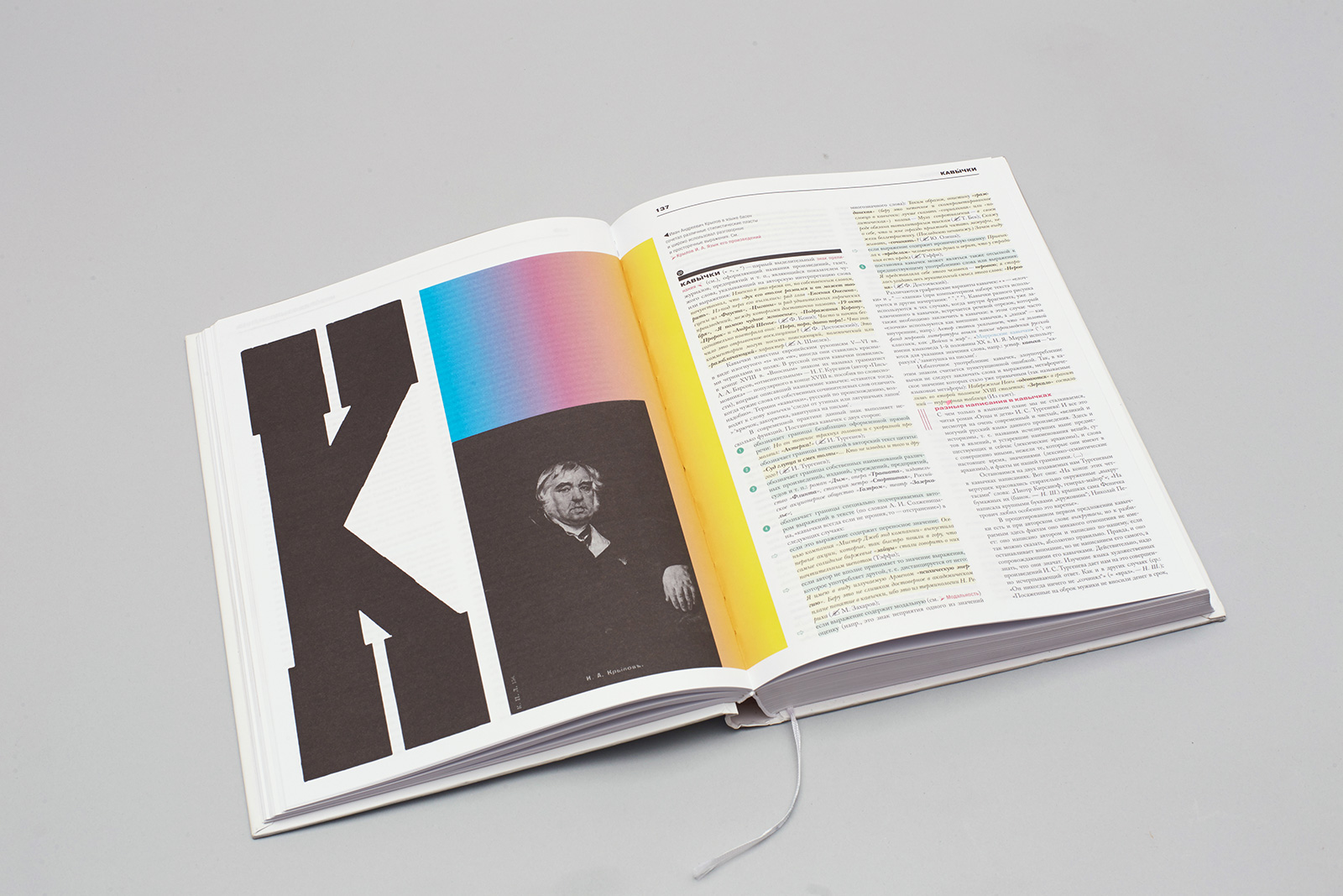
Black-and-white illustrations against the background of colorful text are supposed to create the sense of participation in timeless values.
4. Mobile app
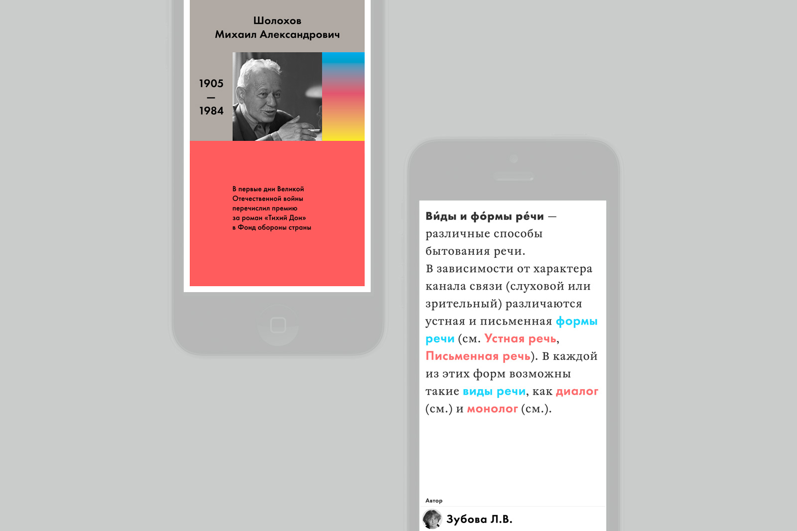
Turning the encyclopedia into an app required new interaction scenarios. The introduction of cross-references alone has made it hard to put the app down. You can spend good 40 minutes engrossed in it.
New challenges emerged as well: we had to make sure that readers would be able to find their way around and wouldn’t get tired from reading — a text of the same size looks different on a book page and on a phone screen. When using the app, readers have to deal with an endless wall of text that they have to trudge through. It is not enough just to define the right primary and secondary typesetting parameters. Blocks of text have to be split into smaller segments, which is why, every quote starts on a new line, with intervals inserted between quotes and neighboring paragraphs, and there are pop-up windows with information about writers.
