Metrostroy
Masterskaya designed the book for the open joint-stock company Mosmetrostroy, the main construction contractor for the Moscow metro, to commemorate the 80th anniversary of the company.

Pages: 320
Paper: offset art paper, Krasnokamskaya Goznak paper mill #3.2.1 120 g/m3
Printing: four color offset printing
Case: hardcover; fabric-backed case material Savanna #5060
1. Team
Creative Direction
Zhdan Filippov
Sergey Fedorov
Publisher
Mosmetrostroy
Project Manager
Masha Zayakina
Typefaces
Hermann Berthold (Berthold)
Jonathan Hoefler (Hoefler&Co.)
Color correction and Prepress
Mikhail Shishlyannikov
Printing techniques
Svetlana Ivanova
Printing
Novosti publishing house, Moscow
© Masterskaya, 2011
DB: Is the font size in the vertical block connected with any others inside the book?
ZF: Like the regular typesetting and captions, it’s just a number, which has nothing to do with anything and has no secret connections. I mean, maybe some other element has the same font size, but the reason is unity, not the magic of numbers.
DB: Why did you chose such an option for the case?
ZF: We wanted to try a lot of stuff, but in the end, we took the one that the printing house had, as it usually happens. Unfortunately, the fabric is not exactly as rough as we wanted it to be.
2. Objective
Dima Barbanel: Do you like subway?
Zhdan Filippov: I really do, especially the Moscow metro. The subway is connected with a lot of good stuff in my memory; it is a magical place for me. Just think about it, an underground train — how cool is that! I love trains. And bikes. I would gladly use just these two if I could. So many things have happened to me on the subway! I have been there in every possible condition, I slept there, had dreams, missed my stations, delivered money, sold a Macbook — it’s like a whole life.
DB: What’s your favorite station in Moscow, St. Petersburg, and Shanghai?
ZF: Well, there are plenty of beautiful stations in Moscow. I like the ones on the circle line: Kievskaya and Belorusskaya, Krasnopresnenskaya, Sokol (for its simplicity), and Mayakovskaya. And of course, Elektrozavodskaya, it’s really grand. I don’t remember anything about the St. Petersburg metro, and Shanghai is a completely different world: strict functionality and sterility, all stations follow one style. That’s why I like the ones where we spend most time.
DB: What objectives did you have, and who set them?
ZF: Masha Zayakina, the project manager, told us about everything that Mosmetrostroy wanted. She’s done a great job.
DB: And how did you set objectives for yourself?
ZF: It’s hard to remember. I don’t think I did. I didn’t think about objectives, the client, or veterans of labor, who were going to get this book as a present. I’m not proud of it, but for me it was a very selfish project, I did it entirely for the sake of the form. I’m really grateful for Mosmetrostroy’s main guy, who approved of all this avant-garde wildness, signed the project, and let the book be. I still don’t understand why. I’d like to think that he found some images in the book that he could relate to, because it’s not that great if the real reason was the deadline.
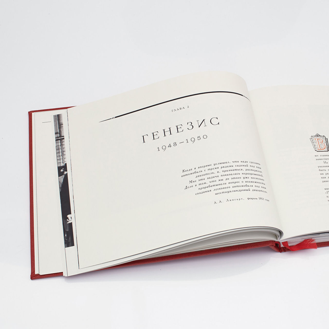
DB: Who came up with the idea that the book should open like this?
ZF: Sergey Fedorov and I had tons of ideas about how the book should open. For instance, we wanted to keep the original way a book usually opens but, at the same time, make each chapter shorter than the next one, it would look like stairs. It was funny at the beginning but turned out dull in reality, and besides, the grid wouldn’t allow it. So we dropped this idea. At some point, we just set a goal to make it strange, so there you have it.
3. Idea
Zhdan Filippov:
“From the very beginning we realized that if we didn’t create a principle that was relatively simple and easy to understand but had a wild form at the same time, then we wouldn’t manage to put this book together. The scope of work was too vast, and we had to put too much of ourselves in it — so nothing would have been possible without love. It was a crazy time, without boundaries; it was when I started working on CitizenK, and this feeling that everything was possible was overwhelming. During the process, Sergey Fedorov and I divided the work on the book more or less equally. Later, he moved to a purer form, without chatter; I borrowed some of his solutions — as a result, everything mixed up together and formed quite a balance between large- and small-sized visual elements.”
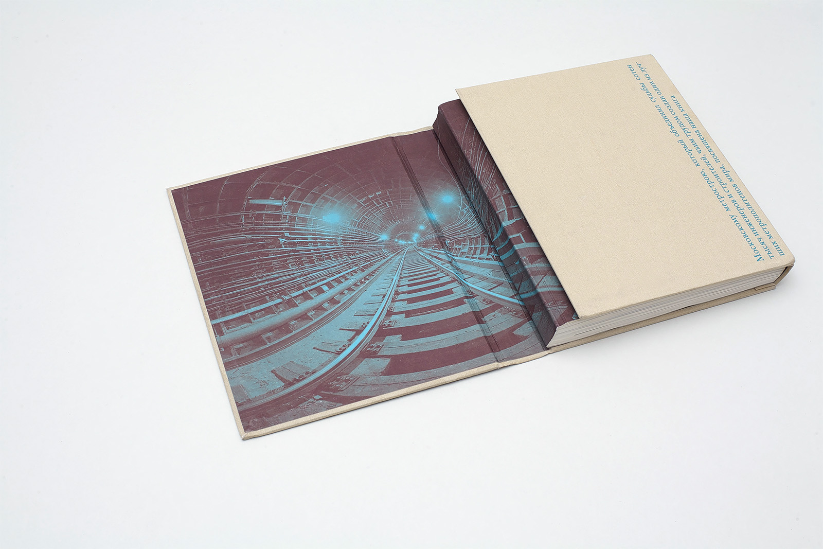
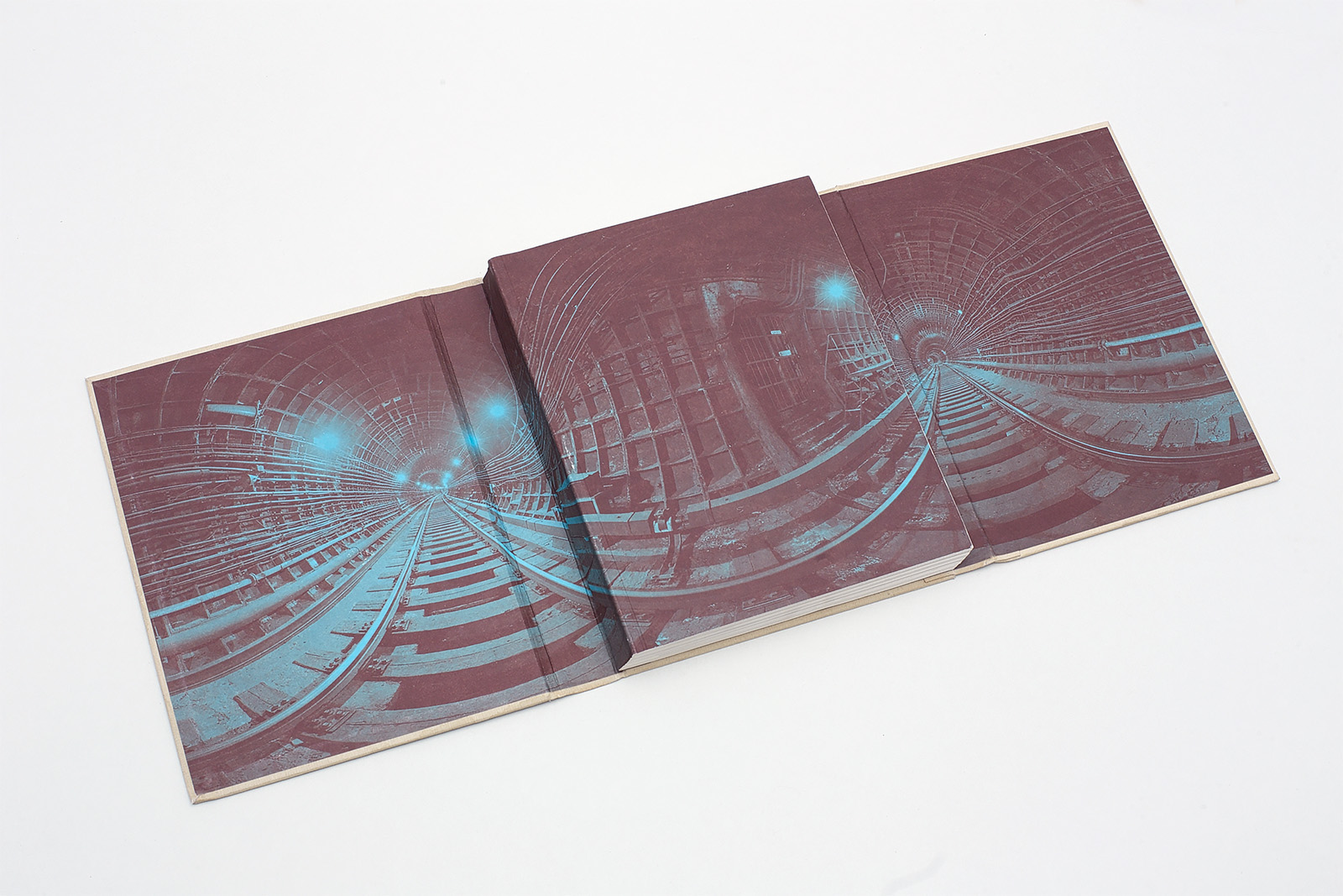
ZF: It’s a run-through grid, a very simple one. The minimal module is a 4×4 mm square. All margins, except the gutter one, are 8 mm; the gutter margin is 20 mm. There is no such thing as a column in the layout. Instead of them, there are fifteen vertical modules — it’s enough to place pictures of almost any proportions inside them. We also have fifteen horizontal modules where (apart from rare exceptions) we placed corridors and tunnels made by the captions.
ZF: The grid was created at the time when I began to divert from the Fibonacci sequence back to simple metric dimensions and I was very much absorbed by the GridCalculator program. It’s really good, I highly recommend it. It has a nice option — to make a square module; and this option defined everything. Font sizes show simple and rough ratios.
ZF: There isn’t any big (or small) idea behind it. It just seemed the right thing to do. Now I understand — and I’ve just tried it — that it was quite possible to do without multi-colored letters. It looks more rigid; that’s what we should have gone for. Gradients in numbers and colored heading look especially silly, it’s too much.
ZF: These are the last names of the people described in the chapter. They are vertical, because we needed such a form inside this margin, there was no other way.
4. Solutions
DB: All typesettings are spaced, what was the main reason for that?
ZF: I have no memory whatsoever of why and when we decided to use such a wide spacing. Probably, as it always happens, it just turned out that way, and we decided to leave it, because we had nothing to lose. I know for sure that we wanted to create a structure that would have an avant-garde and old-fashioned form but, at the same time, would be extremely easy to put together.
DB: Why did you use rule lines?
ZF: For a number of reasons: they set the direction, bring about the sense of speed and the length of the way; they make you think about drafts and blueprints, about blurred lights of a fast car, and about endless railway ties. It looks as if a train is going through the whole book. It is making holes in texts and pushing aside elements, nothing can be in its way — it is a train, after all. Sometimes its part is played by pictures, sometimes by a caption or a group of captions. As a result, there are all types of corridors and tunnels in the text.
DB: Picture captions are quite complex. How were they designed?
ZF: There are two principles in here. As far as “caption-trains” are concerned, the height of the tunnel they make depends on the picture on the next page. This connection gave us a lot of visual freedom: we had both relaxed (like Big Lebowski) and intense (like rush hour in a big city) double-page spreads. The second principle was uniting captions in a group in the lower part of a page. It is usually done when the spread is full of illustrations and it’s just impossible to make a corridor of captions there.
ZF: There were many of them, I can’t even remember all. And we only used half of them, the strong ones, the ones which had passed the double quality control test.

ZF: I saw the whole thing at once, which is quite unusual for me. The main ideas (there were many more of them, not all ended up in the book) were created in an hour of less, and after that we only adjusted and smoothened them. The grid was so basic that it didn’t limit us in any way: it was almost a blank canvas. We were limited only by the principles of arranging pictures and captions that Sergey Fedorov and I had agreed upon.
ZF: If I’m not mistaken, we used six or seven options: black-and-white, full color, and several combinations of dual tones. That way we could put together funny multi-color stuff.
ZF: The pictures that I combined don’t; the combination was based on color and composition.
5. Typefaces
DB: Did you think about using the typefaces that are used in the names of stations, or their stylistic replicas?
ZF: No, not at all. I’m bad at replicas, it would be nonsense, so I didn’t even think about it.
DB: Why did you choose these typefaces? What are their typesetting parameters? Tell us about their interaction, which of them focus on which part of the whole style?
ZF: Akzidenz Grotesk was chosen at once, because of its style and relative neutrality. And Hoefler wasn’t the best match, but what can we do now? It had to play the part of a good cop, but it turned out to be some sort of a half-drunk ballerina from a Macau casino.
ZF: If you mean the circle image put in a square box with a frame, I found this technique extremely interesting, and here it was more suitable than anywhere else.
ZF: No, this is the principle of that corridor or tunnel: these pictures have no other option but be opposite one another. Although, I should admit, looking around sounds more poetic.
ZF: I have absolutely no memory of it; Sergey Fedorov was the one who collaborated with the editor. I found working with the texts convenient. In general, everything was very easy in this project. I can’t recall any other project that was so easy to do.
ZF: Of course, it’s strange. In general, I think Hoefler looks odd here. It seems too elegant in this context. Frankly, there should have been another type of beauty. Soviet beauty, austere, and naive. This is what I think now, though. Back then, we had a different vision.
ZF: I agree, these intervals are not very nice, but it was impossible to establish strict parameters for captions: they varied in size; that’s why the size of the spacing above pictures can be different. But we can live with it.
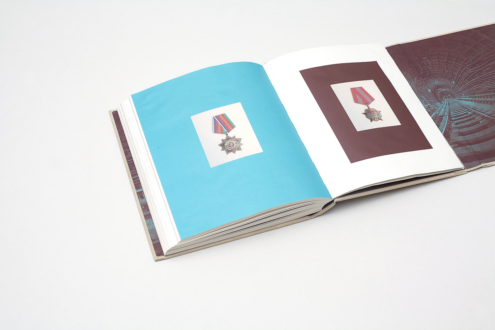
ZF: I don’t know. But it would be nice if it were. I remember it was quite a challenge to work with these medals; for a long time we couldn’t find an easy way to arrange them, everything looked too complicated.