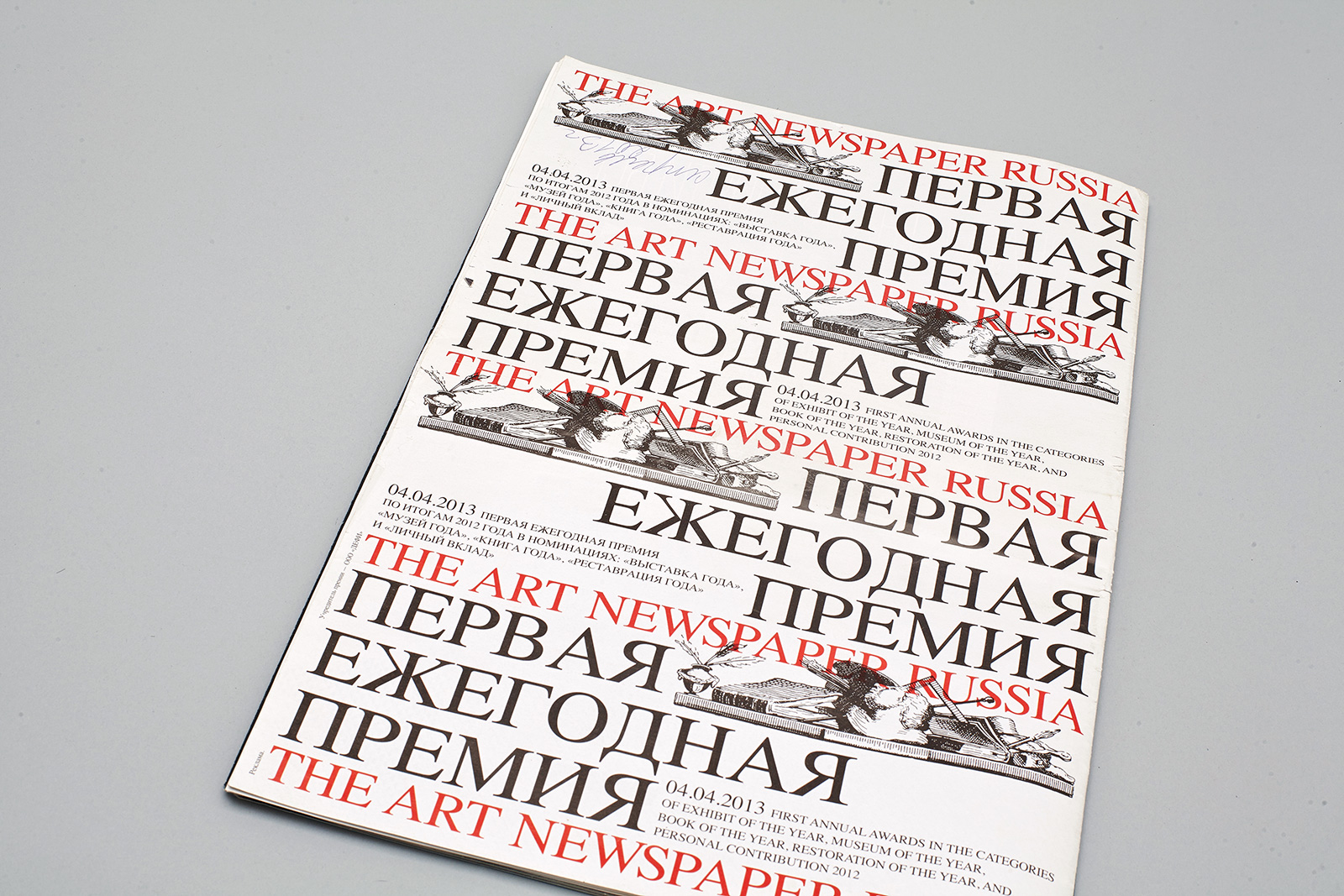
The Art Newspaper
The Art Newspaper is an international digital and printed publication on art, which has been published in six languages since 1990. The launch of the Russian edition included a complete reinterpretation of visual principles underlying the artwork design and the corporate style. To a certain extent, this has encouraged artistic reforms in other editions as well.
At the 36th Edition Best of News Design Competition, the layout of the newspaper was awarded three prizes.
Pages: 96
Paper: offset 53 g/m3
Printing: four color offset
Binding method: interfold
1. Team
Художественная концепция
Дима Барбанель
Сергей Федоров
Российский издатель
Инна Баженова
Главный редактор
Милена Орлова
Шрифты
Мария Дореули
Дмитрий Растворцев
Арт-директоры
Константин Лукьянов
Евгений Тихомиров
Роман Манихин
© Мастерская, 2011
The layout is based on a run-through grid with the gutter interval. The minimal module consists of five gutter widths and forms a horizontal cell which is 1/12 of the width and 1/24 of the height of the typesetting space. Font size 8.272 / 9.886 pt, the William Regular typeface.
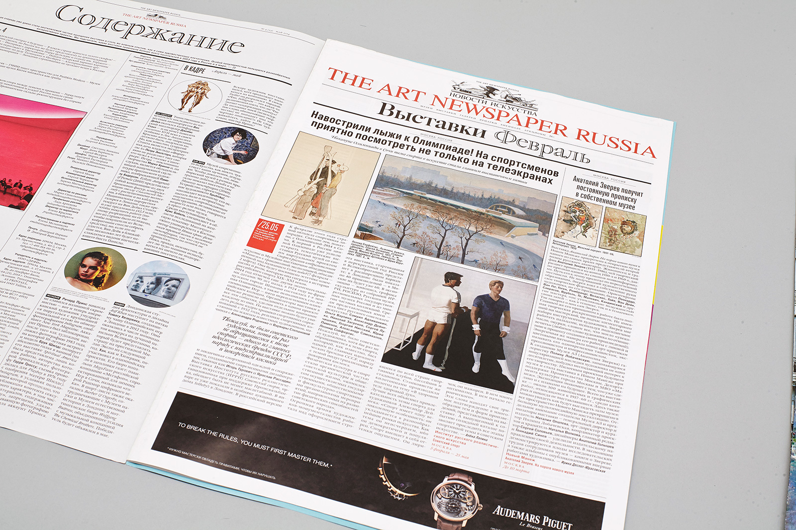
The first section has a dual listing structure; it follows the content page and repeats the heading on the front page.
Listing sections contain a block arranged according to the date, name or place of the event. This block is located outside the typesetting space. It is a dual 1/12×1/12 module.
2. History
The Art Newspaper was designed to be an equivalent of large political newspapers, such as The Guardian, The New York Times, or Corriere della Sera; however, it was to focus on events in the art world. The Art Newspaper is aimed at art collectors, curators, consultants, gallery owners, antiquarians, artists, critics, designers, architects, and historians.
The newspaper is distributed in sixty countries. More than 300 journalists and experts contribute to The Art Newspaper; today it is the most reputable information network in the art world. In 2010, Inna Bazhenova was licensed to publish the Russian edition of the newspaper.
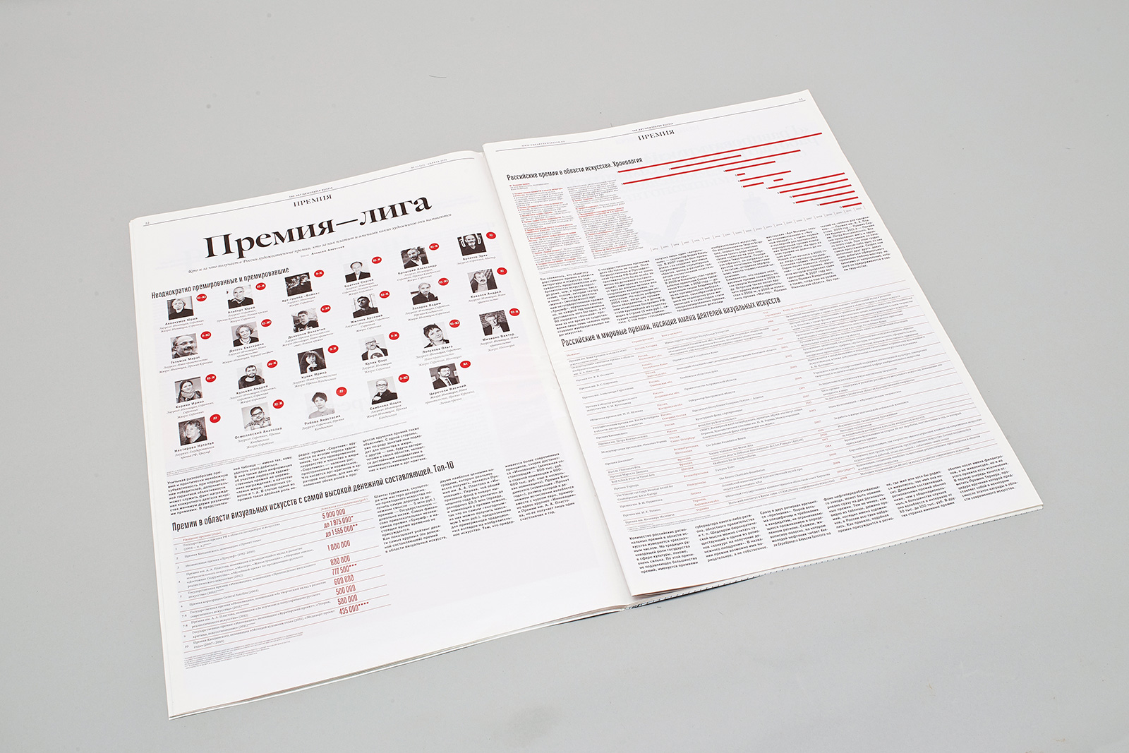
The width of the typesetting space makes it possible to include twelve minimal modules. It provides for the combination of the core typesetting blocks, which take from two to six columns, with two types of alignment.
The recto shows an example of typical blocks, their sizes, and heading alignments.
Box lists in the second column are usually placed among a regular dense typesetting space.
The text and illustrations in the box can vary in width and height; however, the most appropriate size for each of them is 3×4 modules.
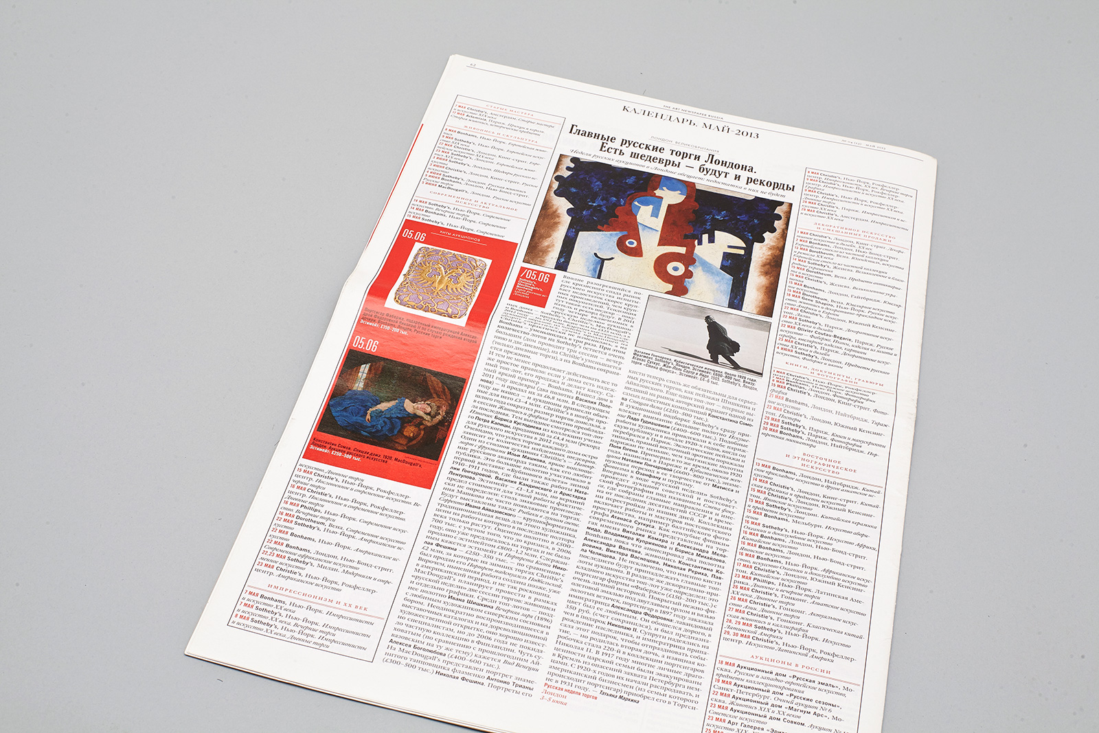
The Art Market section is a newspaper of its own inside the main one.

3. Idea
Whether it is journalism, reviews or analytics, materials on the Internet are not designed to involve a lot of reading. We were working not on an old-fashioned printed paper product; we wanted it to be an interface which would help readers to interact with large texts in a comfortable manner, quickly change the focus point, and simultaneously see several articles located in different threads.
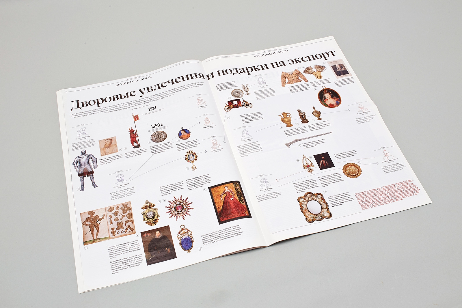
The austere dense text is in contrast with the free arrangement of illustrations. The scales of elements are different due to the large format and a wide range of font sizes. All this makes it possible to arrange a page as a complex multi-dimensional structure.
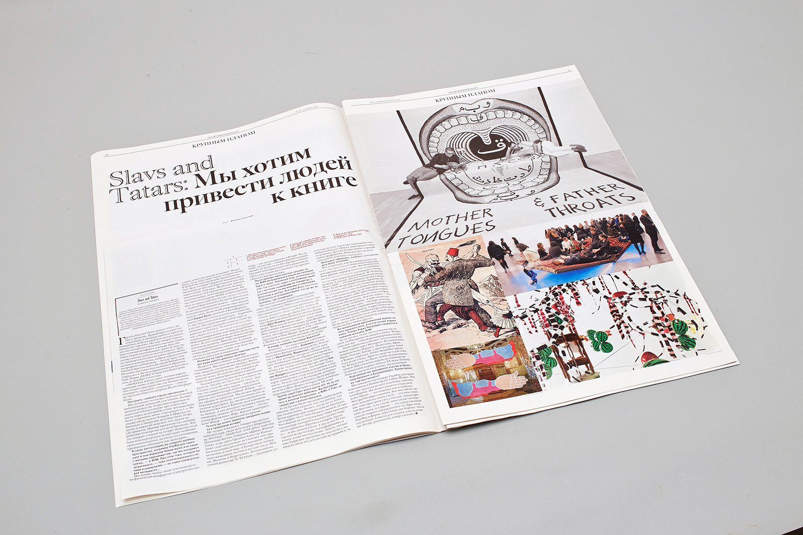
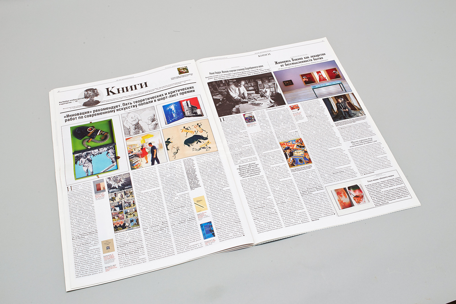
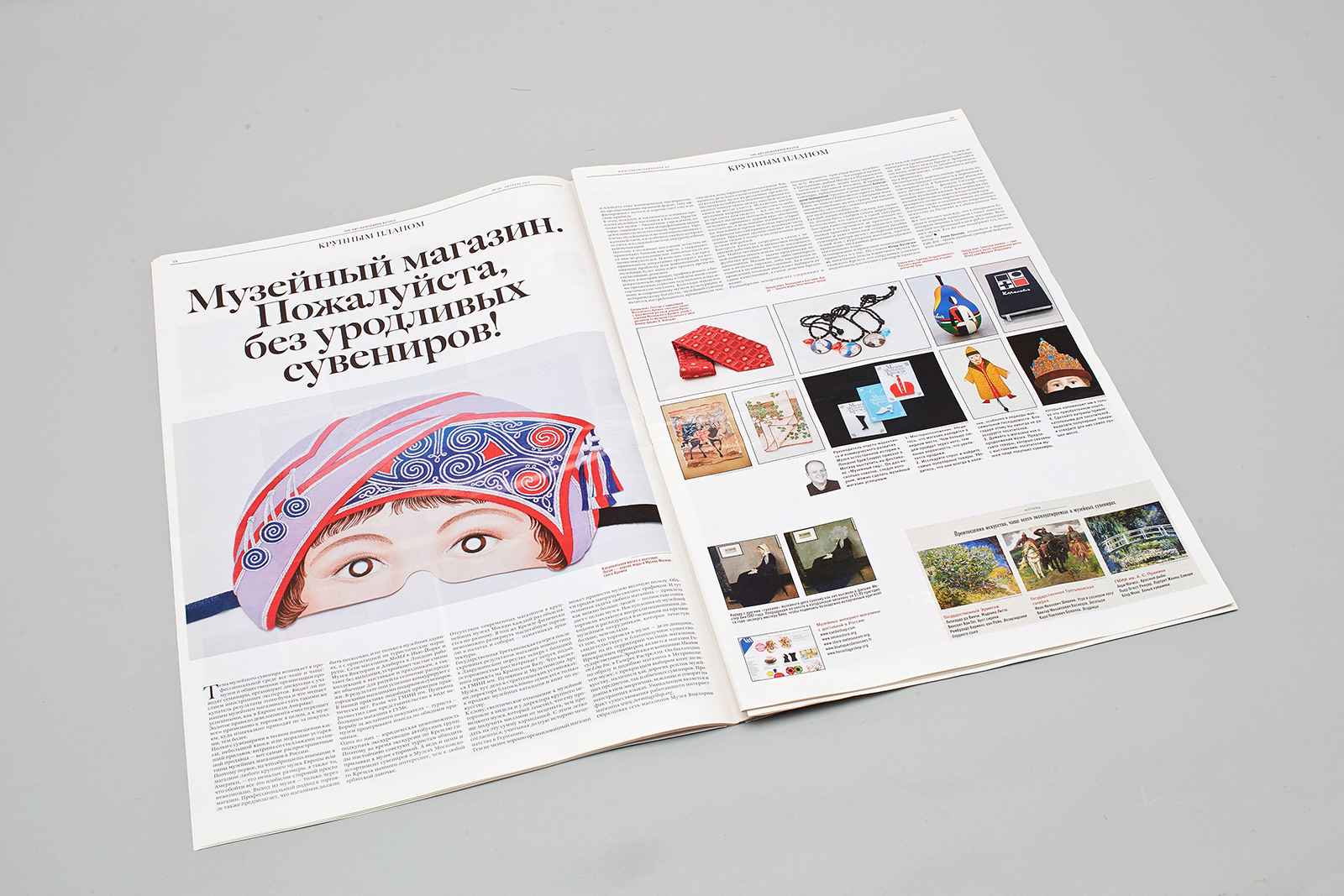
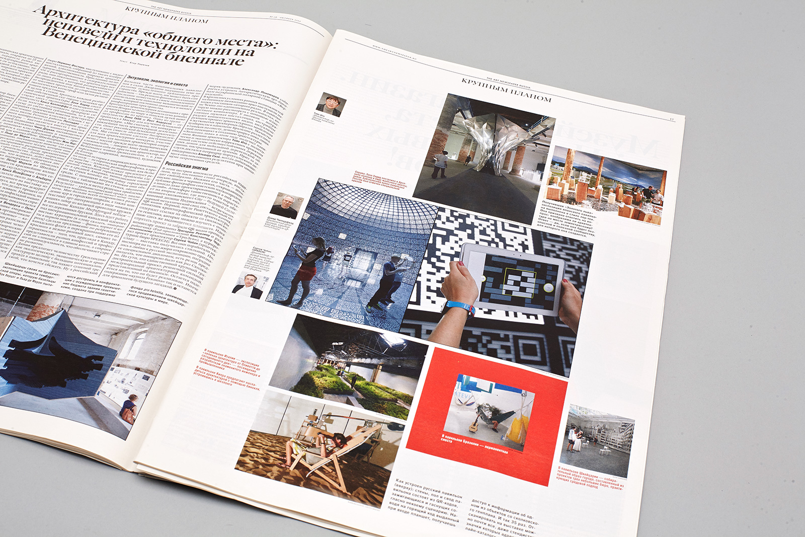
The Close-up section. The section begins with a box filler, which includes the biography of the protagonist or a summary of company background. The illustration block may vary in width, but it is strictly one or two modules high.
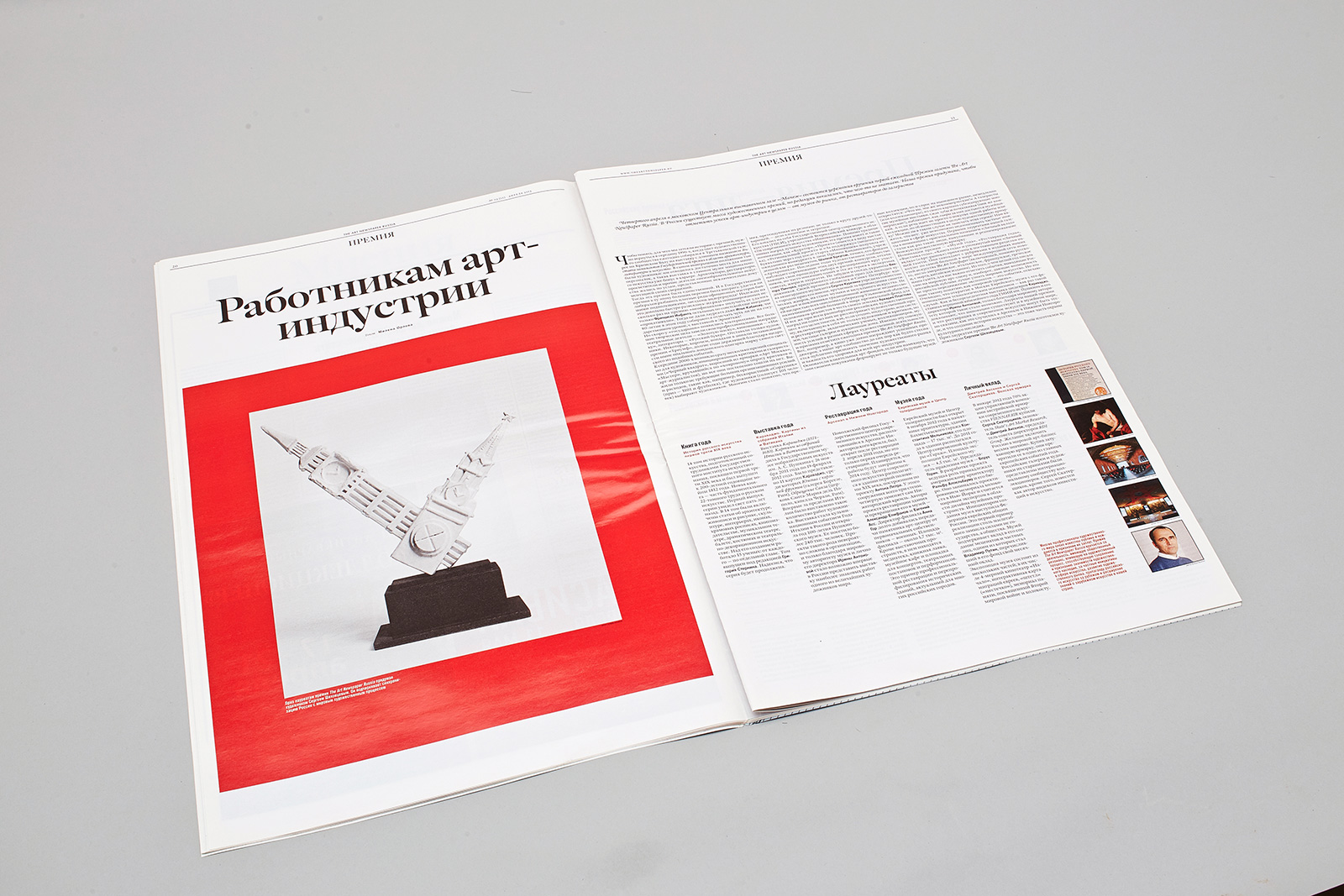
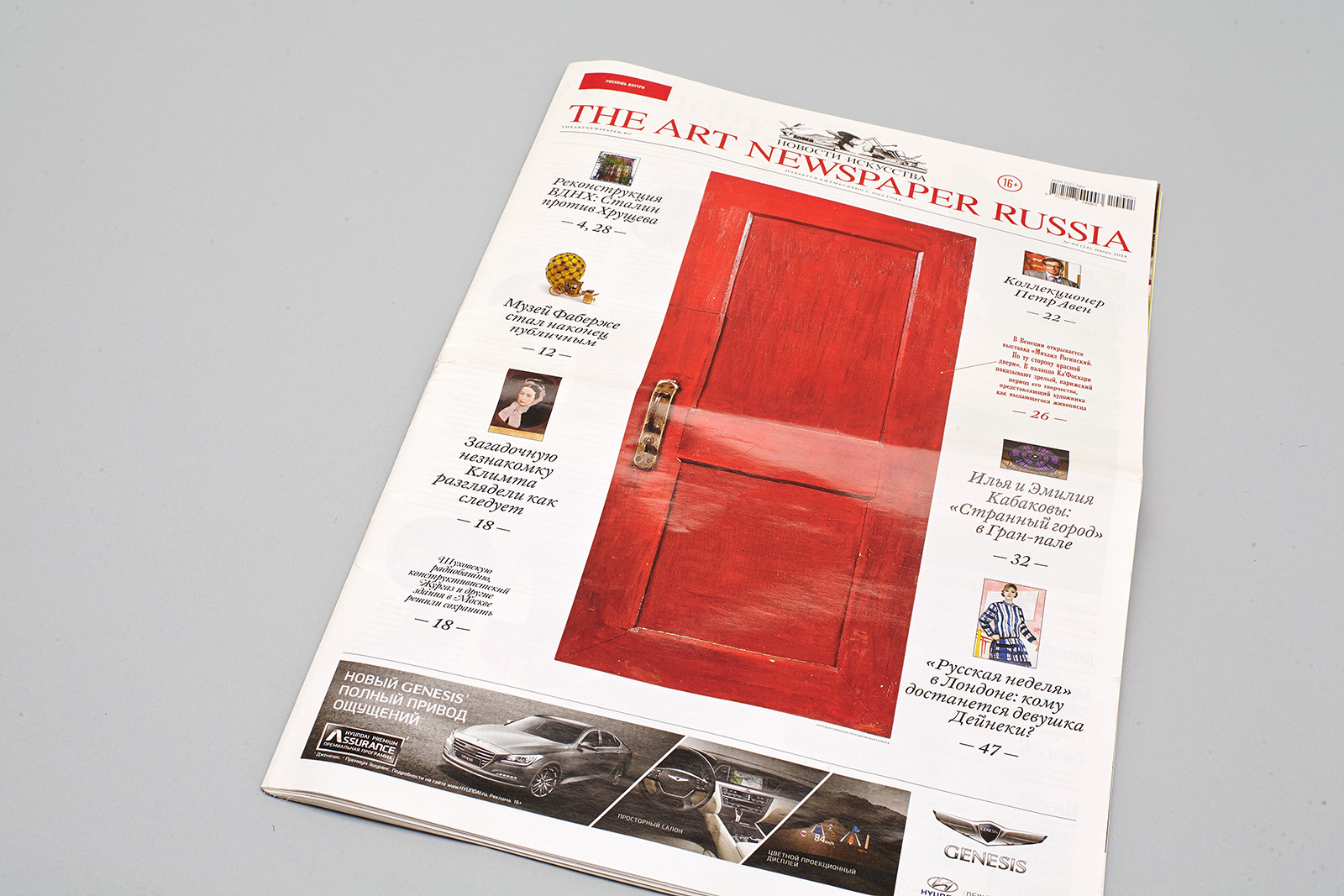
The main picture box can have a red frame of one to three modules wide.
3. Solutions
Format
We used the Berliner format, as we wanted to bridge the gap between the eras of the printed and the Internet media: a long blog and endless scrolling.
In Russia, the A3 format used in the British edition could be associated with free advertising publications; the A2 format, in contrast, is reminiscent of business press.
We used thin chlorine-free paper; as a result, the whole newspaper weighs just 53 grams and can be folded several times and put in the pocket. Besides, it helps to cut down on paper consumption.
Interface
While it was not possible for the newspaper to have a dynamic interface, the one you can find in the cyber world, it was, nevertheless, designed like a non-linear information system: it uses only the visual attributes of typography and a run-through grid of twelve columns based on the Fibonacci sequence.
The layouts of supplements and announcement inserts are designed based on the sizes and visual solutions of the main layout.
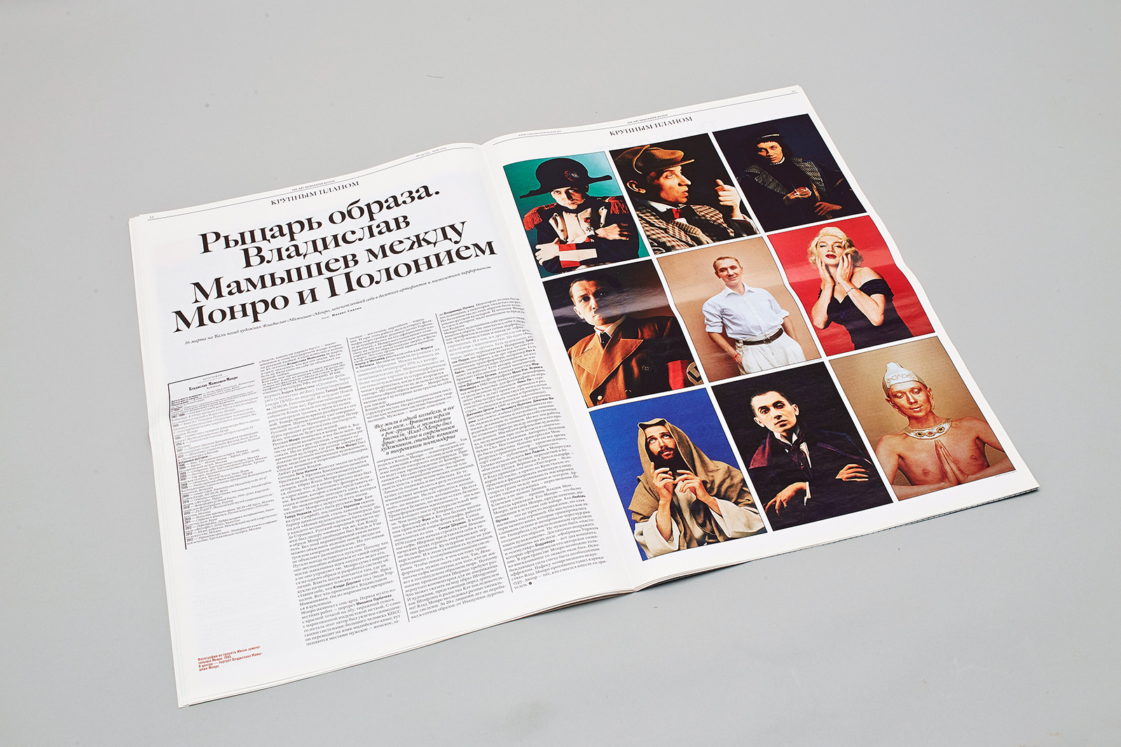
The Close-up section: blocks of text and illustrations are arranged symmetrically on the double-page spread.
Within the module system, a designer can organize the elements in any manner, so that the text block, illustrations with their captions, and first- and second-level headings will contrast each other.
Illustrations in the layout have twelve types of fixed sizes.
4. Typefaces
The main typeface, William, designed by Maria Doreuli, is an interpretation of the 18th-century font family by the English typeface designer William Caslon. The typeface contains six text fonts and six headline fonts, including Display Engraved and Display Black, which are used in large font sizes.
The New Old sans serif was created by Maria Doreuli for Masterskaya and is also used in the Barcode magazine. The layout uses New Old Condensed Regular and New Old Condensed Bold in medium and large sizes of display fonts.
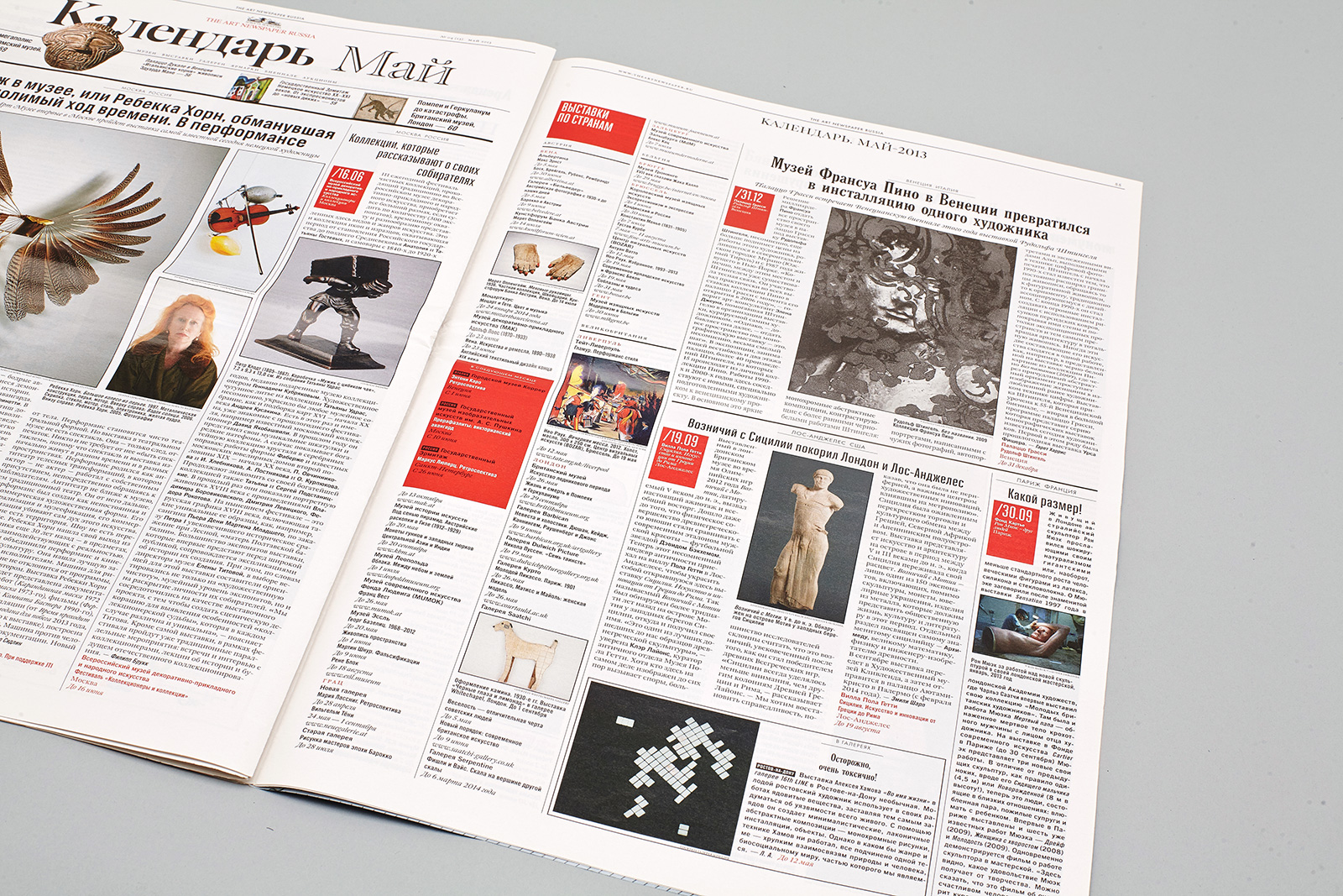
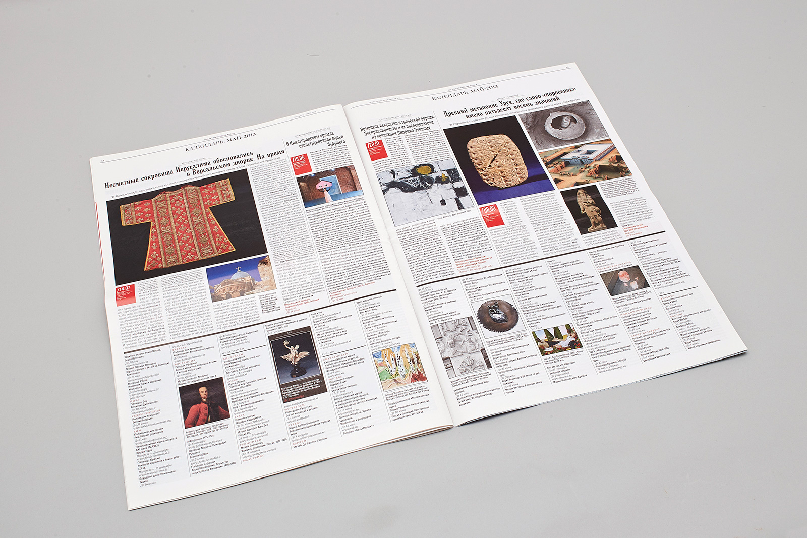
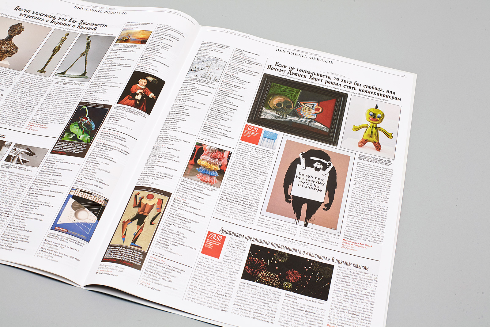
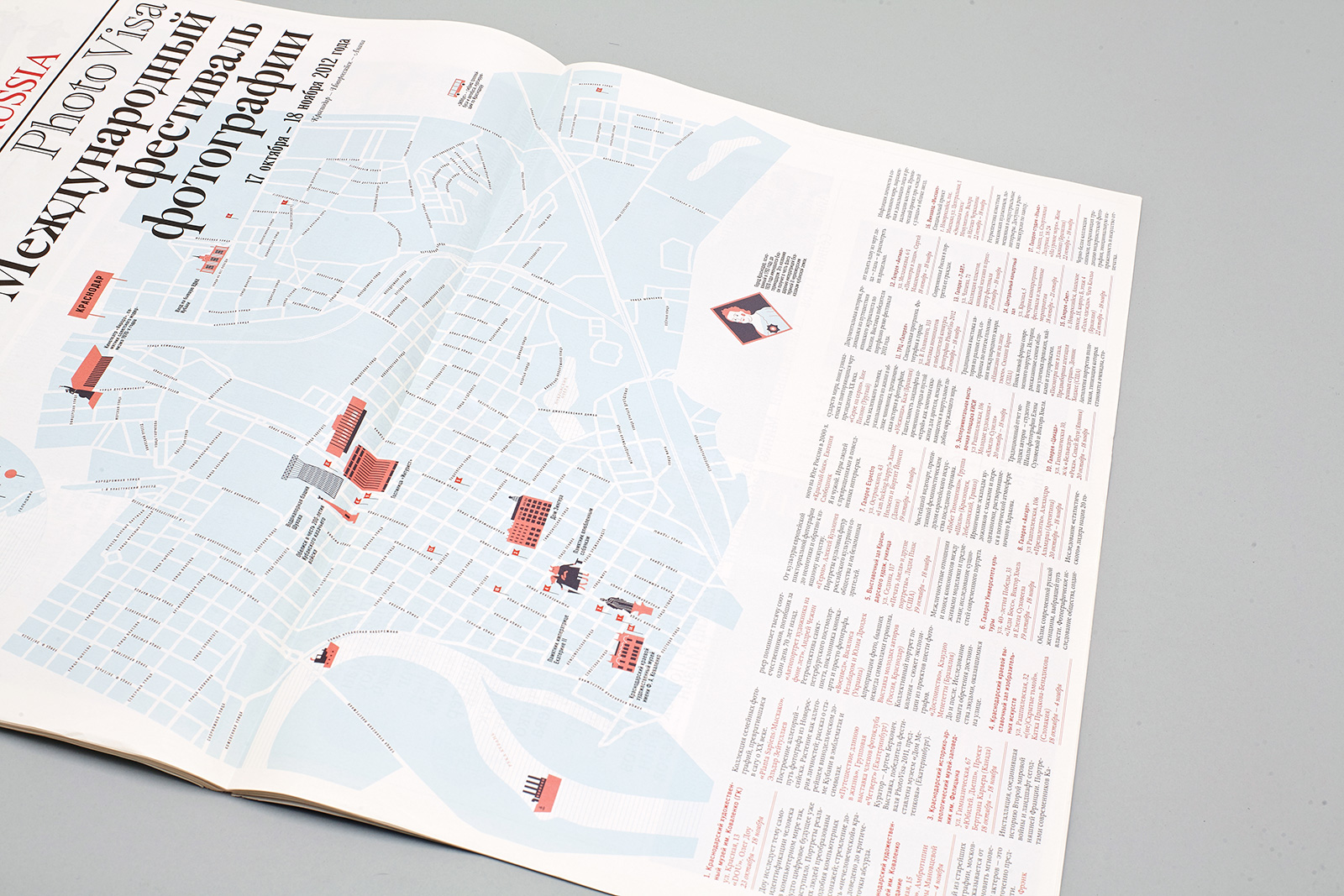
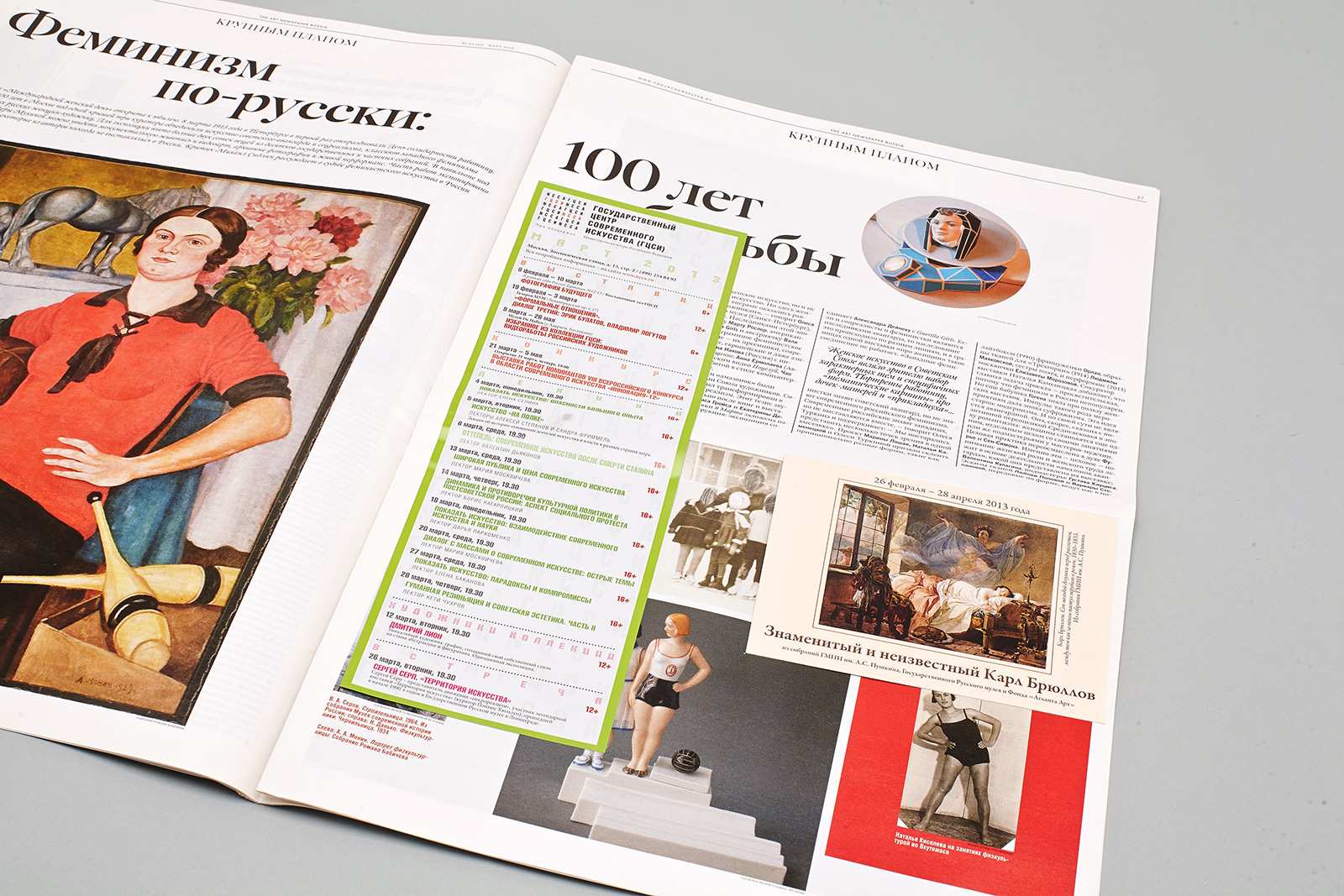
An example of how the double-page spread is divided into two functional parts: the upper part is designed for reviews of the most important events, arranged according to their dates; the lower part includes listings.
The Calendar section is divided based on the date, location and type of the event and contains from one to four illustrations with captions.

Поделиться
Другие проекты
 Vokrug Sveta magazineMagazine
 Hermitage magazineMagazine