The Russian language textbook, grade 5
The most important thing about this book is the comfortable psychological environment it creates for both students and teachers. It is for the first time that design plays such an important role in a textbook of the Russian language: artwork in books of that kind has usually been scant, dull and unoriginal.
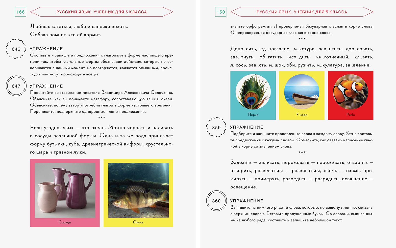
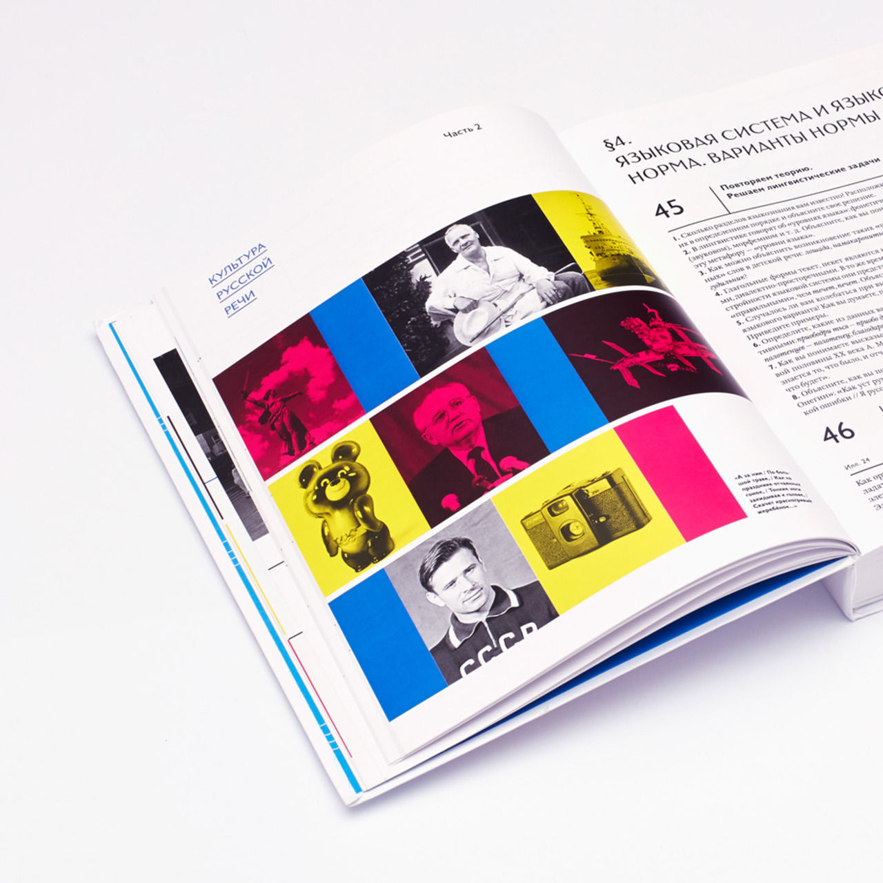
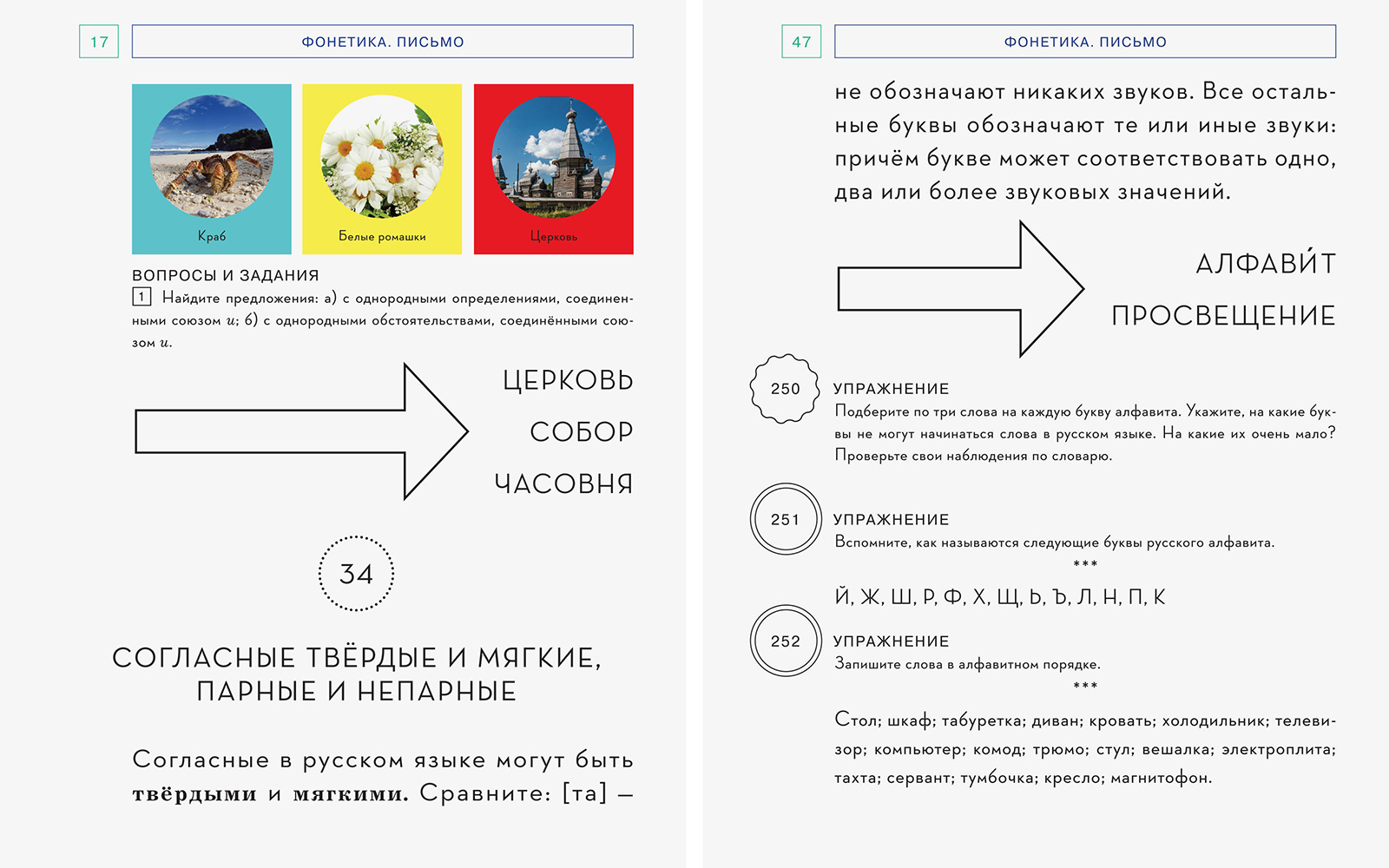
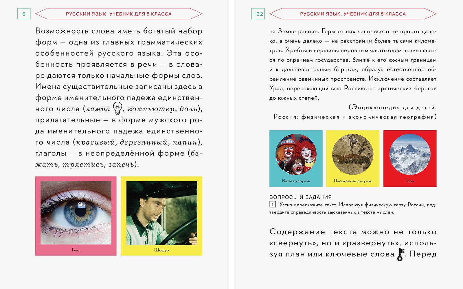
To illustrate literary texts, the textbook features sets of two or three medium-sized photographs, arranged in rows and set off by colorful squares.
1. Team
Creative Direction
Zhdan Filippov
Publisher
St. Petersburg State University
Editor
D. N. Cherdakov
Pagination
Arseny Shmartsev
Management
Sergey Monakhov
© Masterskaya, 2014
2. Idea
Even the look, the design of the textbook of the Russian language created by St. Petersburg State University was intended to present it to the reader as a book of mystery, creating in this way a distinctly different motivation to study the Russian language.
This goal is also achieved through the textbook’s language environment; in other words, through the texts selected for studying. Authors of the textbook discarded those old dull stories about birch trees and forest animals with no remorse. The general strategy now is to show the diversity of the Russian vocabulary in all its complexity and in all its glory.
A very large arrow draws the students’ attention to the so-called “vocabulary words”, i.e. words that are to be memorized once and for all. The size of the arrow depends on how long the word is.
3. Solution
Our main goal was to channel that special feeling of trust in life, that simple and harmonious perception of the world, typical for small children. In other words, we intended to create a textbook that students would never want to put down.
We looked through old Soviet school-books on various subjects — from ABC books to physics textbooks — published between 1930 and 1970. And it was the ABC books in particular that impressed us so much with their sheer visual magnificence. Thin yellowish paper, watercolor-stained pages, letters that look like bird tracks in the snow, and — most importantly! — small simplified drawings right next to the letters, side by side with them, with the same status of graphic symbols, forming precise and beautiful statements about the world.
We decided to insert these small graphic elements into the educational text, while complementing exercises with clusters of two or three color photographs arranged in one line. “Language and the world” is the prevailing theme of the textbook, and it was important to squeeze some fresh juice into it.
Cover page design was the last thing we worked on, and it shaped up surprisingly quickly. It was immediately obvious that we needed pictures of a horse in a gas mask, a sad beaver, and a monkey with a musical instrument — one for each of the three sections of the book.
Educational text contains small graphic elements; they are placed right next to the words they are designed to illustrate. It goes without saying that this pattern stems from Soviet ABC books.
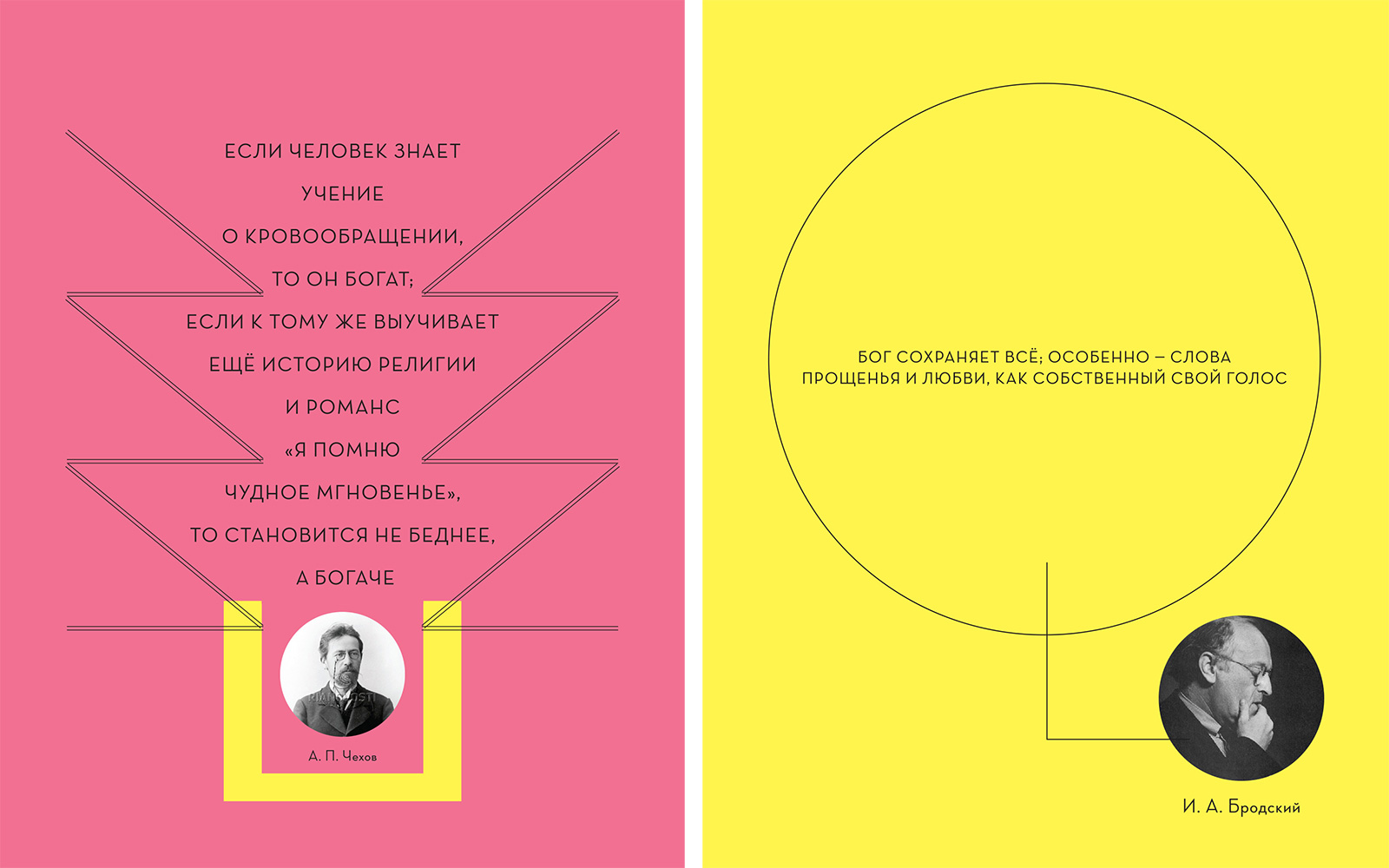
Thought-provoking quotes by Russian poets, writers, scholars, scientists and artists have found their place on separate colorful pages.