Chess textbook

Pages: 224
Paper: offset paper, 90 g/m3
Printing: two color offset printing
Case: laminated hardcover
1. Team
Creative Direction
Dima Barbanel
Zhdan Filippov
Publisher
Ilya Merenzon
Textbook Authors
Elvira Umanskaya, Ekaterina Volkova
Illustrator
Typefaces
© Masterskaya, 2014
Title double page spread. Character illustrations take up the space of a 2×2 module. Frames: a pattern of three rows of black and gray squares around Sasha’s picture and black diamond shapes around Katya’s.
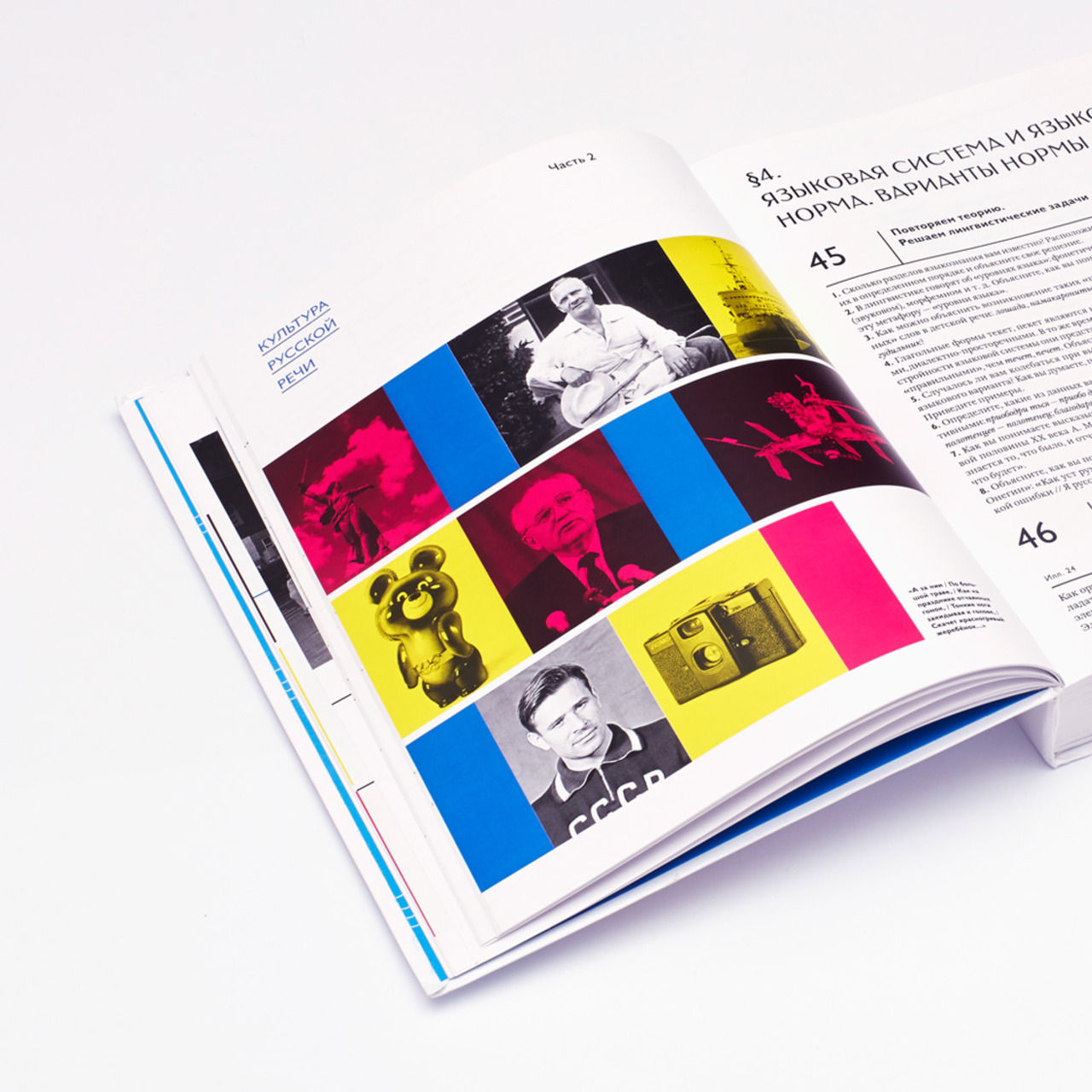
2. Objective
The publishers offered Masterskaya to create a layout for a modern chess textbook for children based on the contents of a classical textbook for specialized schools that had thirteen successful reprints. The project required the creation of a special navigation system — a vivid, intuitive environment that would not only make it easier for school students to work with the educational material, but also (most importantly) would spark their interest in the game. Later on, the illustrations and the iconography of the textbook were intended to be used in mobile applications and in classroom decoration. The textbook was also planned to be published in English and Spanish for schools in the USA, Great Britain, Australia, Canada and Mexico.
НЕТ ПЕРЕВОДА
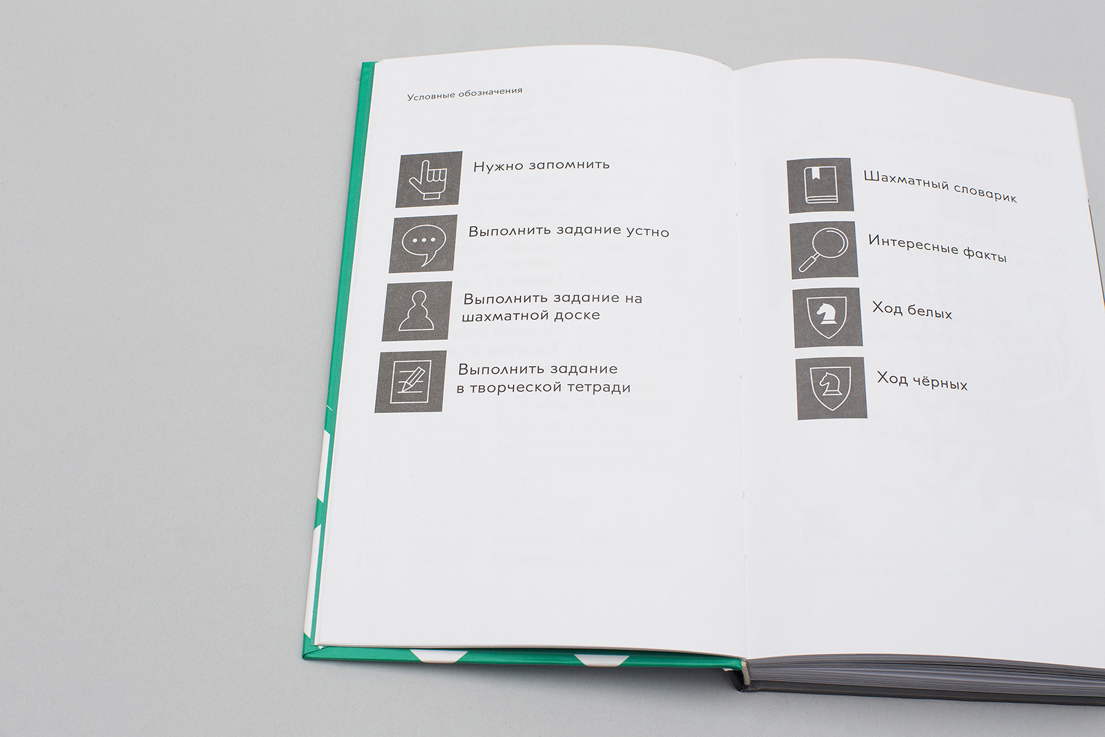
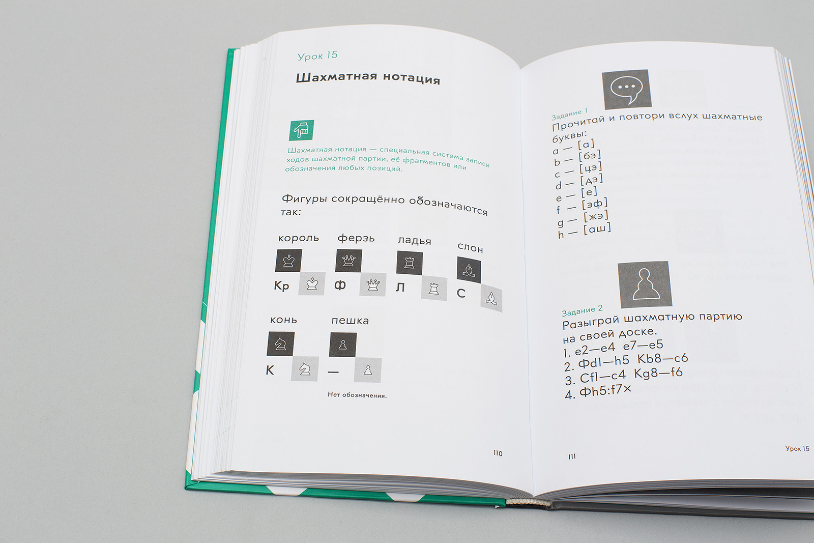
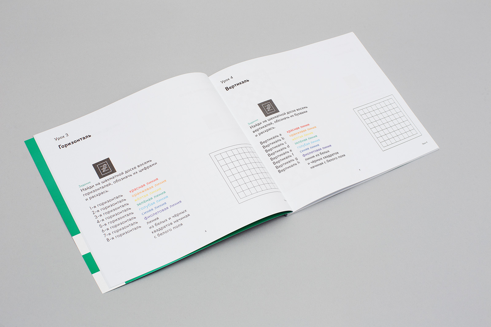
Double page spread with icons used in the book. An icon is a minimum size module — 20.96×20.96 mm. Line width in an icon is equal to that of the PT Emil typeface, weight 0, size 1.267 pt. Three icon sizes are used in the book.
Some chapters have no body text, only rules and exercises. Small PT Emil font, green, weight 400, size 10.825 / 13.137 pt. The icon’s color depends on the corresponding text function; size: 10.48 mm.
3. Idea
The key idea is «book as a quest», like Minecraft on paper, a big detailed map of a chess game split into fragments. Working their way through the textbook and learning the game principles, students gradually piece these fragments together.
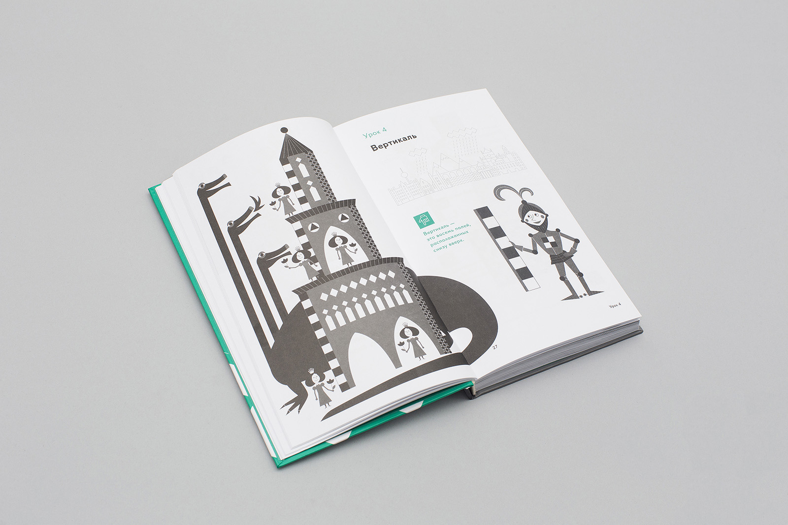
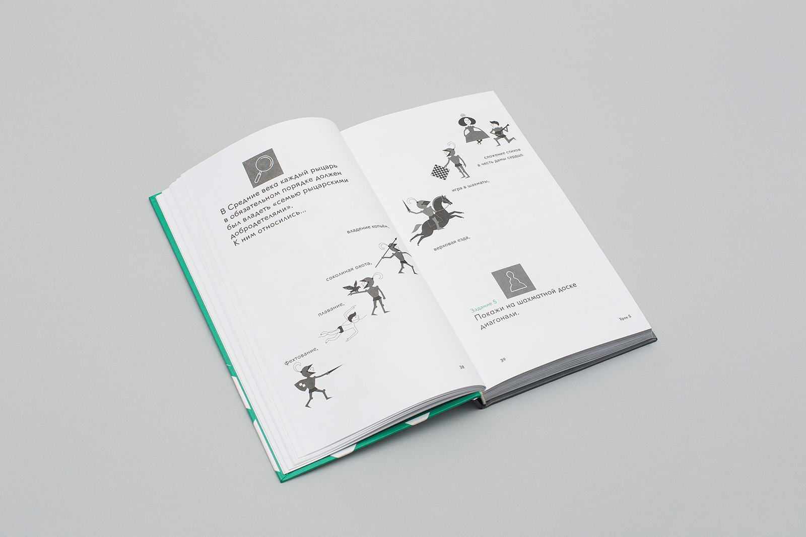
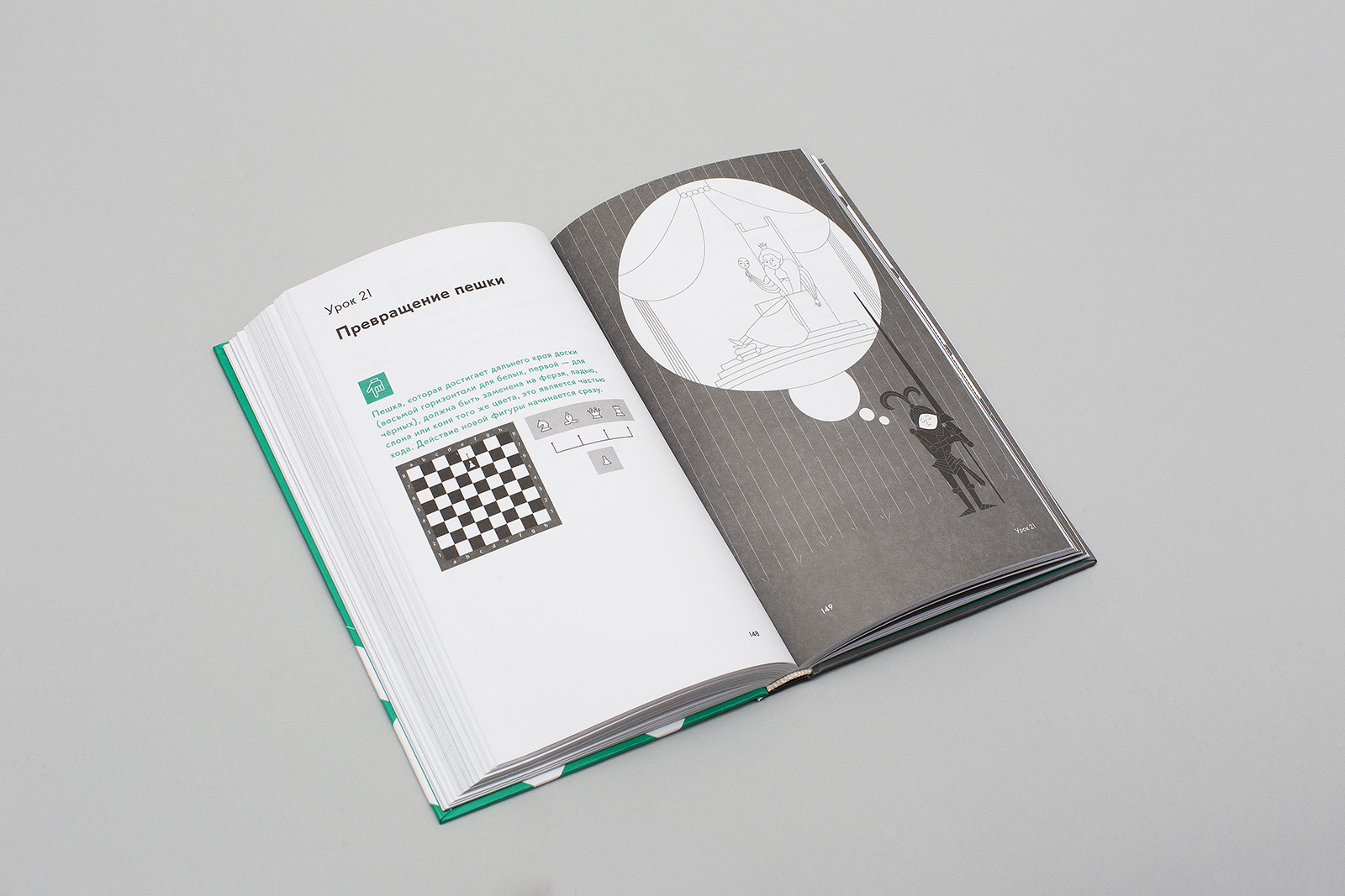
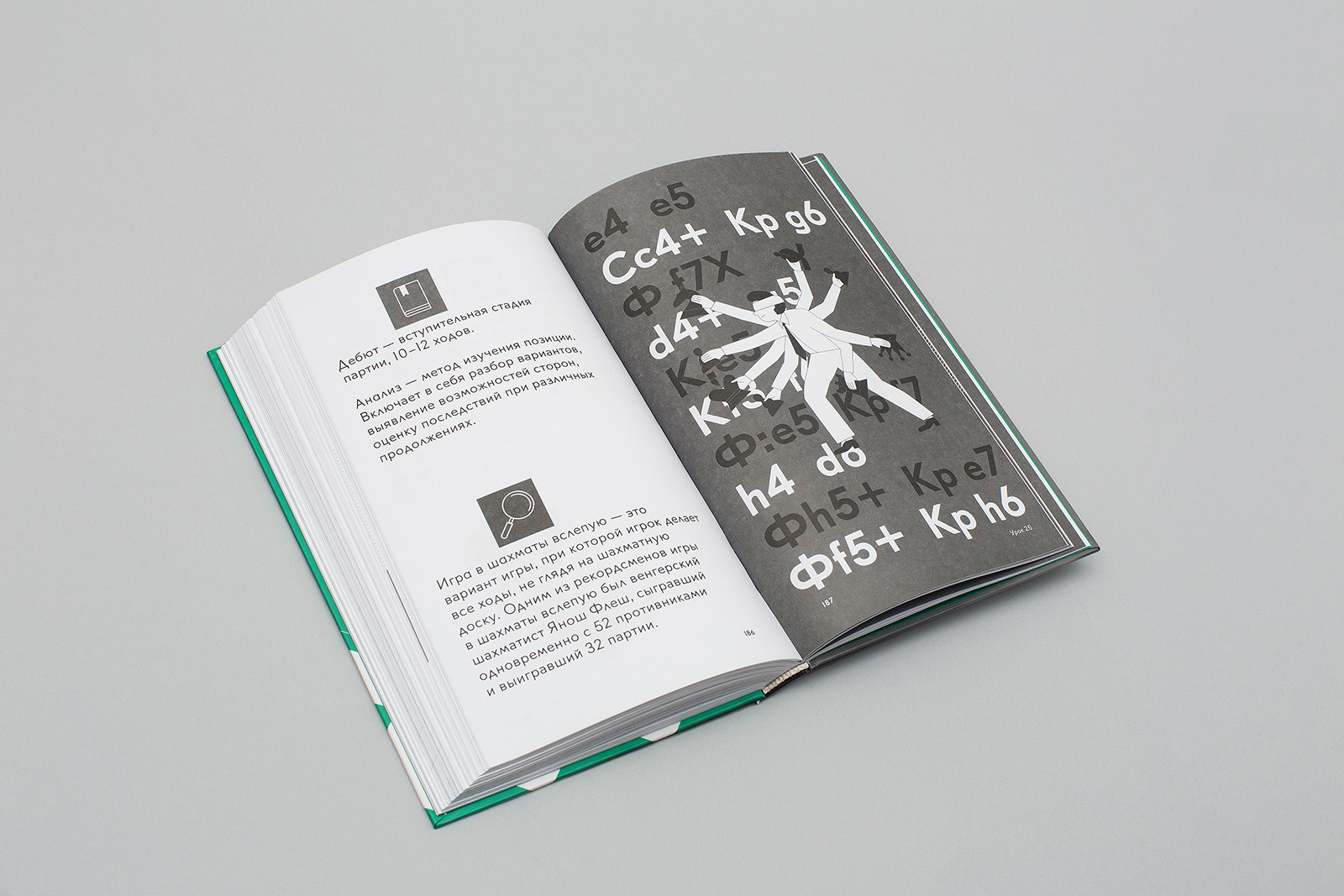
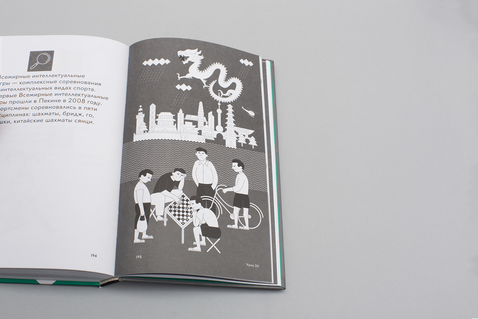
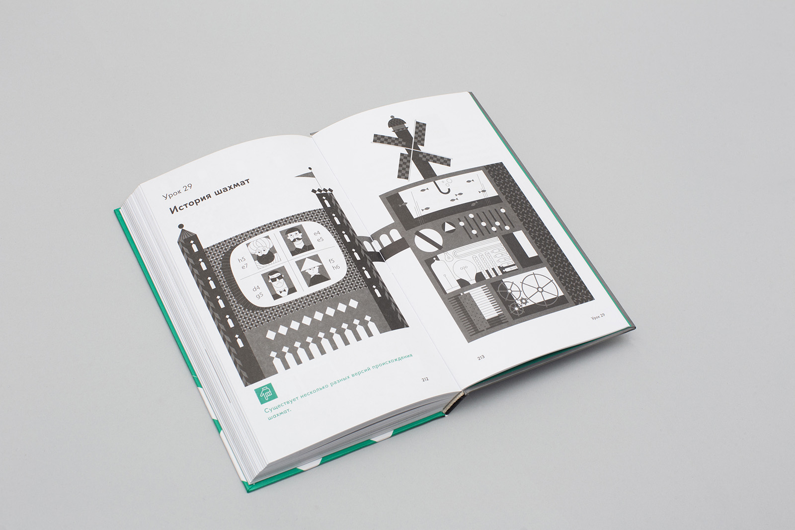
Double page spread with three main illustration types: space; a game or historical plot; a character whose actions illustrate a rule and are connected with the plot illustration.
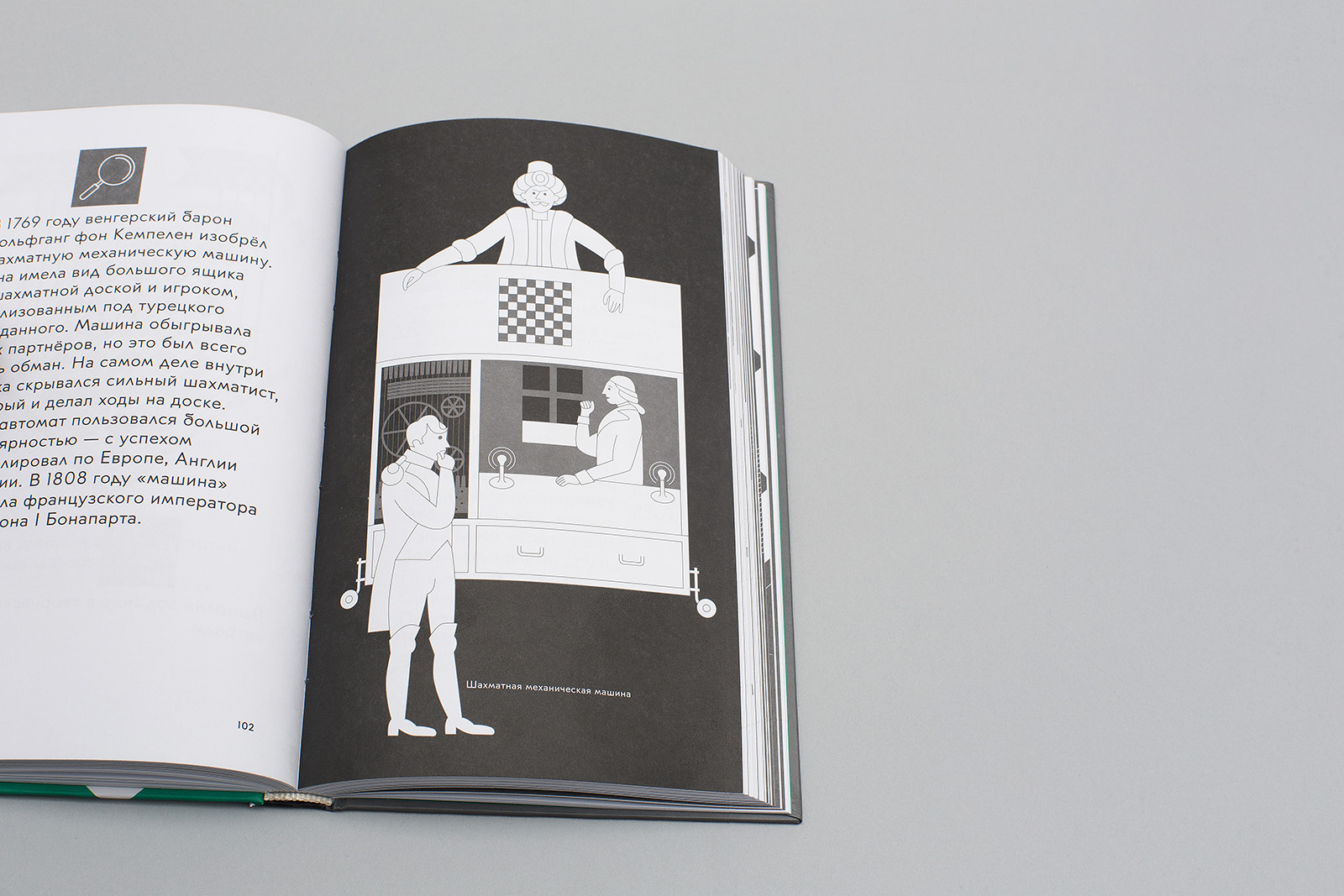
An automatic chess-playing machine constructed by Wolfgang von Kempelen.
4. Solution
The textbook layout is a polyphonic environment of quotes and innovations, where diverse plastic elements often conflict with each other. According to the designers, it would help the reader to see the idea of a game being similar to life, and life being similar to a game — both fun and hard. It was implemented through the employment of an unusual typeface with many alternative solutions, which often contradict the logic of letter design, and, of course, through illustrations. The latter come in three types: plot-related, functional and historical, and their diversity and different scale ensures a better immersion into the game context.
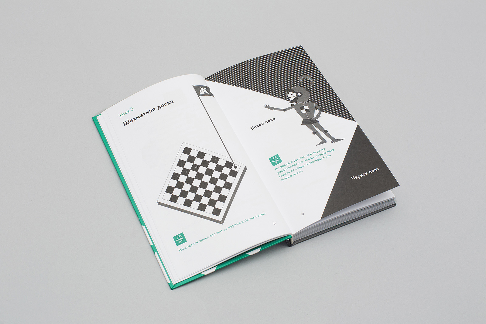
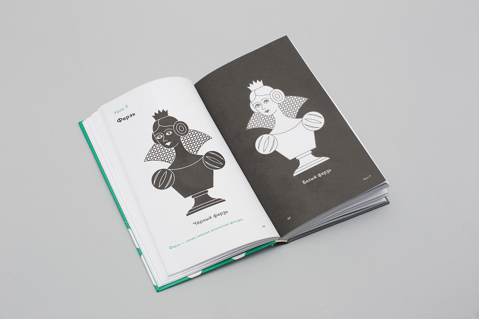
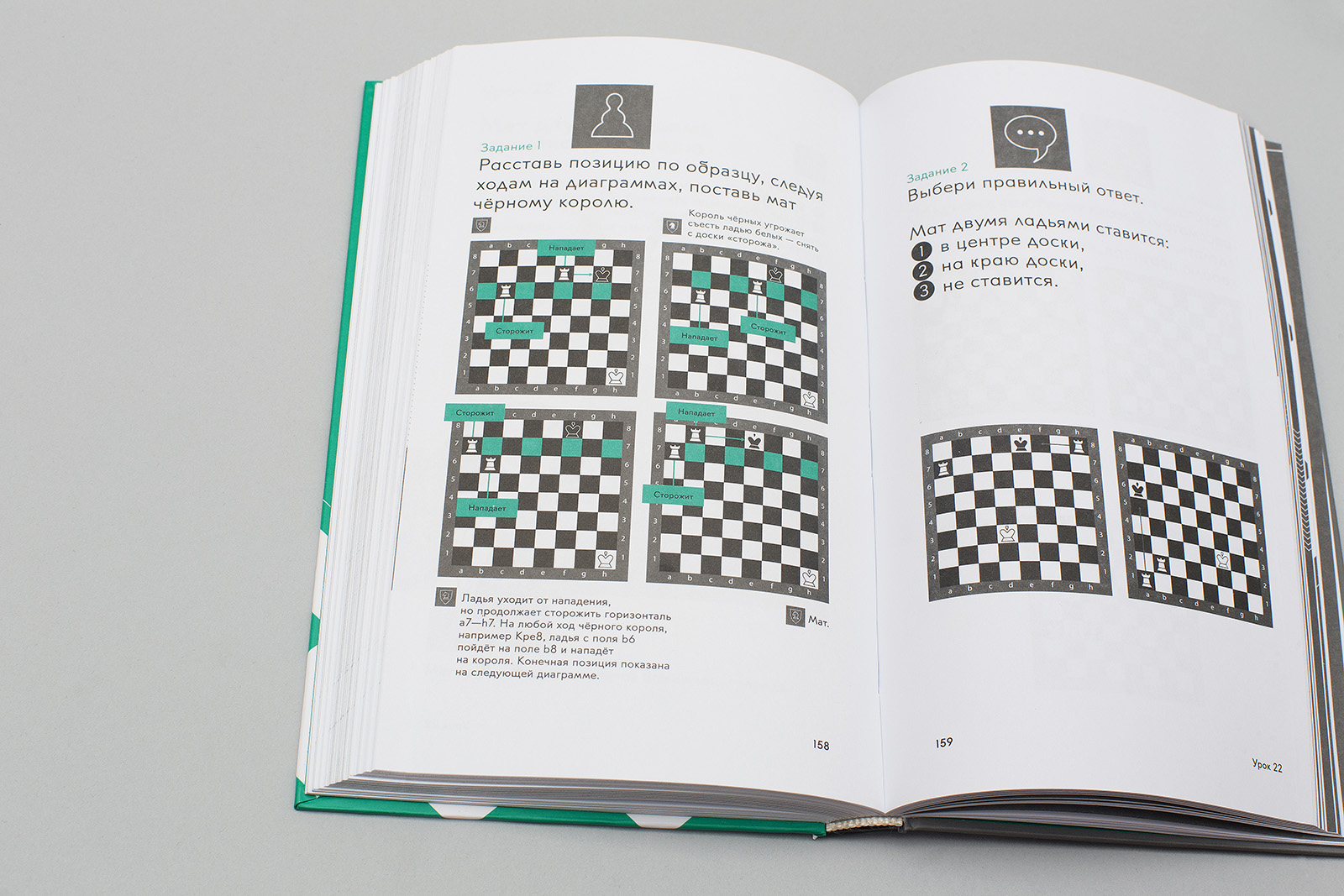
A chessboard is both a character and a scene of action. If it is a part of a plot illustration, it is drawn as an isometric projection. In any other case, it is shown as a flat diagram.
While creating the illustrations, we took into account the solutions proposed by the Pentagram designer John Rushworth for the World Chess Championship. The idea of filling in elaborate outlines with a regular rapport is localized in the book by using «pixelated» Russian and Ugro-Finnic patterns, which also fill the background of plot illustrations.
The cover and the front endpaper of the textbook contain direct quotes from Victor Vasarely (Vega, 1957) and raster images based on a square module.
The layout has twelve key templates, four types of illustrations with different functions and relative scale, three sizes of navigation icons, square cropped photographs, five typesetting sizes and three weight types. We used two color printing. Font size: 15.665 / 17.514 pt
he height of a chess piece icon equals the leading — 17.514 pt. Paragraph indent size on the recto is ½ of a module and equal to the size of the green icon.
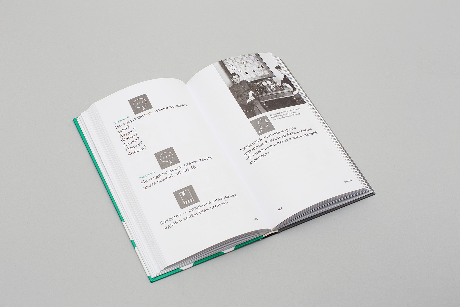
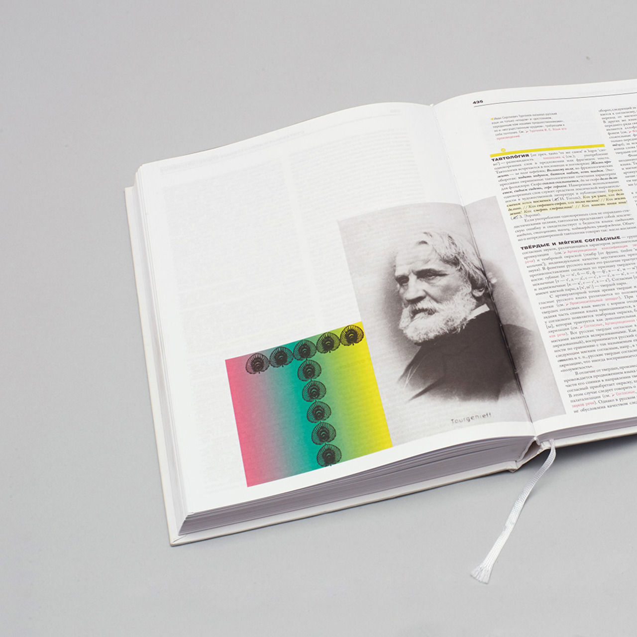
Information on historical figures are introduced through square photographs with captions. This layout always has a wide bottom margin.
Color scheme of the textbook: black, gray K60, gray K20, Pantone Green.

Only the recto has a footer; it has right margin justification and is on the same line as the drop folio.
The illustration is aligned with the grid; the position of design elements depends on the layout modules.
A page filled with content almost to its full capacity; the smallest typeface size.
5. Illustrations, iconography
Roman Manikhin,
“I always start my work on illustrations by carefully studying the subject and trying to come up with main characters’ images. Dima Barbanel and I had already decided that we liked Gennady Kalinovsky’s image of Lewis Carroll’s Alice who found herself in a small chess quest. Alice, however, wouldn’t be able to play a chess game by herself: first, she is a little girl; second, no one can make a miracle on his own, even in fairy tales. So we decided to add another character to help her, a boy — an opponent in the game and a helpmate in her journey. This is how a story about Katya and Sasha and their adventures in a medieval kingdom took shape. At the same time, we had to study and simplify the style of clothes, arms and armor of knights from different countries where chess was popular.”
Typography has become a part of the illustration about János Flesch, a Hungarian blindfold chess player.
The only example of an illustration with a fixed margin inside a module. From the perspective of the layout, it can be considered a piece of iconography.
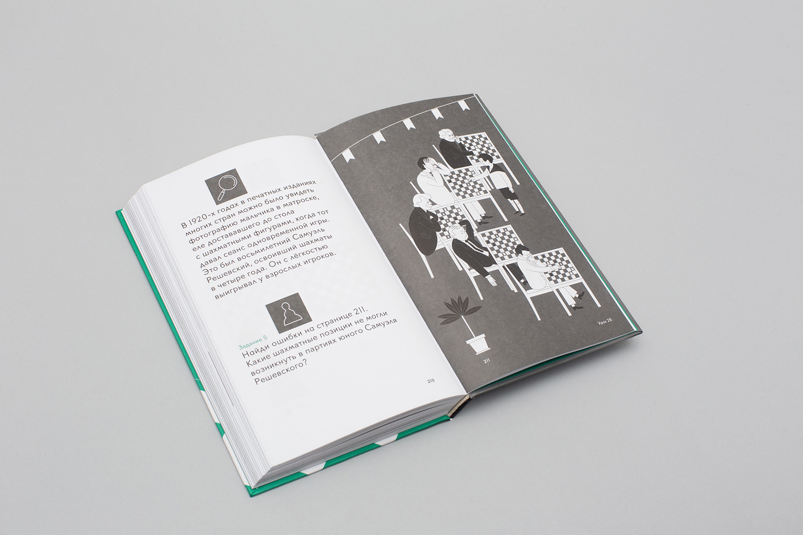
An illustration of a simultaneous chess display of a young Polish player Samuel Reshevsky.
An illustration is at the same time a riddle, a map and a diagram.
6. Typefaces
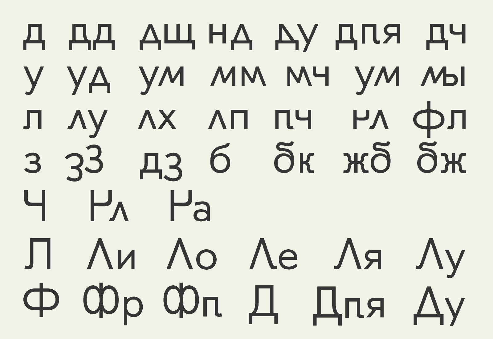
The Emil typeface based on JournalSans (which, in its turn, is based on the Erbar typeface) is a multilayer synthesis of different gothic typefaces of that period. Our immediate goal in designing this typeface was to preserve the familiar appearance, bring it into today’s world, and define and develop the main visual idea. As a result, some basic relations and formal pairs have changed. We added variable grapheme characters and ligatures, which are based on them, into the typeface. It also includes symbol sets for the web, chess and additional versions of figures.
Kostya Lukyanov,
“Initially, this typeface was intended for my mother’s Russian language school in London. My mother explained that she needed ’a simple font, where letters Л and Д would resemble an upside-down V, because kids have a hard time remembering their shape and often write them backwards.’ I tried to do it, and I found it really fascinating, and later on it resulted in redefining the very idea of a ligature.
I named the typeface after the main character from Astrid Lindgren’s book Emil of Lönneberga. Emil is crafty and he is a real prankster — just like my ligatures.
A familiar nod of the upper part of А, which resembles a wave of a hand, makes the typeface look non-draft, which means that technically it can be included into the group of ’non-geometric’, even ’old style’ typefaces.”
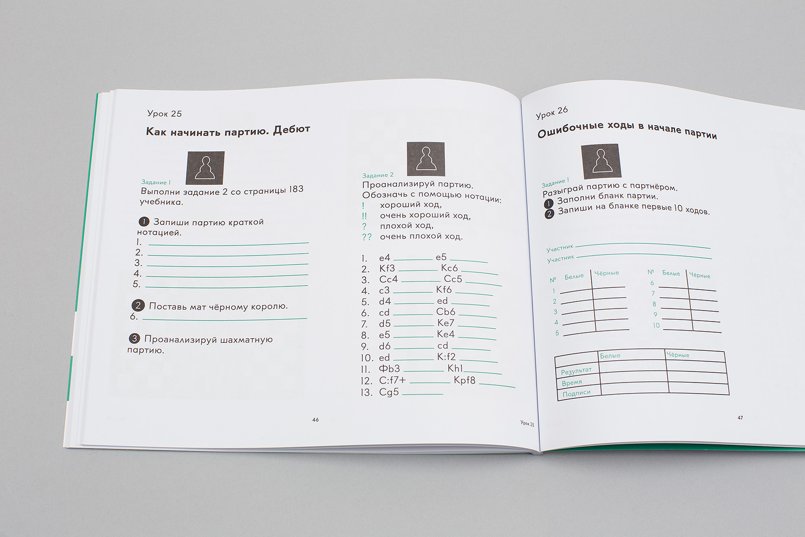
The workbook dimensions are the same as those of the textbook double page spread (250×210 mm). All typesetting styles and element sizes are borrowed from the textbook. Paperback, 56 pages.
Minimum module size: 20.96×20.96 mm. The layout consists of sixty-three modules, 7×9.
The horizontal format is associated with a drawing block and suggests a more liberal approach towards working with paper space.
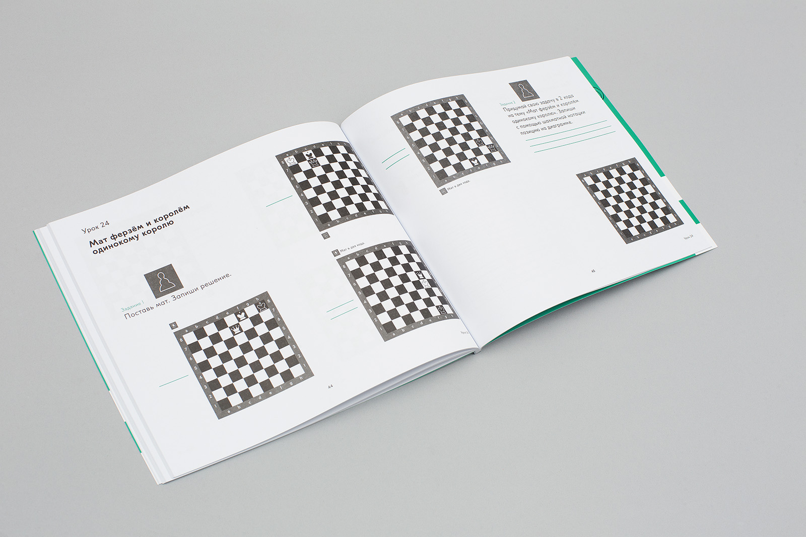
Since a workbook is a much more personal space than a textbook, we intentionally did not include any illustrations in it, so as to relieve students from any stylistic pressure.
All the indents are connected with the column gutter size (3.881 mm).