The Russian language textbook, grades 10 and 11
We don’t need new textbooks because the old ones are bad; we need them because the times are changing. New generations of both students and teachers are coming. Political, social and cultural reality is changing. The language environment that we live in is changing as well. A textbook is not just about certain instructional ideas of its authors; it also reflects the style and the spirit of the age. That is why any textbook, even a very good one in terms of its pedagogical value, inevitably becomes outdated.
This textbook prepared by St. Petersburg State University suggests that school students look at the Russian language from the perspective of language unit usage; that is why literary norms and questions of language culture are the main theme of the book. The pervasive theme of the textbook is interpreting the text, processing it, and creating one’s own utterances and texts.
Sappi offset paper, 100g/m3, bulk 1.55, whiteness 92%
Offset printing: 5 color, Pantone HEX 0F00FE
1. Team
Creative Direction
Dima Barbanel
Sergey Fedorov
Publisher
St. Petersburg State University
Editors
A. I. Dunev, D. N. Cherdakov
Artist
Sergey Kalinin
Lettering
Yuri Gordon
Typefaces
Vasily Biryukov, Paratype
Photo Editors
Ira Zhuravleva, Ilya Korobov
Авторы иллюстраций и фотографий:
А. Бархан, Ю. Блюхер, С. Викторов, Т. Вислевская, П. Воронцов, А. Гуч, К. Данченко, Е. Евграфов, Е. Зубкова, В. Ильин, М. Краснова-Шабаева, Е. Литманович, Р. Манихин, О. Марченко, С. Мембриллас (S. Membrillas), И. Пальмин, Г. Панченко, М. Пещанская, К. Плотникова, К. Рожков, И. Сафонов, П. Темен, Т. Тургунов, П. Уманский, М. Чацкий, Т. Шабаев, И. Шпиленок, А. Юрченко.
Project Coordinator
Sergey Monakhov
© Masterskaya, 2013
2. Idea
The authors wanted the textbook not only to systematize the middle school program, but also to offer a new view of the Russian language. To be not just a set of rules that exist in a sort of vacuum, but to represent the Russian language as a whole, immersed in a multitude of social contexts; so to say, the language submerged into the development of culture.
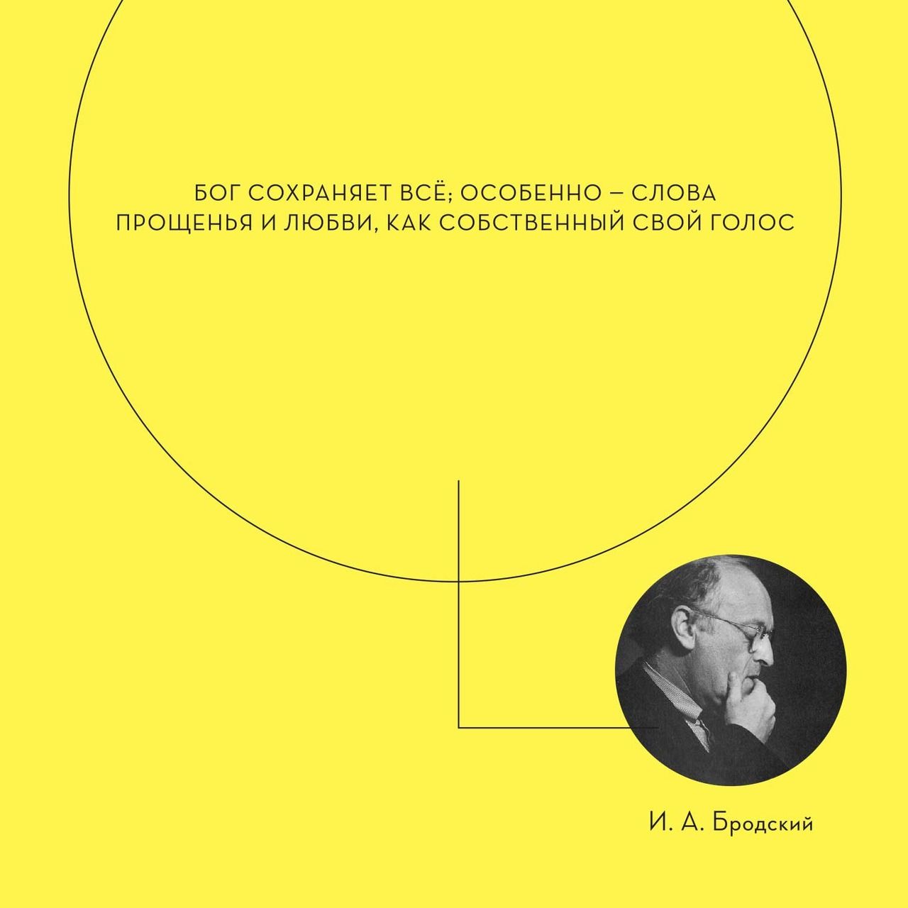
Hence the attention to, for example, norm variation, to questions of text creation and perception, to the selection of textual material, names, quotations and facts that correlate with the keystones in the development of Russian culture and society. For instance, the traditional topic “Russian language in the modern world” is not delivered in a declarative manner, as it often happens, but through a complex of social, political, cultural and ethnic problems (What is the reason for the increase or decrease in the interest towards the Russian language in different countries? Does the Russian language have the potential to become a world or pan-regional language? How should we treat immigrants’ Russian? etc.), as well as with the help of a whole range of names (I. A. Bunin, I. A. Brodsky, etc.) that, for certain reasons, symbolize a special attitude towards the Russian language.
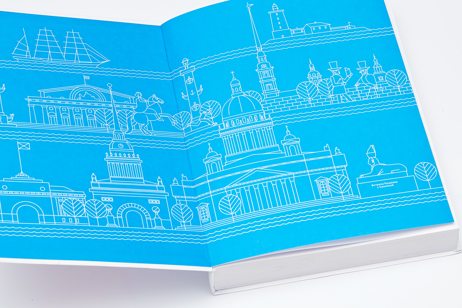
The front endpaper by Sergey Kalinin depicts the meeting of Tomtit and Alexander Pushkin with a panoramic view of St. Petersburg in the background. The back endpaper has a slightly different composition: now Alexander Pushkin has switched places with Tomtit and took off his top hat.
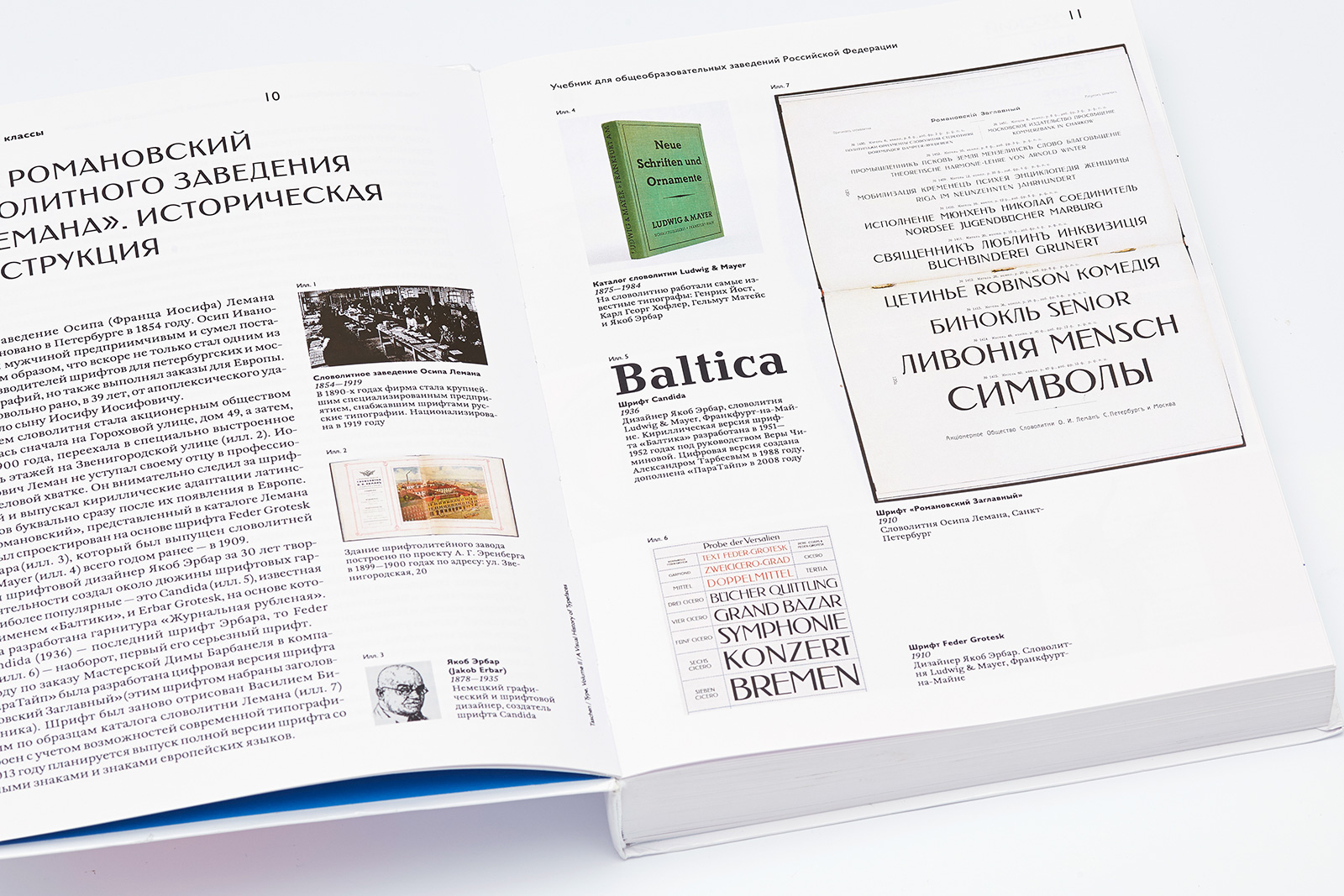
The Romanovsky headline font was designed by Vasily Biryukov (Paratype) after the samples found in Osip Lehman’s type foundry catalog.
Prototype: a commemorative plaque from the house which in the 1830s housed the library and the bookshop of the bookpublisher A. F. Smirdin: 22, Nevsky prospect, St. Petersburg; architect Tatyana Miloradovich; plaque installed in 1997.
Integral binding, 1 color printing.
3. Tomtits
One of the first and most important questions that arose during the layout design process was the image and personality of a recurring character (or characters).
In fact, the very presence of a recurring character in a high school textbook on the Russian language is more of an exception. Recurring characters are usually found in Russian primary school textbooks and study guides for foreign language learners. Still, even in those cases the vital communicative and symbolic functions of a recurring character often appear to be weakened.
In our recurring character design we wanted to meet the following challenges: 1) create a vivid, unusual, catching image; 2) give the character a personality; 3) create a certain symbolic ring to it, in sync with the chosen genre; 4) where possible, build a storyline for this character, in the course of which it would encounter different situations that would make him or her behave in different ways.
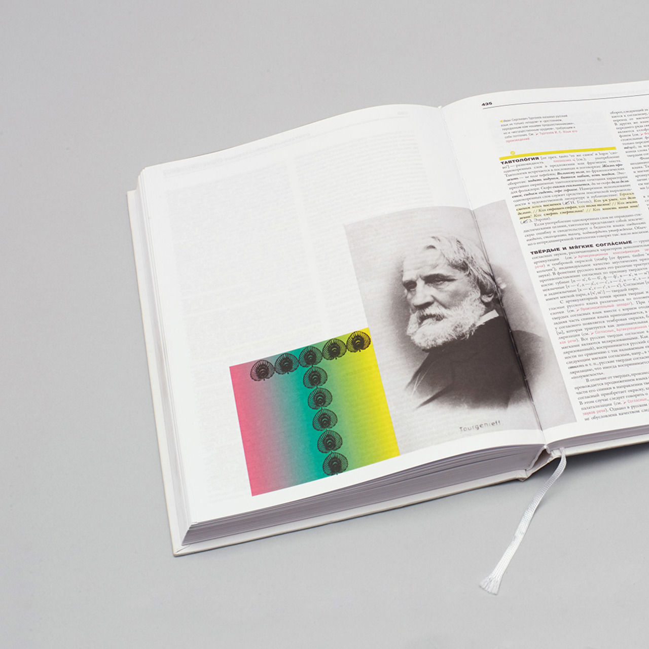
This is how Tomtit was born. Well, not exactly. Tomtit was created by Sergey Kalinin, who was asked by Dima Barbanel to design a bookplate for the open library of his friend Sergiy Sinitsin (“sinitsa” is the Russian word for “tomtit”). Everybody liked the result — an endearing little tomtit turning book pages with its wing — and we decided to continue this theme in the textbook, which needed some playfulness to lighten the mood of its purely academic content. What we got in the end is a sort of a mix of a schematic line drawing, usually found in educational and technical literature, and the ironic graphics of the 1950s—1960s (Saul Steinberg, Ryohei Yanagihara, Cliff Roberts).
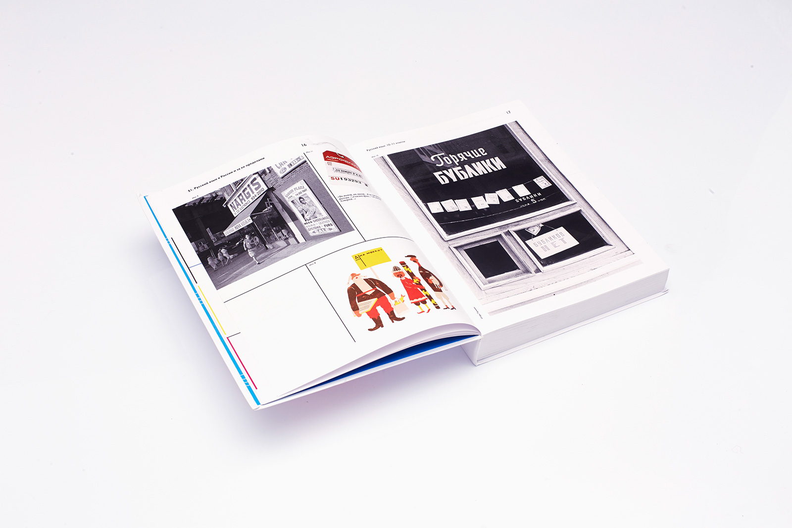
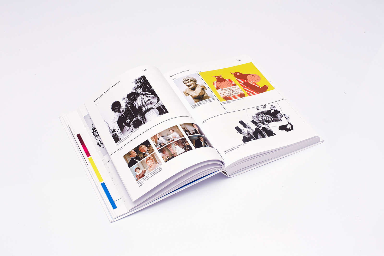
Pictures with tomtits were meant to serve as illustrations for specific exercises, even though their relation to some fragments was not always obvious. (The very fact that we chose Tomtit as a recurring character resulted in its indirect relation to the original educational material.) When everything was ready, we were tempted to try to connect the pictures with a common plot. We needed captions in order to reveal the story that we saw in separate illustrations. These captions bridged the interpretation gap between a picture and the material it illustrated, which gave us the opportunity to create (in tandem with the “big” primary body of text) a secondary mini-text, which challenges its predecessor, ironically calls for its reconsideration or even confronts it directly.
Overall, we can say that, thanks to the complex linking system in the educational text—illustration—caption chain, the tomtit theme feels natural in the context of the textbook and creates the effect of polyphony.
The image of a boy with a speech bubble was borrowed from a German language workbook and slightly redesigned (Leipzig, 1982).
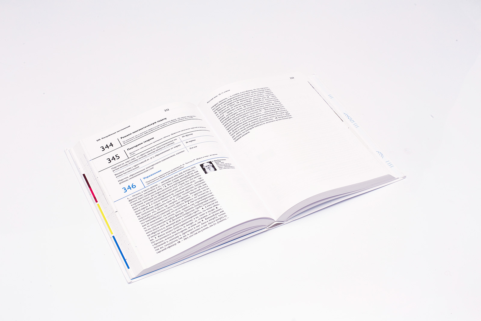
The book has a linear structure. There are three functional elements: half title and chapter opening page, chapter text, double page spread with illustrations.
There are references to the double page spread with illustrations in the chapter text.
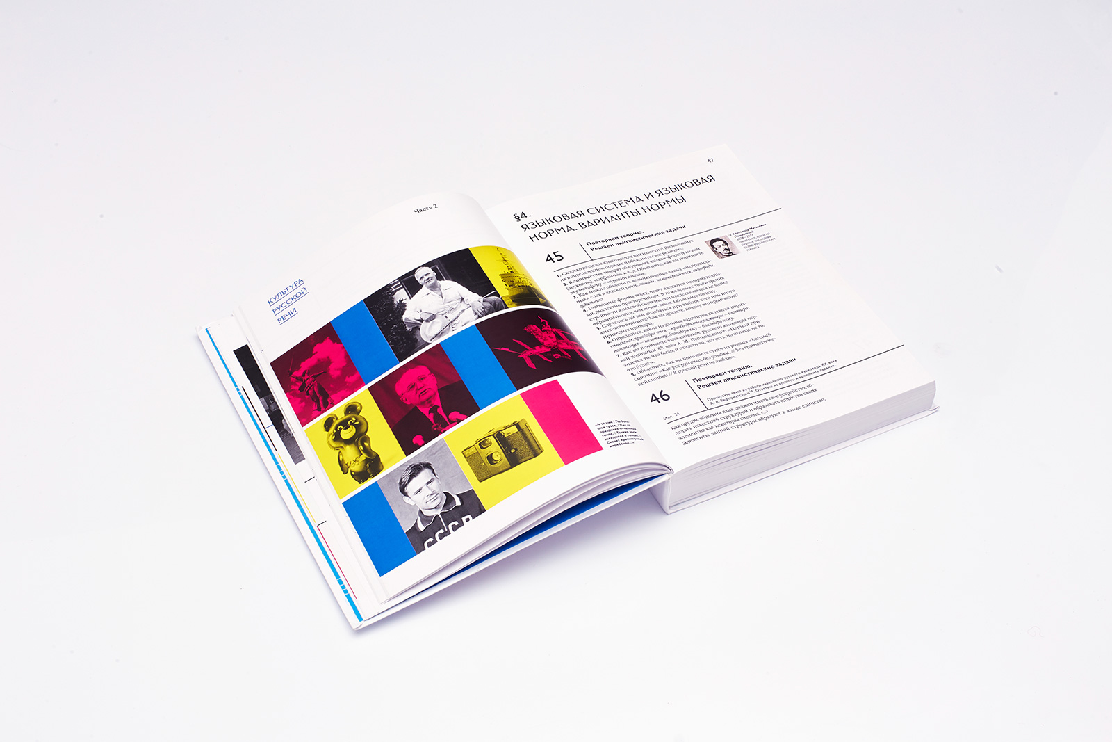
The textbook comprises four independent blocks: typography, tomtits that illustrate the material, captions for tomtits, and all the other illustrations, photographs and infographics.
4. Typefaces
Romanovsky headline font
Osip Lehman’s type foundry was founded in St. Petersburg in 1854.
The Romanovsky typeface was first introduced in the 1910 foundry catalog. It was based on Jacob Erbar’s Feder Grotesk created at the Frankfurt foundry Ludwig & Mayer just a year earlier, in 1909.
William
Maria Doreuli’s typeface is an interpretation of a type family created in the early 18th century by an English typeface designer William Caslon. William includes 6 body types and 6 display fonts. The textbook uses two faces: Regular and Italic.
Humanist 521 (Gill Sans)
This typeface was designed by Eric Gill and released by Monotype in 1928–1930. The textbook uses its Regular and Bold faces.
Infographics are printed with Pantone HEX 0F00FE.
All parts and chapters of the textbook start with a double page spread. A square framed photograph or its caption are the smallest layout modules.
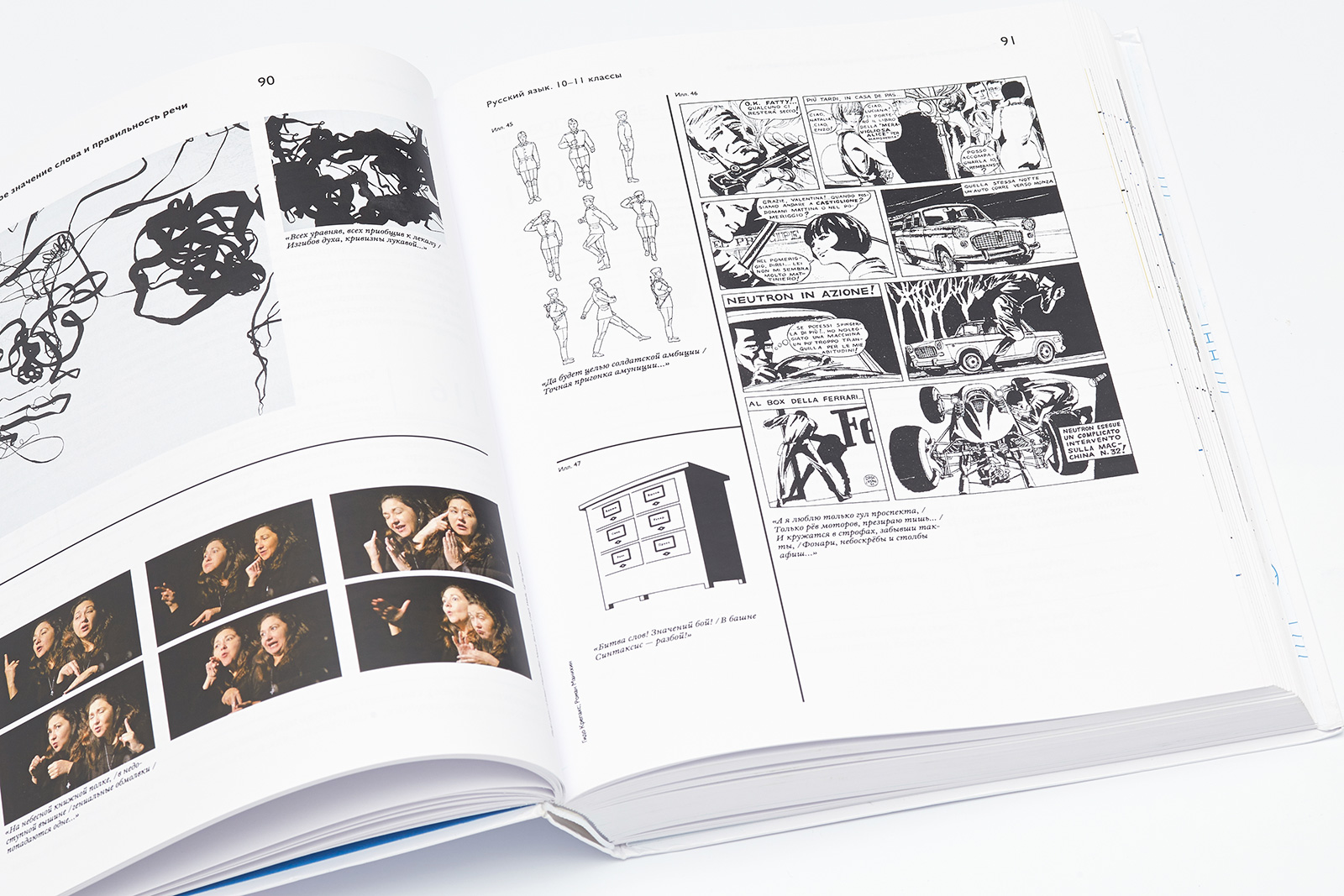
Illustration: a comic strip by Guido Crepax.