Luxury Guide
Indochine Media was founded in 2012 by Michael von Schlippe, who had earlier launched such periodicals as Vogue, GQ, AD, Harper’s Bazaar, Esquire, and Robb Report in Russia and Kazakhstan. Apart from licensed magazines sold in Singapore, Vietnam, Thailand, and Malaysia, the company carries out its own projects, such as Asia: Barcode and Luxury Guide.
Pages: 240
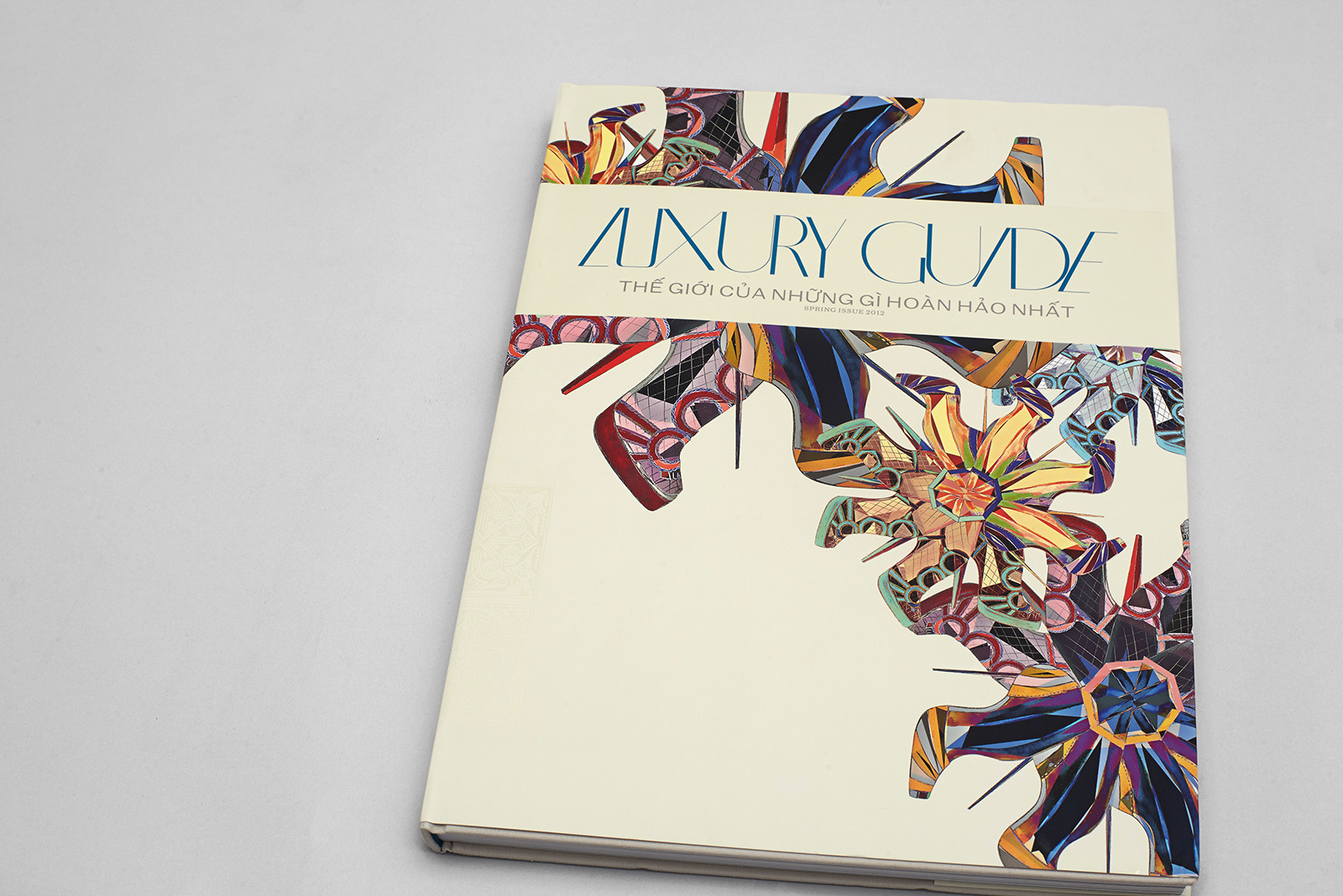
Cover: Brillianta fabric, glossy transparent film embossing, gray film embossing
Dust jacket: synthetic paper 250 g/m2, Pantone 308C printing, Soft Touch matte lamination, selective matte UV coating
Paper: matte coated paper, 128 g/m2
Address section: Lux Cream uncoated offset paper, 80 g/m2
Endpapers: synthetic uncoated paper, 140 g/m2, matte finish
Four color printing
Printing: Great Wall Printing, Hong Kong
1. Team
Creative Direction
Dima Barbanel
Issue Prepress
Zhdan Filippov
Dmitry Raspopov
Publisher
Michael von Schlippe
Indochine Media, Ho Chi Minh City, Vietnam
Editor-in-chief, Project Coordinator
Anna Tsipelnikova
Typefaces
Evgeny Yukechev
Yuri Gordon
Repro
Mikhail Shishlyannikov
Printing House
RR Donnelley Asia, China
Art Director (starting with the third issue)
Aziz Melibaev
© Masterskaya, 2011
2. Idea
The idea of a coffee-table-style periodical, which Bettina von Schlippe came up with, stems solely from marketing objective — to take over the publishing segment of the fast-growing but thematically underdeveloped Asian market. The magazine is a purely advertising periodical, but certain layout and editorial features make it possible to call it an encyclopedia of the world of luxury. Its importance is emphasized by the dimensions and the weight of the magazine. Each issue cover has a new author, usually an artist or a fashion designer. Printing and finishing techniques differ as well. The magazine is distributed through direct mailing.
Body type Kafka Serif Text 9.215 / 12.735 pt, headline font Franz Grotesque Extended 25.378 / 25.47 pt. The header and footer indent is equal to the column gutter size — 9.281 mm. Drop folio on the verso is placed exactly under the first column gutter. Illustrations take up one or two modules out of eight; it depends on the image.
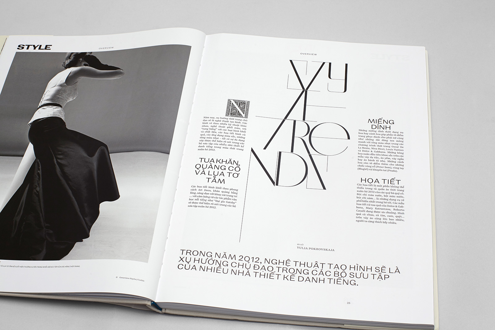
A critical decision for the opening material of four sections with symmetrical structure. A 4×8 module grid; Franz Grotesque Extended 25.378 / 25.47 occupies the bottom module; text starts with an initial cap, whose size is 1/16 of the layout width. Lettering based on Bazaarban.
3. Solution
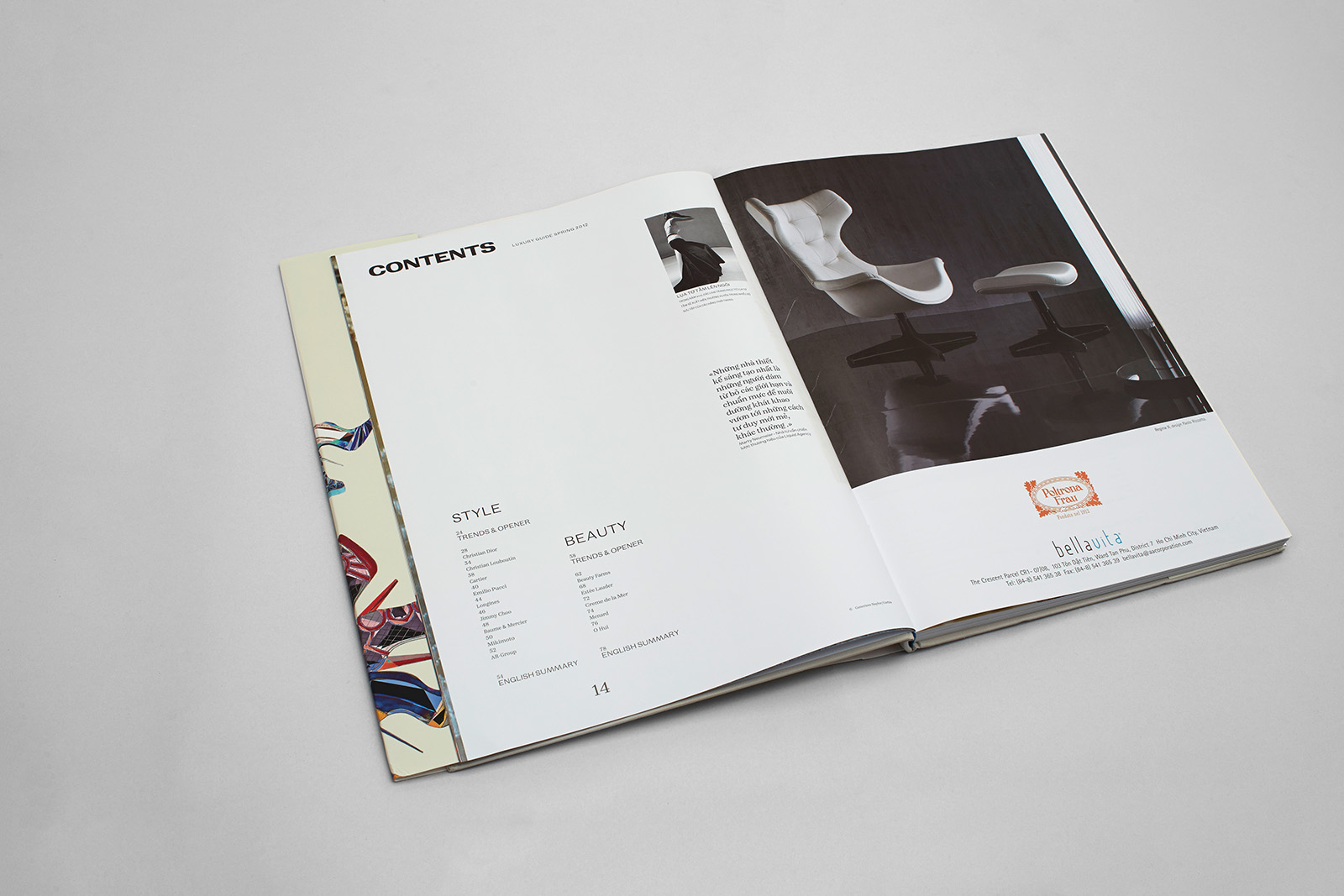
The magazine design is based on a run-through grid; the trim margin size is ½ of the minimum size module. The module ratio is 4×8.
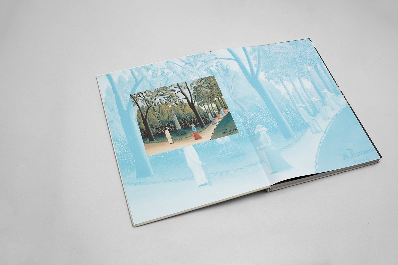
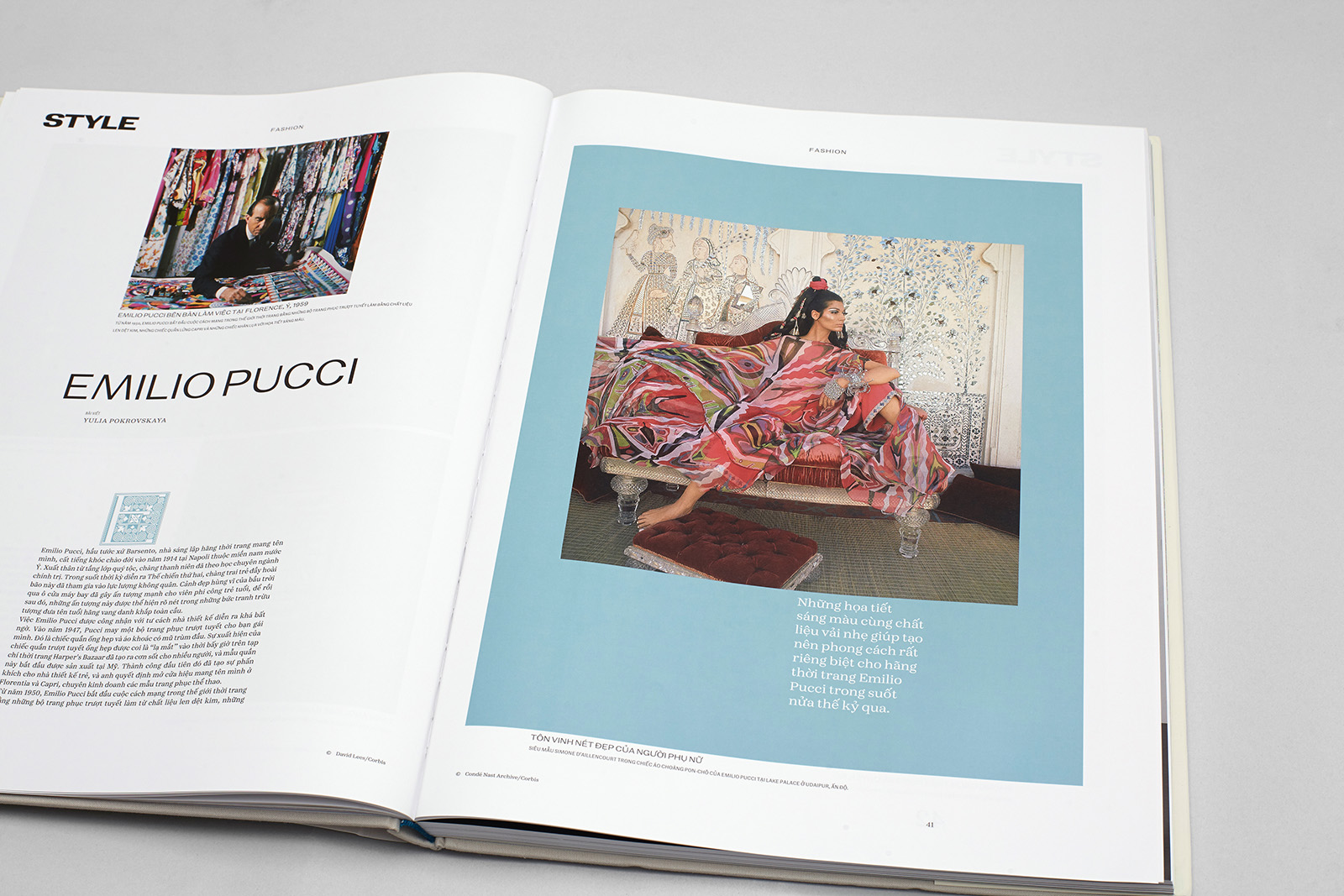
It was necessary to use a small range of typesetting styles and a limited number of artistic devices in order to simplify the publishing process. The magazine composition is as traditional as we could make it; all layout solutions are formalized, all sections are symmetric. Illustrations are always framed, except for the full bleed image on the front endpaper. Cut-out illustrations are only allowed with a light beige background.
We used the Kafka Serif Text typeface (9.215 / 12.735 pt); Kafka Serif Extended for quotations (14.91 / 19.103 pt); three heading sizes. Display matter features elaborate lettering, which uses five alternative sets of the Bazaarban typeface, initially created for Bazaar magazine. Lettering height is defined by module size. A proper balance of white and printed space creates an eye-pleasing double page spread density.
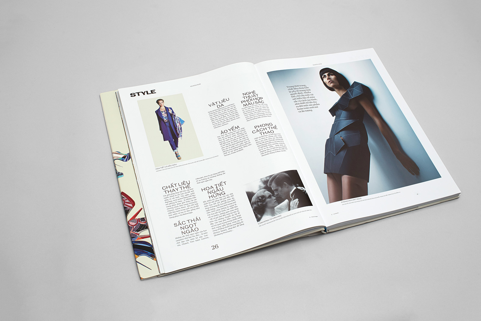
An example of a double page spread with short topic-based reviews. Headers, footers, headings, and captions do not belong to the typesetting space.
A photograph on the recto is accentuated by a colorful frame. It works in two ways — constructive and semantic. Photographs can be of any size — the frame ensures that the layout remains static. The quote inside the frame is of particular significance, as it serves as the synopsis of the issue.
The outer margin is equal to ⅛ of the layout. This module is used for arranging related text clusters and illustrations to ensure axis offset. Headline font: Kafka Serif Extended 58.7 pt. White printed space of the page have approximately equal proportions.
Erbar Grotesk initial caps in the ornamental section. The magazine consists of sections with symmetrical organization. Each of them has an opening material that often includes elaborate lettering.
4. Typefaces
Evgeny Yukechev,
“I designed KafkaTypefamily in 2010–2012. This font family is intended for use in books and magazines; it is suitable for long reading and it includes headline fonts and alternative characters. Stylistically, this typeface is a fresh replica of German modern serif of the late 18th — early 19th centuries, the era of Justus Erich Walbaum. Its slightly narrowed proportions and moderate contrast make lines look firm and neat. This typeface also includes a display face (Kafka Text Stensil), which was released in the Asia: Barcode layout.”
Yuri Gordon,
“Bazaarban is one of the strangest typefaces I have ever had to design. The very name demonstrates its synthetic nature — it’s a mix of the name of the magazine (Bazaar) and its art director (Barbanel). Bazaarban combines the 1960s Optima glamor, the early 2000s techno, Soviet ’big style’, postmodern irony, Swiss modules, and Bauhaus minimalism. Each letter in Bazaarban has a lot of variants. Imagine that — regular narrow, regular wide, italic, and back slant characters all coexist in this typeface. You can start a word with a slant to the left and finish it with a slant to the right. To switch the slant, there are special stopper letters — one side slanted, the other regular. Moreover, Bazaarban makes it possible to make a four-letter word ’МАМА’ (’Mum’) longer than ’МЫЛА РАМУ’ (’Mum was washing the window frame’ — a typical sentence from Russian ABC books) which consists of eight letters and a space. It can be very wide or unbelievably narrow, depending on the situation.
Why? To make you read slower. Bazaarban turns headlines into standalone events. Attracts your attention. Doesn’t let you go. Stop! Something’s going on here! I would call such typefaces ‘the ultimate display fonts’. They work in a much more powerful way than needed to just read the text. Ultimate display fonts are a transitional stage between a typeface and lettering, calligraphy, and drawing.
Bazaarban is built on the same principles as old typefaces for hand-set typesetting. No OpenType tricks, no automatization, no glyph substitution. Want unique result? Procure letters, one by one, from the Glyphs palette, just like a real metteur en pages 100 years ago. Love every letter, try it on, change, experiment — the results might be surprising.”

Most illustrations are accounted for by retail companies’ press-releases. We decided to tamp down their obviously advertizing appearance by placing all cut-out images against a background.
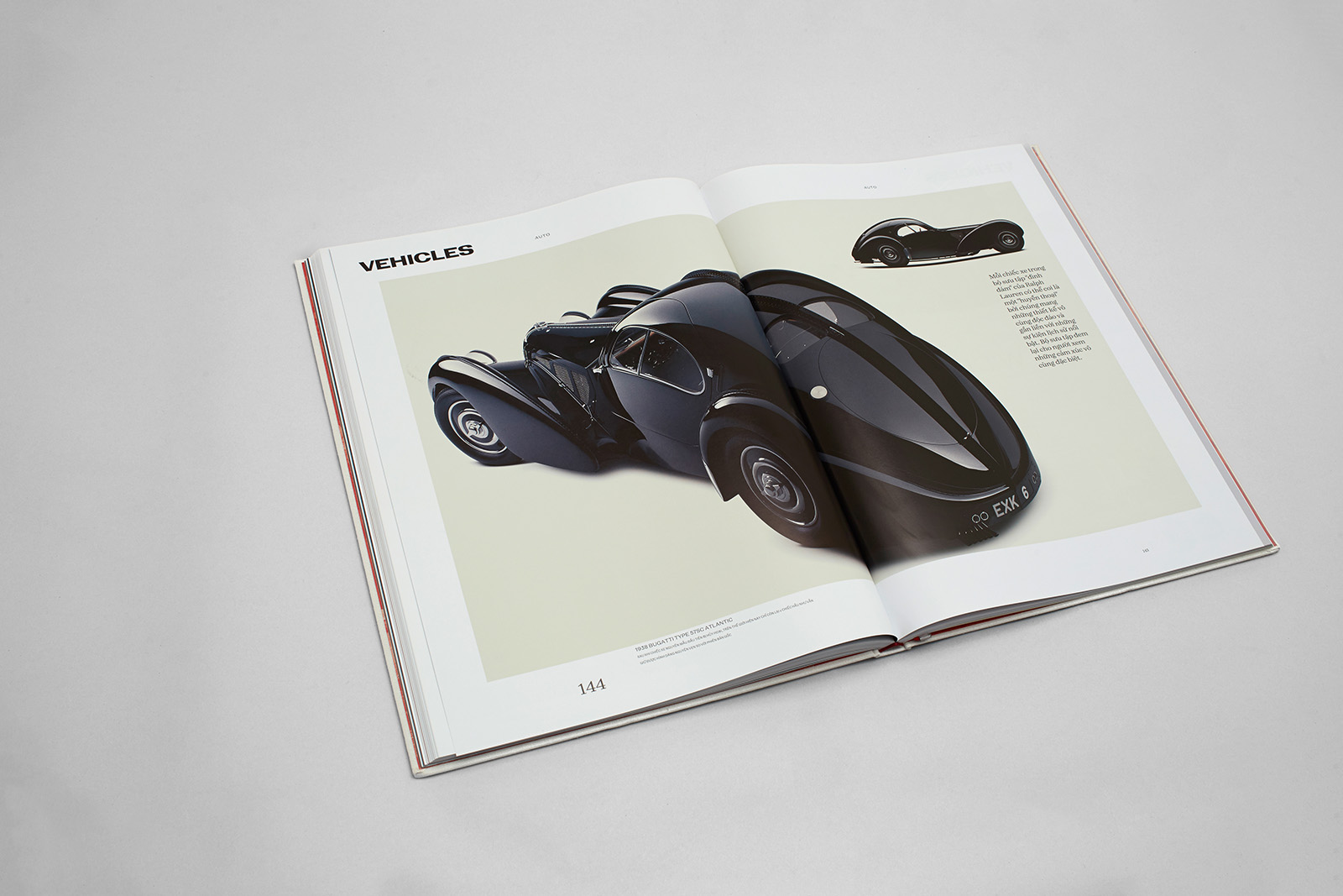
All images in the magazine are set against a beige background, which has the same shade as the address section. Only two colors are allowed: beige and the system color, which changes in every issue.
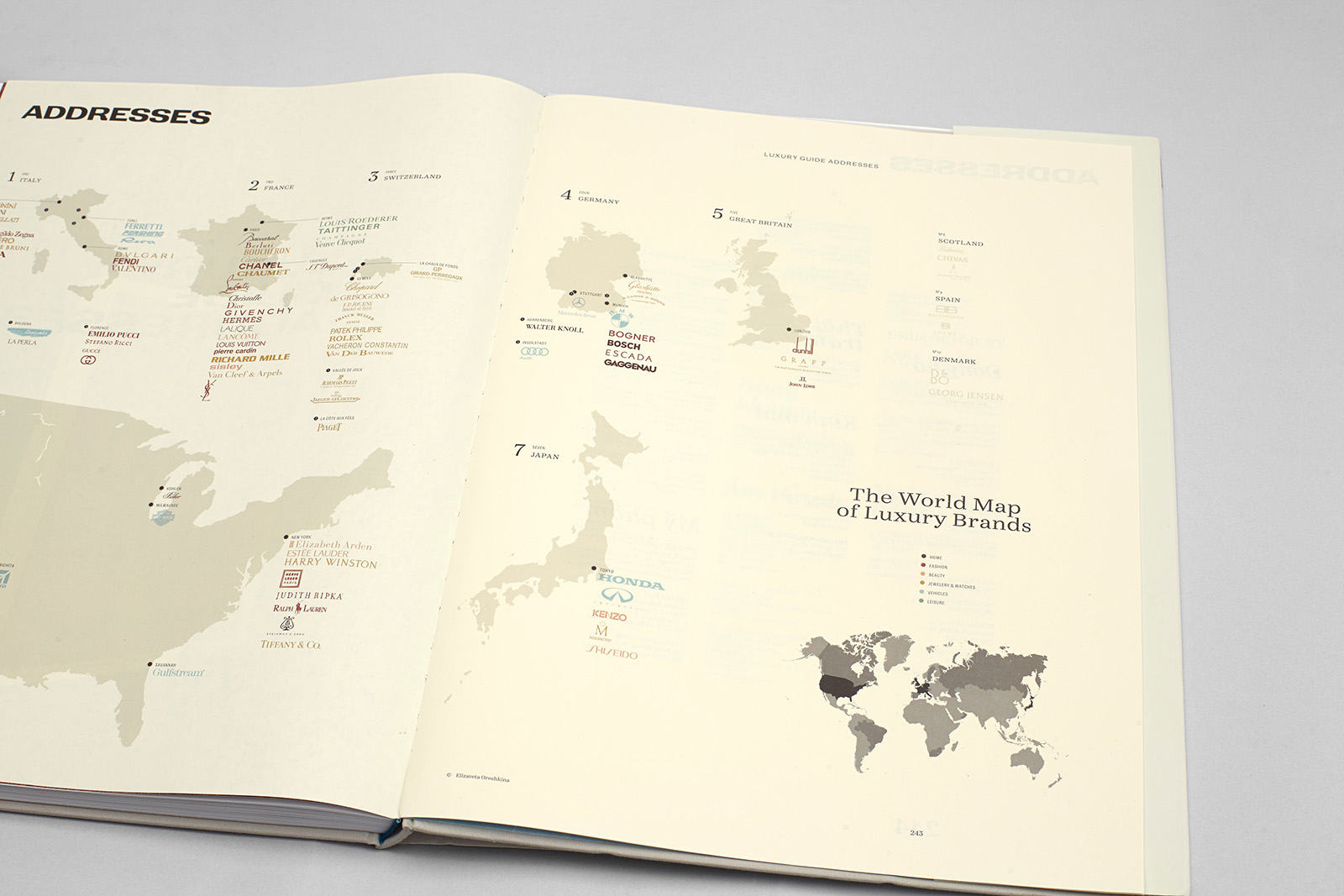
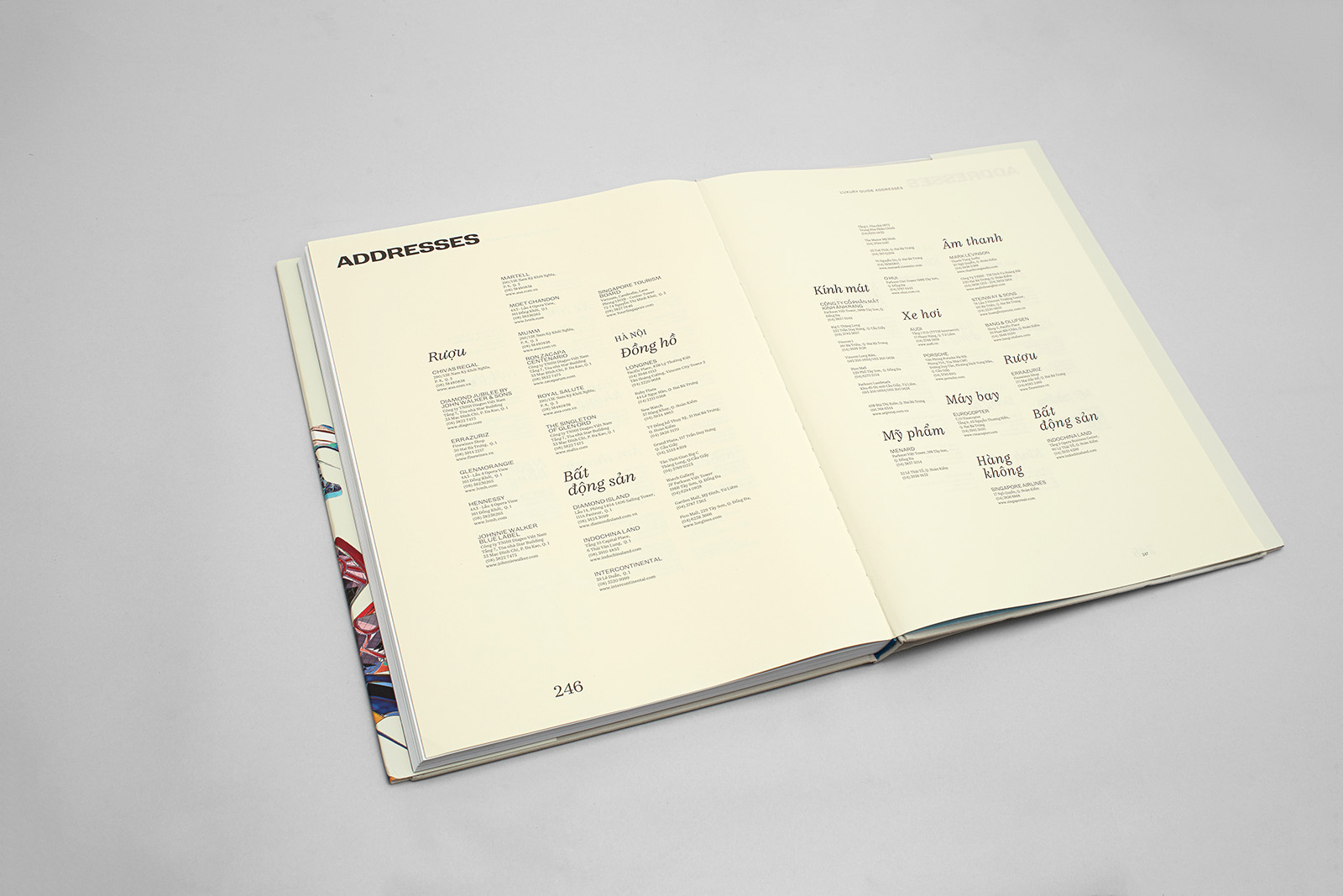
The address section is separated from the main body by a sheet of thin colored offset paper, 80 g/m2.
The iconography here constitues a map of premium goods manufacturers.
Kafka Serif Text, 7.871 / 10.188 pt. Text subheadings: Franz Grotesque Extended 9.215/ 10.188.

Поделиться
Другие проекты
 Barcode City magazineMagazine