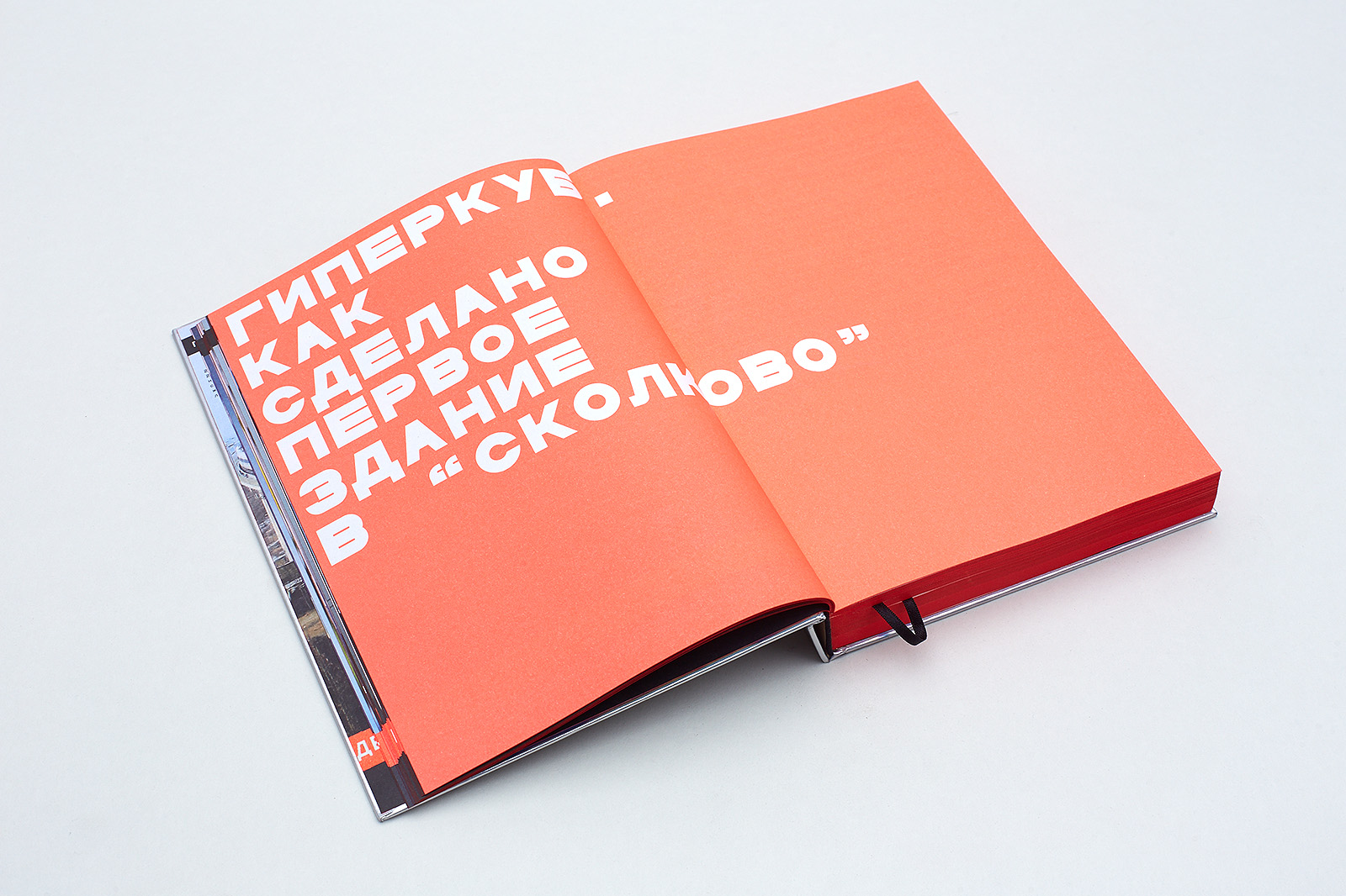
Hypercube
The Hypercube is both the first building in the Russian innovation center Skolkovo designed by Boris Bernaskoni and a book by Masterskaya, a rendition of the creative concept at the heart of this building.
Dimensions: 179×249 mm
Pages: 392 + 16 pages with flaps
Paper: Munken linx rough 100 g/m2
Color: 5+5 (cmyk + Pantone 805)
Laminated hardcover
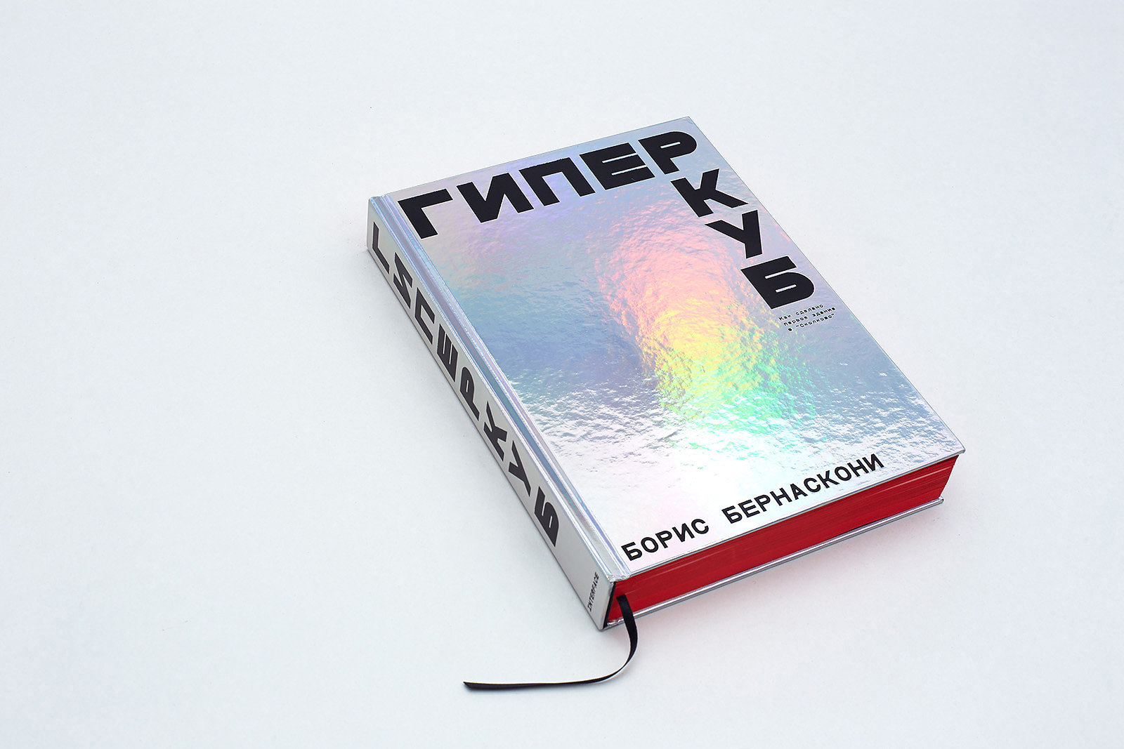
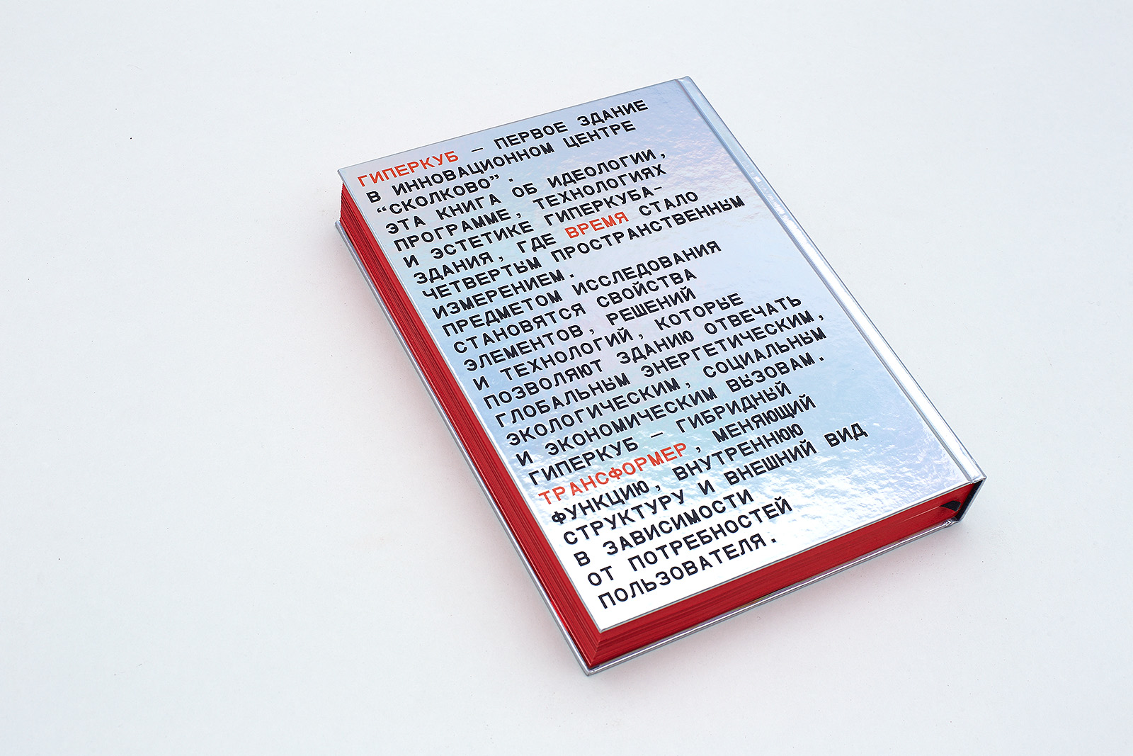
Cover finishing: black texturized foil embossing of the book spine, front and back covers. Liner material: coated paper with holographic foil embossing and glossy lamination
Number of copies: 2000
1. Team
Architect, author of the book
Boris Bernaskoni
Creative Direction
Dima Barbanel
Maksim Volkhin
Publisher
INTERFACE
Guest Editor
Anton Kalgayev
Production Editor
Aleksandra Kononenko
Editors
Olena Grankina
Sergey Kulikov
Maria Kosareva
Antonina Baydina
Valentina Dorokhina
Ekaterina Udalova
Violetta Postnova
Project Graphics, Blueprints
Maria Karas
Typefaces
Anton Terekhov
Photo Editor
Yulia Lukina-Kuranova
Color correction and Prepress
Mikhail Shishlyannikov
Printing Manager
Agata Chachko
Printing
PNB Print, Latvia
© Masterskaya, 2014
2. Objective
Boris Bernaskoni, architect, author, publisher:
Idea of the building
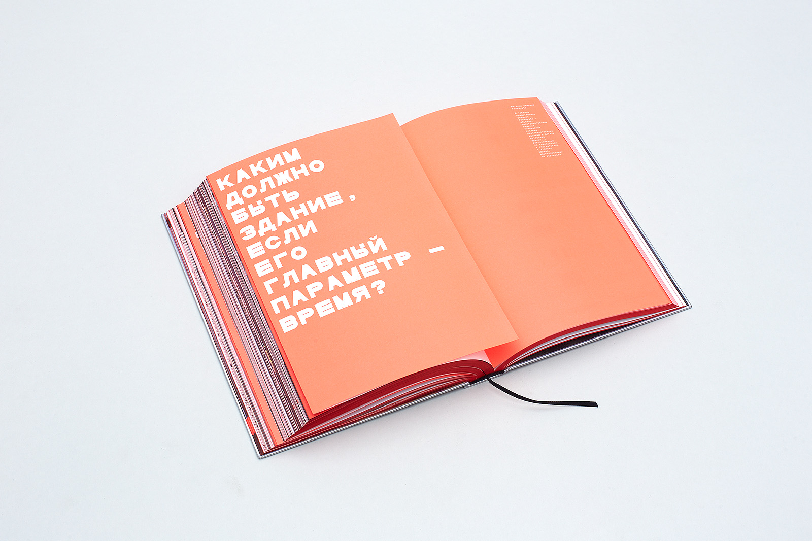
The main question we were asking ourselves when we were getting started on the project was “What should a building be like if its main characteristic is time?” I was dreaming of creating an object that would become an energy flow generator for the future city of Skolkovo, a sort of a crystal to form a new economic, political and intellectual environment.
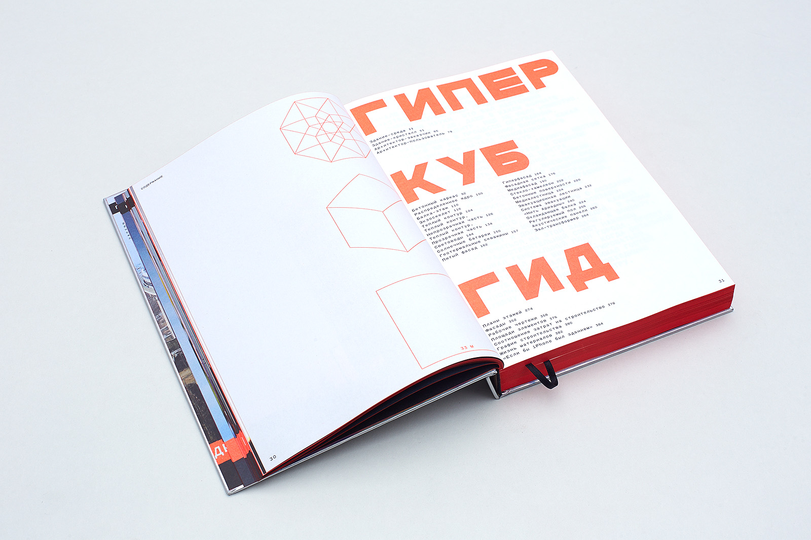
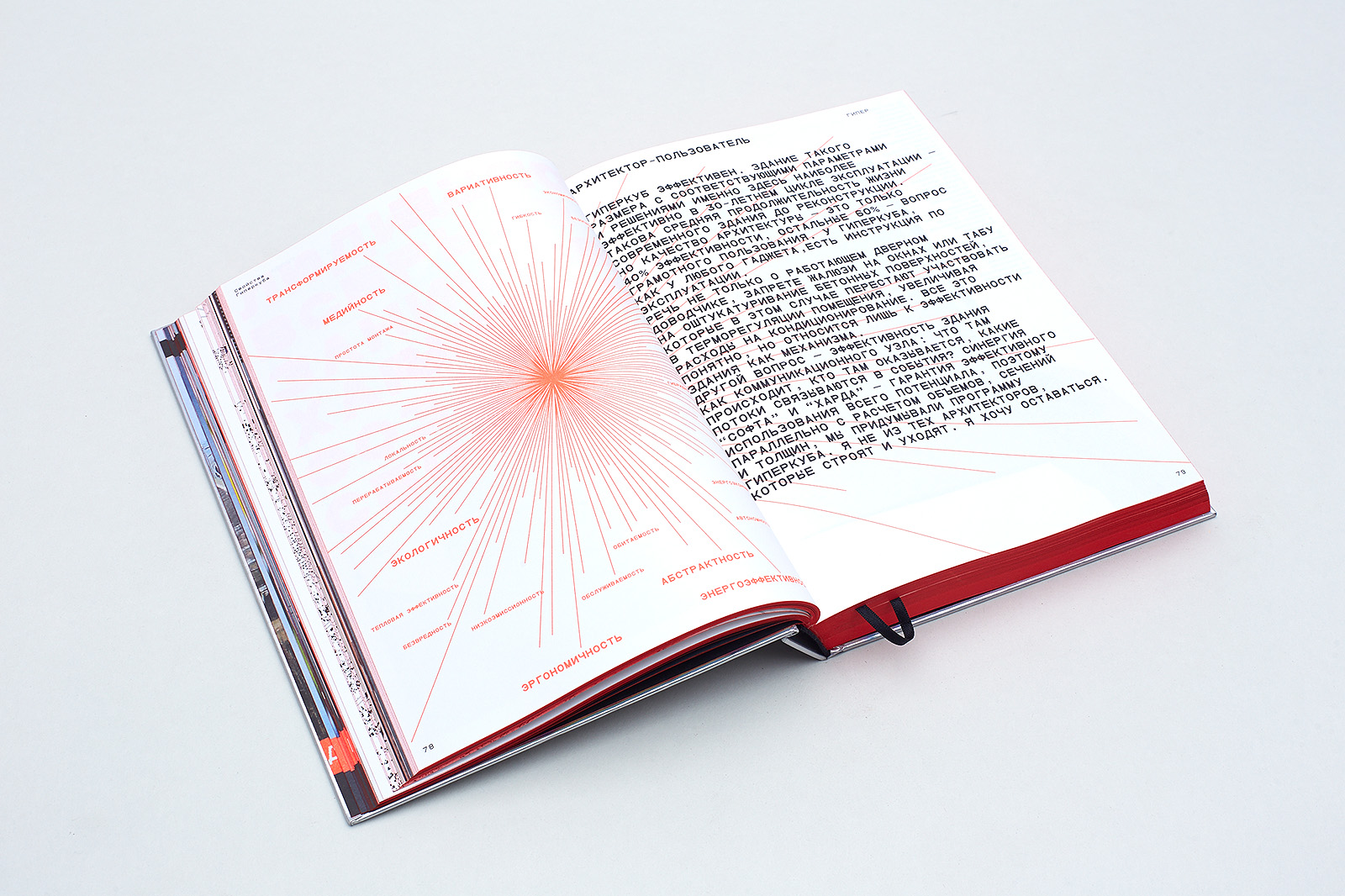
The very idea of the Hypercube is based on a very simple city-planning formula that consists of four key aspects: eco-friendliness, ergonomics, energy efficiency and, finally, cost effectiveness as the result of the first three.
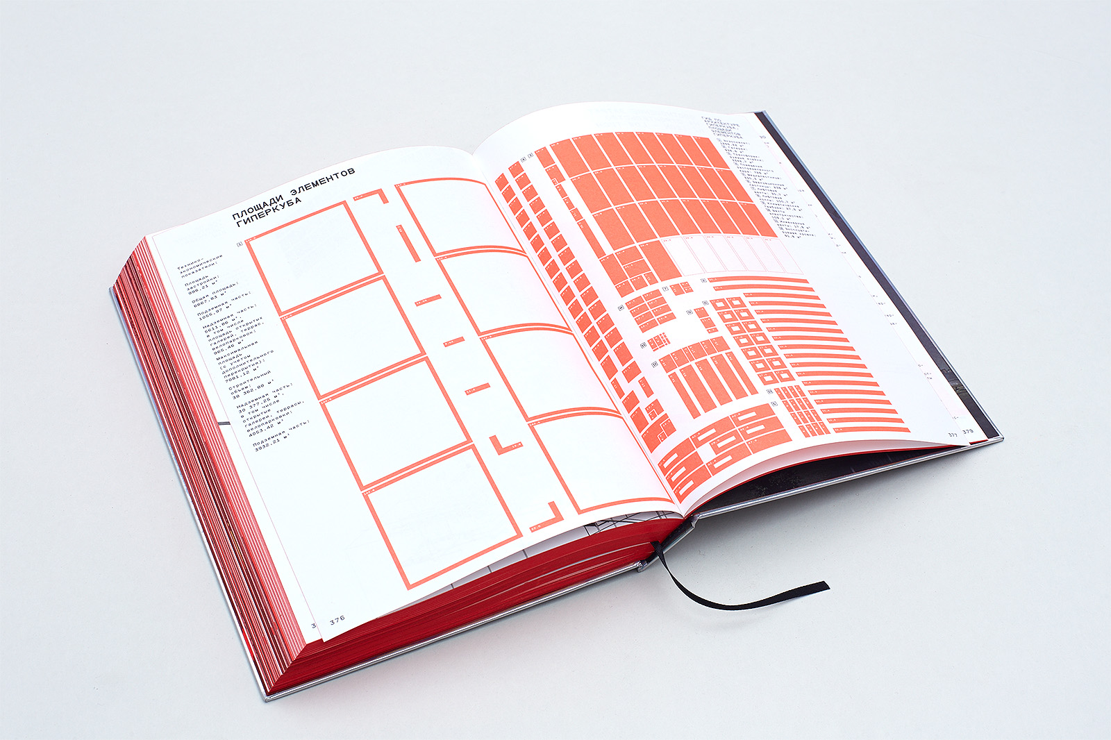
The building is a transformer: it can be modified both on the outside by altering its facade and on the inside by altering its functionality and even its area. The usable space of the building can become 1.3 times larger since its inner structure is basically hollow. There are twenty-eight identical compartments that can be rearranged to change the building’s functionality or, for example, floor height.
The Hypercube facade is the opposite of the classic order; it lets the building change its outer appearance freely as it has no aesthetic ties. It is not final, so it can be used to execute any ideas, even those whose time has not come yet.
Name
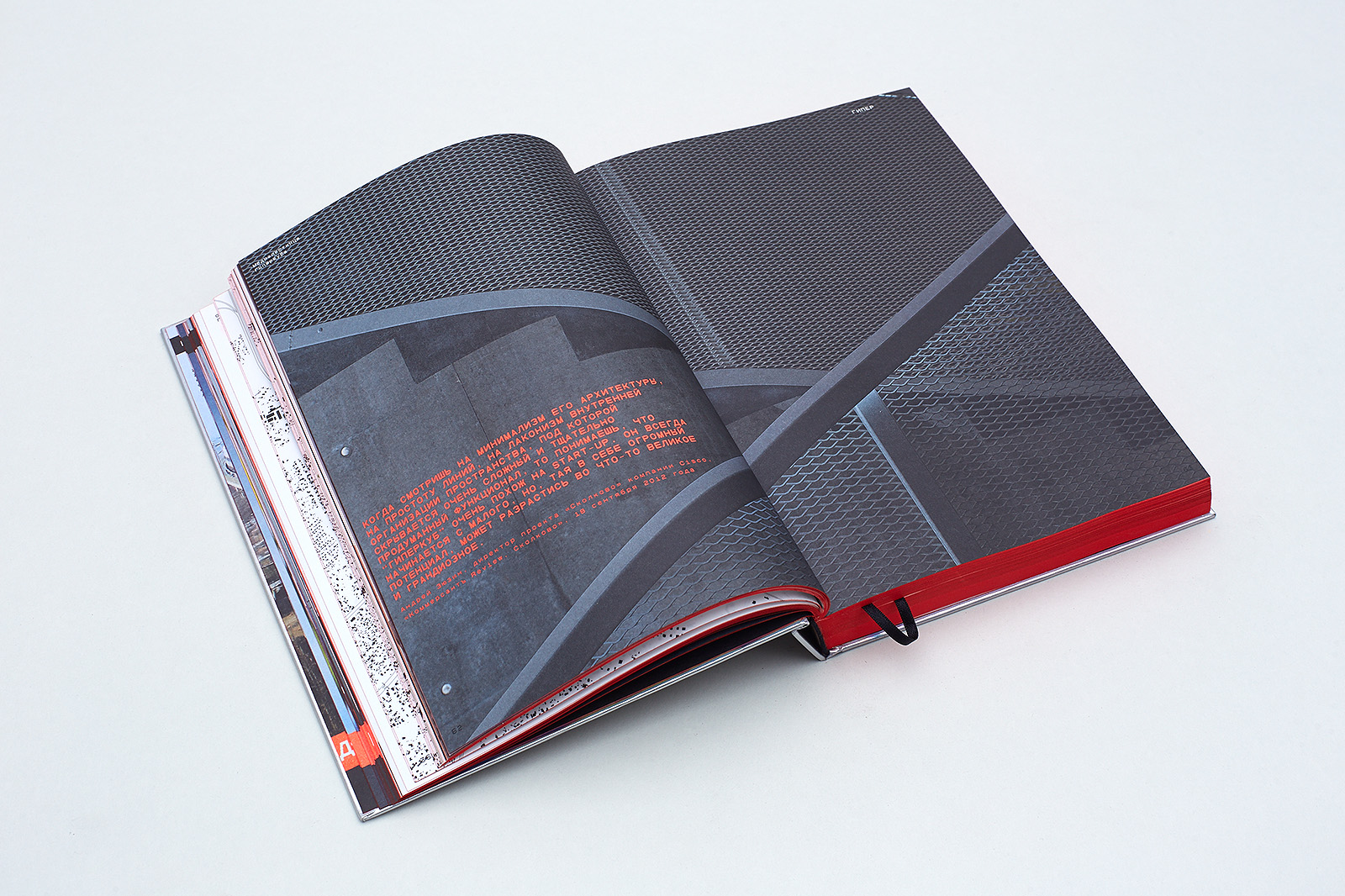
The first reaction to the Hypercube was something like this, “It’s just some gray box, so what? No big deal.” Which is typical, since nowadays people see architecture as something visual and entertaining. In the end, the public sees works of the best contemporary architects as nothing more than photographs.
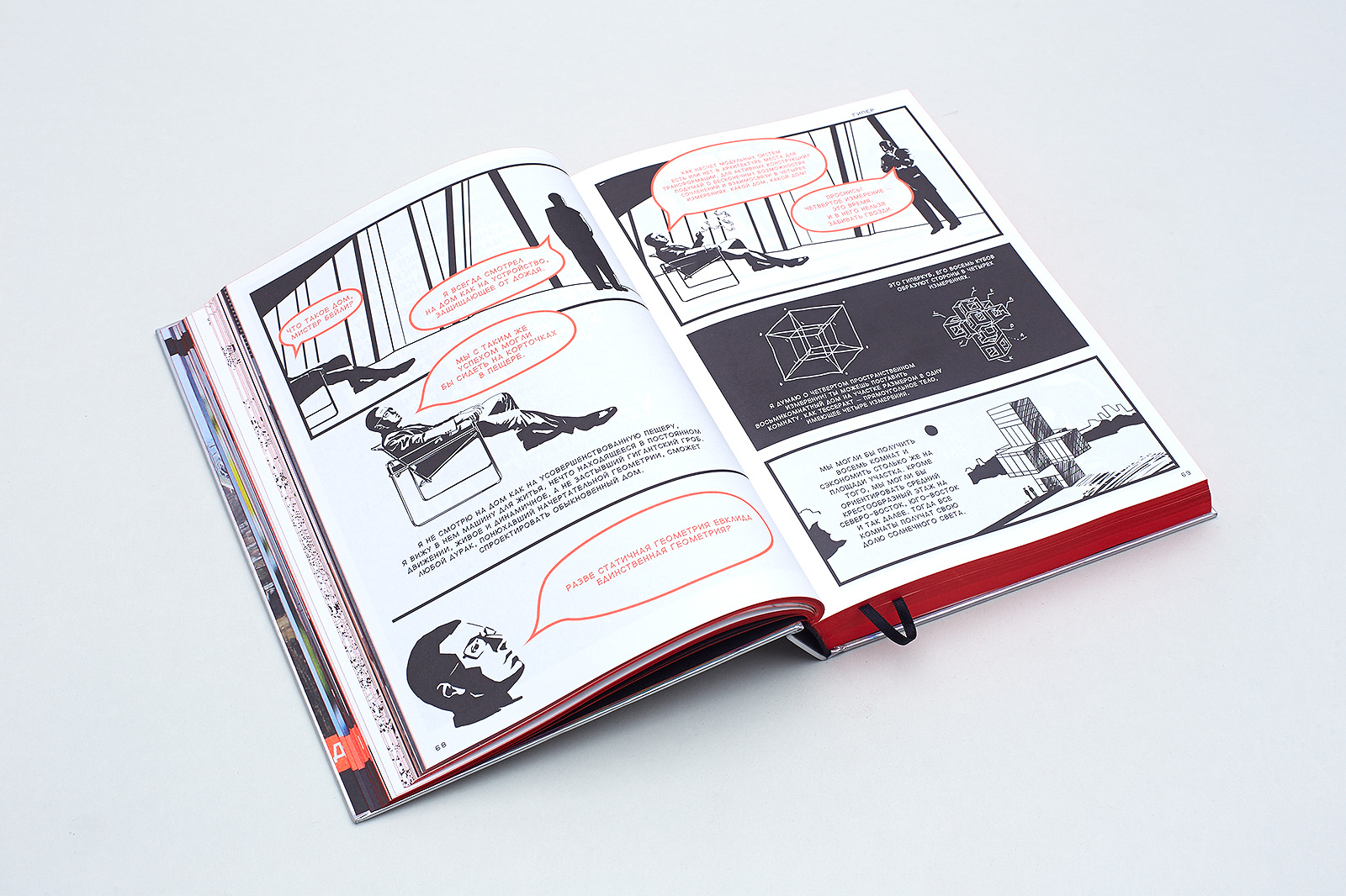
I added the prefix hyper to the name so that people would start thinking about how this cube is different from other parallelepiped-shaped buildings. A cube is the simplest form of a crystal lattice, but the Hypercube also has a fourth, a fifth, a sixth, a seventh and an eighth dimensions, which arise from diverse connections between various points of the real and virtual cubes — the building and the events that take place there.
Book objective
The book is a statement; it manifests the main ideas — what the building’s image means, what its concept and its aesthetic value are. The main notion that we describe here is hyperfunctionalism (hence hypercube). This architectural notion corresponds to two hypertext techniques in the book. First, different parts are connected via hyperlinks; second, the layout itself conveys some of the functional ideas of the building. Therefore, the correlation between the semantics of the text, which always dominates double page spreads, and photographs, blueprints, sketches, and models that illustrate it, is always evident.
Thus, this book, being, first and foremost, a standalone work of art, is also a part of the Hypercube. This is why we have to pay attention to its size, weight, color, cover, proportions — to each and every part of its design. The book is the Hypercube’s ID. It tells a story about both the building’s hardware (concrete and design) and software (the program it is operated by, the program which controls everything from window blinds to the Hypercube’s transformer room).
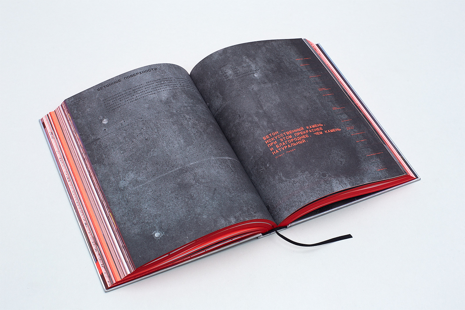
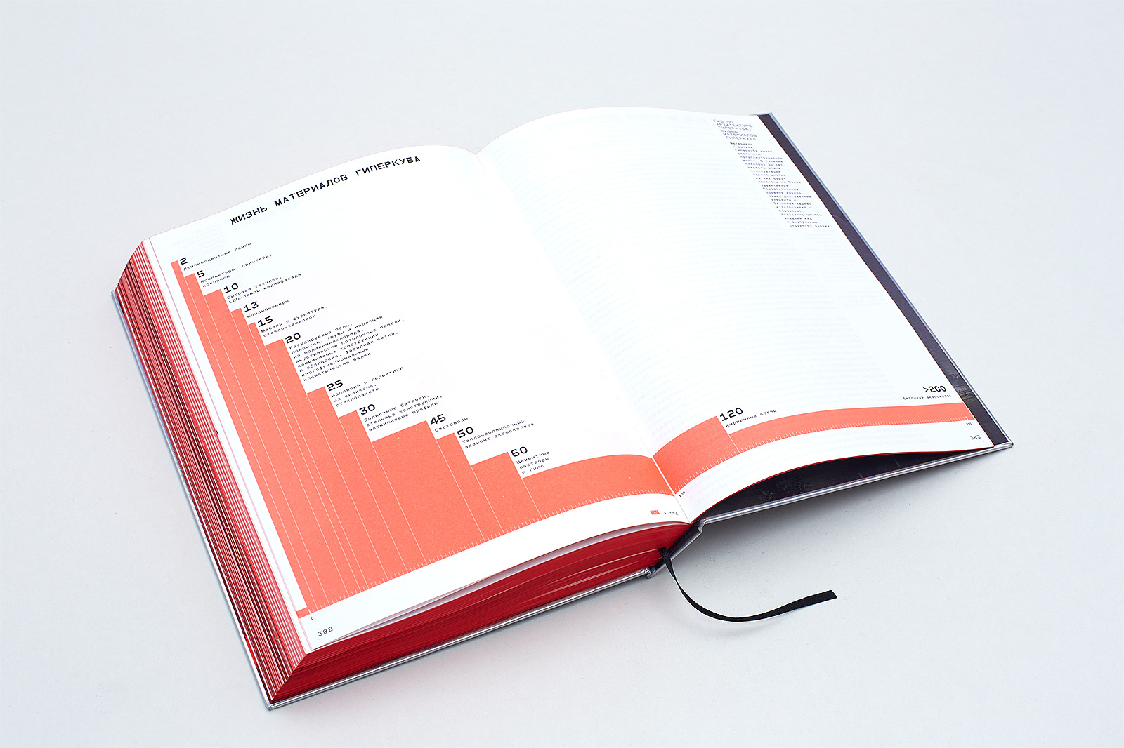
However, the main subject is time. The building and time. The Hypercube and hyperdeath. We are all going to die someday, and architecture is mortal as well. It has to do with different parameters — for example, with physical qualities of different materials. Copper changes in three years, stainless steel — in twenty-five, solar panels — in ten; concrete is ageless; acoustic systems go out of date in three years; software has to be updated every half a year, every week. So, the last building element to die will be its reinforced concrete frame. To some extent, we all think ahead.
3. Idea
3.1.
Sergey Monakhov:
Which layout features were suggested by the building, which ones were a development of the Hypercube ideas, and which ones emerged independently?
Dima Barbanel:
The Hypercube is a parametric formula where a change of one variable transforms the whole structure. In our case, the Hypercube building was first compressed to the minimum font module in Font Lab and then it began to grow to the size that allowed us to turn it into a book.
The first solution we came up with was that the book should be a continuation of the building, not its miniature copy; it should develop its real typometric relations.
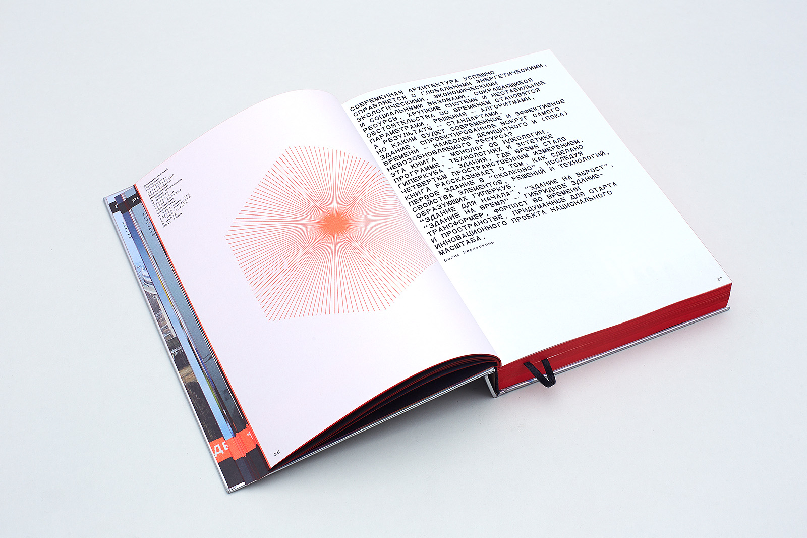
The second solution was to mention some qualities of the building allegorically, through metaphors, complementing them with polygraphic allusions to the building materials used.
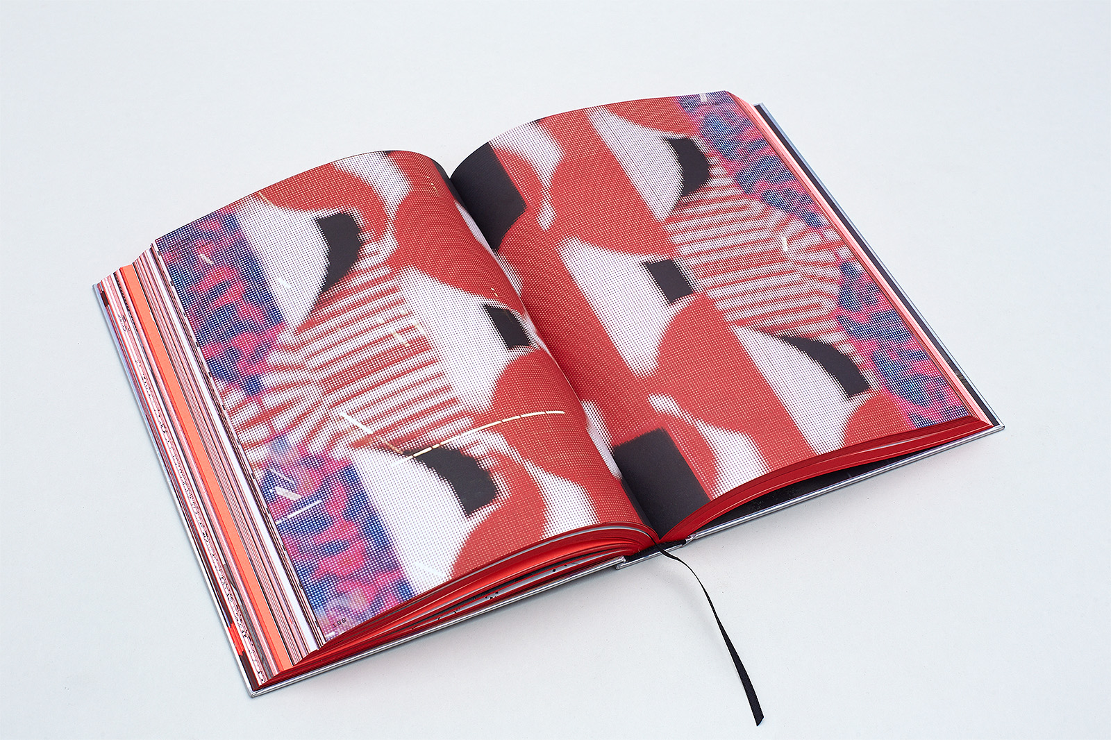
The third solution was a run-through non-CMYK hypercolor, neon Pantone 805, used to highlight parametrically and contextually connected textual elements and images.
The module system is square-based, and it predetermines the rigid connection between all elements: font sizes, line weight and em-box parameters, line spacing, image size, and project art line width. The run-through grid makes it possible to rescale elements keeping all the proportions the same.
3.2.
SM:
How did you convey the idea of time, constant change and inevitable death, such an important idea for an architect?
DB:
The layout is intentionally based on the metric system, artificial and disproportional for a human being. Underpinning all the ratio parameters of module proportions, it produces the desirable effect of temporality, finiteness and mortality. The typometric system (Fibonacci), on the other hand, is natural for man and his proportions, so it does not create such an effect.
3.3.
SM:
How did you come up with the cover? Were you tempted to somehow make it more interactive, like the media facade of the building?
DB:
The cover is always the hardest part. It is what the customer is unsure about during the working process, and what leaves me asking questions after the book has been printed.
The typography here is determined by the grid and the general idea that a book page is the building's facade. The five-letter part of the name (HYPER) is printed horizontally while the four-letter part (CUBE) goes down vertically, starting with R, which makes it look longer by one letter and creates an optical square. This concept was not as obvious in the Cyrillic version (ГиперКуб), so we took the module under the letter Б and put a description resembling works of Russian formalists there: How the first Skolkovo building was made. Its purpose is to balance out the elements.
The typography was appropriate; it was accepted straight away. However, we still could not get the feeling that the material and finishing were supposed to create. We definitely wanted to avoid this traditional a-piece-of-cardboard-with-some-letters-on-it image. We wanted the cover image to be dynamic; we wanted it to be separated from the title by creating a new level, both formally and emotionally.
We had spent a lot of time thinking about a 3D-cover, multi-level embossing and thermography, but we still ended up with a direct allusion to the chameleon glass that the ground floor of the Hypercube is decorated with — cardboard backed with holographic lining. The cover defined all the display matter features: fonts became a spacial structure; lines could now fill the whole page and go diagonally, vertically and even backwards.
3.4.
SM:
How does the layout actualize the hypertextuality principle, which, according to Bernasconi, expresses architectural hyperfunctionalism?
DB:
Hypertextuality, which makes notional and formal connections between the elements of the Hypercube building and the book apparent, is primarily rendered on the level of text organization, but it also has visual manifestations.
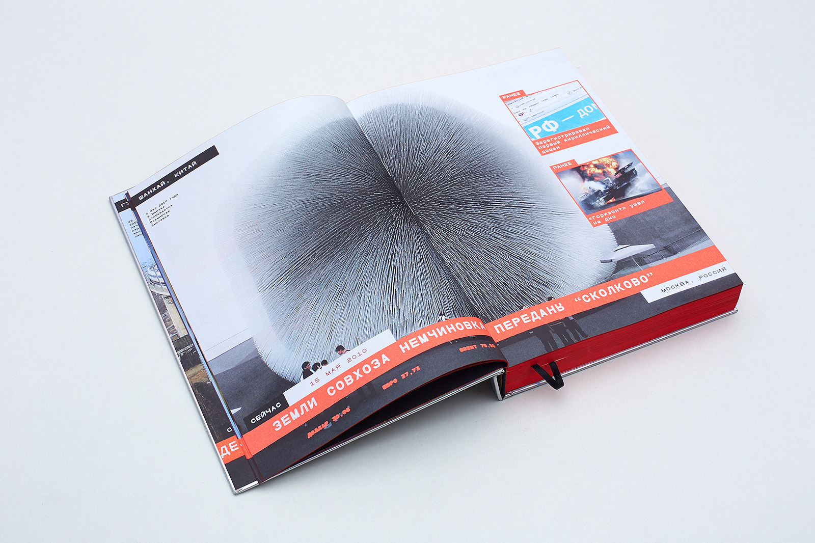
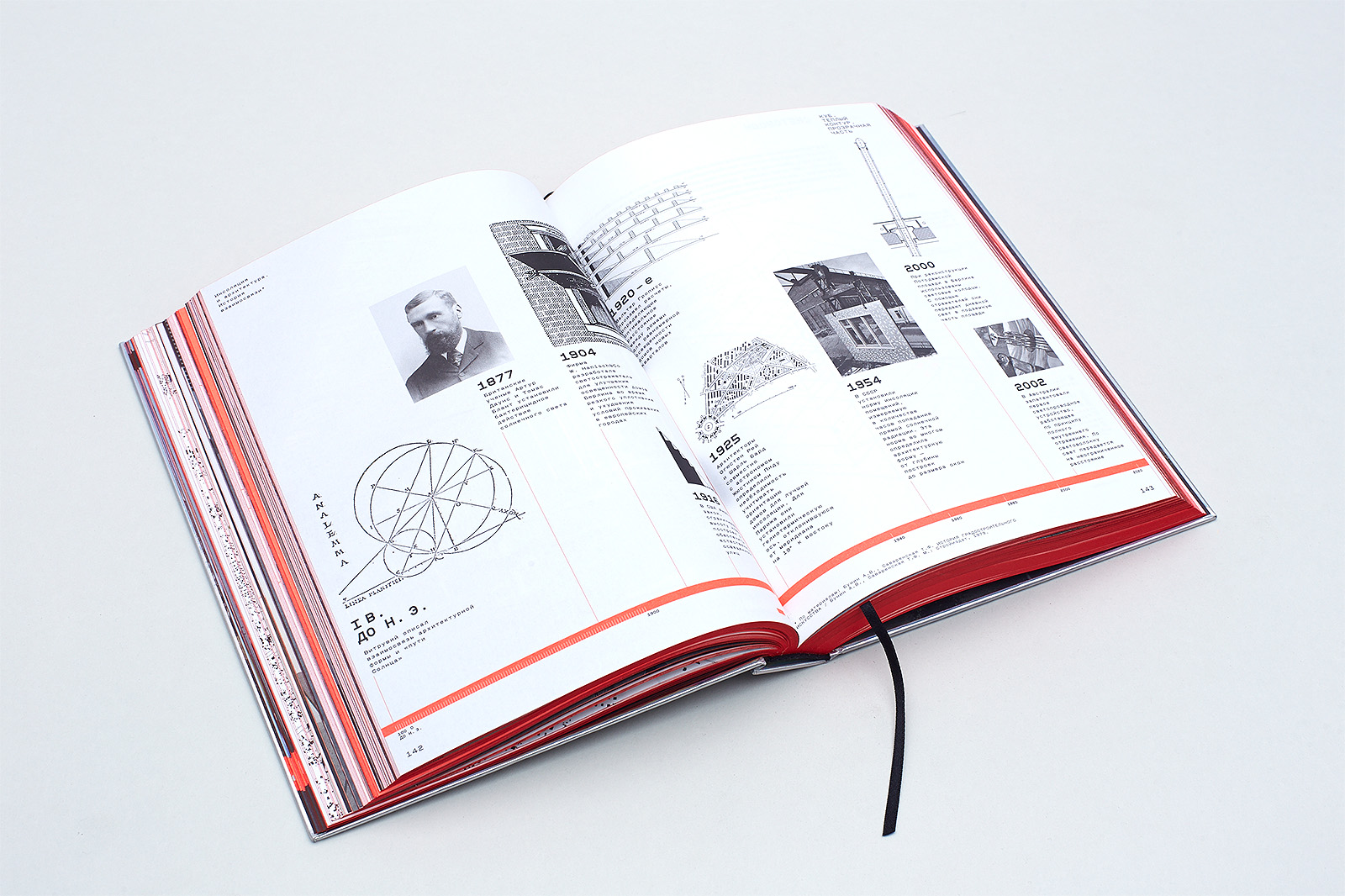
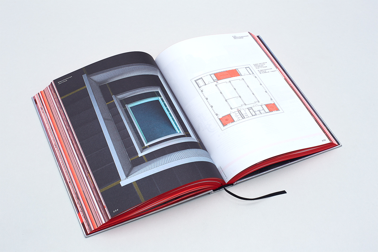
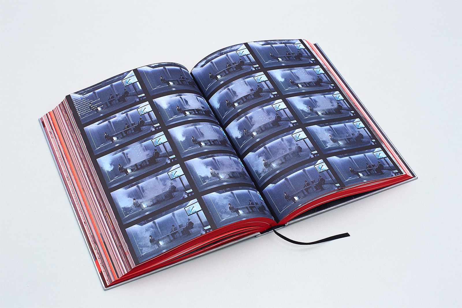
Separate contextual elements in different parts of the book are connected via hyperlinks. Photograph captions come in three sizes, 6.73 pt / 11.7 pt / 15.62 pt, which allows for perspective: a far away object is accompanied by a small caption, while an object in the foreground has a large one. The same spacialization effect is created by placing images (for example, blueprints) on top of other images using a very bright Pantone 805 fluorescent color.
3.5.
SM:
Even with all the incredible technological solutions used in the Hypercube construction, it is still hard to stop seeing it as "just a gray box". How did you cope with the danger of readers seeing the book as "just a collection of blueprints and floor plans"?
DB:
There are ten principal page types in the layout, which turned out to be enough to ensure a complex rhythm of the narrative. Moreover, elements have highly different sizes, which adds volume to the layout.
4. Solutions
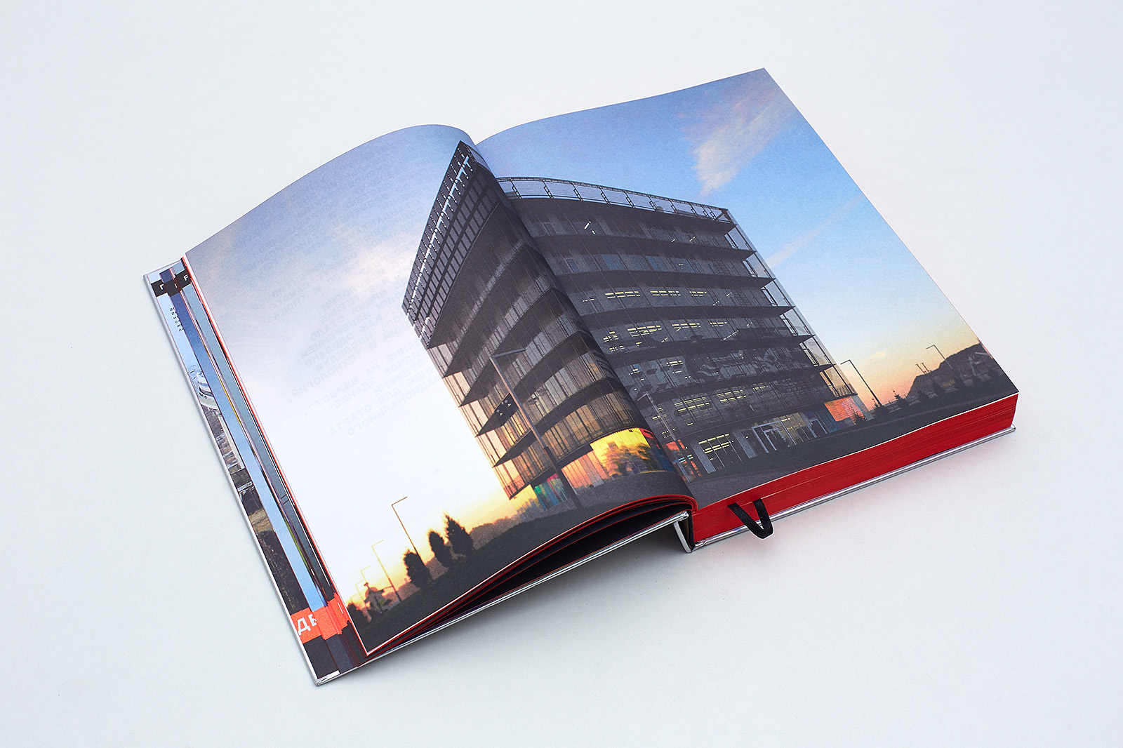
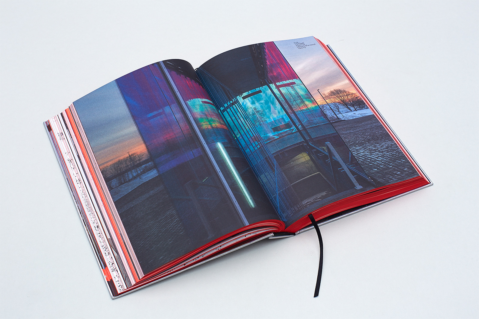
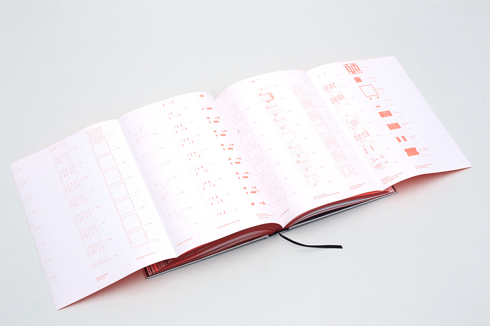
The symmetrical double page spread shows the spacial principle: the reader faces the corner of the building and can see two facades at once. The reader enters the Hypercube space fitted into the layout with the help of a symmetrical 5×7 grid based on a square. The layout structure borrows the Hypercube's semantic and functional principles: body type — much like the inner space of the building — takes up 4×7 modules of the layout, and the service block (1×7 modules), based on the space between the media facade and the main frame of the building, is used for headlines, drop folio, marginalia, illustration and blueprint captions, and credits.
While in other cases the choice of design features can be defined by the technology, the context of communication with readers or — less often — by the book’s creative image, where any rigidity would look foreign, here the design is based on the font and the module system, and not the other way around.
The run-through line spacing of the book is 10.936 pt; the parametric principle determines all the font sizes and line spacing values, tying them all together.
All seven typesetting styles fit into the module: starting at its top margin, justified by their Cap Height, all the way down to the bottom margin, which is a line. Therefore, either the second or the fifth line is always on the grid. (gif animation from HCA 01а+HCA 01b+HCA 01c).
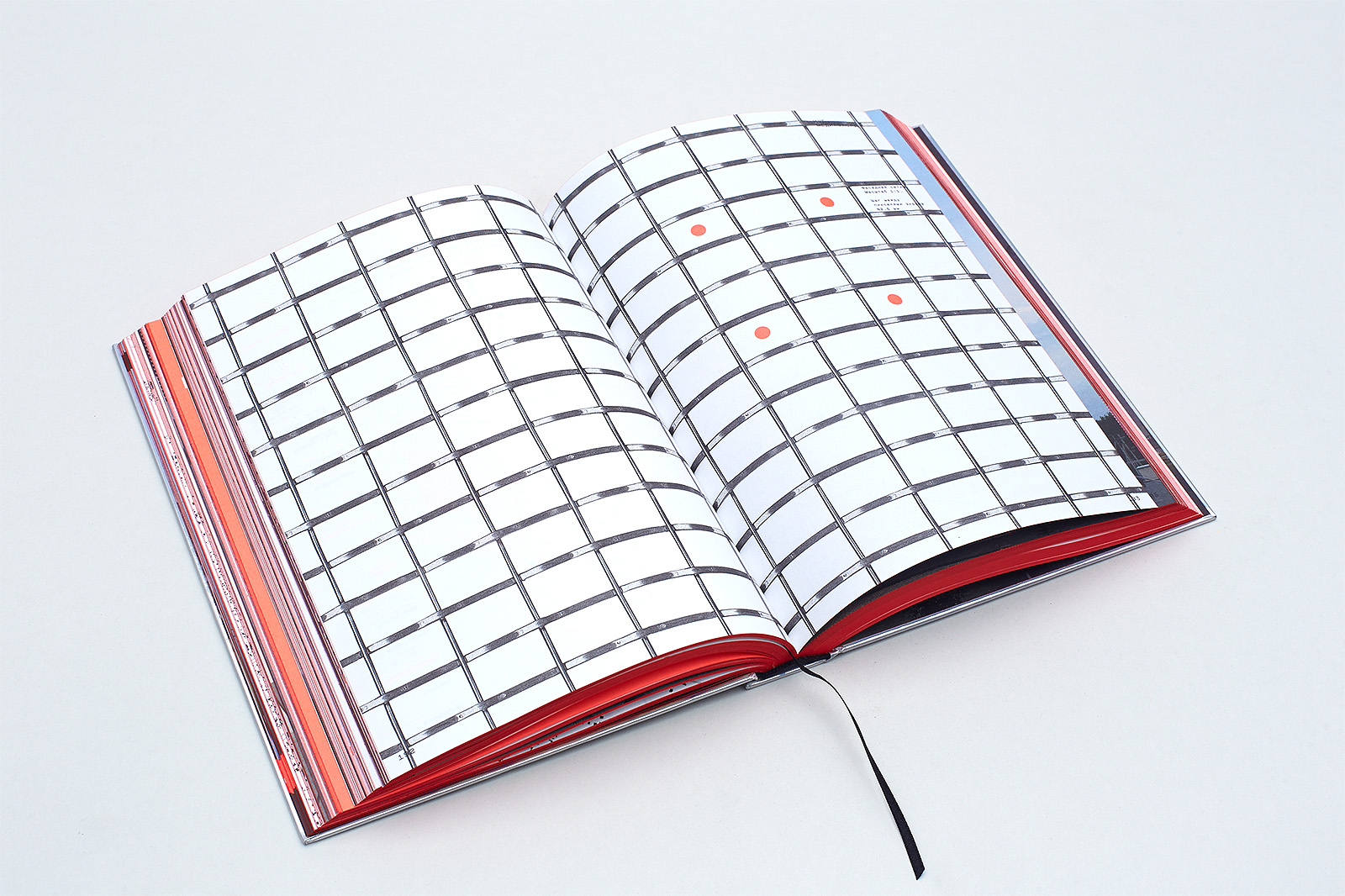
The headline grapheme line weight in 117.18 pt size becomes a run-through grid module with an interval of 16.404 pt. Horizontally, a page consists of thirty-one such square modules forming five columns with a one-module column gutter. Vertically, it comprises forty-three modules; top/bottom margins and spacing between seven modules are also 16.404 pt. The layout is symmetrical; its modules are metrically equal to the Haver&Boecker® facade grid blocks used in the media facade of the building.
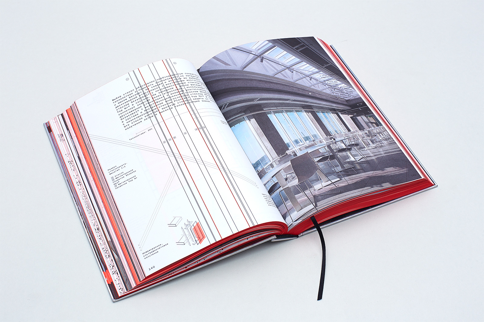
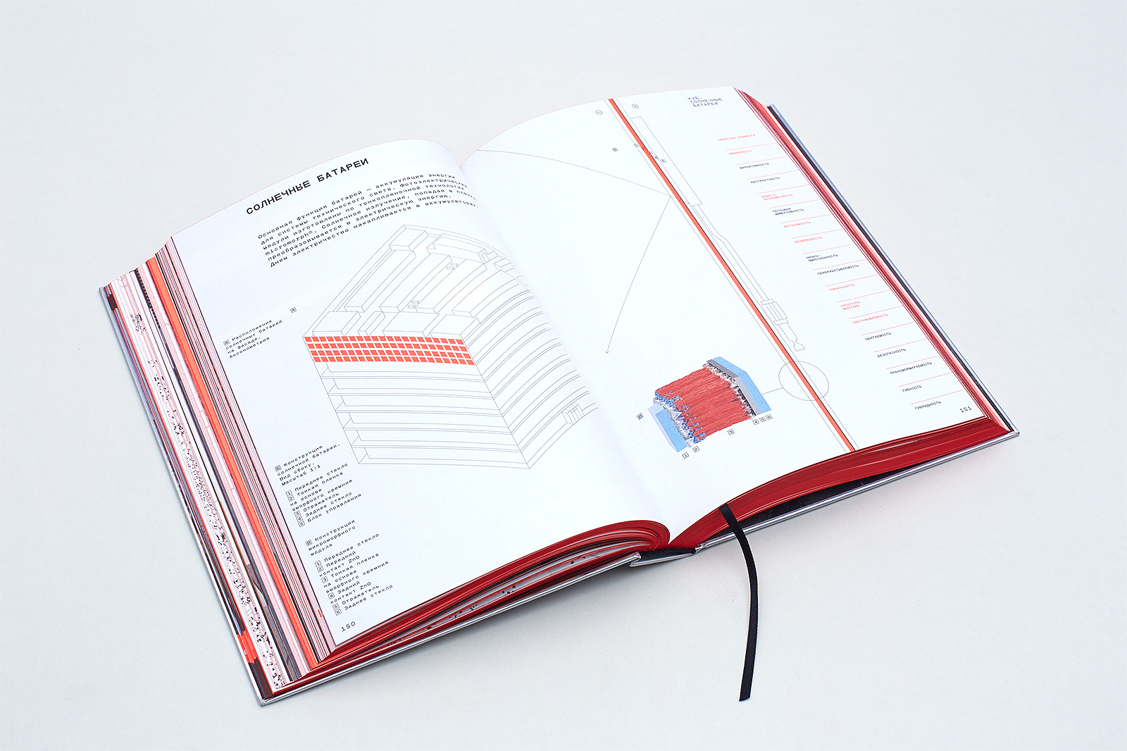
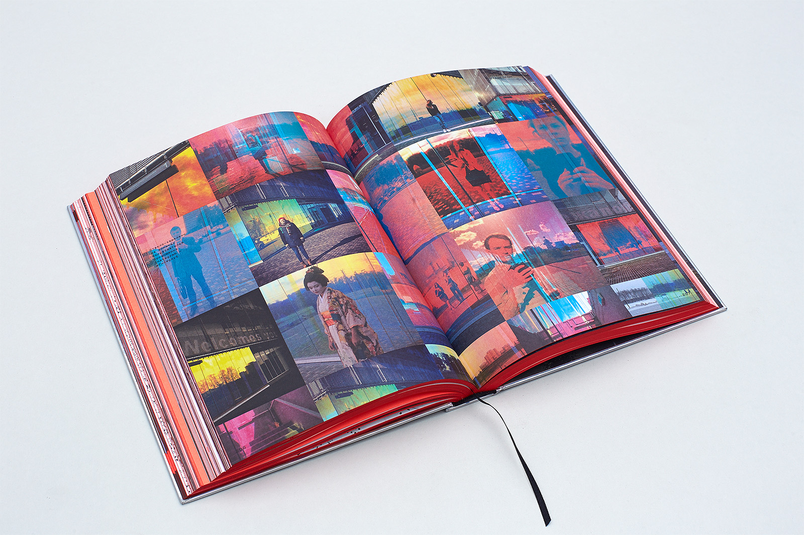
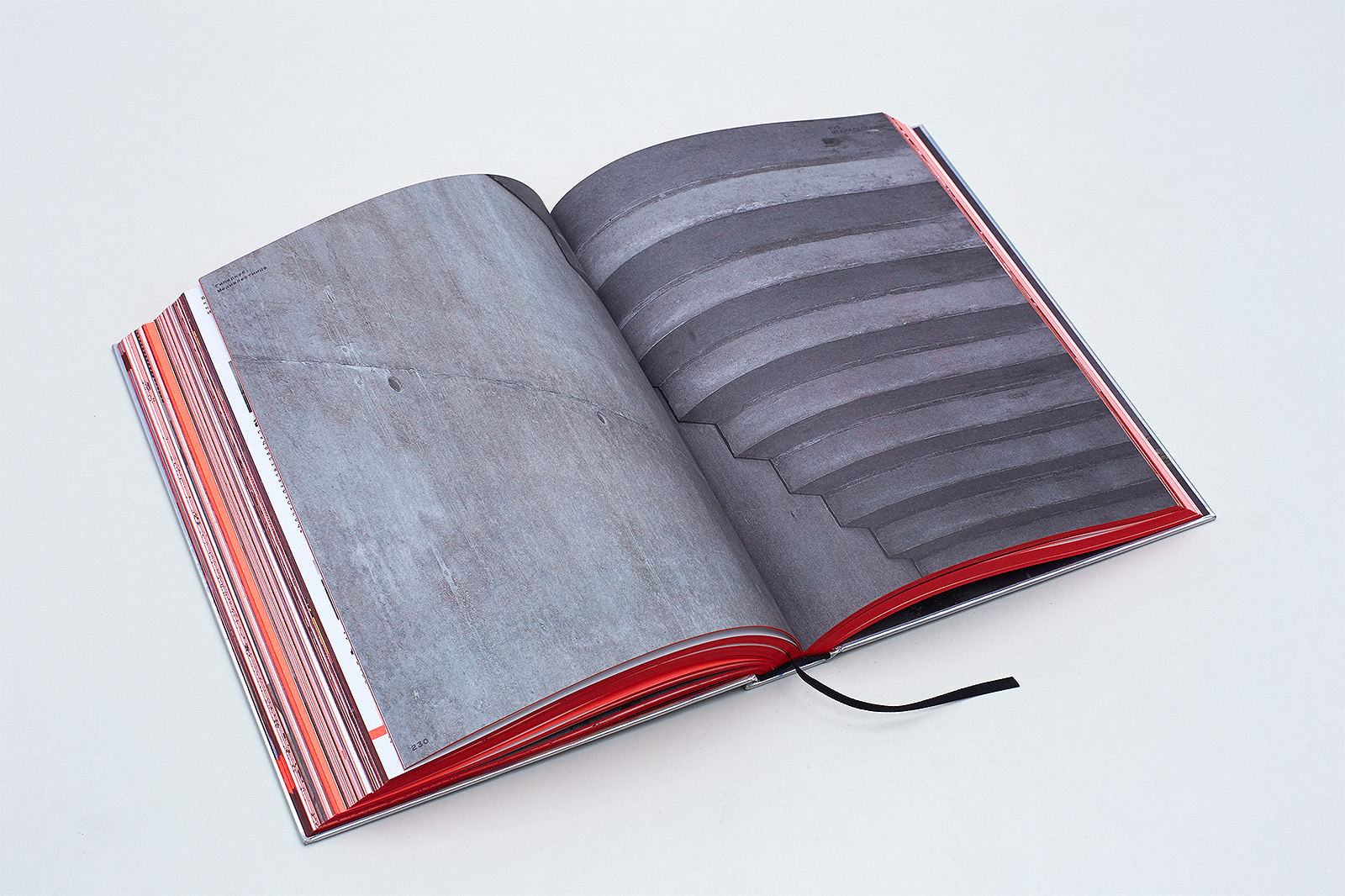
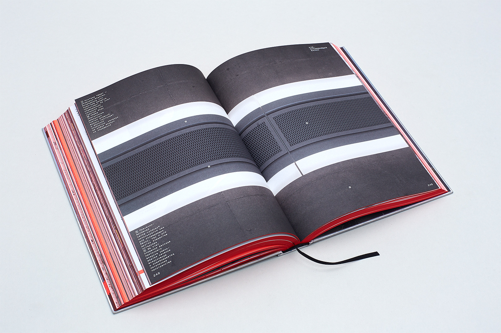
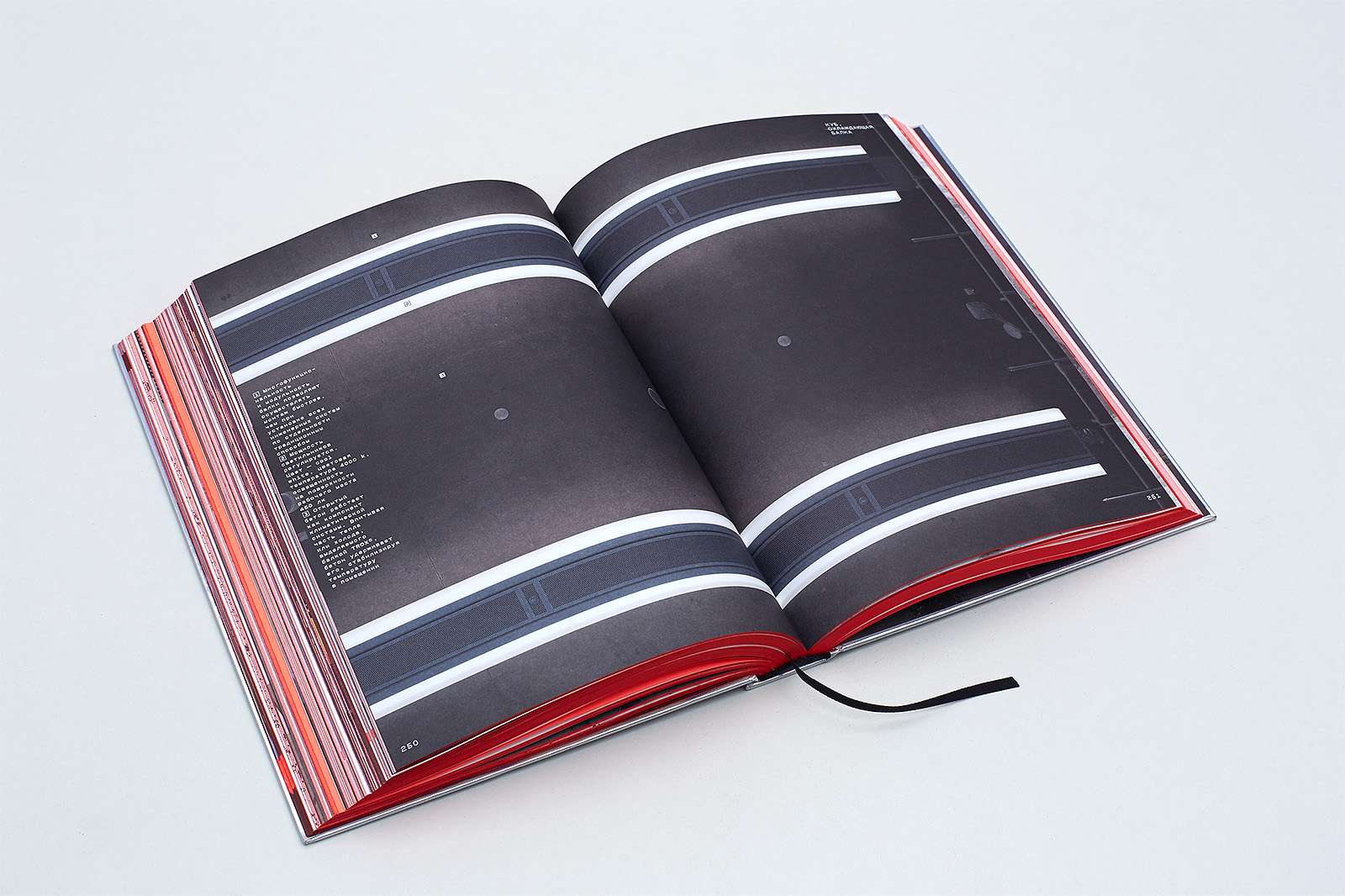
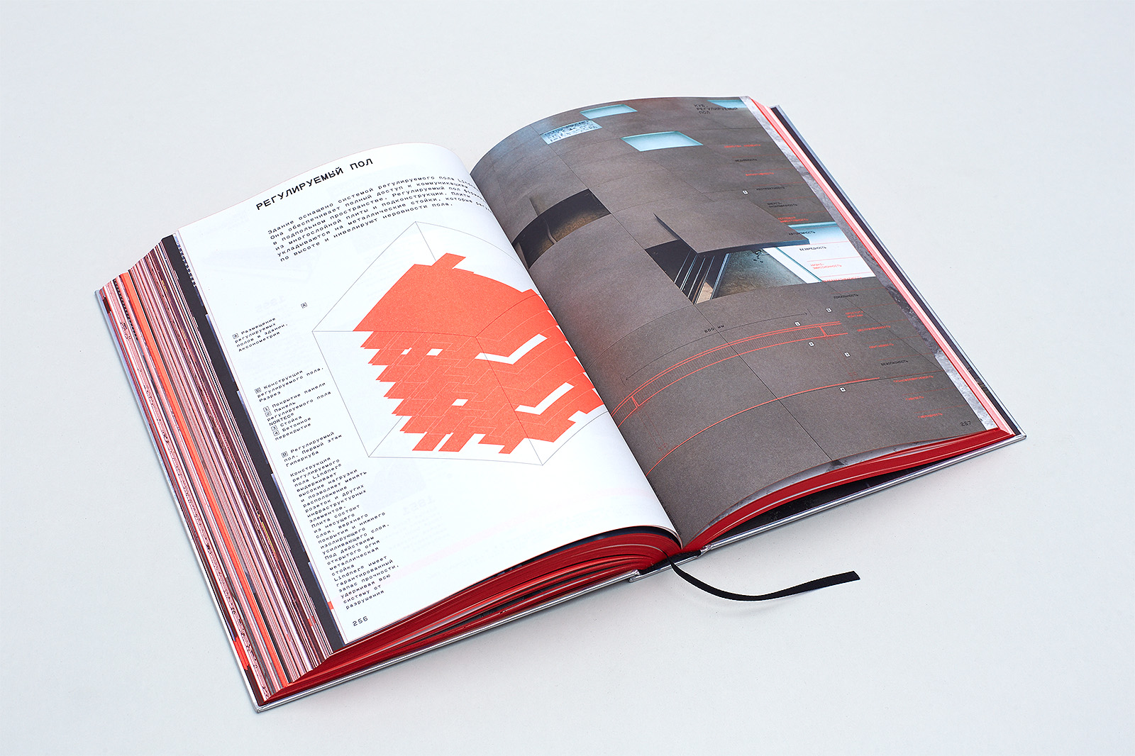
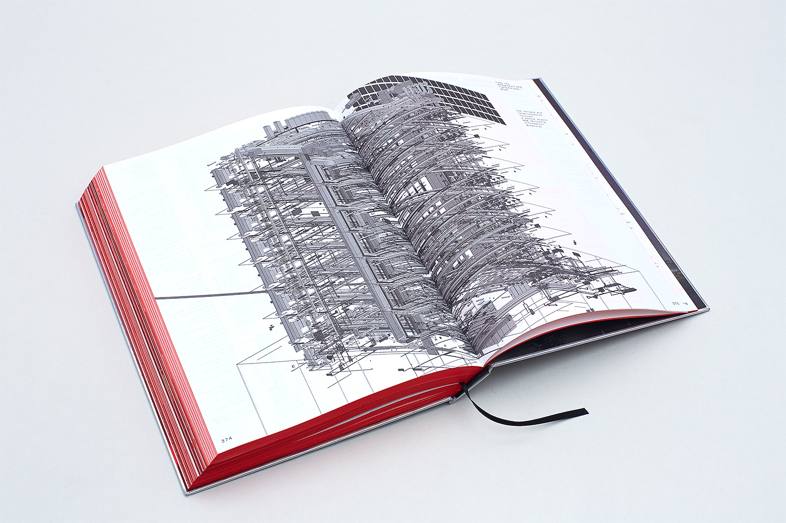
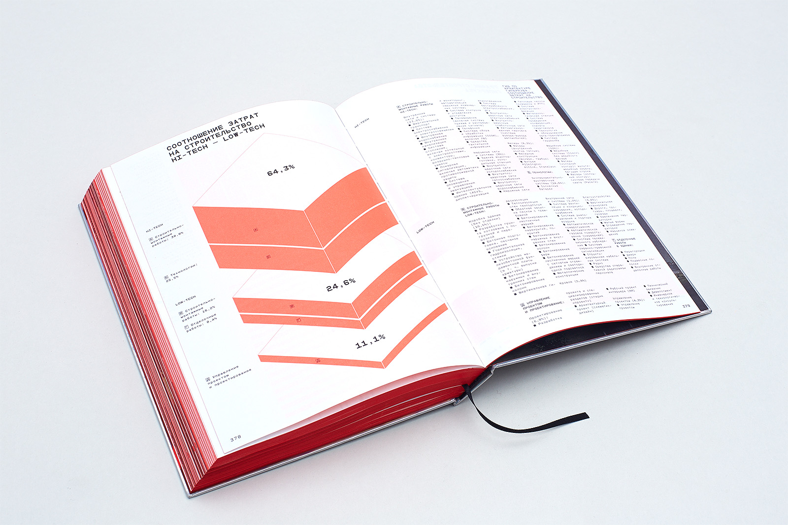
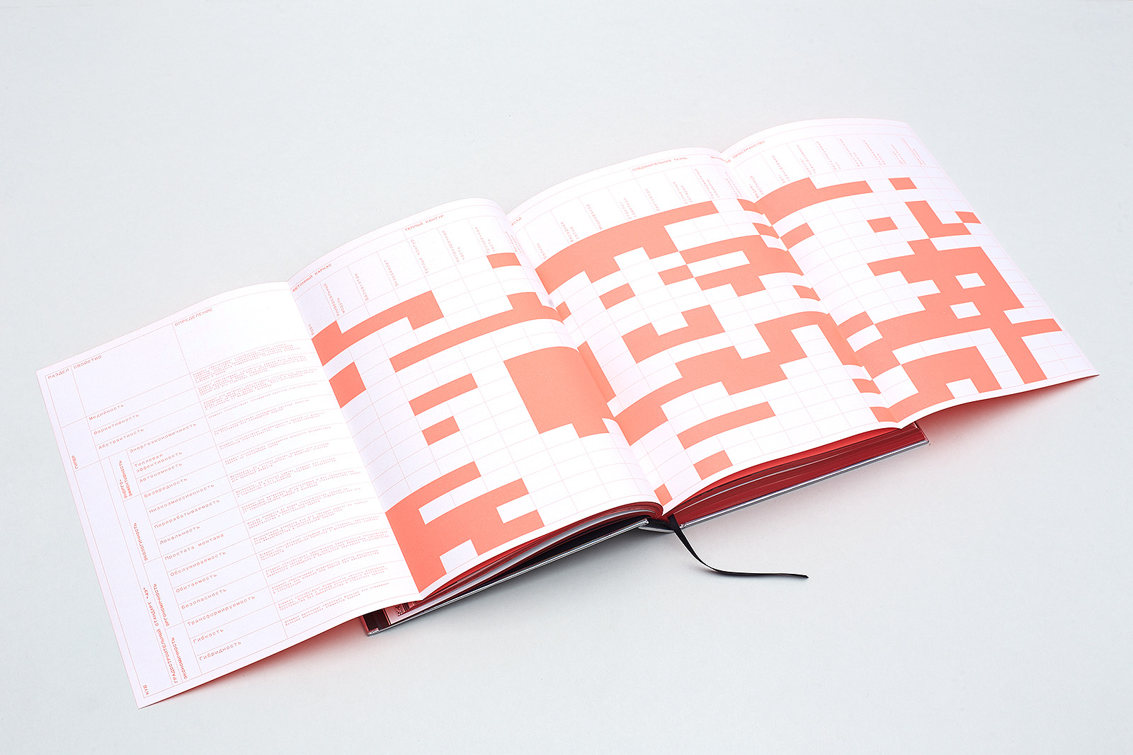
The layout features two types of content: texts and graphic elements. All the texts can be divided into two groups. Big blocks of body text: essays, articles, project documentation, including technical specifications. Small standalone blocks of text: terms, quotations, extracts with popular scientific information, reprints and printscreens of media publications. Graphic elements include project blueprints, text illustrations, the Hypercube photographs, archived construction photographs, scanned documents, etc.
Download Guidebook (PDF, 29,6 MB)
5. Typefaces
Anton Terekhov, graphic designer:
The PanOpticum typeface was created specifically for the book about the Hypercube. This geometric gothic typeface is based on letters used in optotypes, opthalmologic charts of Golovin-Sivtsev and Louise Sloan.
The character and image of PanOpticum is mainly determined by simple constructive logic: its letters are module-based (they consist of a limited number of elements), monospaced (all the characters have the same width) and monolined (vertical and horizontal lines have the same thickness).
Having started with the optotype structure where letters are inscribed into a square that consists of twenty-five blocks, their thickness being equal to one block, we developed PanOpticum into a typeface with varied thickness and saturation. Character width was changed by altering em-box proportions (3 × 5, 4 × 5, 5 × 5, 6 × 5, 7 × 5), while saturation changes depended on the line weight/module ratio.
The body type shares the same geometry and em-box width with optotype characters, but it has different forms and proportions, as well as a set of lower case letters.
Headline fonts have two character width settings, Condensed and Expanded, and three saturation settings, Thin, Medium and Fat. Body types have two versions, Book and Medium. This font also features a set of figures that allows fitting two-digit numbers into one character space.

Поделиться
Другие проекты
 MetrostroyBook
 The Russian Language encyclopedia and mobile application Book, mobile app