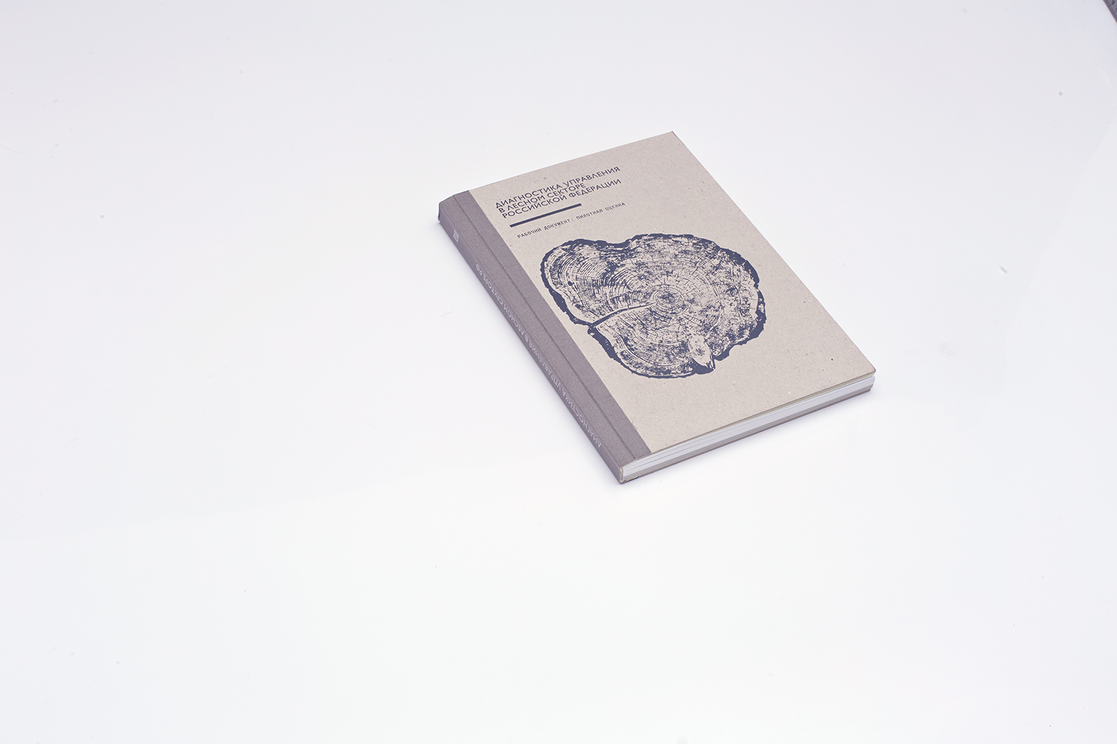
The book Forest Governance Diagnostics in Russia: A Pilot Assessment
The World Bank office in Russia suggested Masteskaya to reconsider the traditional approach to publication of reports and work groups’ analytical findings. The project included preparation of a bilingual book Forest Governance Diagnostics in Russia: A Pilot Assessment, a bilingual brochure for the 2014 Helsinki conference, and the visual identity development for the FLEG program (Forest Law Enforcement and Governance).
Pages: 172
Paper: offset Munken Lynx 130 g/m3, Mondi Maestro Trend grey GR21, 80 g/m3
Printing: four color offset printing
Cover: Hardcover, Smurfit Kappa grey cardboard, 1.9 mm
Finishing: matte color foil embossing
Number of copies: published in two languages, 200+200 copies
1. Team
Creative Direction
Dima Barbanel
Publisher
World Bank
Editor
Vladislava Nemova
Typefaces
Linotype design studio, Paratype
Infographics Designer
Vadim Ilyin
Photo Editor
Irina Zhuravleva
Illustrations
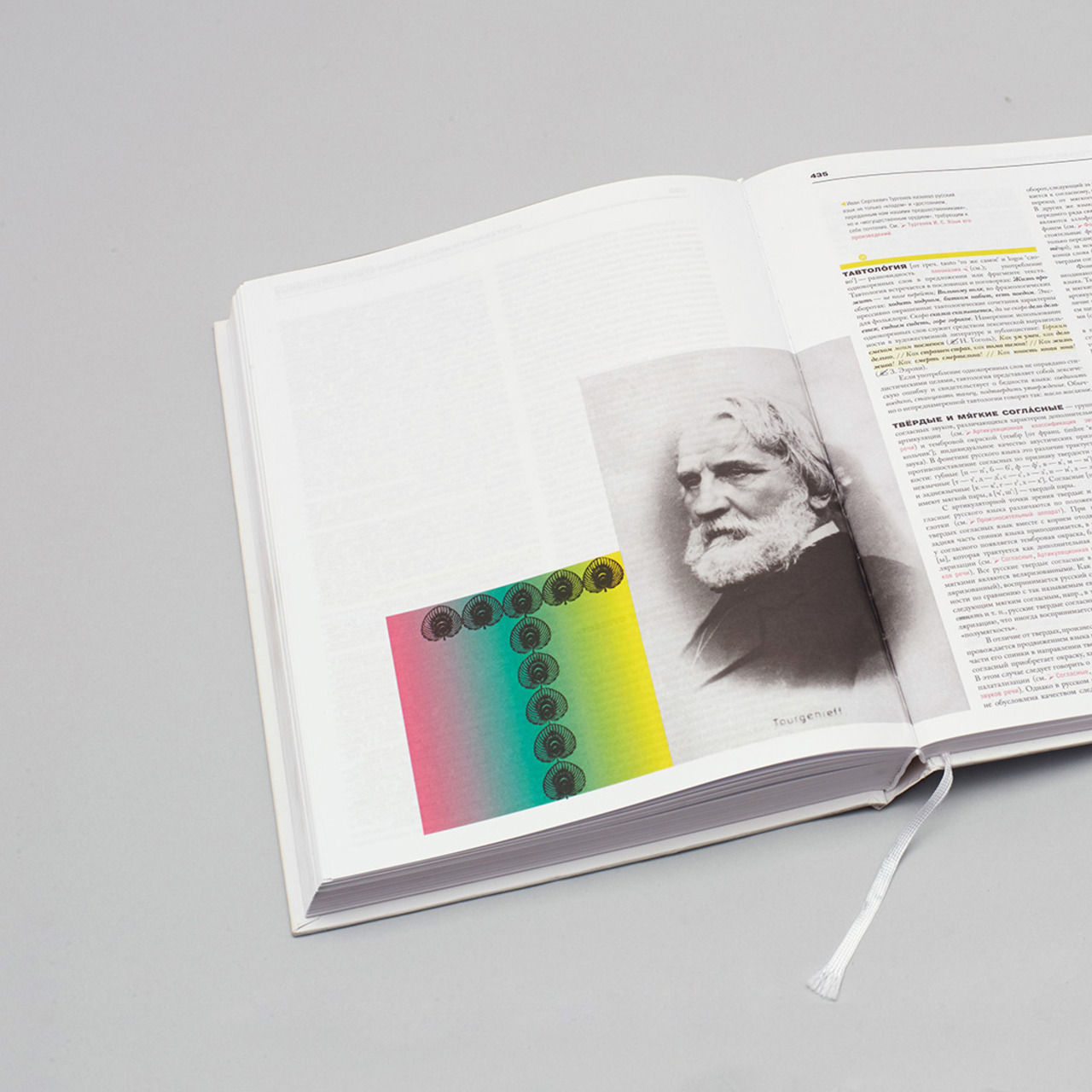
Matt Moore, Mie Morimoto, Evgeny Evgrafov, Shimobros, Ellie Davies, Gregory Euclide, Tata Vislevskaya, Weston Teruya, Rostislav Mashin. The publication uses materials of the Russian Imperial Geographic Society Expedition to Central Asia, Altai and Caucasus, 1900–1910.
Color correction and Prepress
Mikhail Shishlyannikov
Printing Manager
Elena Kaporskaya
© Masterskaya, 2012
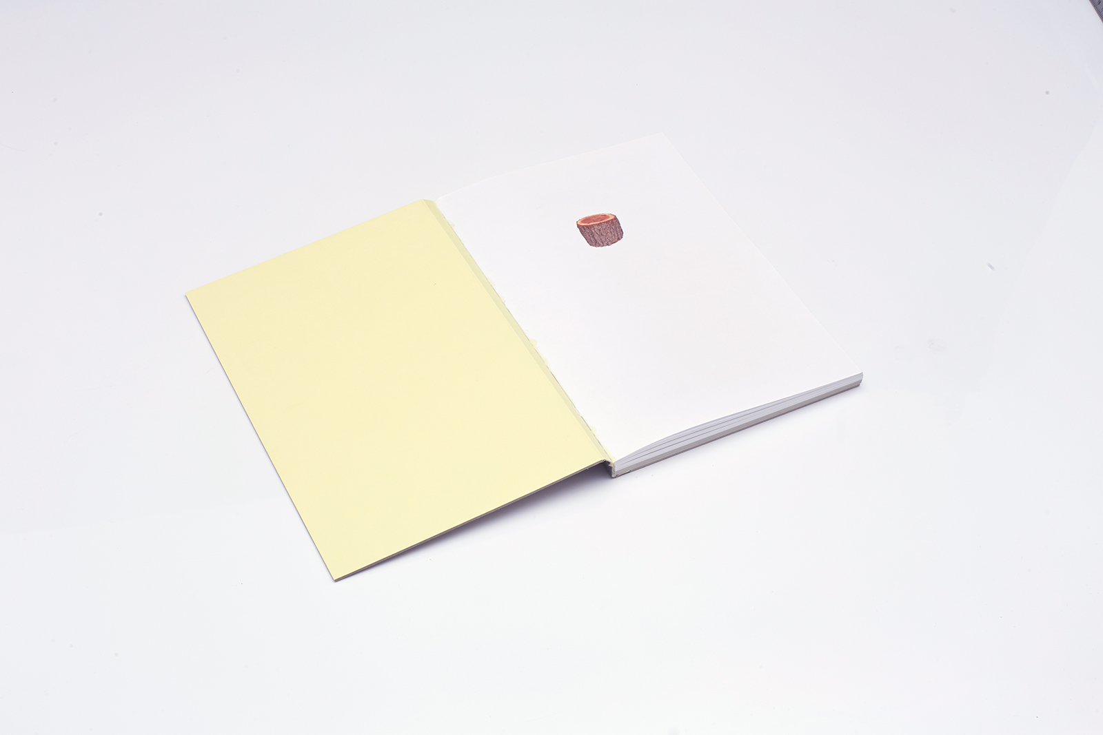
The cover is made of recycled cardboard, which is usually concealed by the endpaper backing. Here it symbolizes effective resource management — exactly what the book is about. The cover is trimmed to the size of the book block. The front endpaper is backed with Gmund 51colored paper.
2. Idea
Breaking the mold is the best way to interest someone in what you do. However, in this project we were not absolutely sure about our boundaries, and we could not define just how serious we were supposed to be: visual stereotypes of a Russian and an American client differ greatly.
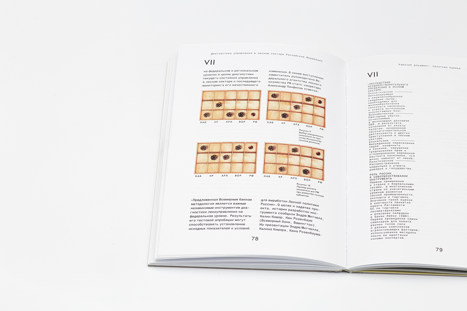
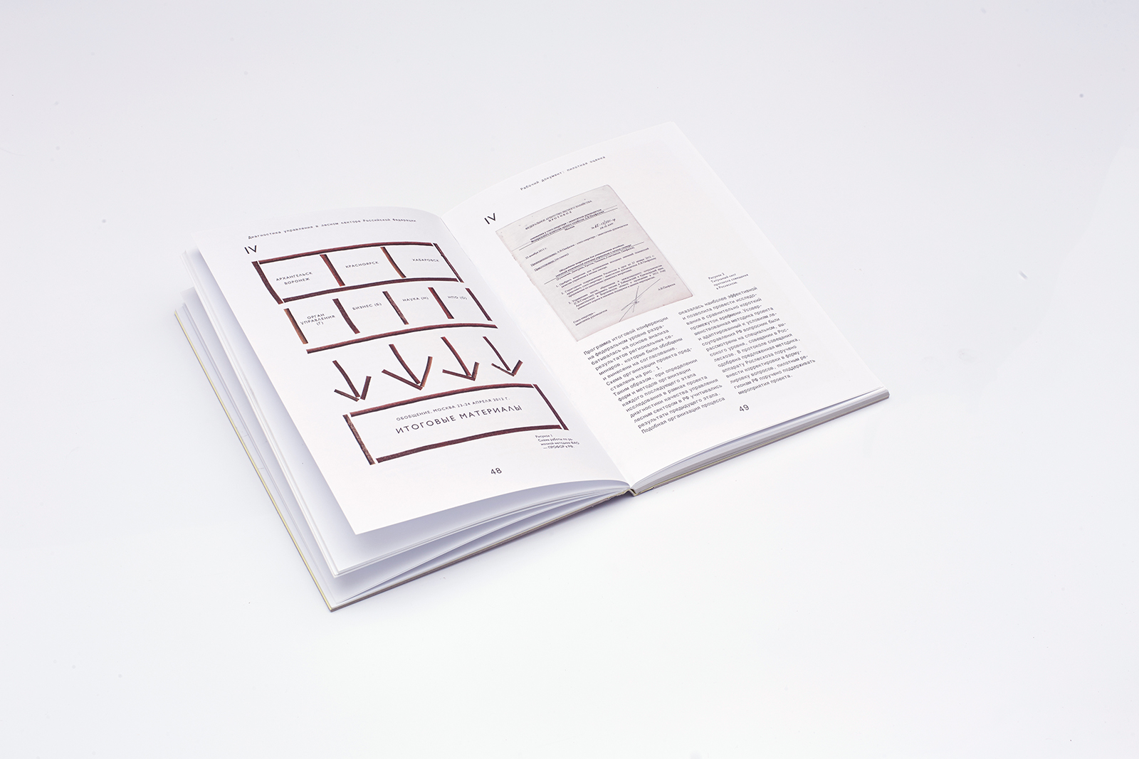
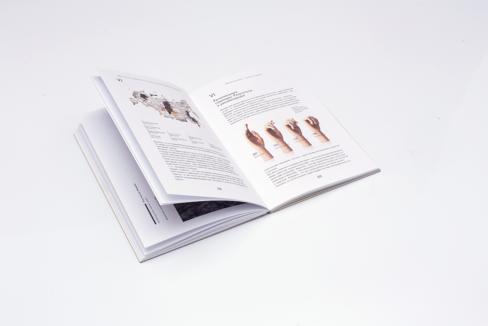
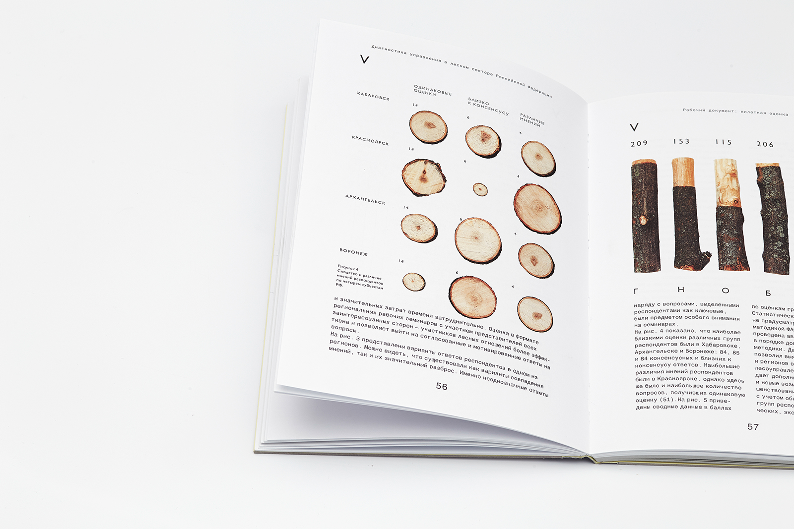
The operational documentation given to Masterskaya for this project became a unique artifact, a separate publishing unit that had nothing in common with office printouts or Power Point presentations. Visually precise, unusual infographics by Vadim Ilyin (Iconography, Vokrug Sveta); photographs reflecting the change of seasons; graphics on the relationship between man and different ecosystems; intentionally rough finishing and materials with no design luster — it was all included into the expanse of the low-contrast monospace text with white paper overpowering the printed area.

One of the ten illustrations by contemporary artists on the topic of the relationship between man and nature used in the book. Matt W. Moore, Life, 2010.
3. Solution
The layout of the book uses a classical grid based on the Fibonacci sequence. Its width equals to its height divided by Fi. All typometric relations inside the format, including the variety of all font sizes, are defined by the book height.
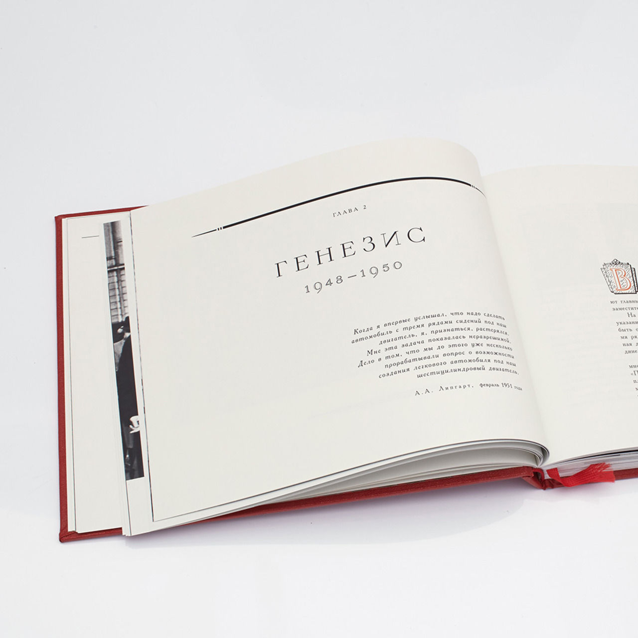
The body face is large and simple; font size varies from 25.78 to 7.11 pt. The difference between typesetting elements results from the visual contrast of Gill Sans and Helvetica World, as well as such parameters as word spacing, character spacing and indent sizes. We used Gill Sans in three sizes as the display font for the whole book. Quotes are set off by bars aligned with the text xHeight level. Text starts with a monotonous rhythm of one-column typesetting that takes up the whole layout width, and then it breaks down into one or two narrow columns; the body of text is intersected by double page spreads with photos or illustrations by contemporary artists from Japan, the USA, and Great Britain, who have been contributors of Masterskaya since the Hermitage magazine project.
The layout uses a symmetrical grid based on the first Fi breakdown, the consecutive dimensions division by 1.618. The layout consists of four columns, 25.81 mm each, whose size is equal to the inner and outer vertical fields.
The primary typesetting sizes are 9.441 / 12.878; word spacing 57, character spacing 1. Secondary typesetting parameters are connected with the primary ones. Typesetting sizes 7.546 / 8.586 pt, word spacing 90%, character spacing 20%. Primary/secondary typesetting ratio: ¾.
The body text either has one-column typesetting that takes up the whole page width, or two narrow columns, ¾ of the page width each. Secondary typesetting parameters: one column, ⅓ of the page width.
The width of the caption block is ¼ of the page; it uses Gill Sans regular 7.119 / 8.586 pt. Typesetting ratio of captions to body text: ¼. Gill Sans Regular headlines’ sizes are 17.278/16.437 pt, and they have negative line spacing. Primary/secondary typesetting ratio: ⅕.
4. Typefaces
The book uses two gothic typefaces that have nothing in common. It is the Roman gothic Humanist 521 (a version of Eric Gill’s Gill Sans released by Monotype in 1928–1930) and Helvetica World, a neogothic typeface, which stems from old gothic traditions and the Helvetica typeface (1957), reissued in 2001 by the Linotype type foundry.
Eric Gill was not a professional type designer in the modern sense. He was an English artist, who mastered stone carving, as well as a graphic designer, a calligrapher, a sculptor and a thinker. His typeface designs gave a new life to Edward Johnston’s ideas, his friend and mentor, who revolutionized the views of English and German calligraphers and graphic designers of the early 20th century.
Gill Sans is, in fact, the development of Johnston’s ideas found in his Johnston Sans typeface, which was created (in cooperation with Gill, by the way) for the London Underground in 1916. Gill Sans is a remarkable example of British graphic design. It still looks lively; the irregular and free character features make it effortless and, so to say, “literary”. The Cyrillic version of the typeface was created by Vladimir Efimov and Isabella Chaeva, and the extra bold face was designed by Tagir Safaev. The ParaType company reissued Humanist 521 in 2013. The Humanist 521 type family works in this Masterskaya’s project both as the lead singer and the prompter: it is used for the headings as well as for footnotes, marginal notes and background information, and it does its job really well.
We chose Helvetica World as a counter to the lightweight, self-willed gothic Humanist 521 — static, absolutely precise after years of releases and reissues, associated with the Swiss neutrality and accuracy. Helvetica, its predecessors and creators have already become legendary, and there is no use in repeating their stories here. Helvetica World, however, is a more interesting topic. It supports all basic languages, consists of 1866 characters and has a wide range of faces. The Cyrillic version of this typeface was created by John Hudson in collaboration with Maksim Zhukov. It contains the familiar features of the Akzidenz Grotesk font family that appeared in Russia in the early 20th century in the St. Petersburg branch of the Berlin firm H. Berthold AG. The notable sprawling arms and legs of the Russian letters “К”, “к”, “Ж” and “ж” create a vivid image and a rich texture.
Supplementary material uses two color printing on Mondi Maestro Trend grey GR21 colored paper, 80 g/m3. Body type: Gill Sans Regular 7.546 / 8.586 pt; word spacing 90%, character spacing 60%.