Hermitage magazine
Hermitage is a quarterly cultural magazine established by the State Hermitage Museum.
It is nothing like other art, let alone museum, magazines. Several types of paper, embossed hard cover, all sorts of inserts, a rave of fonts, innovative design techniques.
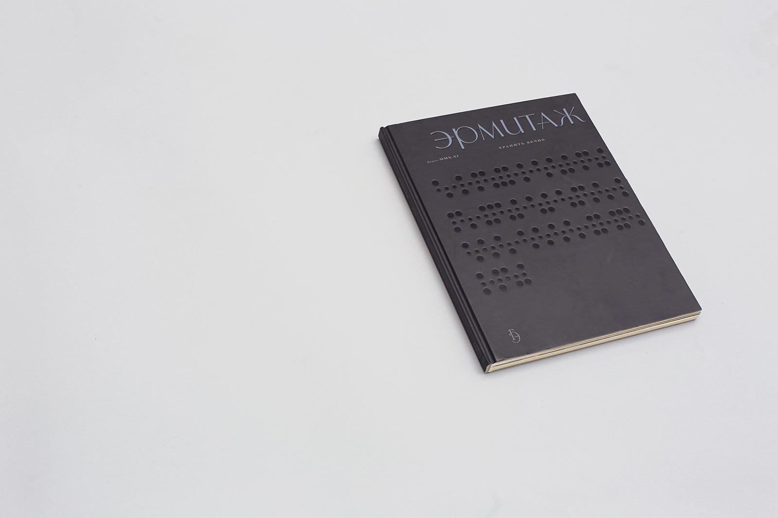
1. Team
Creative Direction
Dima Barbanel
Zhdan Filippov
Publisher
Hermitage XXI Century Foundation
Founder
The State Hermitage Museum
Chief Editor
Sergey Monakhov
Picture Editor
Ilya Korobov
Typefaces
Yuri Gordon
© Masterskaya, 2010
2. Idea
The main theme of the 2010 Fall issue of Hermitage is contemporary art. Cryptography and decoding are its secondary topics. Therefore, the magazine views contemporary art as an encrypted sign system with a lost key, and it sees a museum as a universal decoder that can decrypt the most difficult codes.
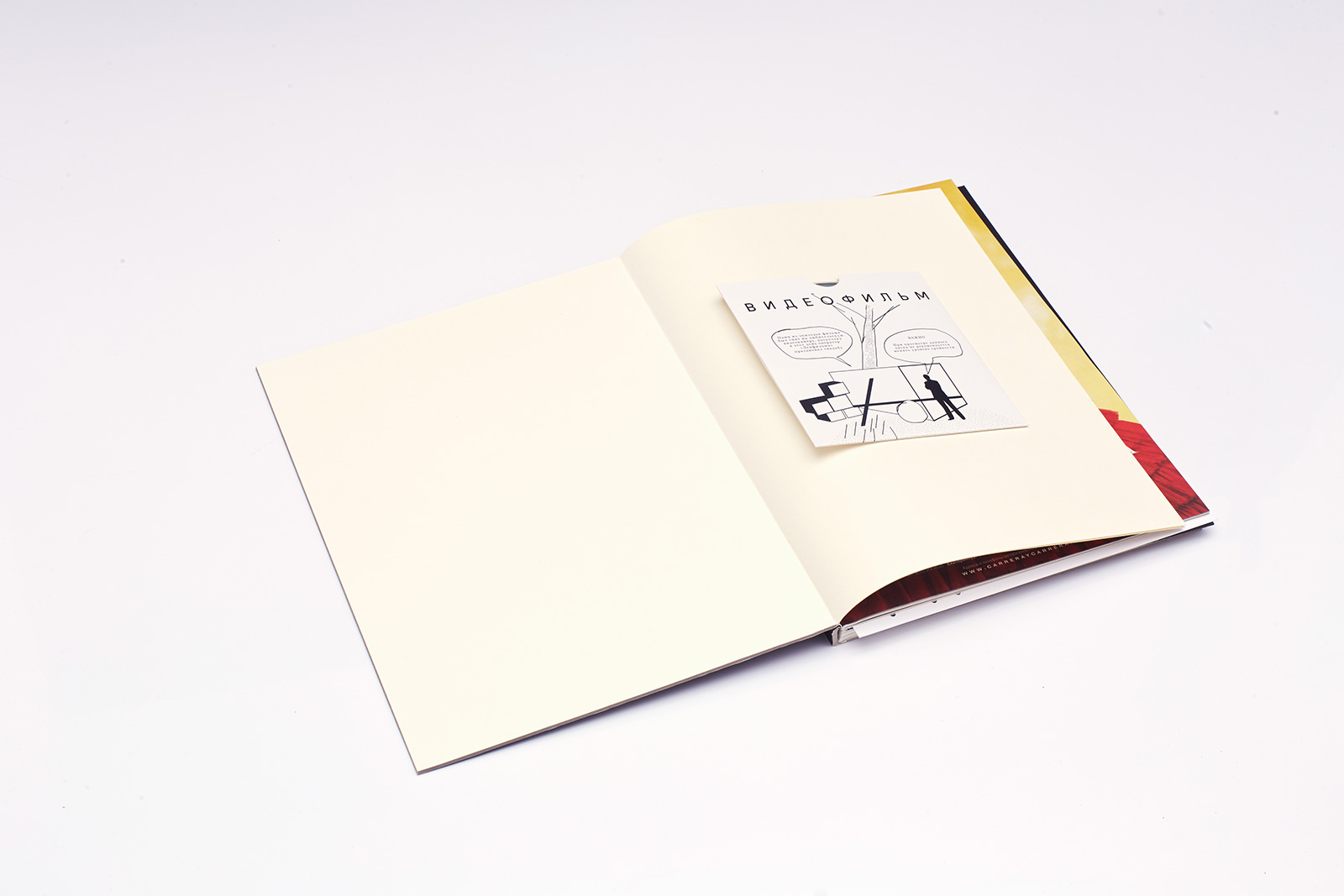
Front and back endpapers are backed with Ivobel paper. The CD contains a concert film by Oleg Karavaichuk; the illustration is a sketch of a volumetric-spatial composition installed in the State Hermitage courtyard by the artist Protey Temen with the assistance of the editorial staff.
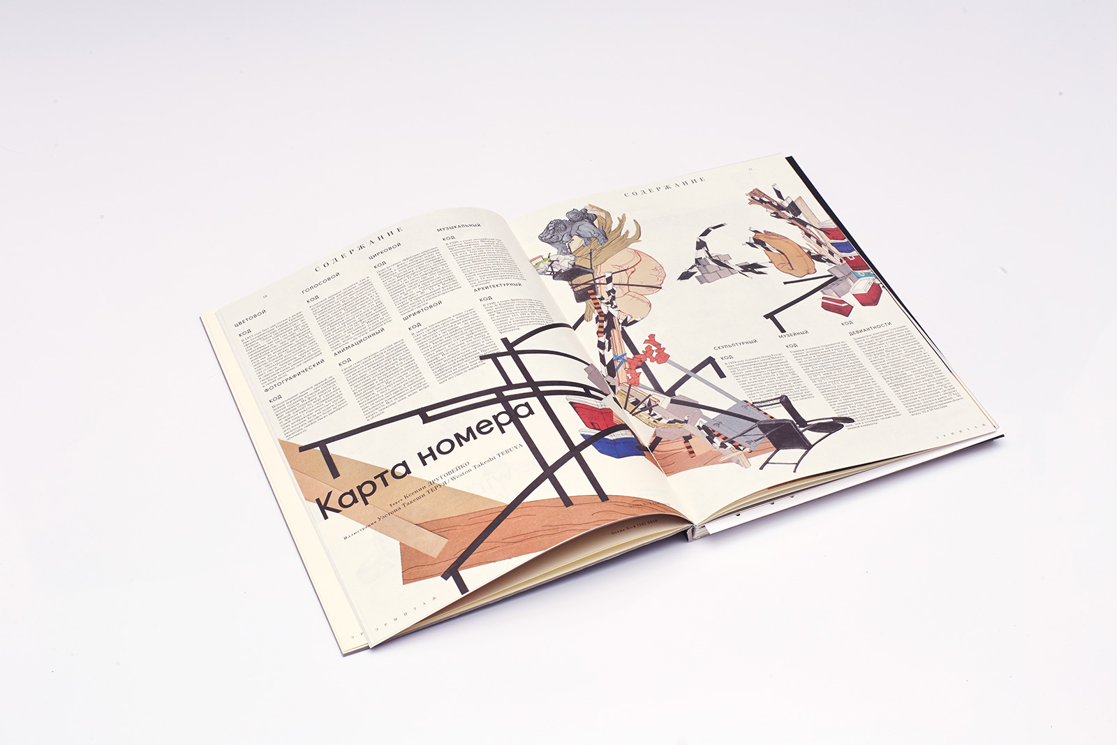
Contents or “Magazine Issue Code” — Illustration by Weston Takeshi Teruya, small 21Cent font.
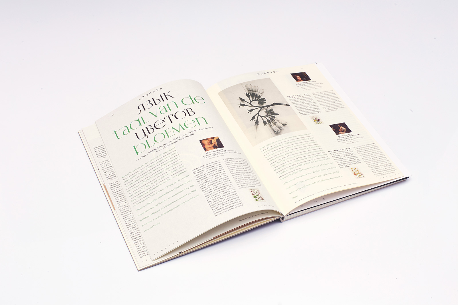
An article on the language of flowers in art. Parallel typesetting: alternating lines in Russian and Dutch. The Hermitype typeface includes several unicase sets.
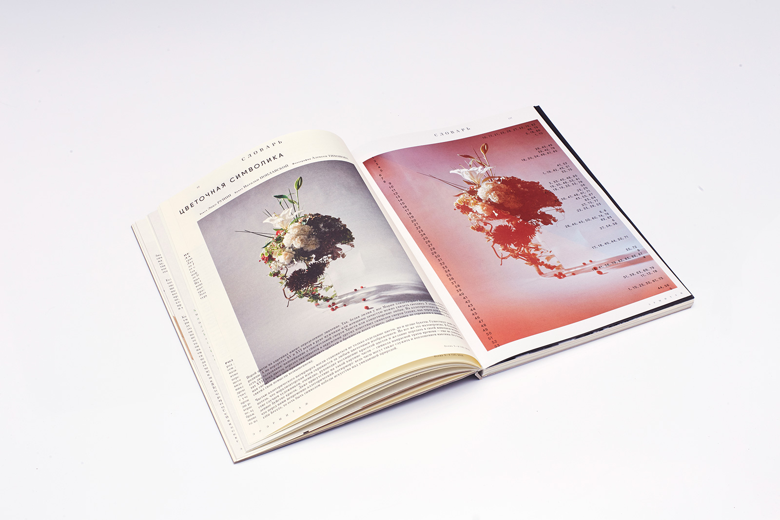
The continuation of the article on the language of flowers in art. The recto is printed on soft coated paper, while a bulky yellow-gray offset paper was used for the verso. A special card with a key to decrypting a text cypher is inserted into this double page spread. Two photos of a beautiful bouquet: one taken with a vintage analog camera, the other with a digital one.
3. Solution
A symmetrical composition of the issue is created by interreflecting big and small narrative circles. The development of ideas in each circle goes along the following path: reality — art — code — art — reality. The smaller circle in a way follows the movement of the big one on another scale and from another historical perspective, communicating the idea that the processes discussed are eternal and unchangeable.
The main concept feature of the issue is multiple recoding of messages by means of various sign systems, as well as an experimental test of the adequacy of their perception by different people. The magazine encompasses almost every imaginable language of art: architecture, music, sculpture, painting, photography, cartoon animation, cinematography, circus, language arts, and flower language.
The magazine was meant not only for reading, but also for working with it. This is why several tools have been included in the issue: a mirror CD disc, 3D glasses, a punched card for text decryption, a die-cut frame for examining image details.
Many materials were specially created for this magazine issue: a mini-album with O. Karavaichuk’s music, Y. Norstein’s drawings and film project, essays by L. Petrushevskaya, S. Nosov and P. Krusanov.
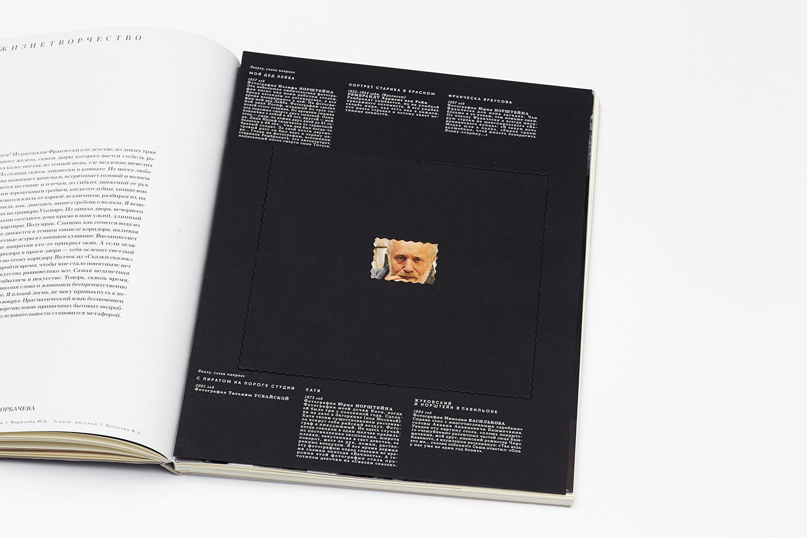
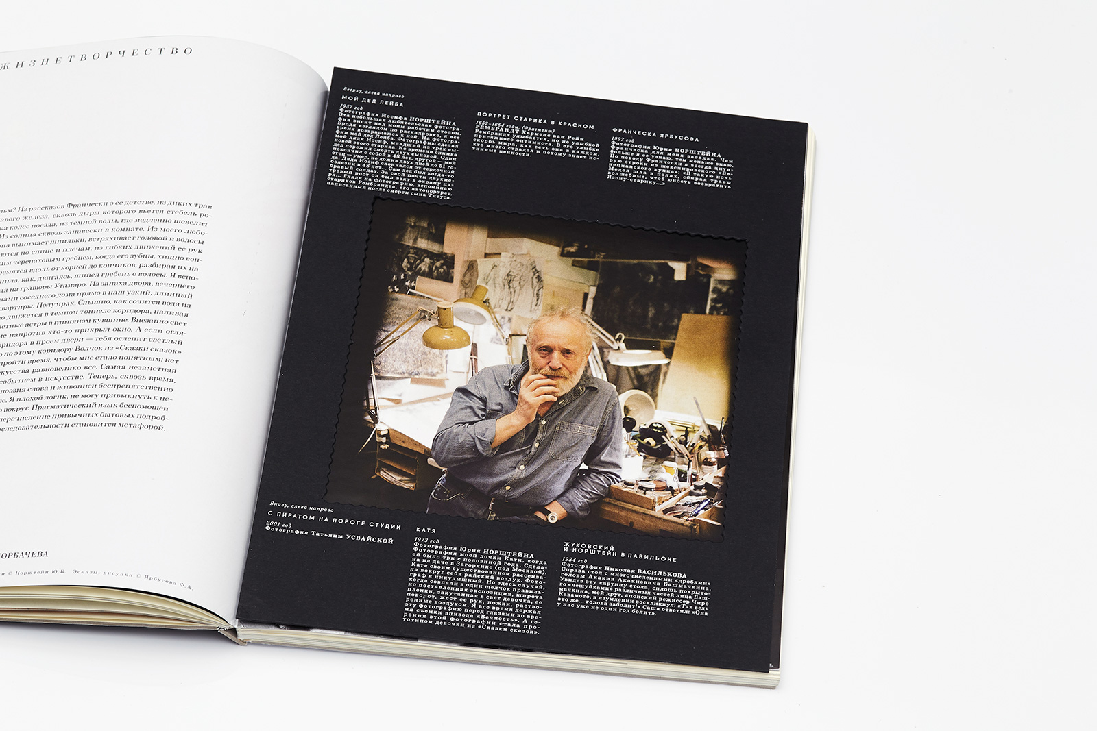
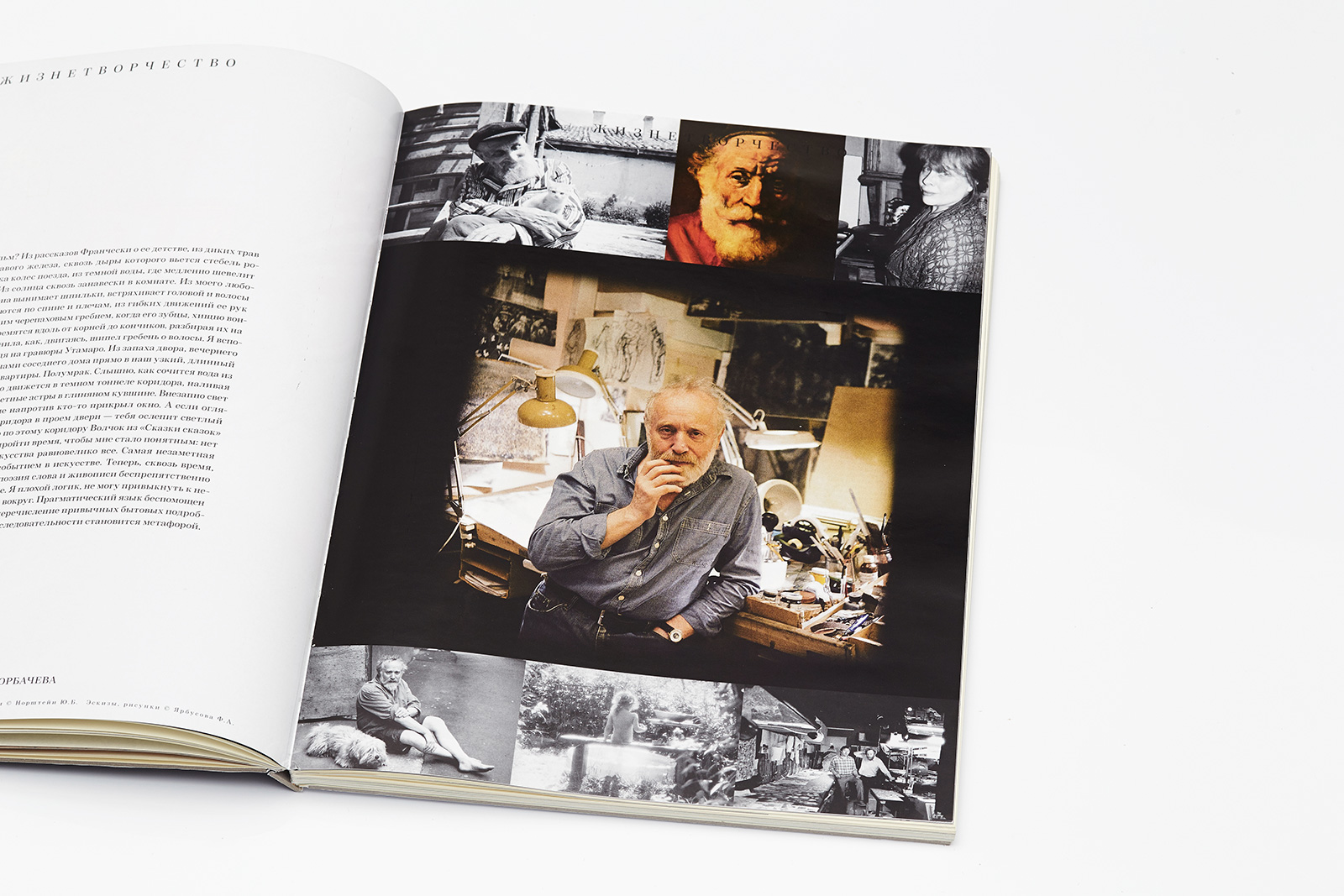
Two sheets with ornamental die-cut frames were inserted into the recto. Gmund colored paperboard, Pantone 877 printing.
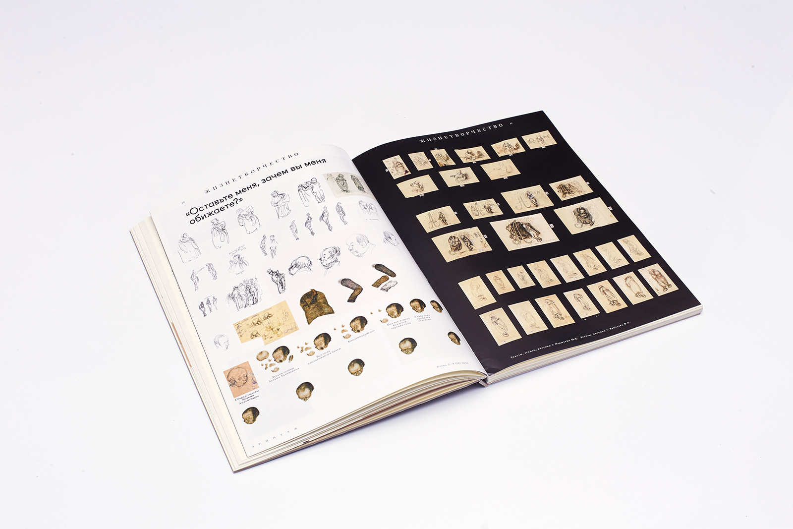
The continuation of the article on the life and creative work of Yuri Norstein; a guide on the object environment of The Overcoat animation film with the director’s comments.
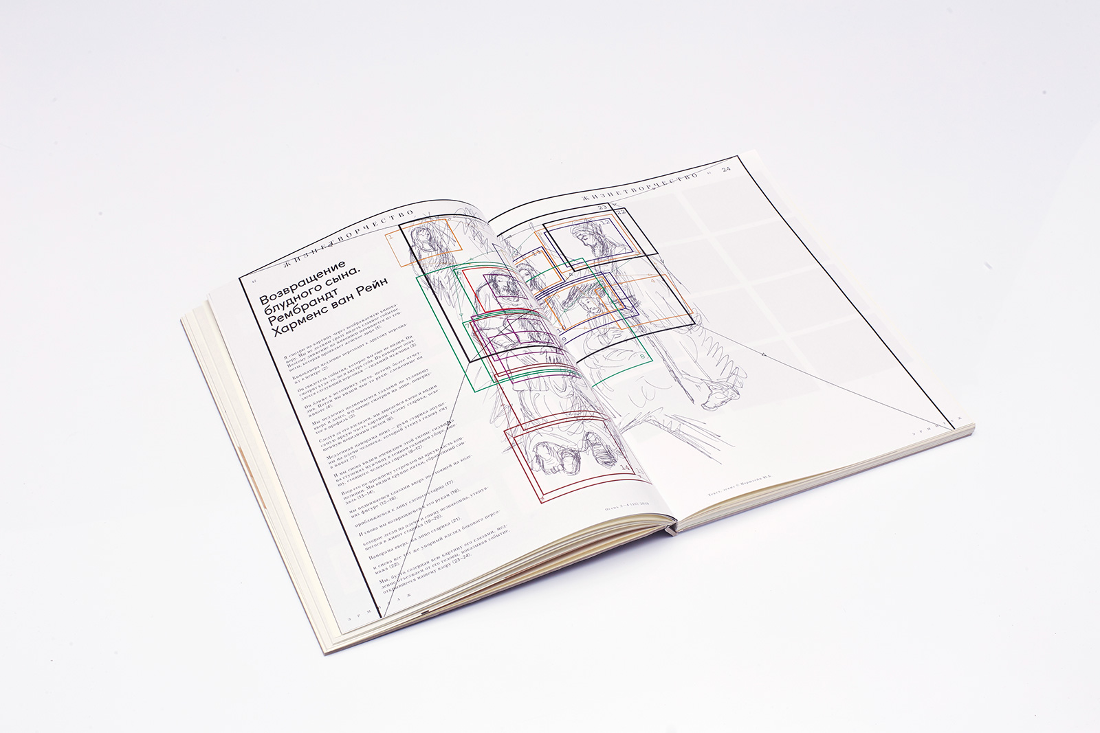
The reproduced original storyboard by Yuri Norstein: scene sequence and structure based The Return of the Prodigal Son by Rembrandt.
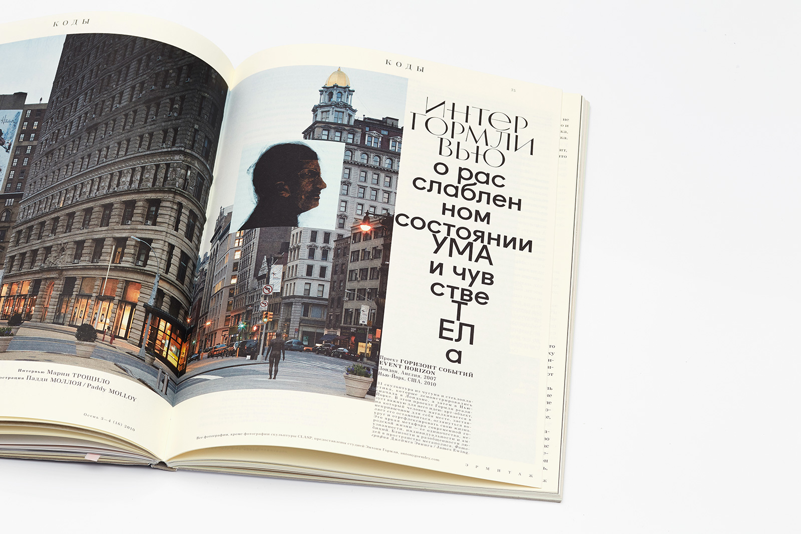
Opening page of the article on Antony Gormley. Illustration by Paddy Molloy.
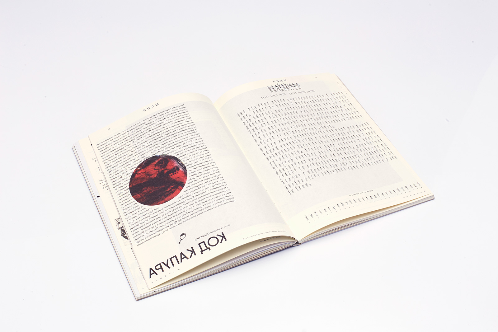
The verso contains the final part of the interview with Anish Kapoor; mirrored text. (In order to read it, one should use the provided mirror CD disc with Oleg Karavaichuk’s concert film recording.) The recto contains the beginning of the interview with Antony Gormley, which is set in the Dancing Men code typeface, designed by Evgeny Yukechev following the sketches of Gormley’s sculptures.
4. Typefaces
The Hermitype typeface, created specifically for the magazine. This unicase font family comprises characters of different styles that are formally tied with the slightly playful art deco structure.
One of the first examples of brilliant typographic compilation, inspired by the works of Paul Renner, Fugue first appeared in 2008, and a month before the layout release, Radim Peshko, the author of the typeface, released its Cyrillic version. The typeface is available at http://www.radimpesko.com/fonts/fugue
21Cent, a free version of Century typefaces, carefully visualizes the peculiar features of contemporary Russian literary language.
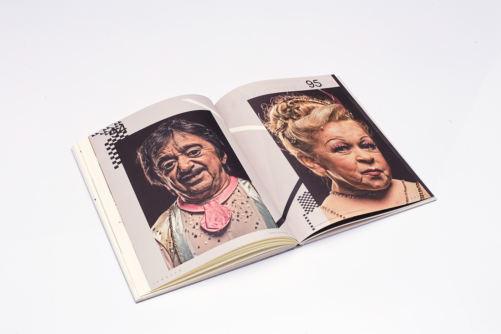
Portraits of Cirque du Soleil performers by the head photographer of The State Hermitage Museum Yuri Molodkovets. There are three double page spreads in different parts of the magazine which all illustrate Konstantin Zilberburg’s play Balaganchik.
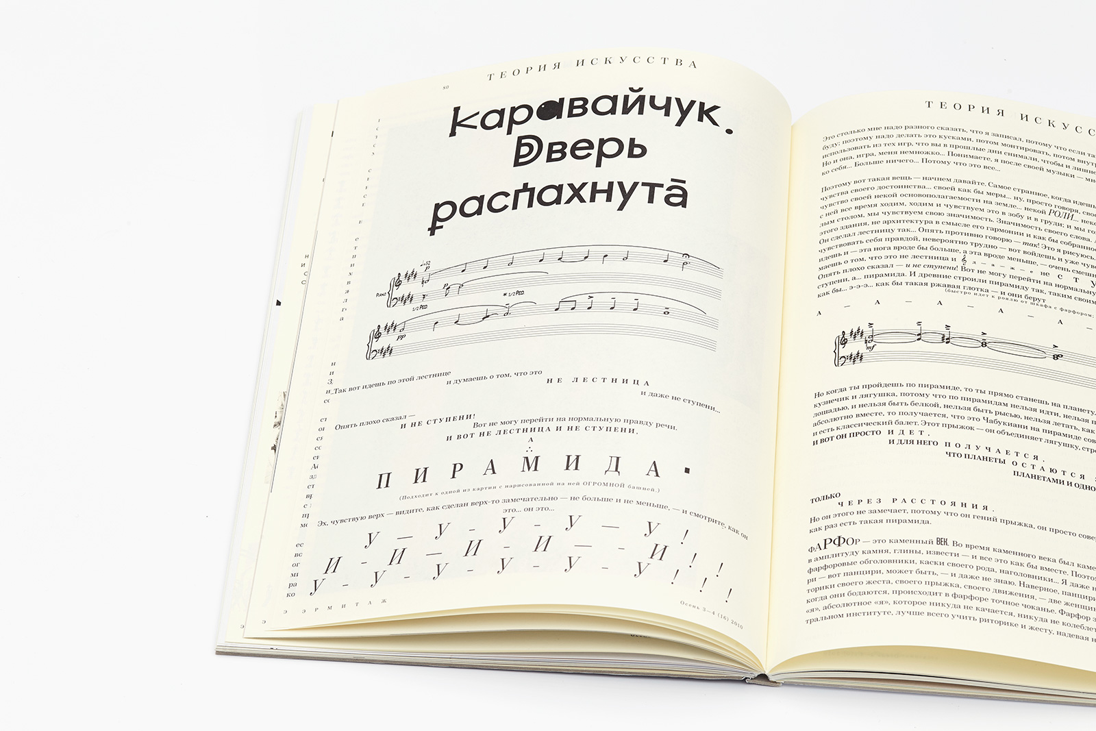
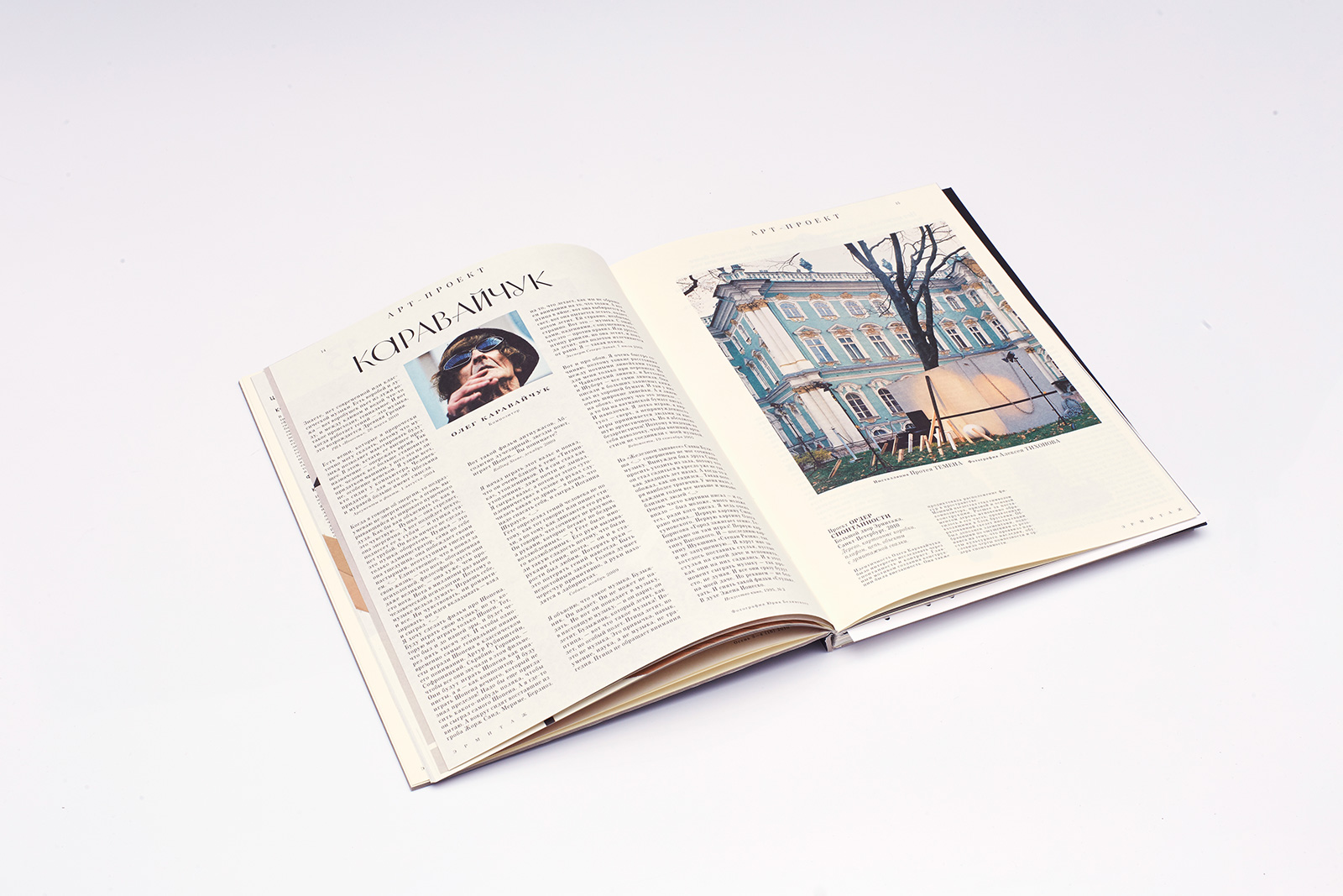
The composer Oleg Karavaichuk designed the text of his philosophical monologue himself, having placed all the emotional emphases, which, in fact, defined the structure of the text.
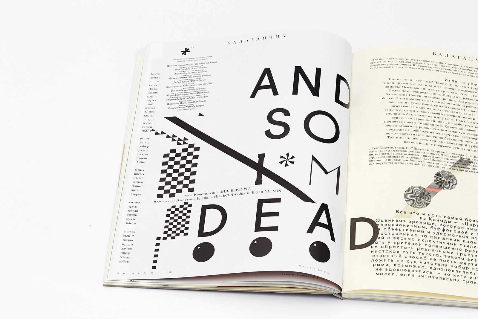
Illustration for Balaganchik by Justin Bryan Nelson. English language typography in the Russian issue and Russian language typography in the English one.
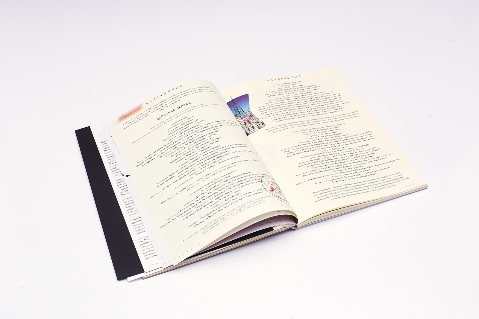
The text is centered and it uses the Fugue typeface with three kinds of emphasis.
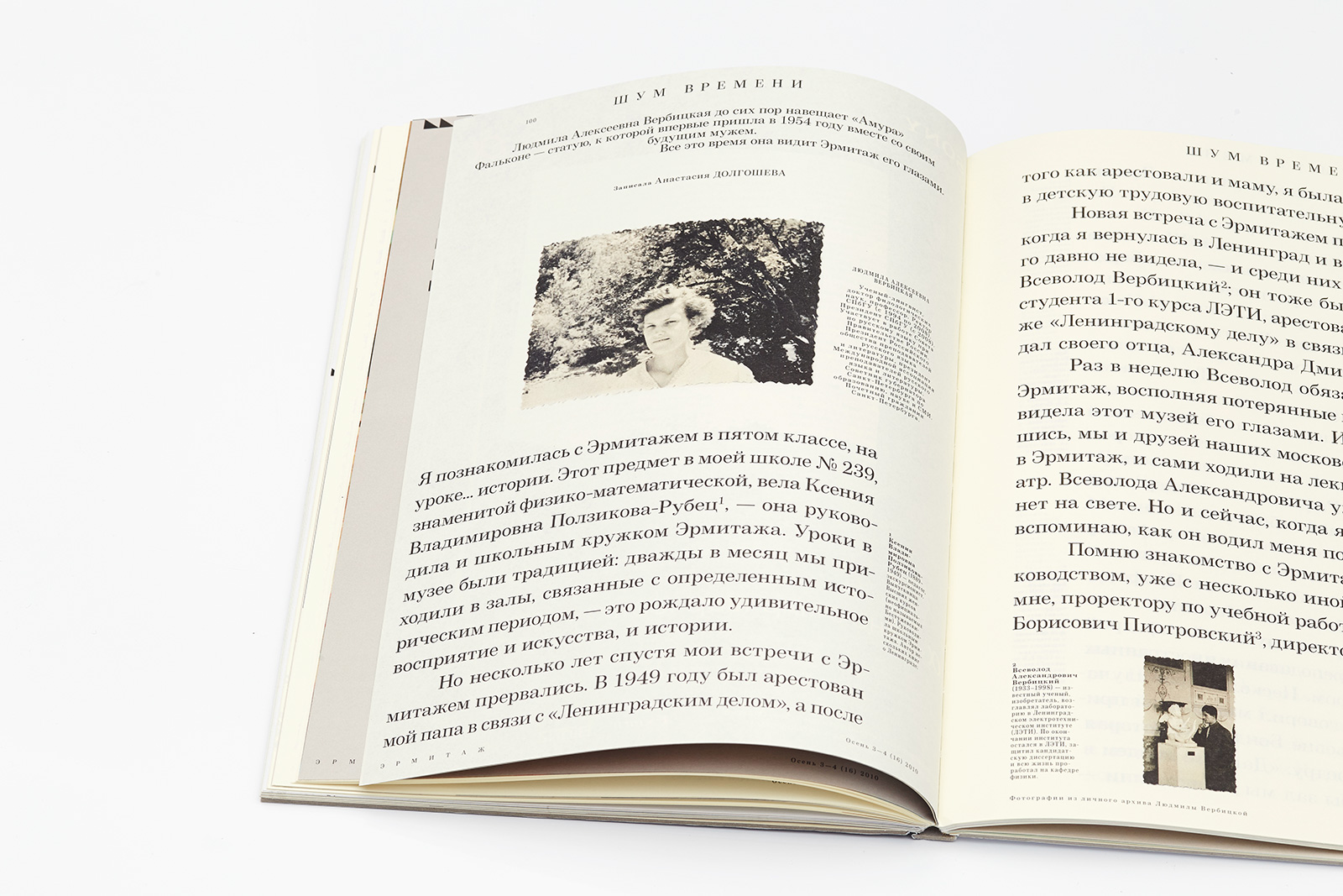
The introduction and body text typesetting parameters have switched places in this section: it was important to draw reader’s attention to this material. Double-spaced, font size 26.17 pt.
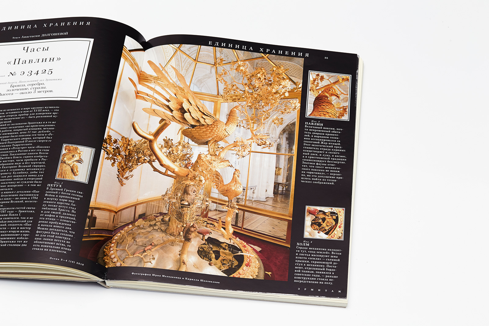
A typical magazine section consisting of two double page spreads about the design of an especially valuable exhibit.
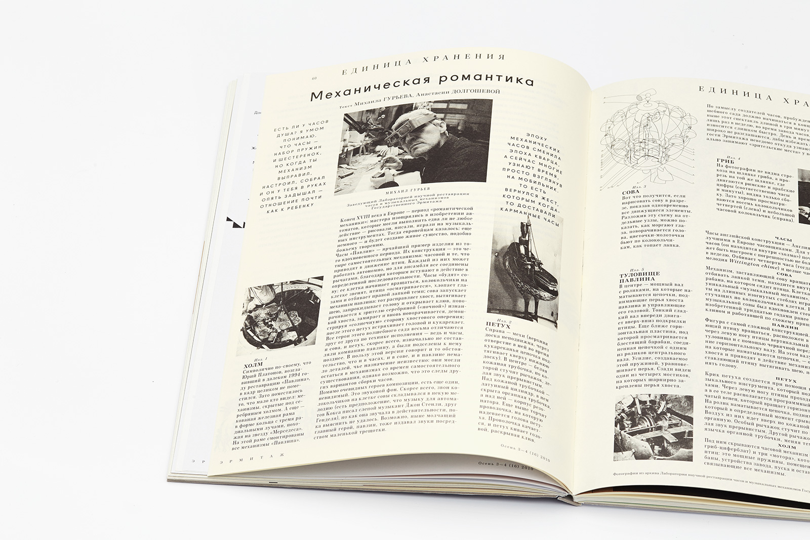
The second article about the same exhibit consists of three interconnected textual flows, and has the structure of a guide list.
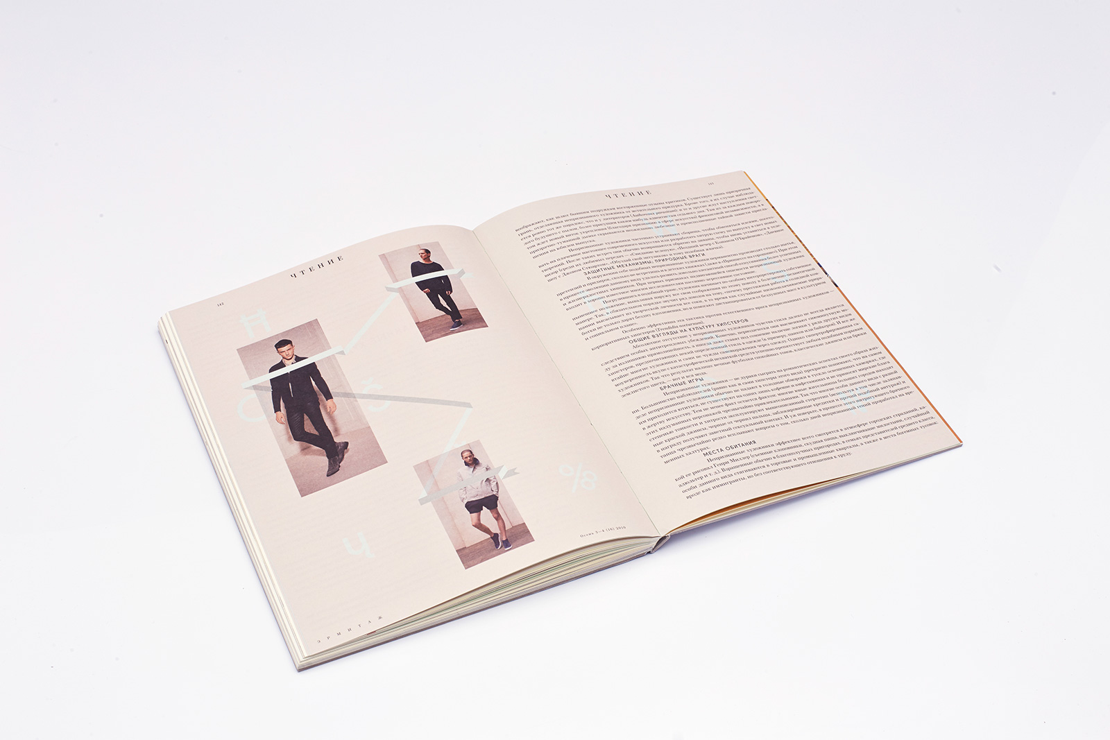
Illustrations from the Acne lookbook. The bleed is very thin.
Другие проекты
 Vokrug Sveta magazineMagazine
 Barcode City magazineMagazine