Business Molodost
Business Molodost is a Russian coaching company that commissioned Masterskaya in 2012 to do the company’s rebranding and create a website. In 2015, they commissioned Masterskaya to prepare a wonderful and cheerful book, a textbook of life, which grew from a collection of autobiographical essays, exhortative LiveJournal posts, and idle reflections on the nature of the so-called homo soveticus.
Pages: 372
Paper: Cyclus Offset 115 g/m²
Color: 6+6, CMYK, Pantone 814, Pantone 5463
Cover: 2+0, Pantone 814, Pantone Black 6
Glossy Dutch hardcover
Front/back endpaper: Cyclus Offset 140 g/m²
Number of copies: 300
1. Team
Authors of the book
Mikhail Dashkiev, Petr Osipov
Page layout
Dima Barbanel
Desktop publishing
Andrey Kondakov
Publisher
Business Molodost
Editor
Sergey Monakhov
Illustrations
Roman Manikhin, Jeremyviille, Maksim Volkhin
Iconography
Sergey Kalinin, Santiago Arias
Photographs
Misha Domozhilov, Aleksey Naroditskiy
Typefaces
Konstantin Lukyanov, Radim Pesko
Photo editor
Yulia Lukina-Kuranova
Color correction and Prepress
Mikhail Shishlyannikov
Printing manager
Agata Chachko
Printing
Pareto-print, Russia
© Masterskaya, 2015
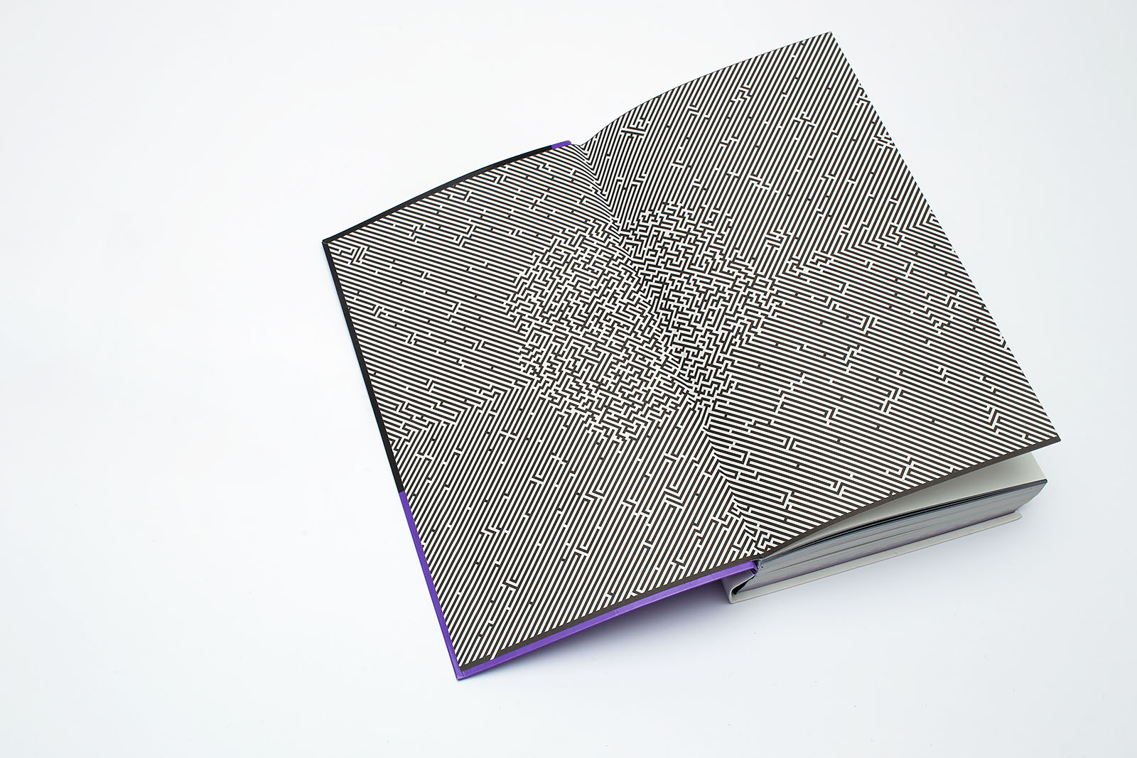
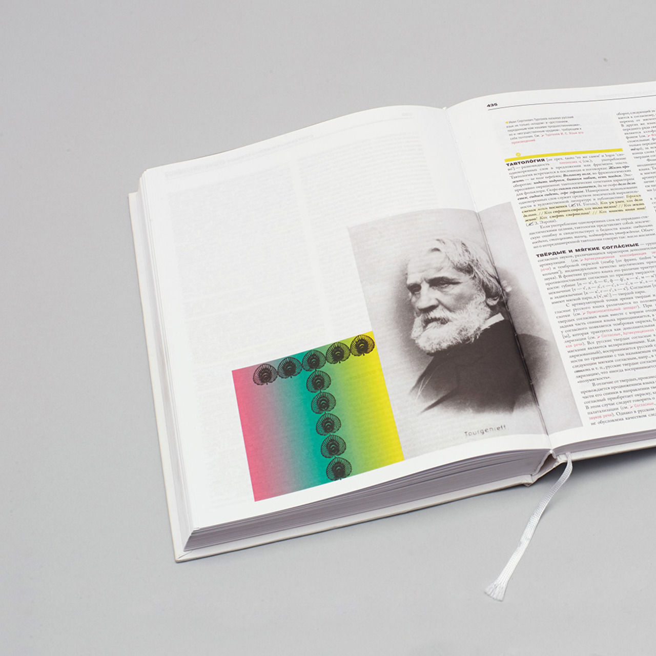
“A human brain maze in time and space,” this is approximately what the design brief for the illustrator Maksim Volkhin sounded like. The line width, 4.31 pt, is equal to the cap height of the header/footer in smaller typeface elements of the layout and ⅓ of the line spacing, 12.929 pt, in the main typeface. The maze entrance and exit are marked by the lines which go over the borders of the format.
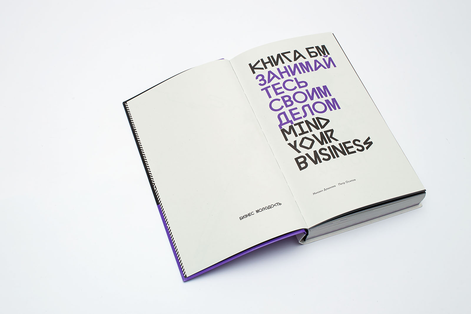
The back of the half title and the title page; typeface Lyno Stan + Ulys 54.678 / 49.82 pt.
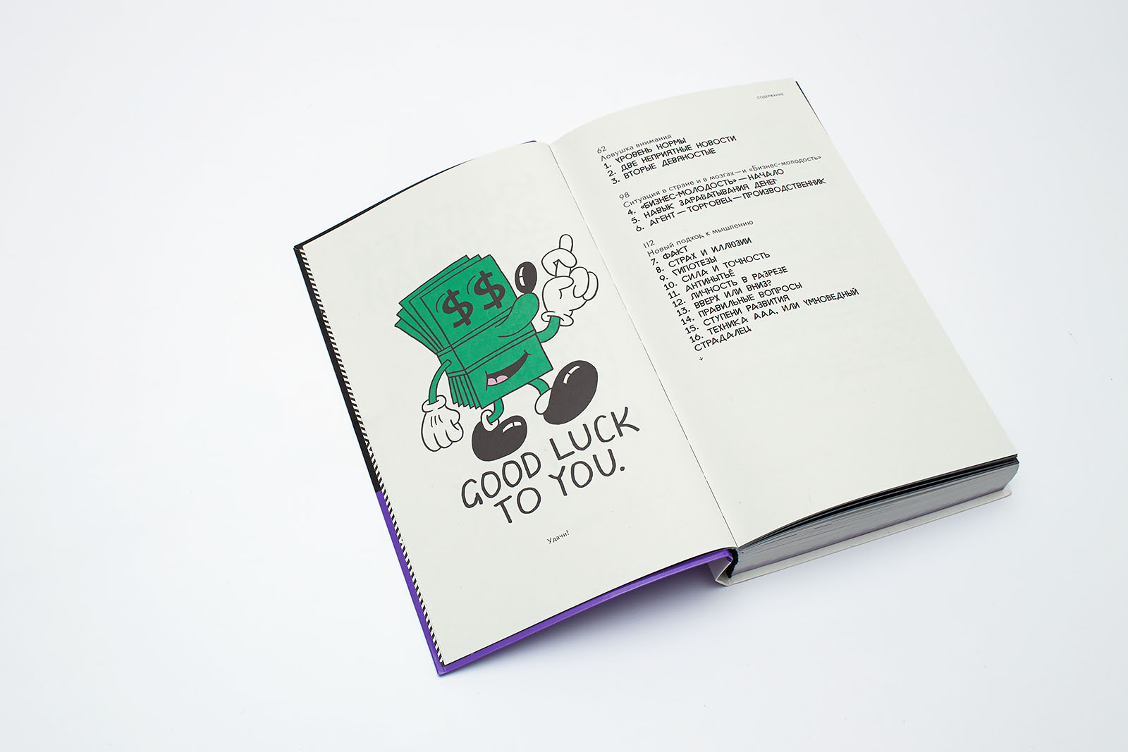
Two content double-page spreads; typeface BM RAW and Lyno Stan + Ulys 11.043 / 12.929 pt. The first Jeremyviille illustration was included at the stage of the preliminary layout.
2. Objective
2.1.
Sergey Monakhov:
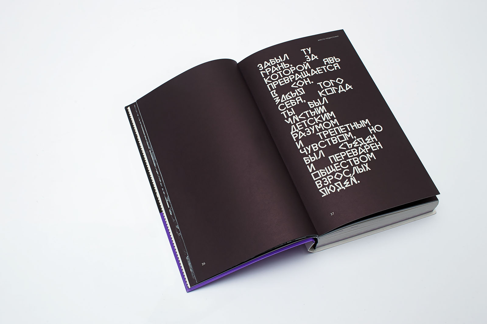
I’d say the genre is close to that of a textbook, however, you can feel it has some ambition to look like some sort of Doctrine: there is almost sectarian zealotry, fury, and peremptoriness — all signs of neuro-linguistic programming. So, the question is, what was the objective set for Masterskaya by the client—a wish to teach or a wish to recruit followers?
Dima Barbanel:
As layout designers, all we had to say was to show our interest in the book and its authors. A lack of emotion is a dead end with only one way out, into despondency. This is why the book, a living object, becomes extremely important in terms of conveying an idea through emotions. Everything focuses on making the reader feel something: love, anxiety, disappointment, fear, confidence, pride, etc.
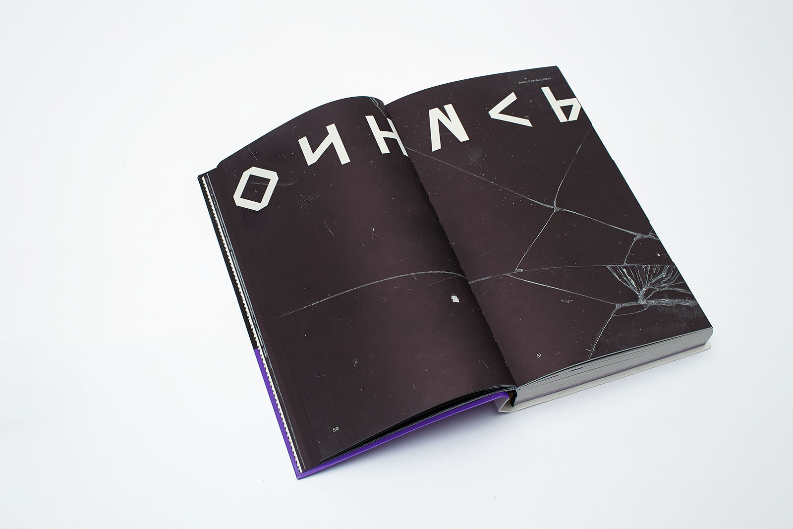
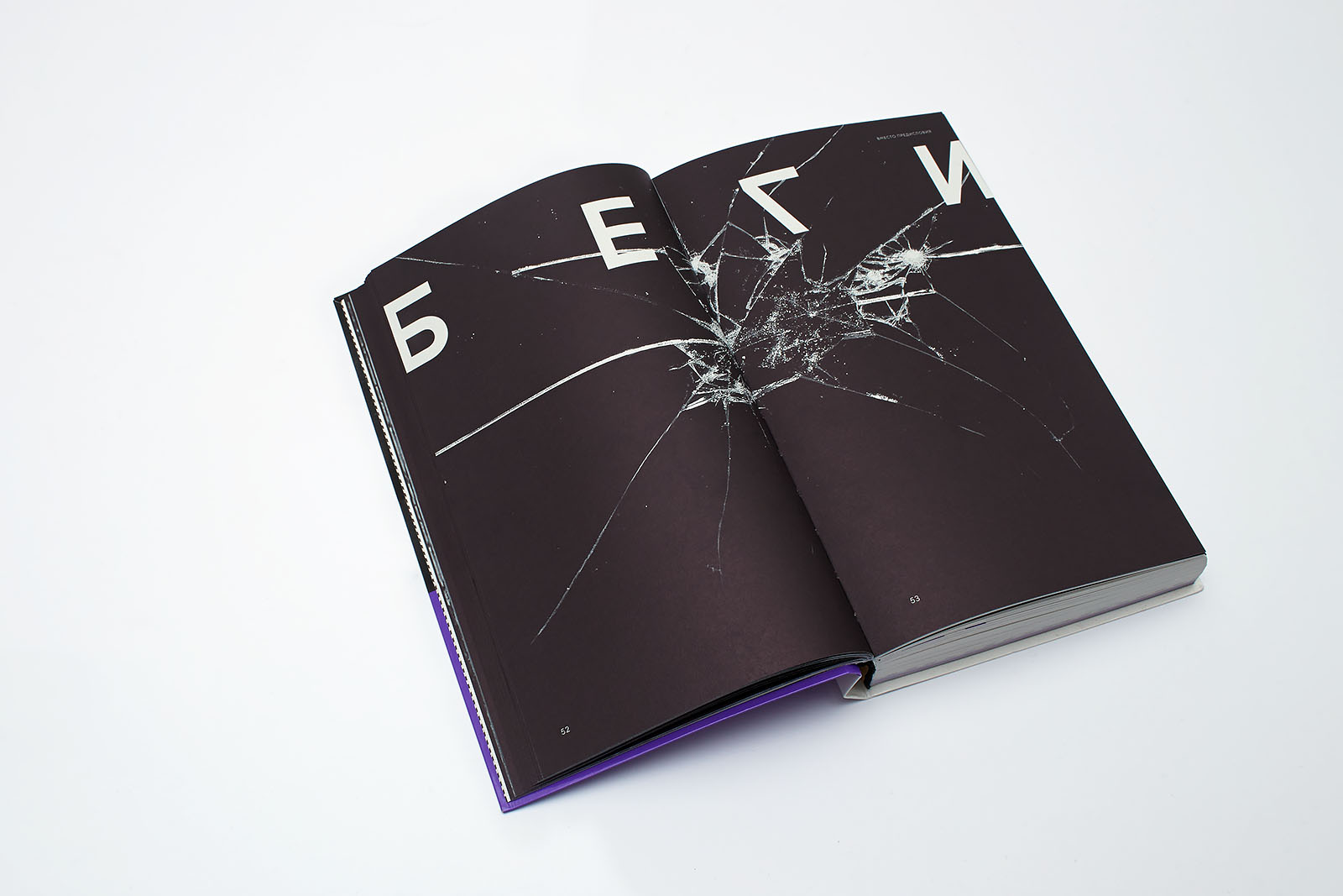
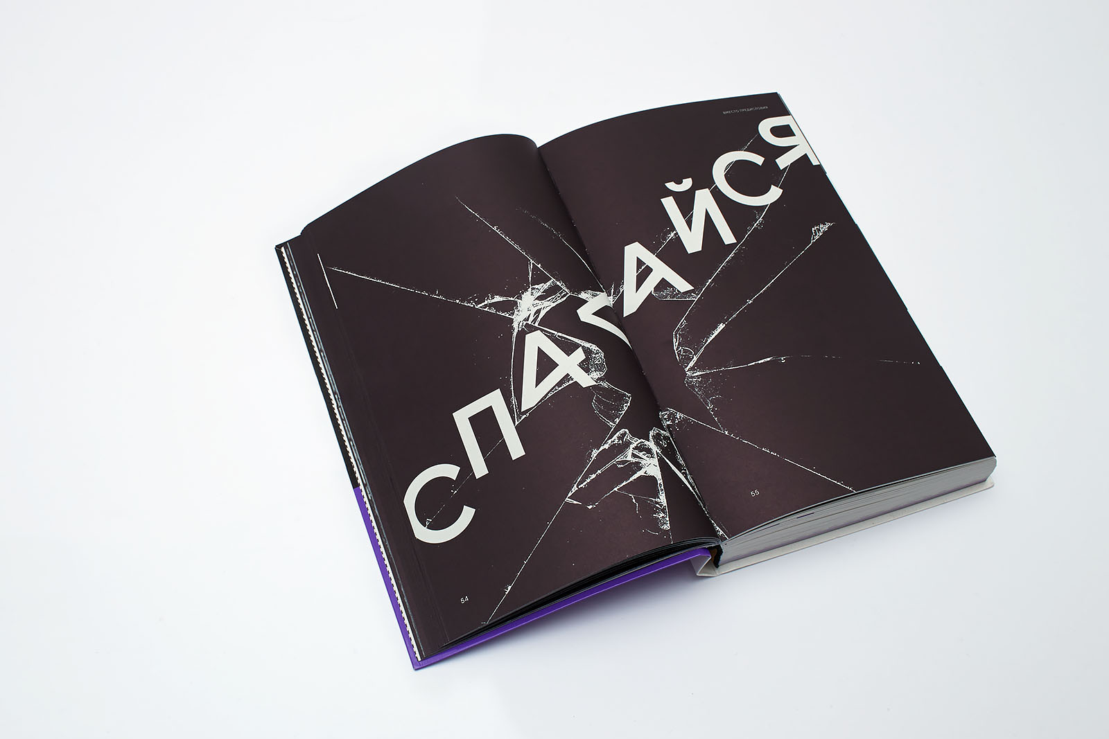
The first version of the cover — an emotional reaction to the brief — directly replicated the style of brochures which Jehovah’s Witnesses used to hand out to unwary passengers in local trains. It contained an illustration of a coffin knife made by Sergey Kalinin and a slogan “Get Rich or Die Tryin’”, which we took from the 2003 50 Cent album of the same name. It is interesting that none of us had seen the album cover, and it is only now that I’ve noticed a couple of amazing coincidences: broken glass and a cross on the singer’s chest were used in our metaphors several times.
The general sense of the composition was quite hackneyed: fight vigorously or you will die having learned nothing about life. The layout was eccentric and therefore inaccurate.
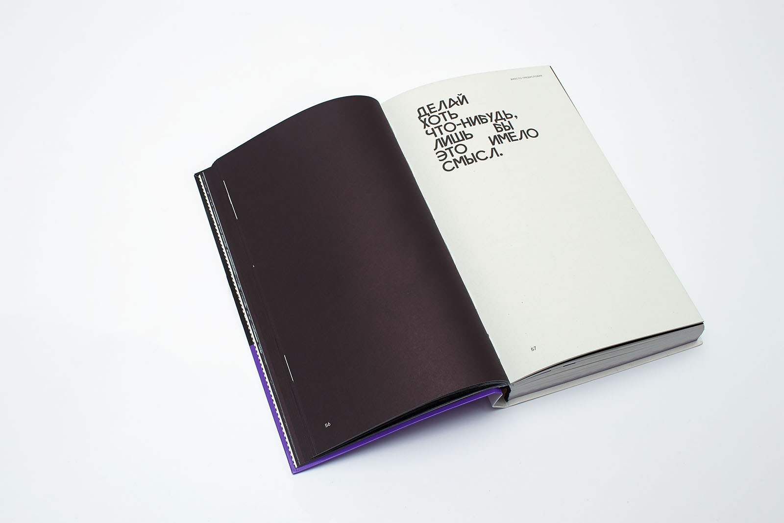
Later on, after finally reading the text to the end, we realized that they meant something different. The new slogan — “Do anything as long as it makes sense” — has made the image more precise, and it became the backbone of the final layout version.
2.2.
SM:
If we compare this book and other, more traditional textbooks designed by Masterskaya, which significant features, differences or similarities can you point out?
DB:
We’d never worked with this genre before. In general, memoirs and business textbooks can be easily nominated for the Most Boring Book award; but it’s hard to imagine that this book, a funny and fresh hybrid of an autobiography and a textbook, could function within a tedious layout.
3. Solution
3.1.
SM:
Certain key techniques can be easily noticed not only by experts, just because they strike the eye. Please, tell us in more detail how you came up with them. First of all, the typeface. What is it? How was it done? Why?
DB:
The book follows the corporate identity designed for Business Molodost at the end of 2012. At the system level, we provided for a combination of elements of various nature; this feature guaranteed the polyphony of the message and represented the image most accurately. This solution allowed us to create a very complex graphic environment and use materials made by completely different authors.
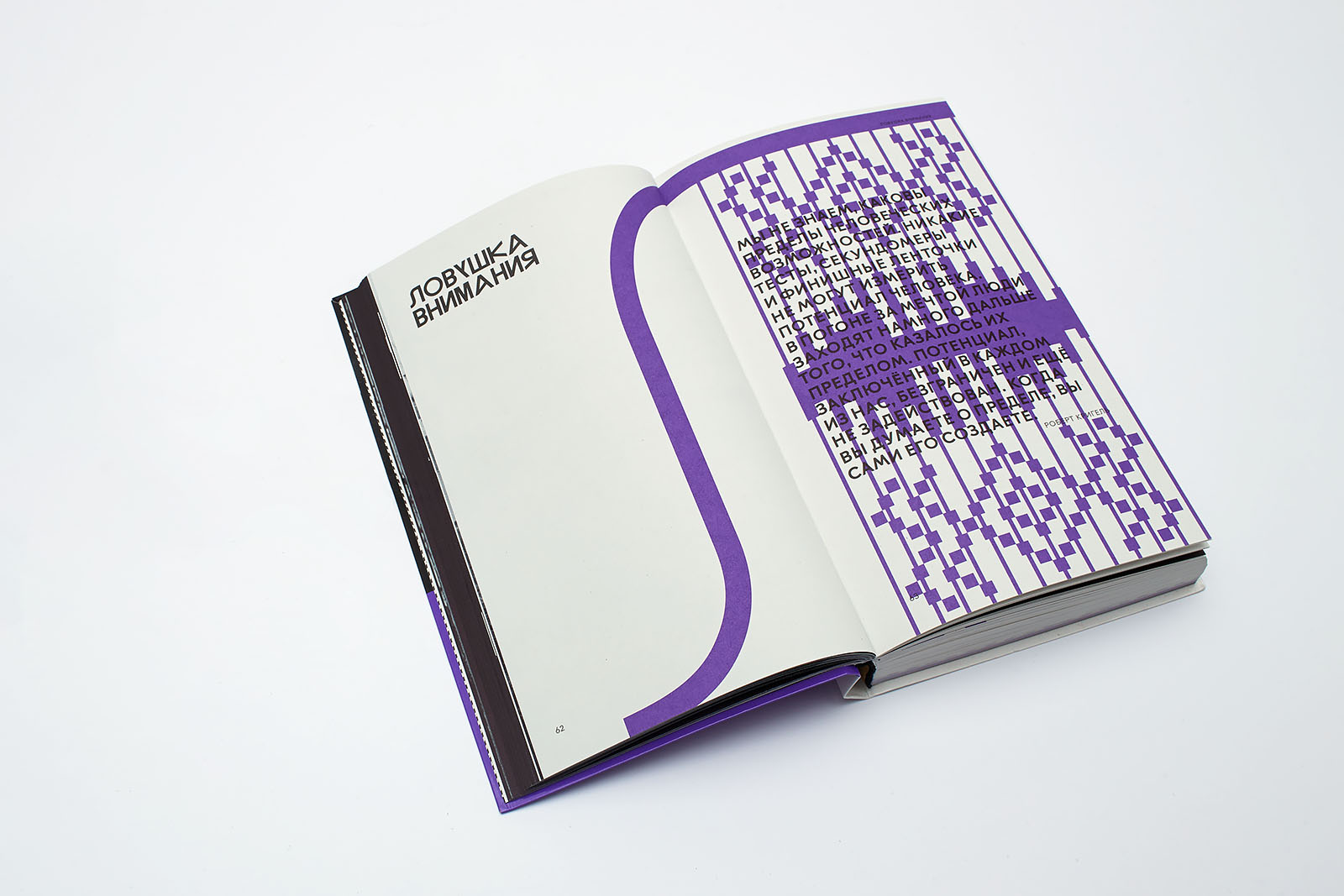
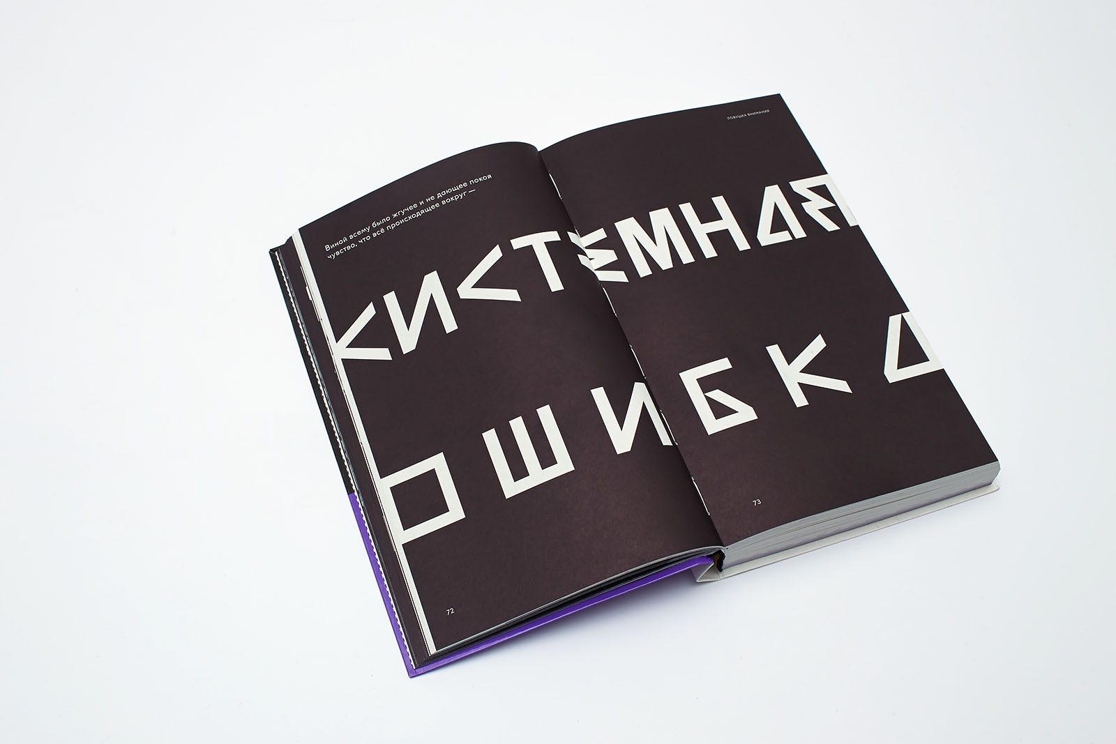
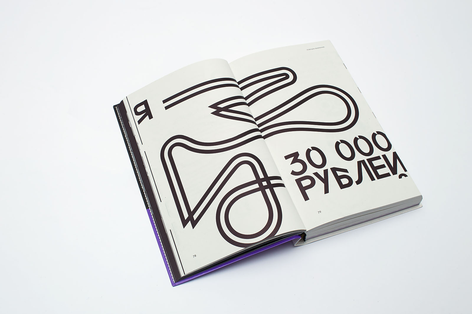
We chose the Lÿno typeface by Radim Peško, as it corresponds to the concept of a brand “for people who think differently”. We used two fonts, four sets of characters altogether (upper case + lower case), mixing cases in a line, intonating and achieving maximum imagery through the regular typeface without applying any additional elements.
The Emil RAW typeface by Konstantin Lukyanov echoes Lÿno on a page; its thirteen alternative sets gave us an opportunity to change the imagery a little bit in each paragraph.
3.2.
SM:
Why did you decide to design iconography this way? There are images like a frog, a toy, and many more. How were these images created?
DB:
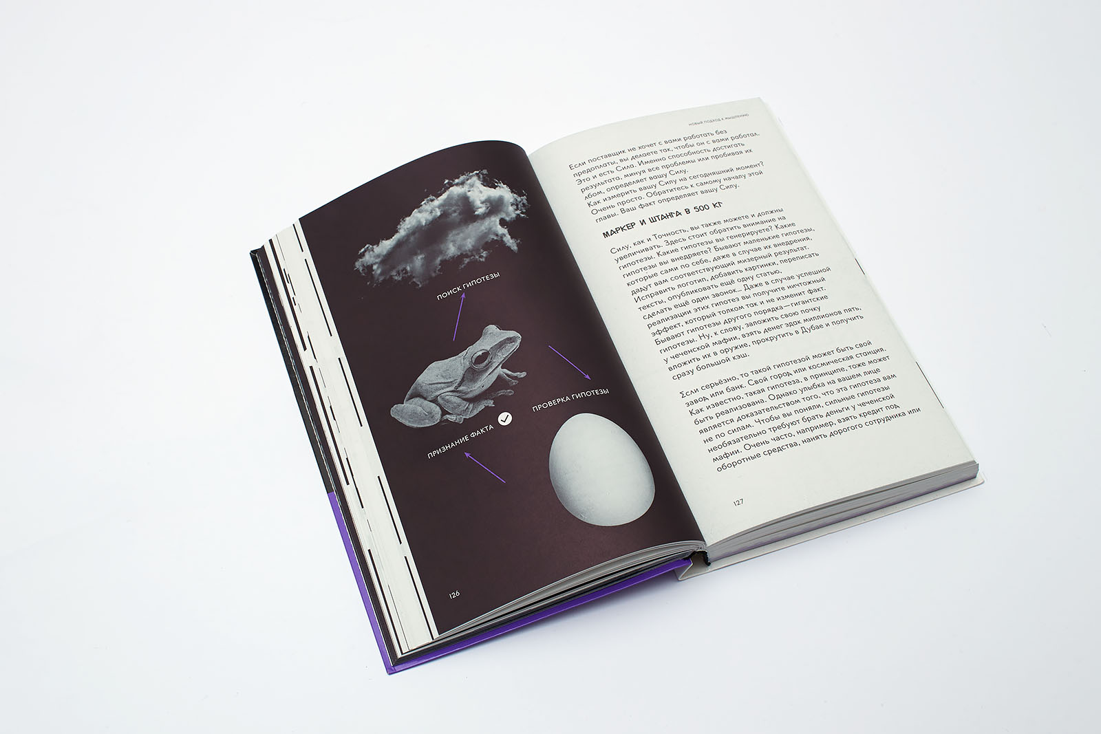
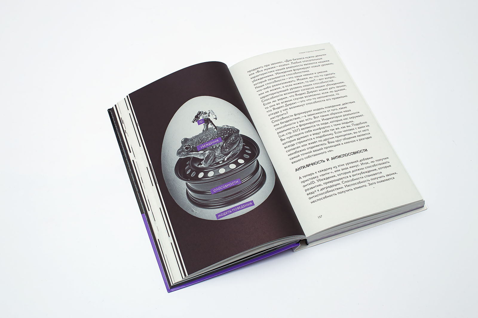
Iconography represents the whole, which is made up of components. We thought of a matreshka doll and the Russian folklore character Koschei the Deathless, whose death was on the needle point which was hidden inside an egg, and so on — with some adjustments to the modern reality. The characters are created in a way where you can, so to speak, put one of them into another: figuratively speaking, a frog appears from an egg, and a cloud is likely to be its state at some point in its life.
3.3.
SM:
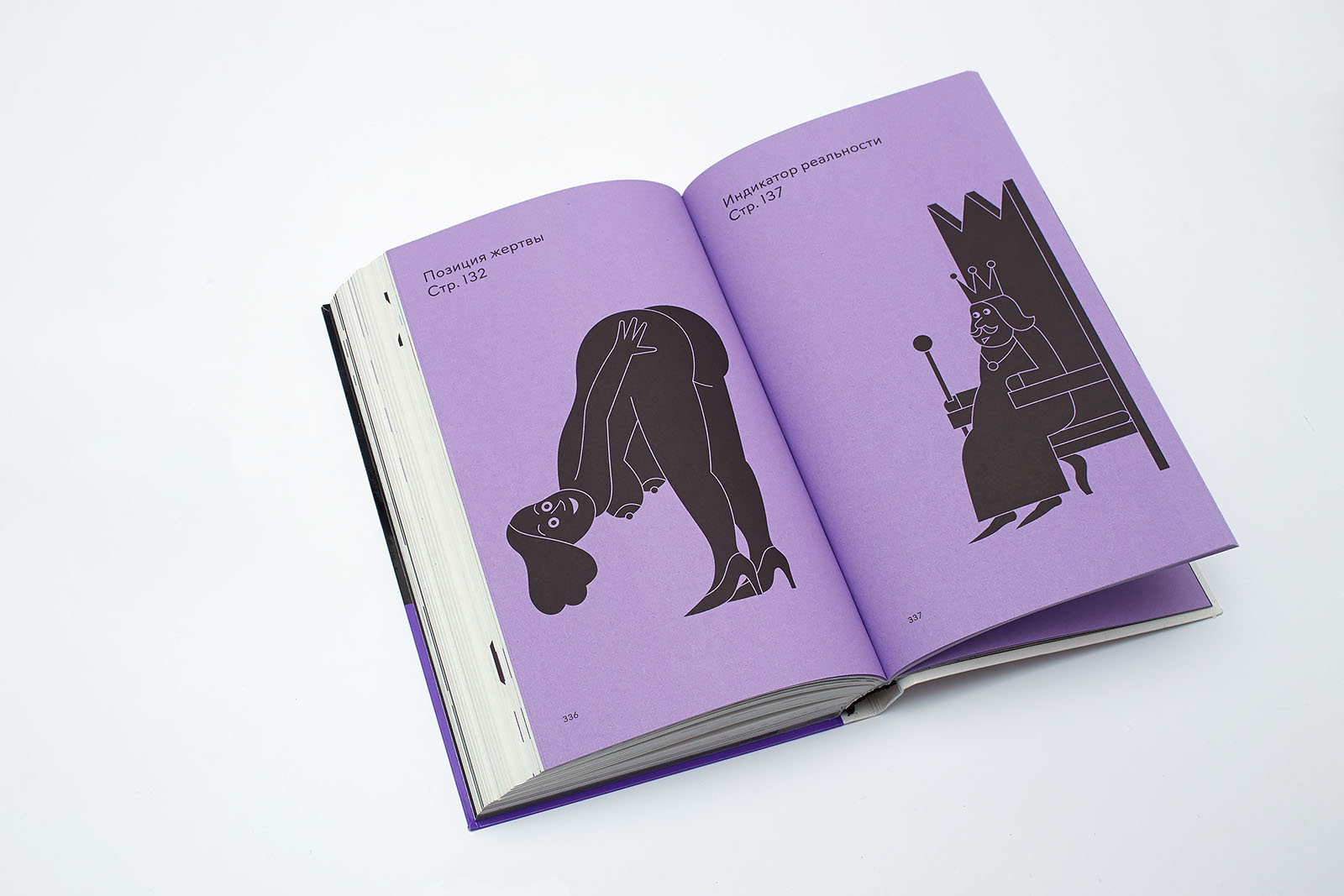
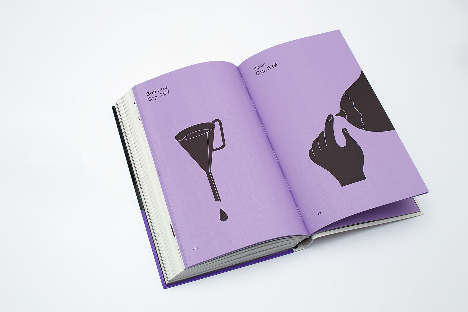
The book has an appendix with quite an unusual glossary. Not only are the terms unusual, but so is the way they are defined: the semantic meaning is conveyed through pictures. Who came up with this idea? What part of it is a joke, and what is true?
DB:
It was a spontaneous idea, and it led to quite a funny result. We asked Campus participants to analyze the texts in terms of word repetitions. Soon they produced a list where the word “we” was at the top, leading with a wide margin. So that we wouldn’t have to refer to each “we” in the glossary, we decided to create a ligature, the first one after the “Ы” and “Ю” ligatures incorporated in the Russian alphabet. After that, we chose eighteen most common collocations from the long list and gave them to the artist Roman Manikhin without any context details. This is how instead of an ordinary store we got a magician named Kopeck (a contraction of the word “store” in Russian coincides with the word “magician”).
3.4.
SM:
Small graphic artwork is probably one of the most attractive features of the book. What function does it have: is it just a pattern or does it serve as navigation?
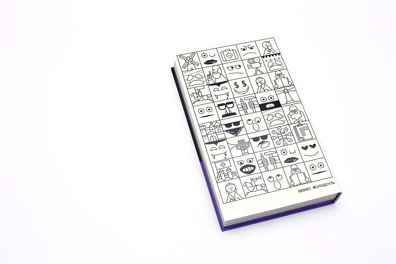
DB:
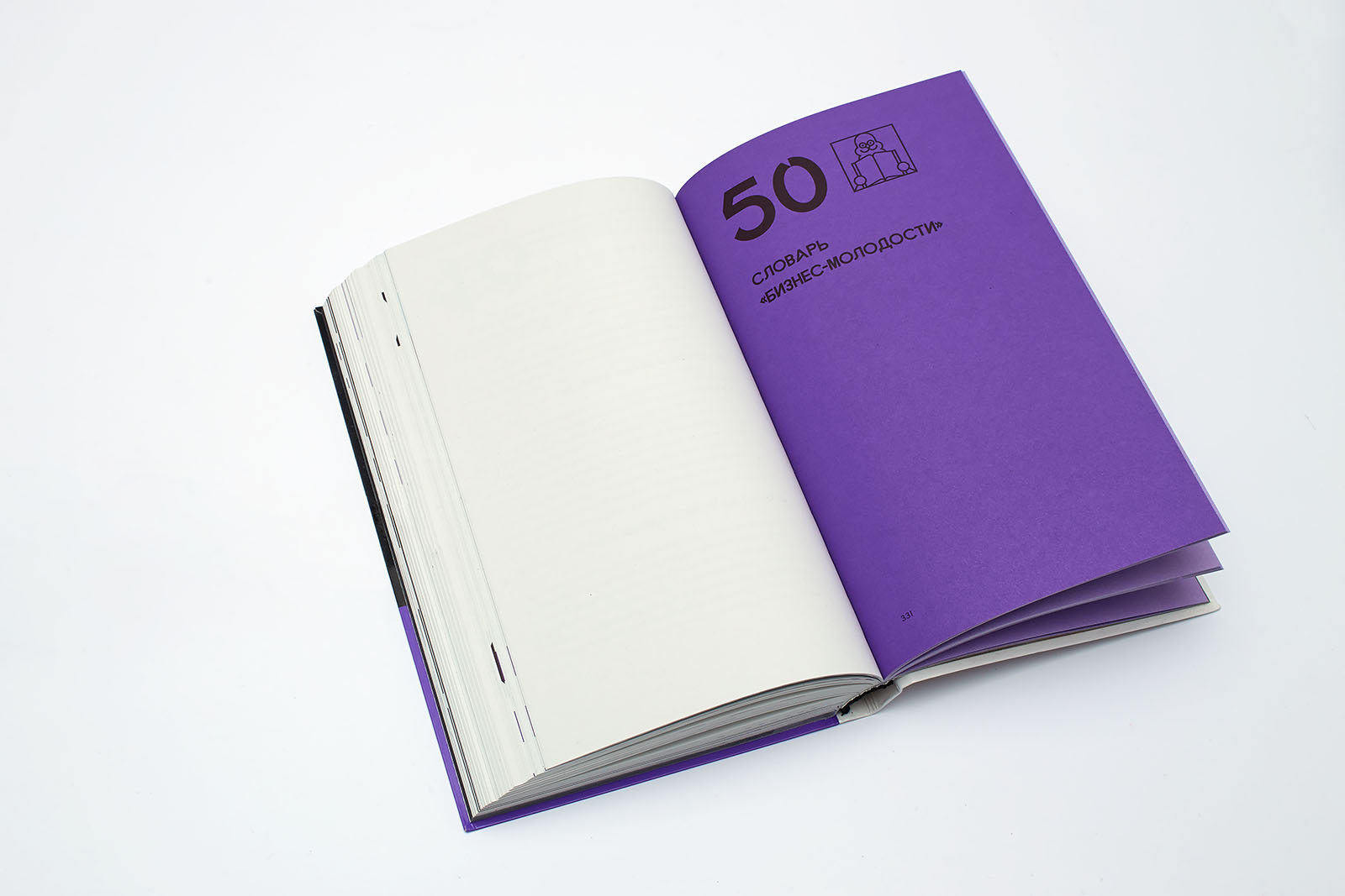
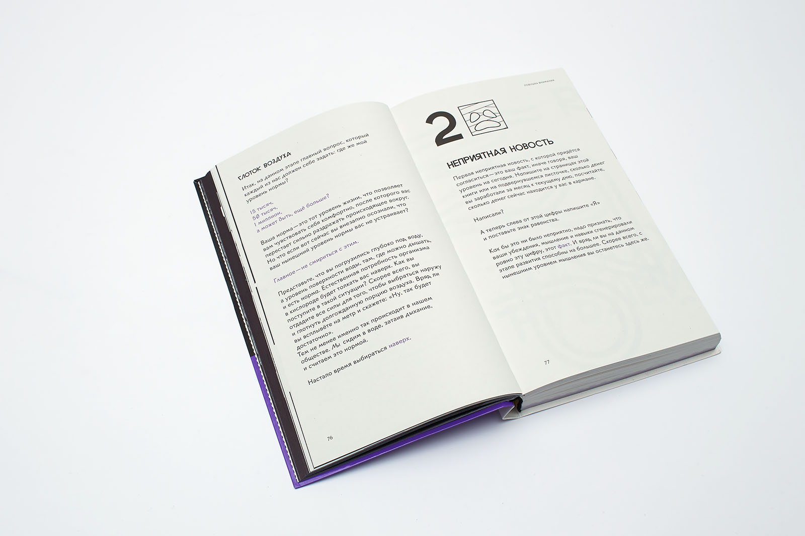
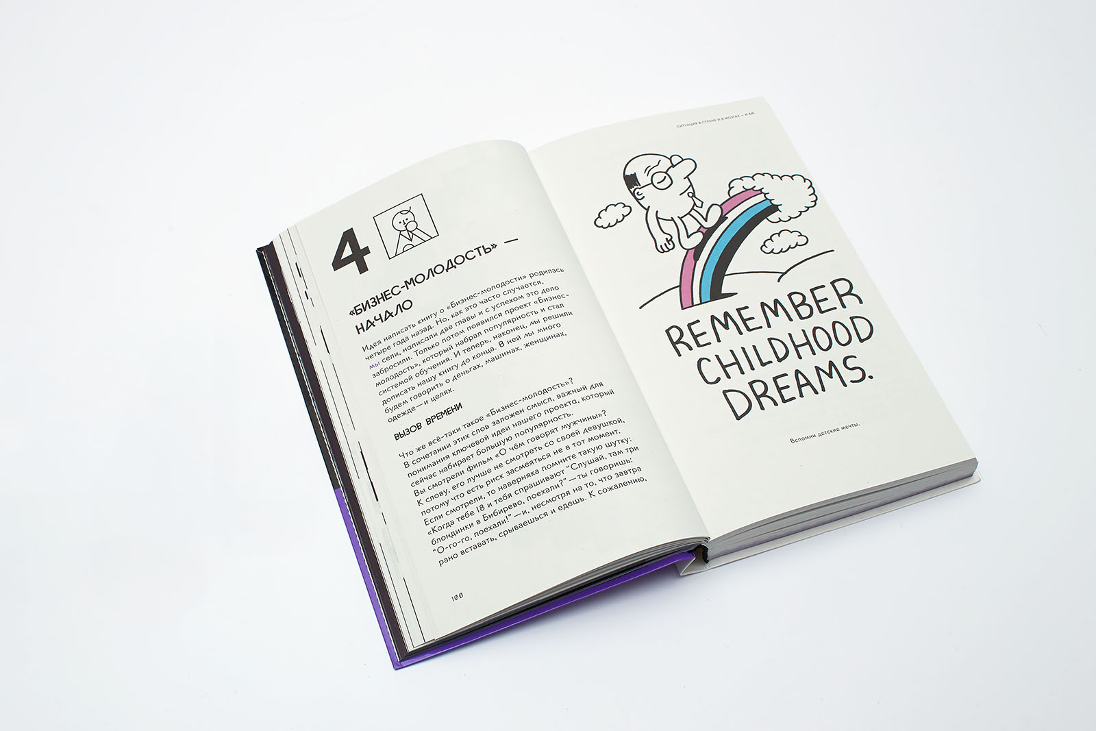
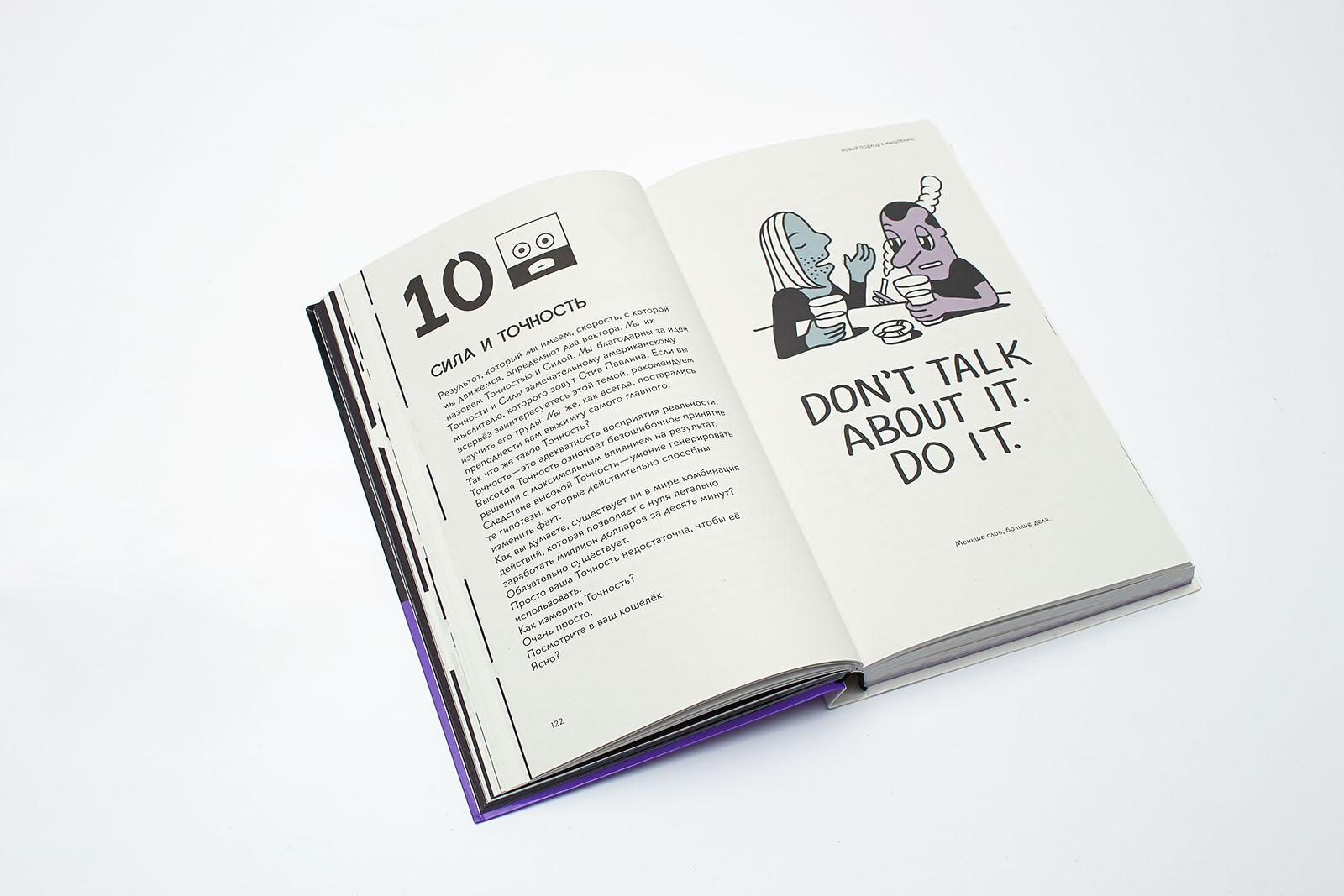
Each chapter starts with one of the forty icons and an ordinal number. The topic of the chapter directly determined the subject of Kalinin’s icon or the emotion of Arias’s one. Therefore, a reader can guess the subject of the chapter by looking at the icon. Various artists, who weren’t even aware of each other, created the rest of the artwork for the book. We didn’t mind having different styles. To be honest, we chose from what was available. The rigid page structure gave us such an opportunity.
3.5.
DB:
I suppose, as a reader and an editor, you don’t often come across such texts. What was your first impression after reading the book? To what extent did you change the text?
SM:
My impression of the book was (and still is) very positive. Of course, when I first got it, there were tons of various stylistic and grammar oddities, but none of them interfered with the main feeling: the people who had written that text had, without a doubt, a bright and distinctive style. Today, when everyone’s speech has become so homogeneous, it is an extremely rare feature.
Besides, in the course of our work we tried the methods of statistical and corpus analyses for the first time. And we discovered a lot of interesting things.
For instance, the way the guys work with terminology. Here is a sample list of keywords from the book: “trigger”, “trigger”, “resonance”, “conversion”, “hyper-forgetfulness”, “descript”, “trap”, “whining”, “lead generation”, “meat jelly”, “money”, “strength”, “fact”, and “price”. Even this list shows their main approach: along with actual terms, they take common everyday words and make them terms by giving them special meanings.
The same is true for collocations: “noise level”, “attention trap”, “invisible reason”, “high definition”, “deal cycle”, “capture point”, “key level”, “rejection indicator”, “newest person”, “word price”, “sales funnel”, “contact surface”, “client flow”, “inevitability model”, “invisible beast”, “selfishness level”, “mass lead-generation model”, and “earning skill”.
As you can see, the language of the book doesn’t contain any clichés. In general, the proportion of unique (1–3 times) word usages among content words varies from 50 to 75%.
The morphology of this text, its range of parts of speech, is very peculiar. The most common part of speech is the noun; there are more than 5,000 nouns. They are followed by verbs (3,000), adjectives (2,000), and adverbs (900). This means that despite its gravitation towards scientific (pseudo-scientific) nominative description, this text is an extremely harmonious and balanced system, which combines different stylistic features.
If we choose the most popular words from each category and combine them, we’ll get the following phrase: “new person *really can”, which is quite symbolic.
Some syntax characteristics are also curious. For instance, an average sentence length is seventeen words, which is quite long, longer than usual. The authors tend to use complex structures, and it is an important feature of a text that doesn’t simply impose a certain opinion on you but is arranged in a logical way, explaining and providing evidence. At the same time, there is, without a doubt, an attempt of an active and direct impact on a reader. 500 sentences out of almost 2,500 (20%) contain imperatives. At the same time, the subjunctive mood is almost never used; perhaps business, like history, does not accept it.
Thus, in conclusion, we owe this book for the idea of Pygmalion, a method of speech branding aimed at improving written verbal communication, a method we plan to use in various future projects.
Presentation (126 KB)
Iconography by Evgeny Belyakov, one of the nineteen authors whose works we used in the book to illustrate double-page spreads of this type.
4. Typefaces
Lÿno (Lÿon)
“This typeface was designed by Karl Nawrot and Radim Peško between 2009 and 2012. At the commission of Masterskaya, which was designing a corporate identity for Business Molodost at the end of 2012, the typecase was complemented with Cyrillic characters for the Stan and Ulyss faces.
At this point, it wouldn’t go amiss to mention the typeface that has triggered a whole trend, giving birth to various new typefaces, including Lÿno:
“The elementary matrices that Crouwel visualised in his New Alphabet might appear curious to us now in their reductiveness. Indeed, for many designers, the extreme restrictions of this programmatic typography are somehow haunting. Crouwel’s proposal was at once pragmatic in its response to the emerging conditions of digital production, and radical in its recourse to simplistic and historically obscure letterforms. The typeface spoke the language of the machine, but it was the wrong machine. The New Alphabet opportunistically set aside the common cognitive memory of the Roman alphabet.
Present generations of type designers have greater technical freedoms, but also unexpected burdens. Useful restrictions are harder to perceive, paradigms increasingly more difficult to transgress: the archive of our forebears looms all around us. This situation suggests important questions. How might we structure methodologies in the relative absence of formal or programmatic limitations? How do we position our practices in relation to the archive? What should we value as a community of designers and readers?
Digital production permits us to exploit the mutable and the itinerant. These are the characteristics of a maturing digital language. We must be alert and responsive: not merely to the mechanics of production, but to the contexts in which letterforms are to be applied and the meanings that they are to be read in support of. It is the cognitive machine of the human eye and brain that we must engage with our designed messages, not the transient technologies through which graphic language will continue to be manifested.” (James Langdon, “Newer Alphabet”, Birmingham, 2010, “Typefaces Issue” supplement for Graphic#16)
Emil RAW
The Emil typeface based on JournalSans is a multilayer synthesis of different gothic typefaces of the 20th century. Our immediate goal in designing this typeface was to preserve the familiar appearance, bring it into today’s world, and define and develop the main visual idea.
Konstantin Lukyanov:
“It started with the nod of the letter а. I saw the legacy of handwritten texts in it and transferred this quality into all the other characters. As a result, some basic relations and principal formal pairs (even o-n) have changed. I thought that if the Cyrillic Л and Д have an axis of symmetry, then maybe such characters as В, Ж and Х have it as well, albeit in a ‘frozen’ form, and I started rotating them. The flexibility of Cyrillic graphemes created a bold and vivid typeface, which was necessary for keeping the reader focused.
The book uses the ‘wild’ Emil RAW, with an emphasis on features of old-style gothic typefaces that work well with Lÿno. Our guidelines in picking all these peculiar features were the beauty of the text structure, the accuracy of the rhythmic narrative, and the adequacy of text representation. It was difficult to balance out the characters’ expressiveness and their frequency of occurrence — some ligatures appear just once throughout the book. In addition, some ‘ligatures’ are not letter-to-letter, letter-to-space or quotation marks-to-letter. The ligature ‘мы’ (‘we’) is probably the most important part of the layout.
The typeface also includes symbol sets for the web (Sergey Kalinin) and chess as well as four sets of numbers from 0 to 99”.
5. Initial caps and patterns
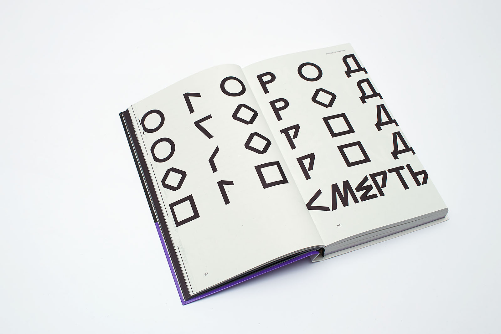
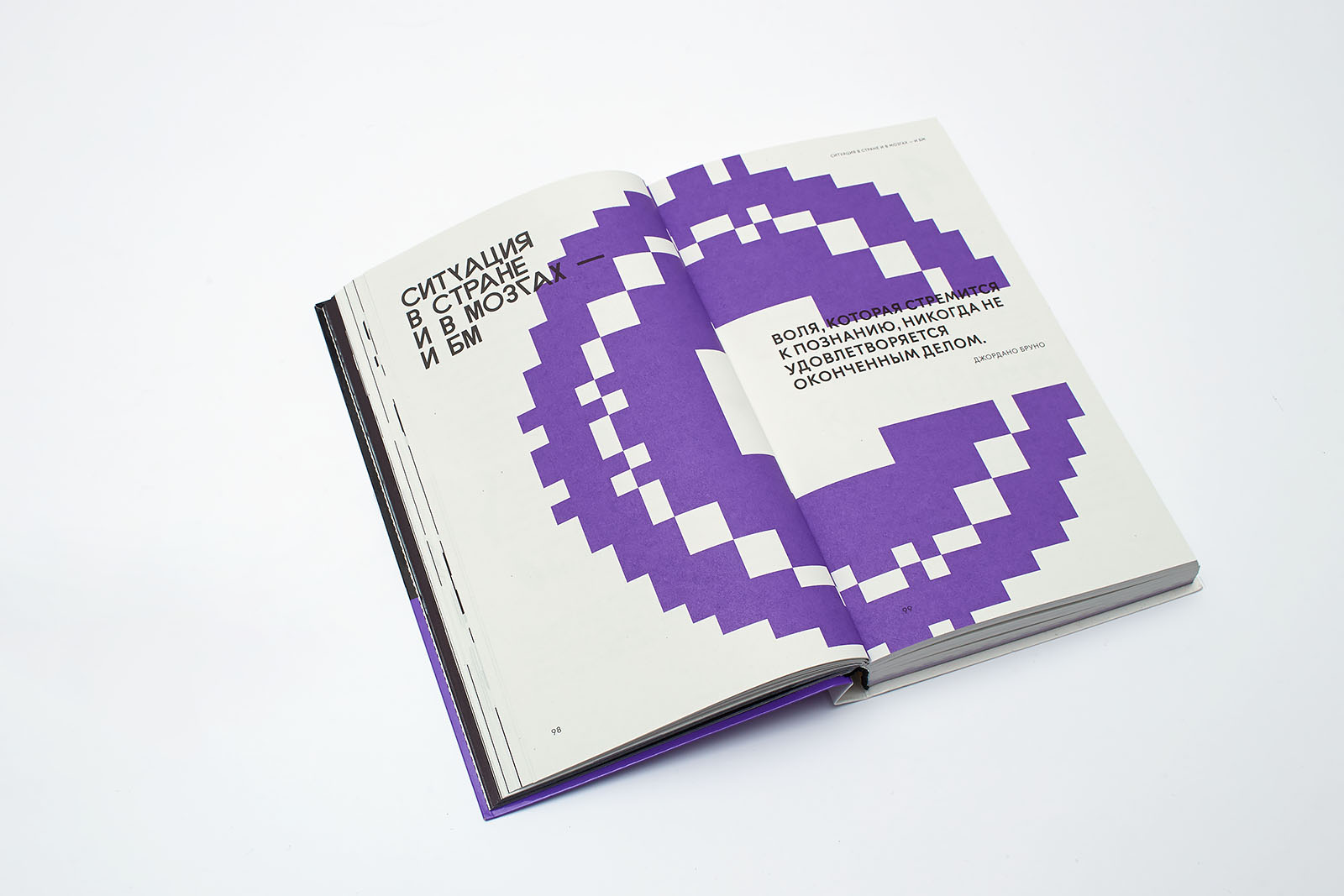
The idea of including traditional motifs into the book was suggested by the posters on the Keva Pension Fund building in Helsinki. We decided to underscore the fact that the authors of the book come from the mythological context and the semantic space of the Republic of Chuvashia (they were both born in the city of Cheboksary) by complementing the visual narrative with traditional initial caps and patterns.
The composition of Chuvash embroidery, its motifs and techniques vary among different ethnic groups but they are based on the same principles: a blue-and-red palette and geometrical rope ornaments made up of diamond shapes and lines from different quadrangles. It was easy to integrate these features into pixel graphics.
It was important for us to show the genetic relation between Chuvash and Finno-Ugric people. In addition, the traditional pattern of Chuvash embroidery includes ancient Chinese pictographic characters from the Yin period (2000 BC) as well as characters from ancient Iranian tribes’ Zoroastrianism, Khazarian Judaism, and Islam from the times of the Bulgarian Khanate of Kazan and that of the Golden Horde. Embroidery was the most popular craft done by practically all Chuvash girls and women.
Colorful initial caps and pixel illustrations were initially placed at the beginning of every part of the book, comprising two double-page spreads. The illustration material was designed by Maksim Volkhin, who used graphic reconstructions from the Book of Chuvash Patterns and Symbols as a reference. Subjects of the illustrations echoed common embroidery subjects: hertsurt, the female household deity, land fertility, crop harvesting, the firebird, cockerels, fields, and flowers.
The initial caps were designed by Konstantin Lukyanov. We excluded the illustrations from the final version of the layout, having considered them excessive, and only kept one double-page spread with initial caps filled with various patterns.
6. Photographs
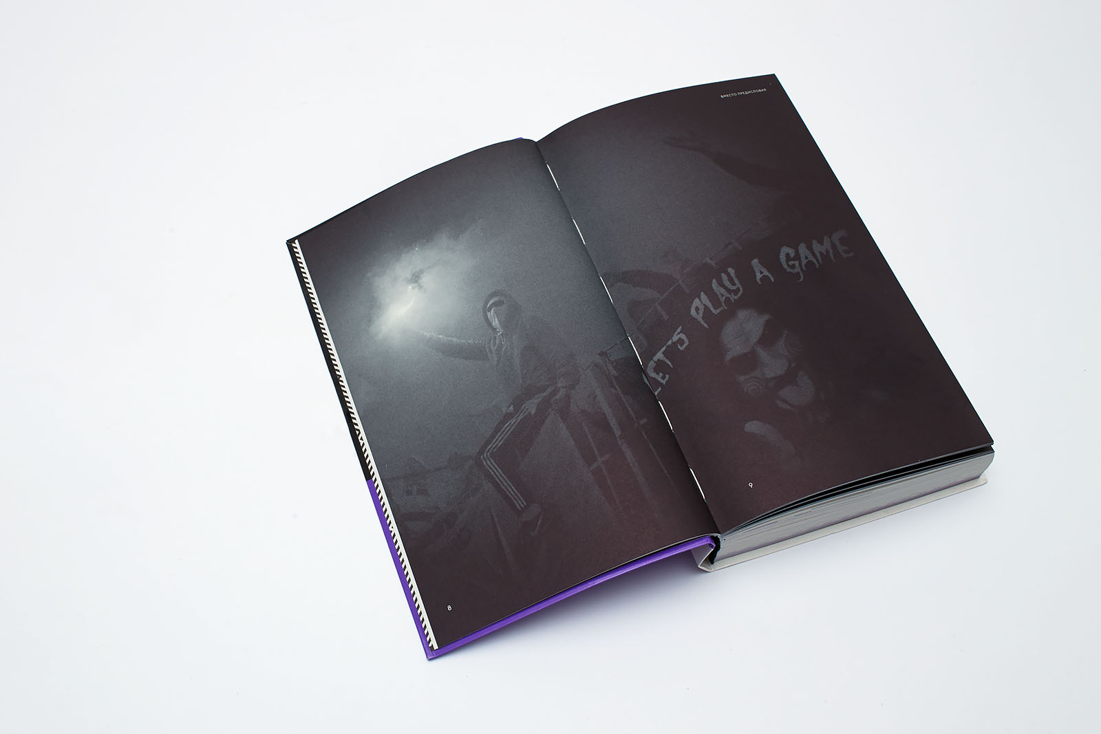
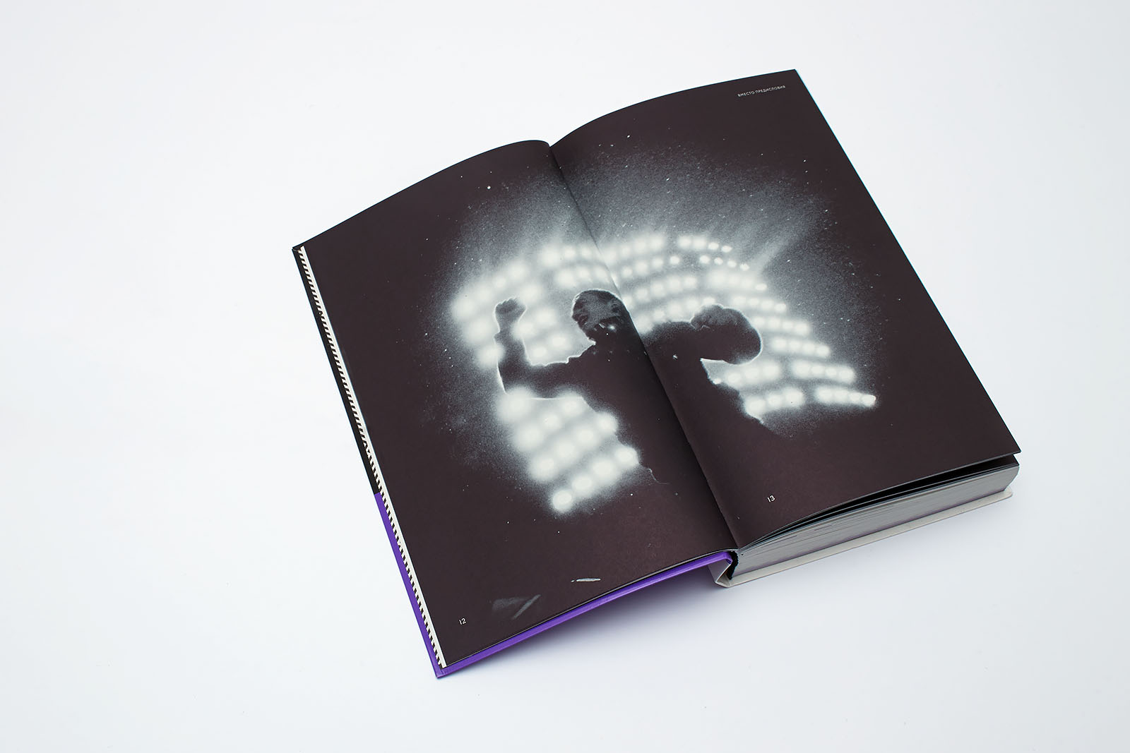
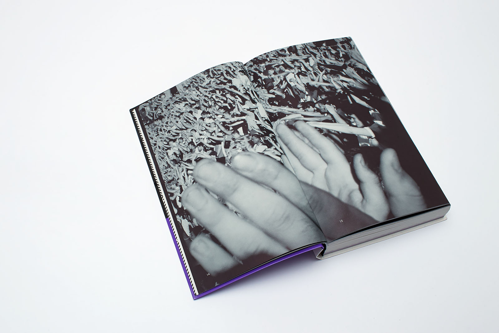
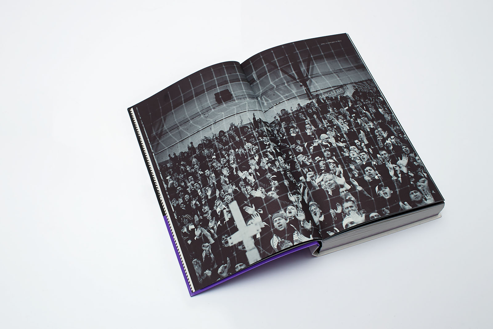
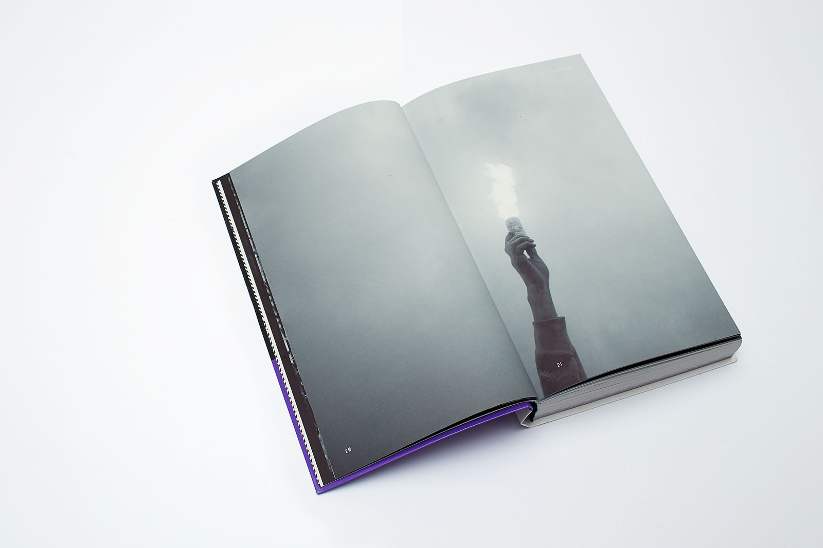
Ultras
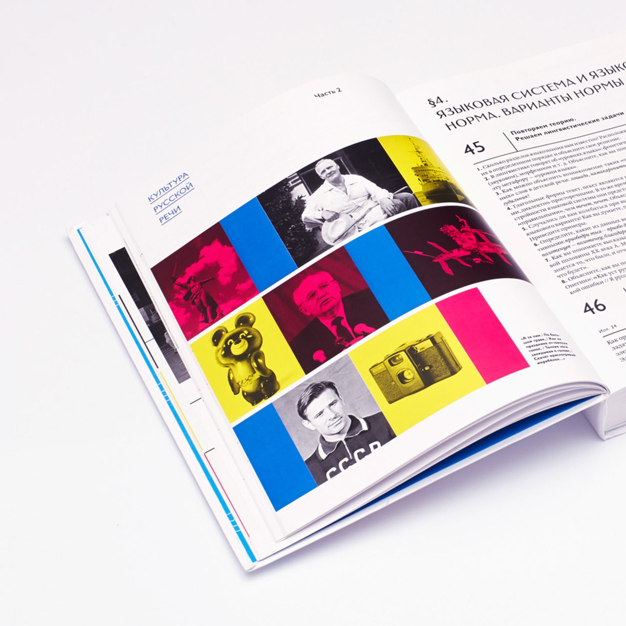
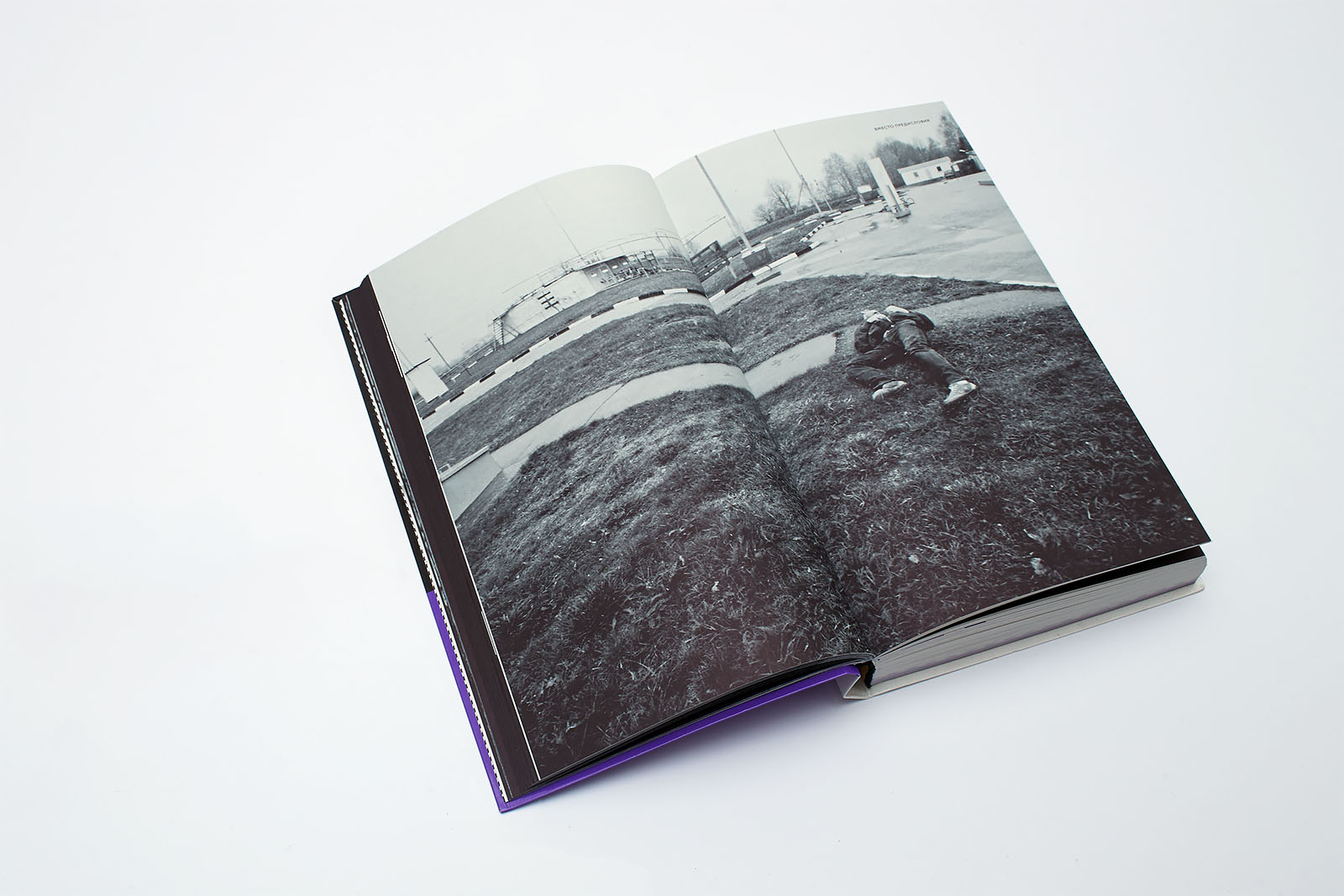
The book uses the content of the documentary photo-project by Mikhail Domozhilov dedicated to St. Petersburg FC Zenit ultras. Zenit ultras are considered to be one of the most powerful football fan movements on the territory of the former Soviet Union, amounting to 5,000 members. This well-organized group has its own hierarchy, leaders and values. The project photos were taken in 2010, a significant year for both Russian football in general and Zenit in particular. The St. Petersburg team became Champions of the Russian Premier League; Zenit ultras celebrated their thirtieth anniversary; Russia won the bid to hold the 2018 Football World Cup; and the end of the year saw thousands of football fans take part in unauthorized nationalistic rallies in several Russian cities, which left Prime Minister Vladimir Putin with no choice but to meet with the leaders of the main Russian ultras groups.
This story in photographs provided the beginning of the book with the desired feeling that Business Molodost members are striving to create: unity based on a superidea.
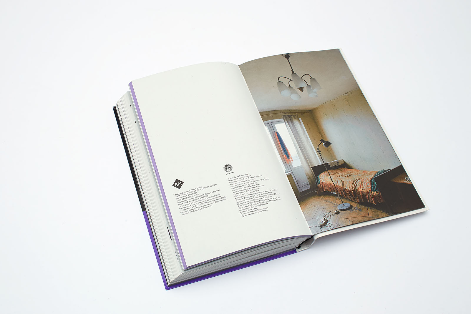
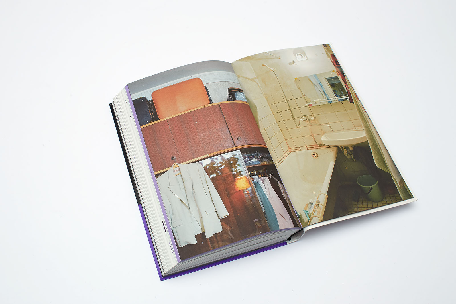
The Morphology of a Soviet Apartment: a Field Study.
These photographs by Aleksey Naroditskiy are a part of the project displayed at the Central House of Artists during the 16th International Exhibition of Architecture and Design ARCH Moscow (supervised by Artyom Dezhurko and Yulia Bogatko).
It showcased photos of five Moscow apartments with preserved furnishings of the 1960s—1970s, interviews with their owners, as well as the best pieces of furniture from Soviet apartments made in the GDR, Hungary, Romania, and Czechoslovakia.
The goal of the art show supervisors was to promote two ideas: 1) “the object world of the mid-20th century modernism is wonderful” and 2) “the past should be known and appreciated”. An apartment’s interior is a reflection of the family history. The objects stored there are its memorial monuments. The authors of the exhibition oppose the universal habit of cleaning out an apartment, down to the concrete, of all its marvelous archeology that has been accumulating there for decades and, having done a complete “European-style” renovation or some “design” work, settling down there as if a nuclear holocaust has destroyed every piece of evidence of family history, ancestors, and childhood.
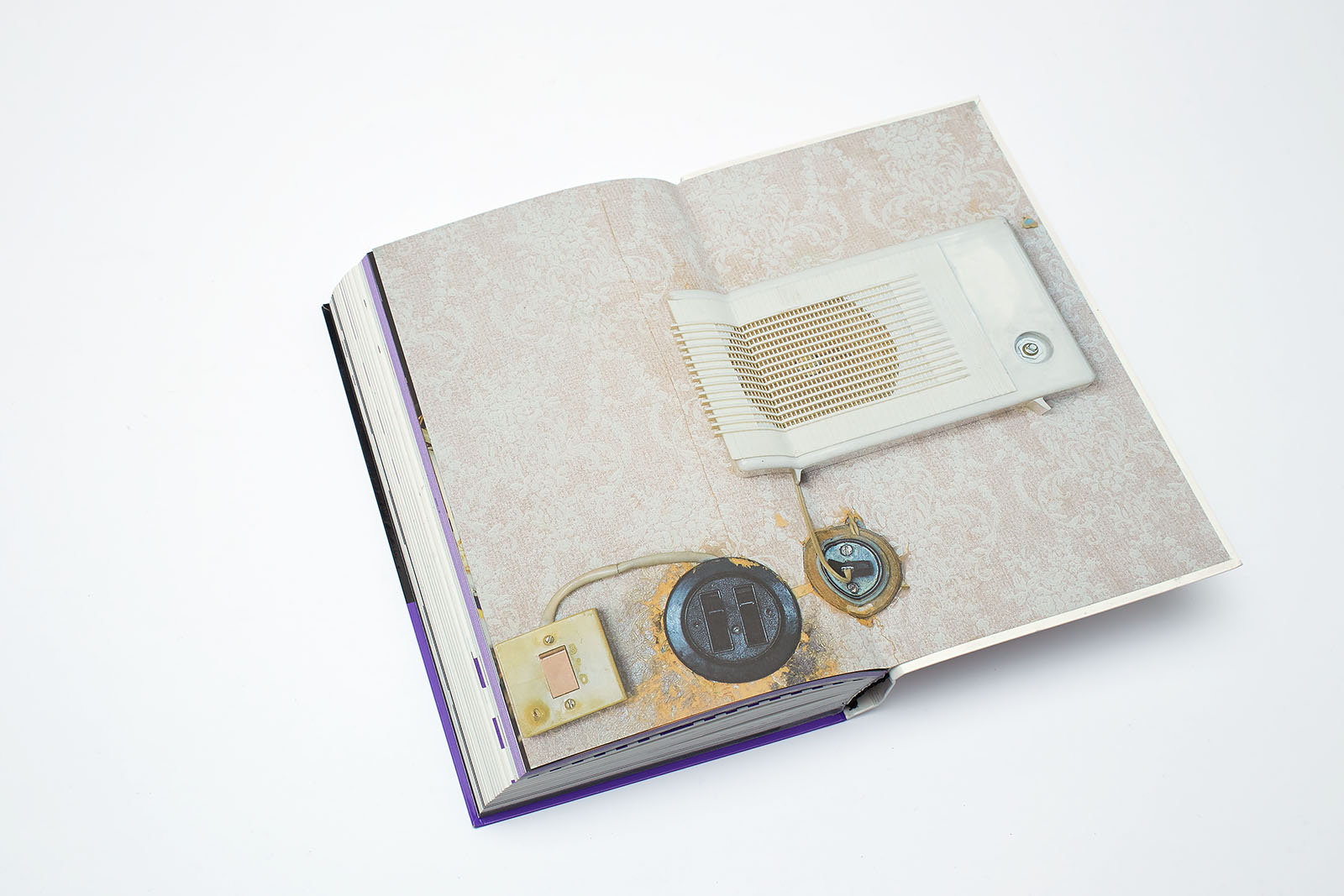
Unlike the exhibition supervisors, we needed an antithesis to the whole preceding text, a powerful metaphor that could bring back the reader enchanted by mind-blowing prospects back to their (and, really, our shared) reality. The photo story consists of five double page spreads — a sort of a tour around a typical apartment for rent. The back endpaper plays a particularly important part here: a lonesome radio set, a speculation — what if all this was just the reader hearing things? It is the last frontier, the last attempt to mobilize people into action instead of accepting their context as permanent and final.