Barcode City magazine
Barcode is an independent publishing project of the German company Indochine Media. The city magazine is published in three countries — Vietnam, Singapore, and Malaysia. It has rapidly gained popularity and is unique among traditional monthly periodicals for young people.
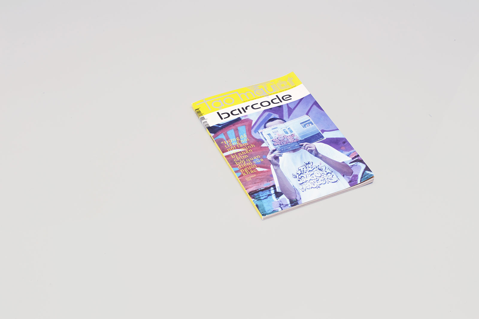
The magazine’s dimensions are 175×241.8 mm. It is printed on recycled newsprint paper. The cover features a logo designed by Maria Doreuli, and above it, the logo prescribed by Vietnam’s Ministry of Information and Communications, not included in the design layout.
1. Team
Creative Direction
Dima Barbanel
Sergey Fedorov
Publisher
Michael von Schlippe
Indochina Media, Ho Chi Minh City, Vietnam
Editor-in-chief
Vita Letnitskaya
Production
Anna Tsipelnikova
Printing House
RR Donnelley Asia, China
Art Director
Sergey Fedorov (issues 1–3)
Aziz Melibaev
Logos
Maria Doreuli
Iconography
Sergey Kalinin
Typefaces
Evgeny Yukechev
Maria Doreuli
Igor Mustaev
Brian Lucid, Guy Jeffrey Nelson (Font Bureau)
Emmanuel Rey (b+p swiss typefaces)
Matthew Burvill (HouseOfBurvo)
John Hersey, Jonathan Barnbrook (Emigre)
© Masterskaya, 2011
2. Idea
Even in Vietnam, a so-called developing economy, the publishing market is quite saturated. Indochine Media did not want to replicate what was already being done by the local publishers; neither did it want to pay for an international brand license; so they came up with the idea of launching a magazine for young people that would focus on their city and its points of interest.
Barcode’s editorial staff consists of three people in each of the three countries; most of the materials are supplied through crowdsourcing.
The magazine has four core sections: feature articles, usually not related to any specific newsmakers; short articles; reviews and event announcements; and a service block. Cover photos and captions are separate materials.
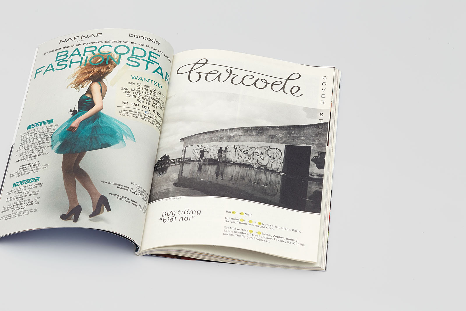
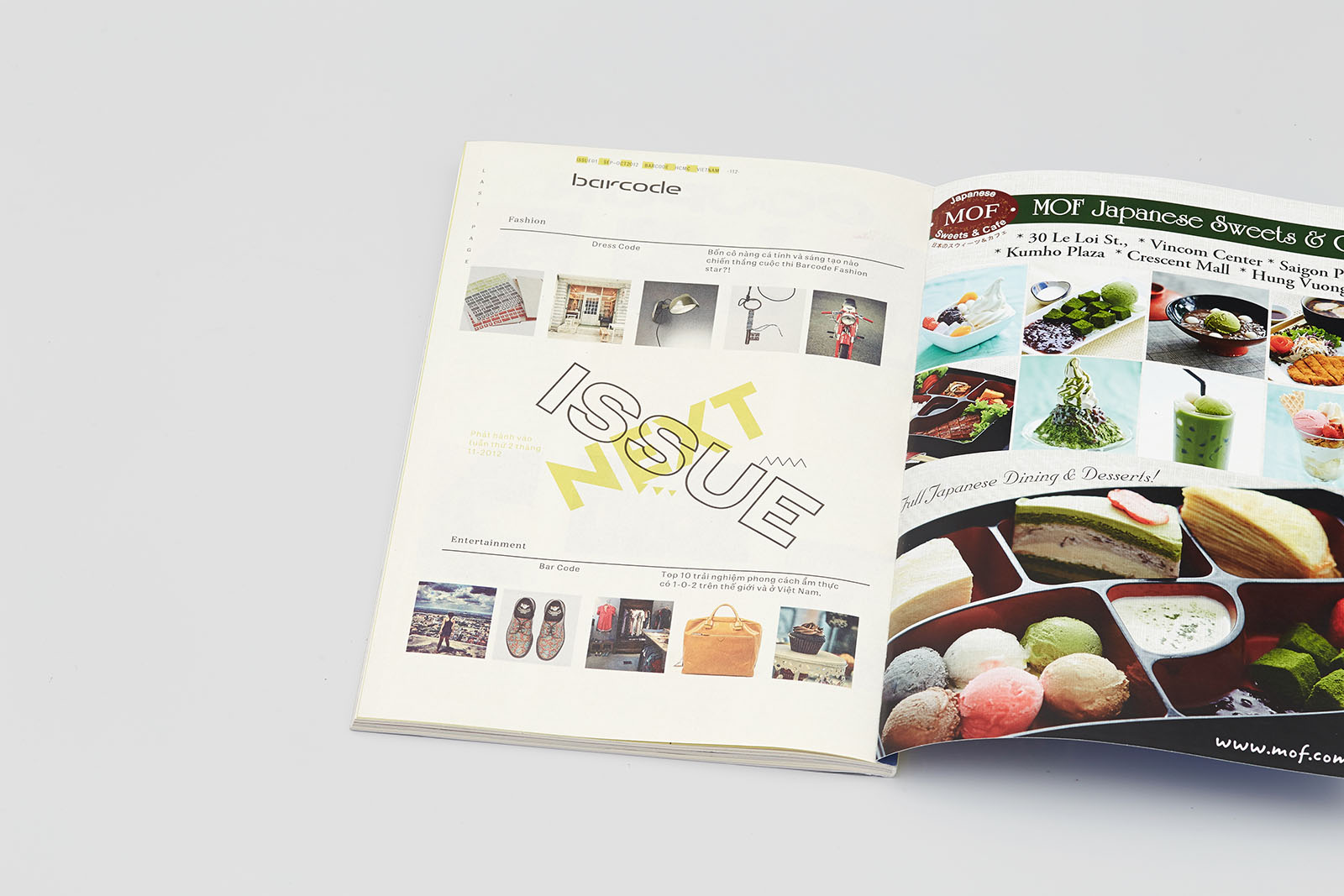
The first half-title after the service sections. Lettering by Maria Doreuli was suggested as a variant of the magazine’s logo but was rejected.
Static layout elements are arranged asymmetrically: the large folio on the recto is typed vertically.
The half-title in the first section of short one-page reviews. Lettering based on Helvetica Neue 85.
The heading of the one-page theme review subsection. Lettering based on New Old Black Extended.

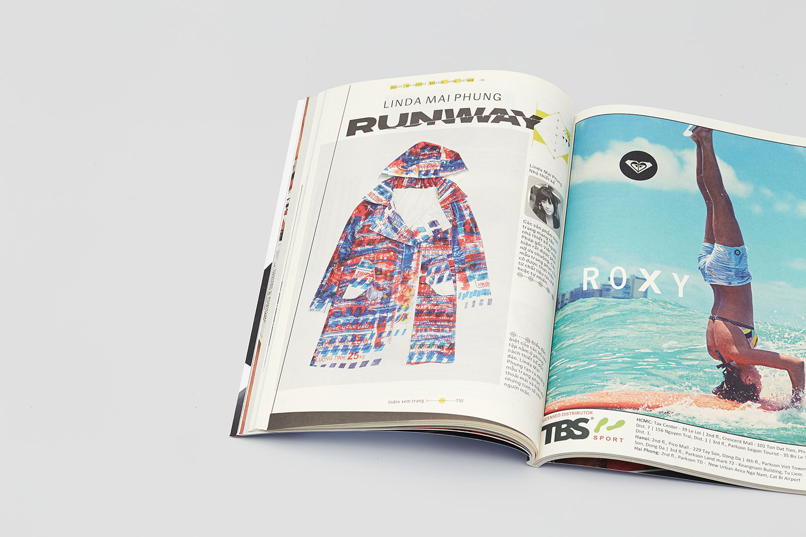
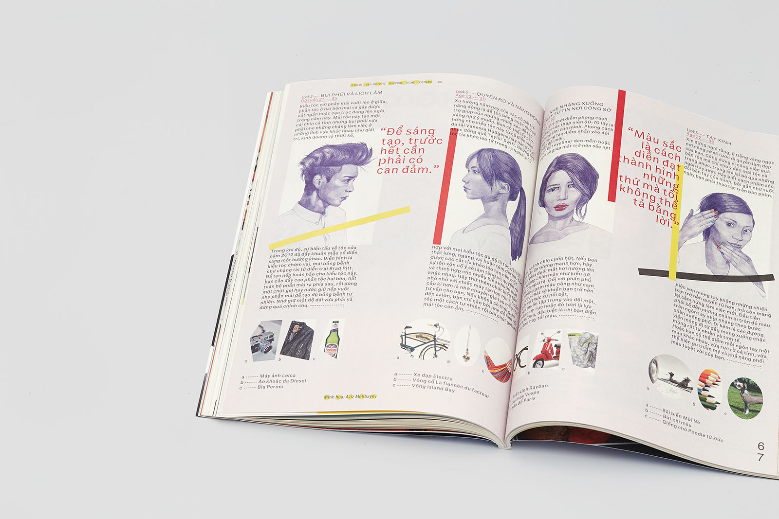
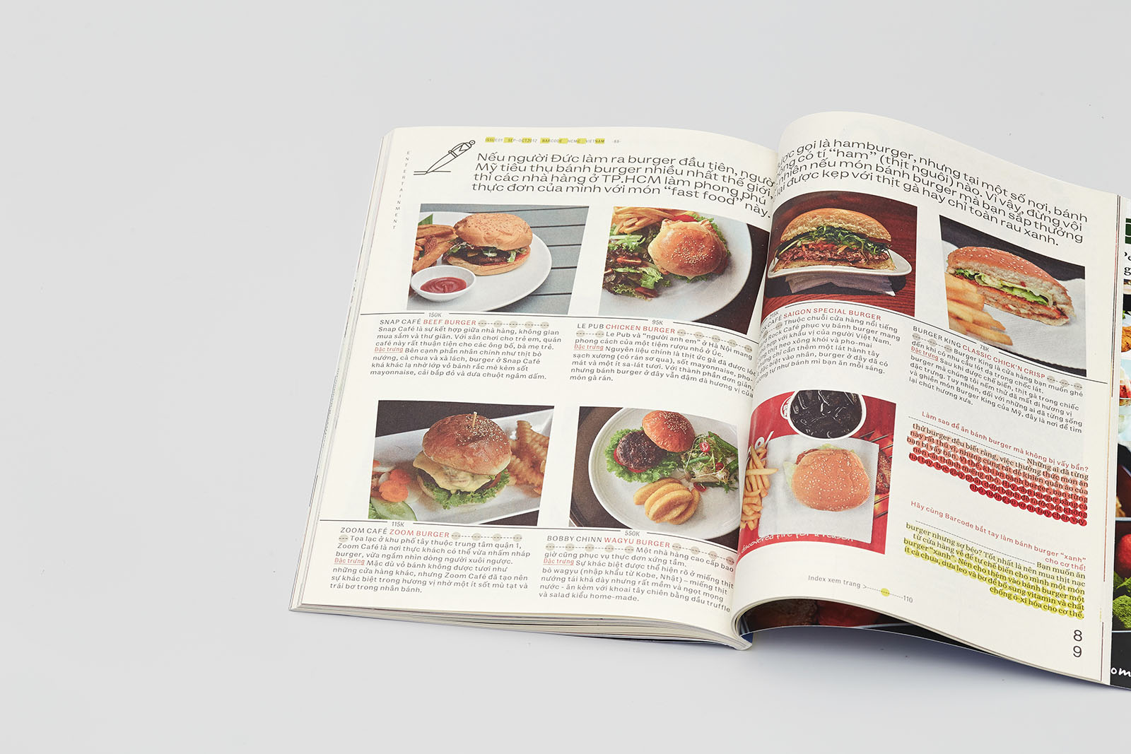
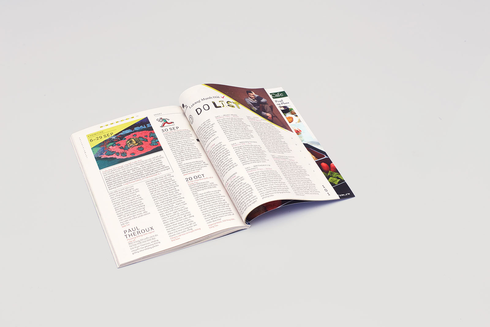
A thematic block of double-spread and one-page reviews. Lettering based on the Barcode typeface (Brian Lucid, Font Bureau, 1994). Background color of a photo sometimes becomes the background color of the page, creating the effect of inversion.
3. Graphics
The layout was inspired by the Japanese tabloids of the late 1980s and turned out to be extremely popular with Vietnamese young people, who saw it as an embodiment of their visual aspirations.
The magazine was meant to become an interpretation of the city space, a sort of map which would offer its readers information on several levels simultaneously.
The layout is based on a run-through grid and the Fibonacci sequence, making it possible to create three different visual solutions for the magazines published in three different countries, while fitting in naturally with a given language and space and at the same time preserving its own identity.
In terms of typography, the magazine uses two styles of typesetting: the crisp and balanced Кafka Text, Kafka Stensil and Franz Grotesk body typefaces, and unique letterings for each section.
We are also planning to introduce an online service for mobile platforms.
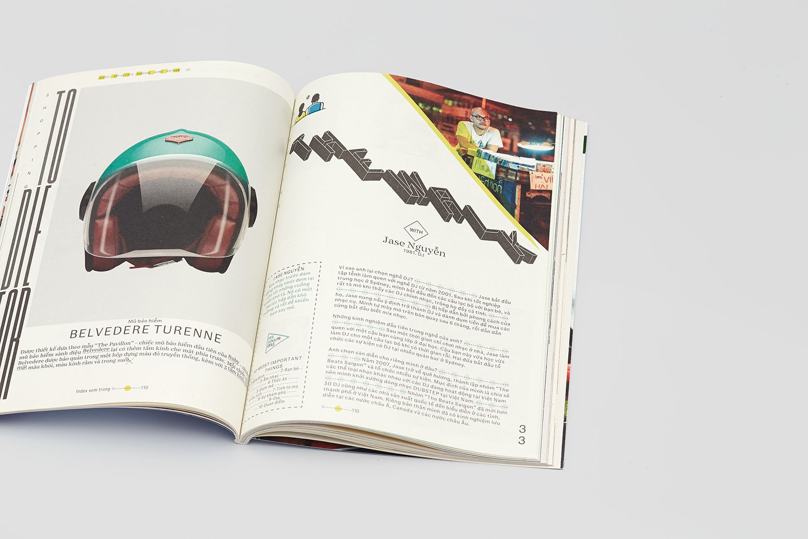
The recto uses geometric lettering. Additional display elements are collected in the Interstate Pi typeface (Guy Jeffrey Nelson, Font Bureau, 1994).
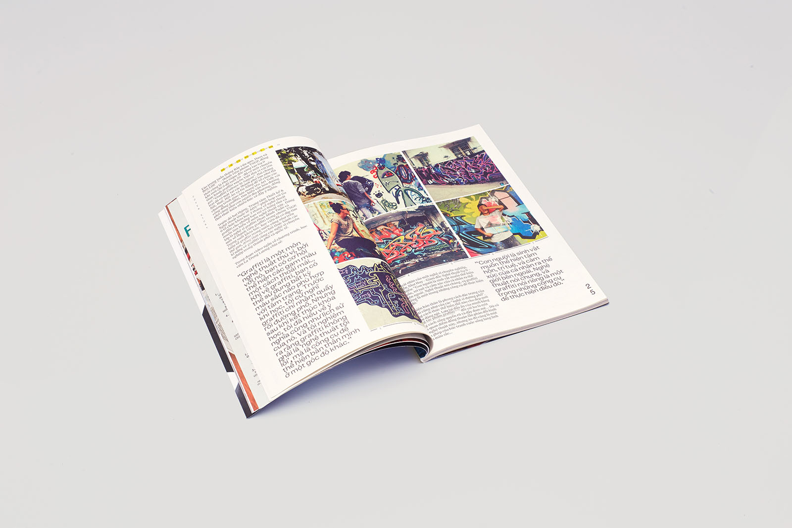
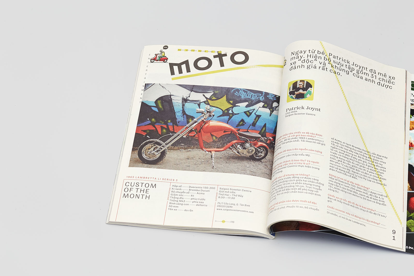
An example of a page filled with content almost to its full capacity. This interview is organized in accordance with the geographic principle.
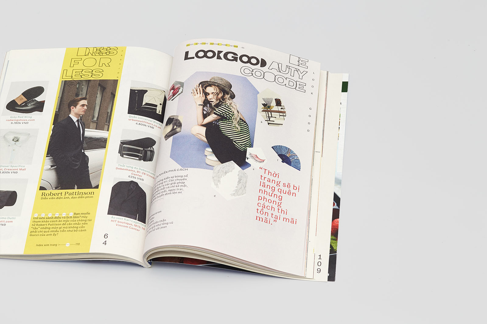
On verso, lettering is based on the New Old Outline Expanded Bold typeface (Maria Doreuli); on recto, lettering is based on the NowGrotesk typeface (Igor Mustaev). Photographs are cropped into asymmetric polygonal shapes of quartz crystals.
The presence of elementary drawings is set out in the design layout guidelines. The typography is built on the combination of Franz Groresk и Kafka Serif Stensil (Font Shop).
4. Iconography
The artist Sergey Kalinin used as a starting point the Interstate Pi typeface (GuyJeffreyNelson, Font Bureau, 1994), which includes a set of highway signs. The idea was for icons to open each new section and sometimes line up to form a message.
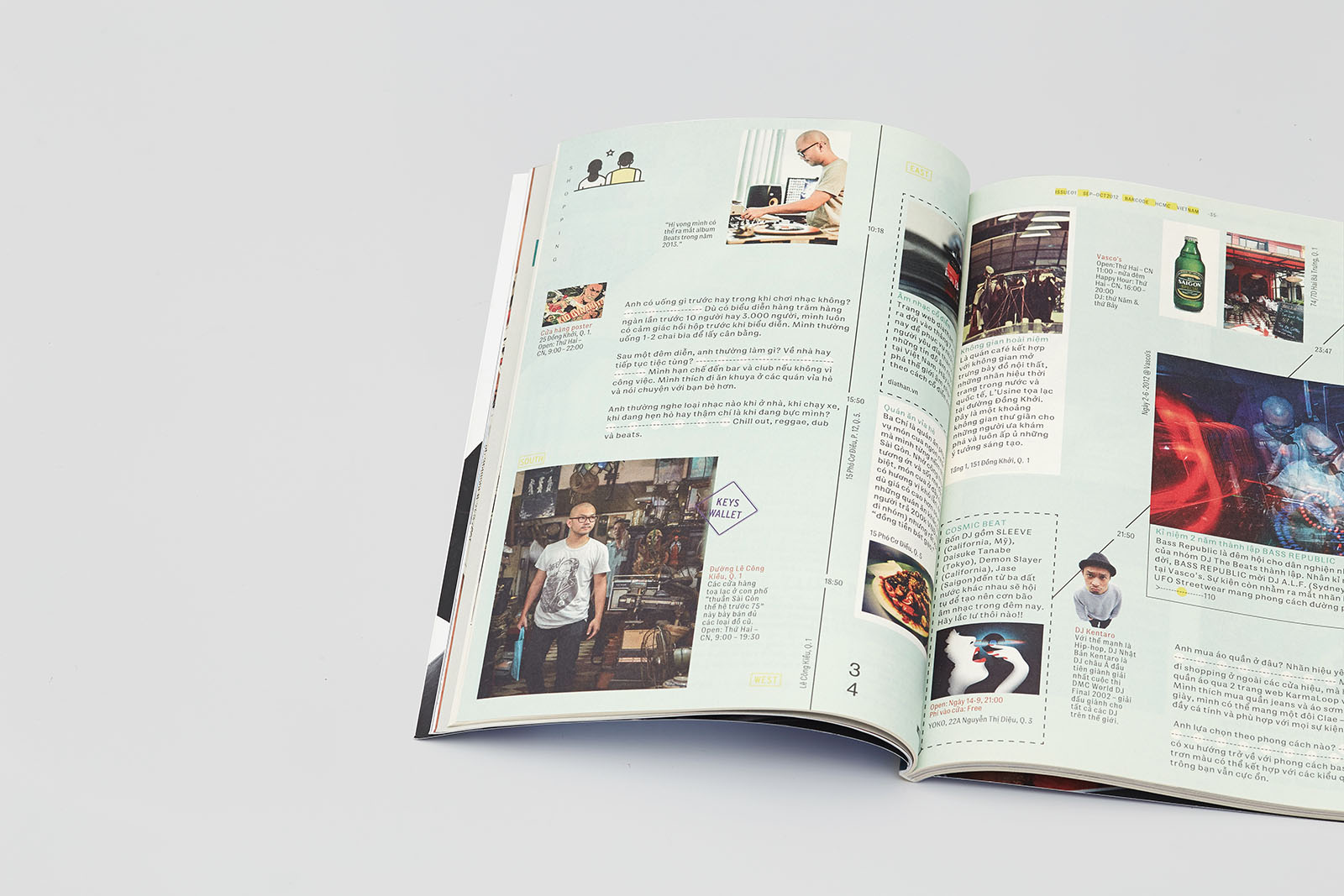
The theme of travelling is covered in all its numerous aspects: baggage, transport, services, the very principle of events coming and going in quick succession, etc.
This design was inspired by Vespa and Honda scooters, the Vietnamese alphabet, Vietnamese carnival and theater masks and puppets.
The regular structure of the page is concealed within complex image outlines.
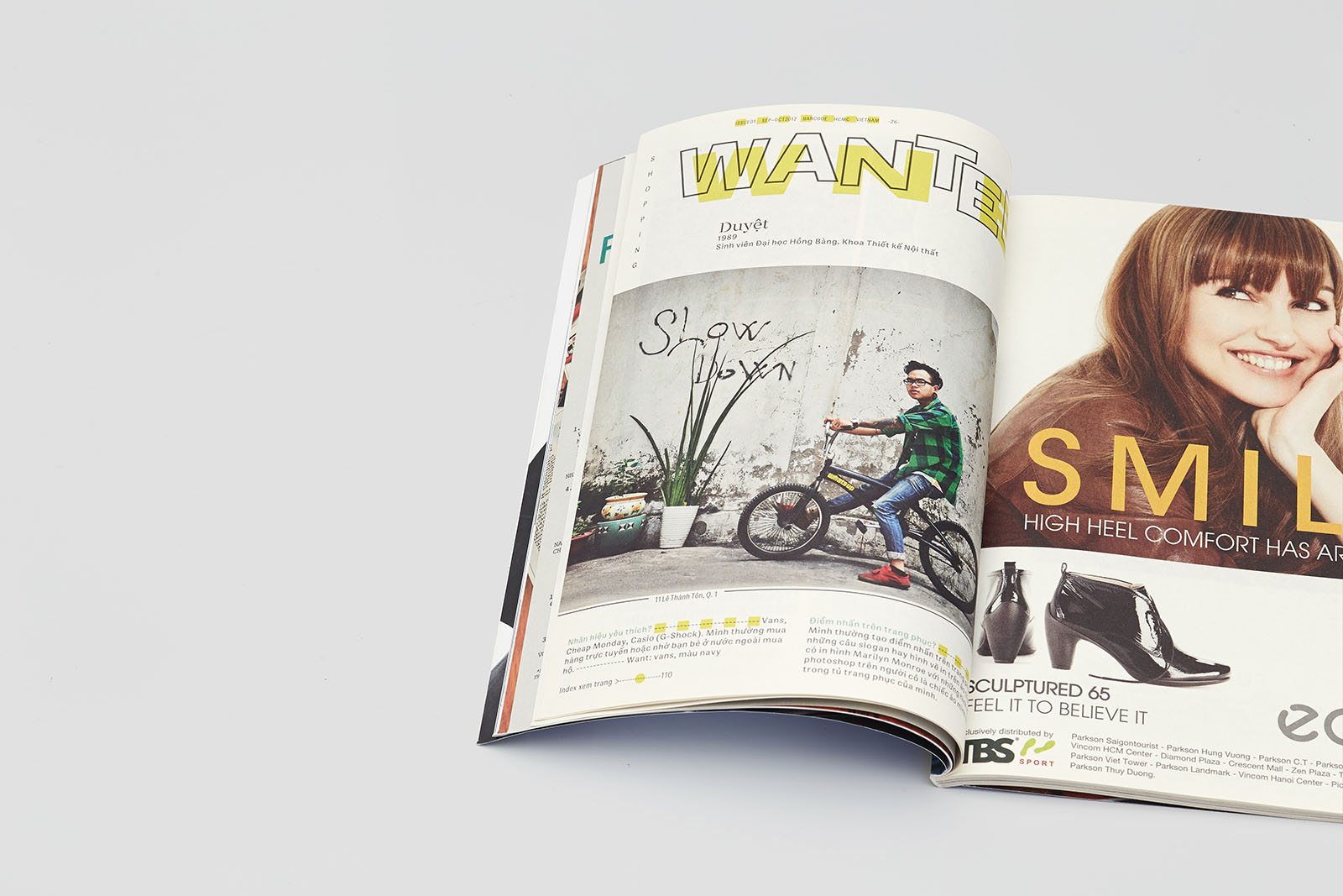
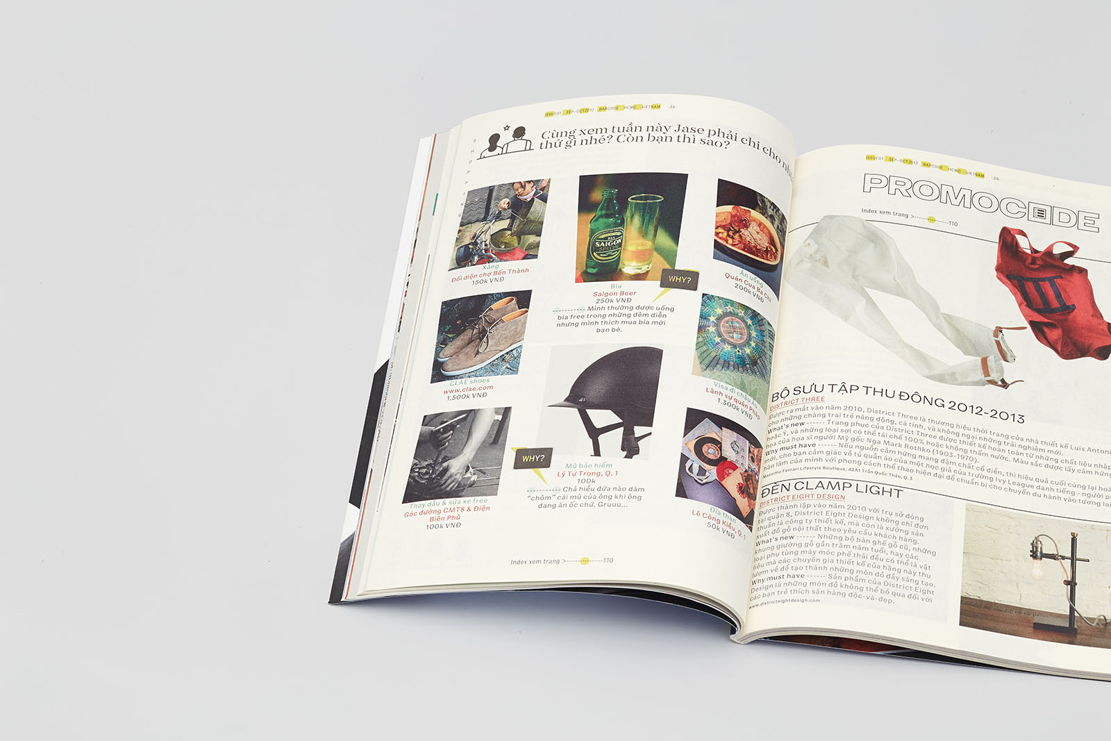
On recto, lettering is based on the Blockhead typeface (John Hersey, Emigre 1995). Gaps between subheadings and the text following it are filled with bullets, their number depending on the length of the line or the subheading. It is one of the twelve layout features that apply to the whole text. All addresses are written in superscript, aligned with the cap line and underscored.
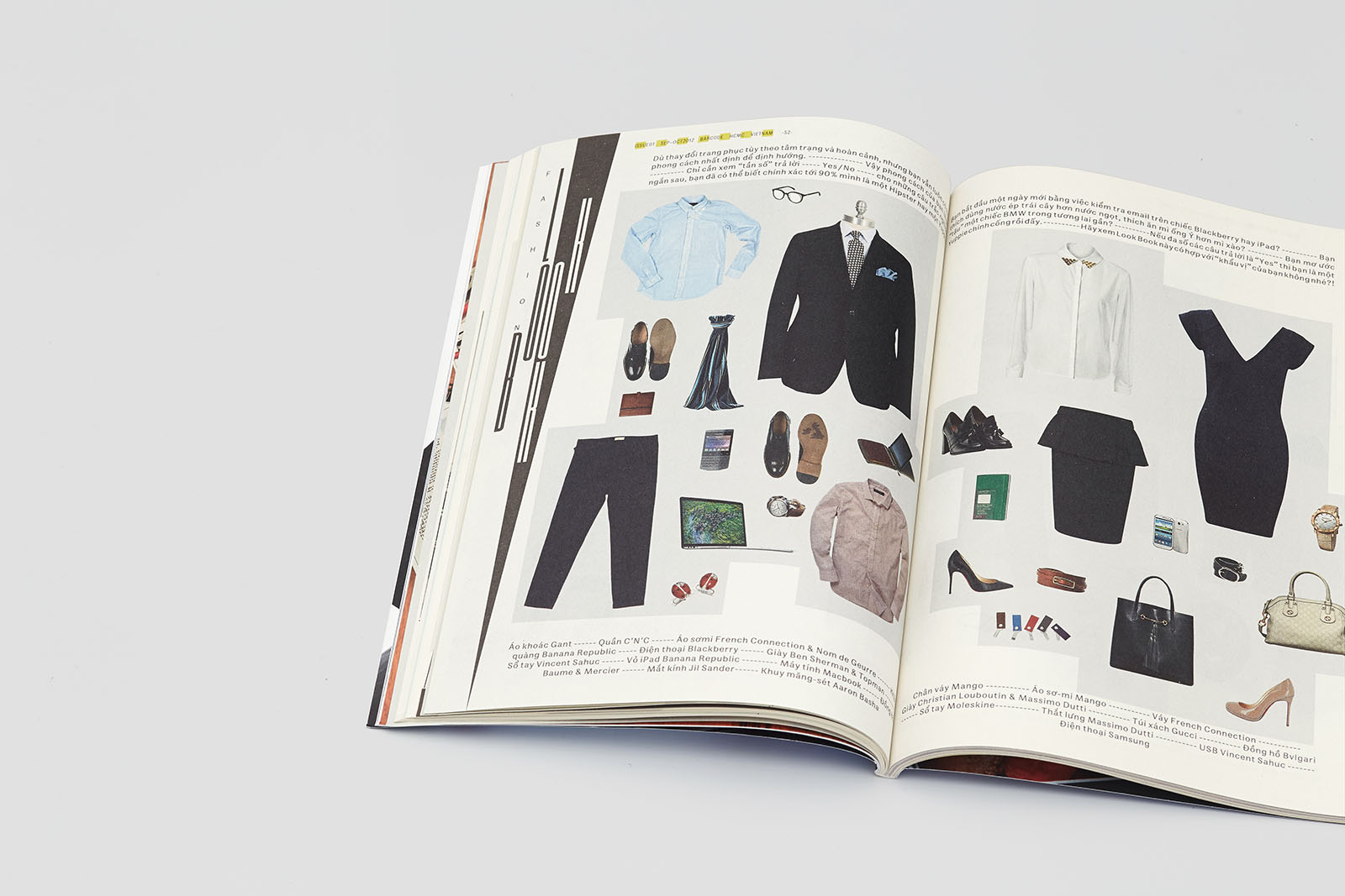
Double-page spread of the review section. The resume text block is complemented by rows of colorful bullets with variable color density. We used different spacing settings for typesetting characters and decorative components.
Lettering with Mason typeface characters (Jonathan Barnbrook, Emigre, 1992) and ornaments with scooter tire mark patterns.
5. Typefaces
The KafkaTypefamily font family was designed by Zhenya Yukechev in 2010–2012. This font family is intended for books and magazines; it is suitable for prolonged reading and includes display faces and alternative characters. Stylistically, this typeface is a fresh replica of German modern serif of the late 18th — early 19th centuries, the era of Justus Erich Walbaum. Its slightly narrowed proportions and moderate contrast make lines look firm and neat. This font family also includes a large display face (Kafka Text Stensil), which was released in Barcode’s design layout.
The New Old typeface includes five fonts, two of which (New Old Outline Expanded Bold and New Old Ultra Expanded Black) were created by Maria Doreuli for Barcode’s design layout.
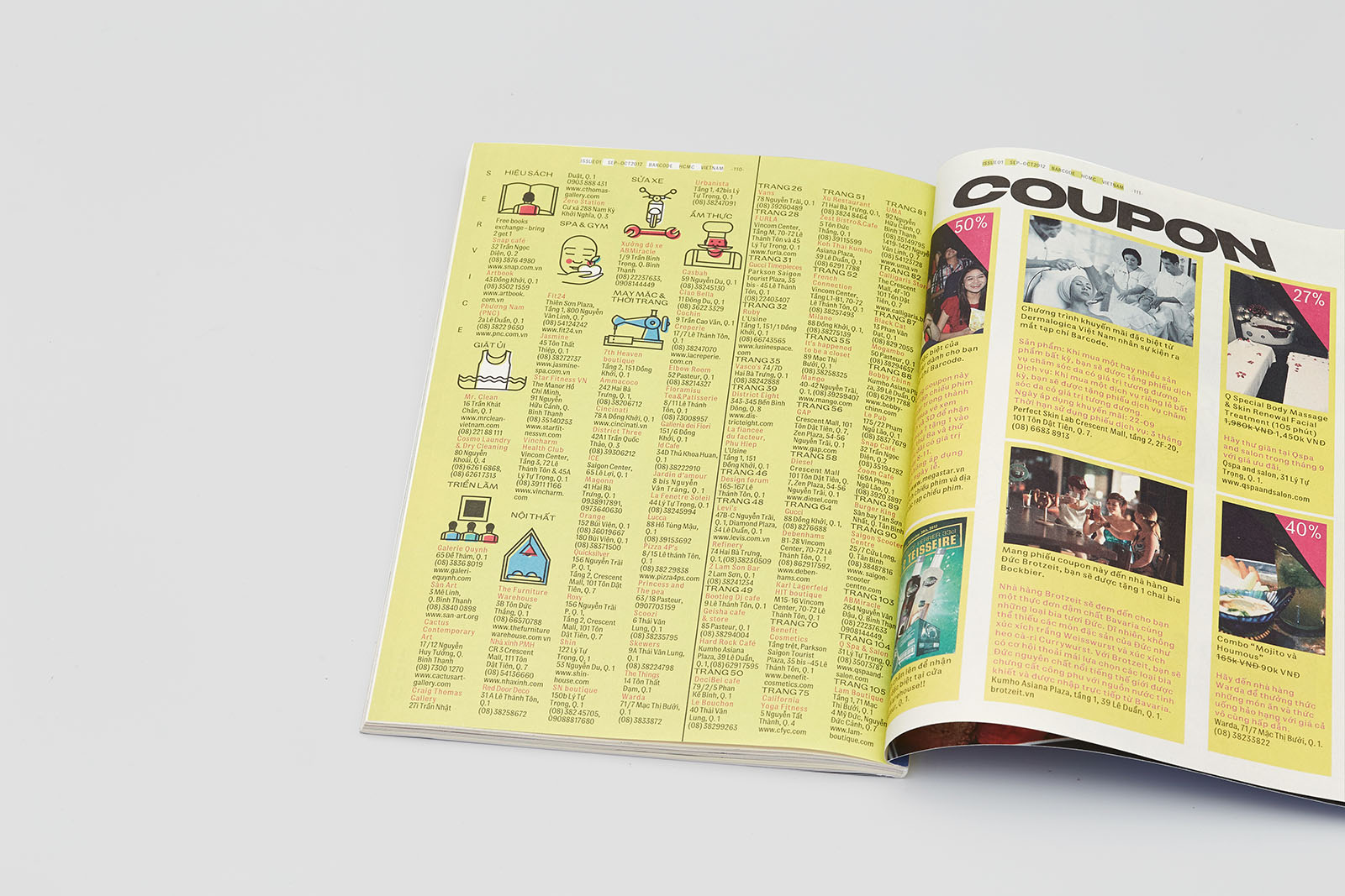
Double-page spread of the service section. Here we used Franz Grotesk Condensed 80, a font that was not developed further inside its own font family.
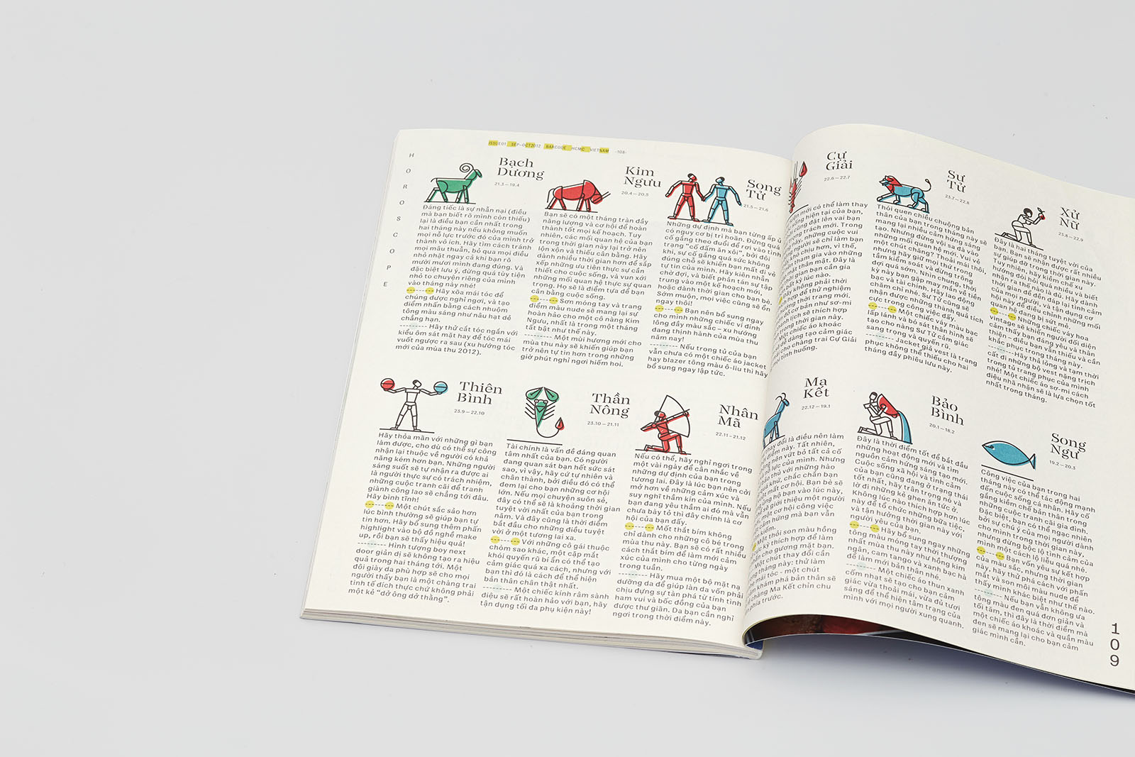
Double-page spread of the horoscope section. Interviewees’ quotations are set off by gray and yellow bullets.
The recto lettering is based on the Blockhead typeface (John Hersey, Emigre 1995).
The image for the last page design layout was inspired by the building of the Abteiberg Museum (Hans Peter Schaefer, 1972–1982).

Поделиться
Другие проекты
 Vokrug Sveta magazineMagazine
 Hermitage magazineMagazine